Ice Cream Vibrant Colorful Splatter Artistic
DownloadTopics
Details
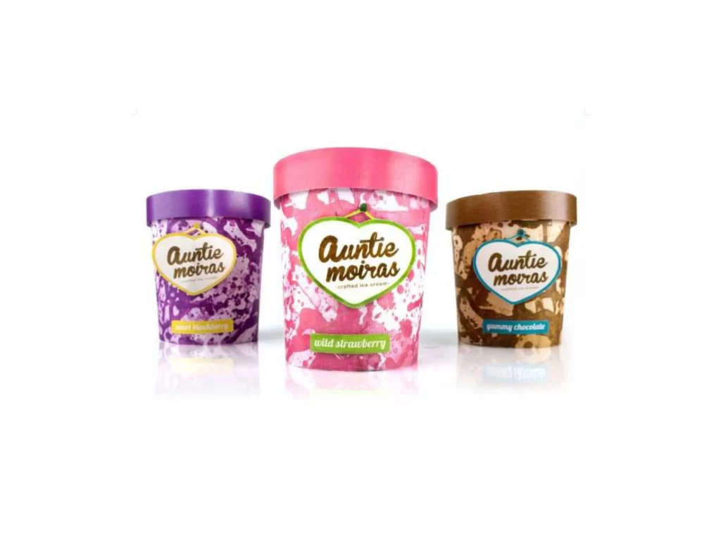
Three cylindrical tubs of Auntie Moiras ice cream stand in a row, each distinguished by a different lid color and a unique splatter pattern. The left container features a purple lid and a violet-and-white speckled body with a yellow flavor label reading "mixed blackberry." The central tub, which is slightly larger and positioned forward, sports a bright pink cap and a pink-and-white paint-splatter design with a green label for "wild strawberry." On the right, a brown-lidded container displays a tan-and-white marbled texture and a blue tag indicating "passion chocolate." All three share a heart-shaped logo containing the brand name, set against an uncluttered white surface that reflects the objects beneath them.
Vibrant, irregular paint-splatter textures across the packaging create a handmade, artistic feel that contrasts sharply with standard smooth-finish dairy containers. Each flavor is assigned its own distinct palette—cool purples for berry, warm pinks for fruit, and earthy browns for chocolate—allowing the product line to be instantly recognizable through color alone. Designers can grab the full-resolution file at no cost to study how these chaotic patterns interact with clean typography and geometric logo shapes.
Packaging designers developing frozen dessert brands would find this composition useful for analyzing how saturated colors communicate flavor profiles without photography of the actual food. Marketing teams planning retail shelf layouts could reference the relative sizing and spacing of the three units to understand visual hierarchy in product trios. Brand identity specialists might examine the heart-shaped lockup and script lettering to see how playful elements soften an otherwise bold, high-contrast aesthetic.