Canada West Maple Syrup Stack
Topics
Details
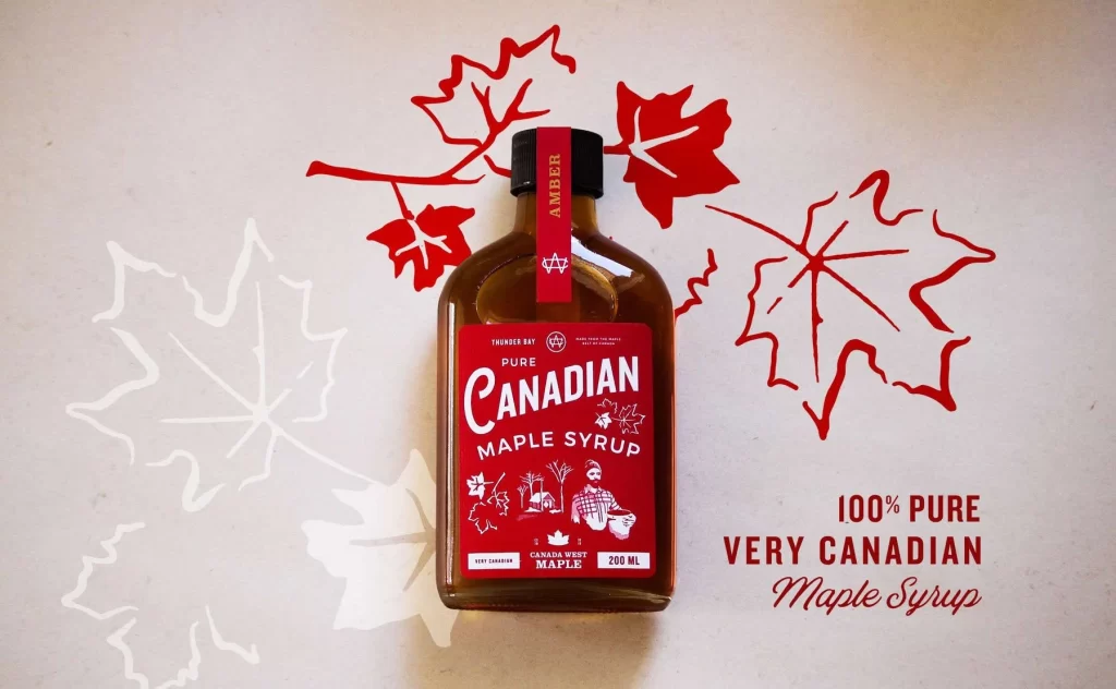
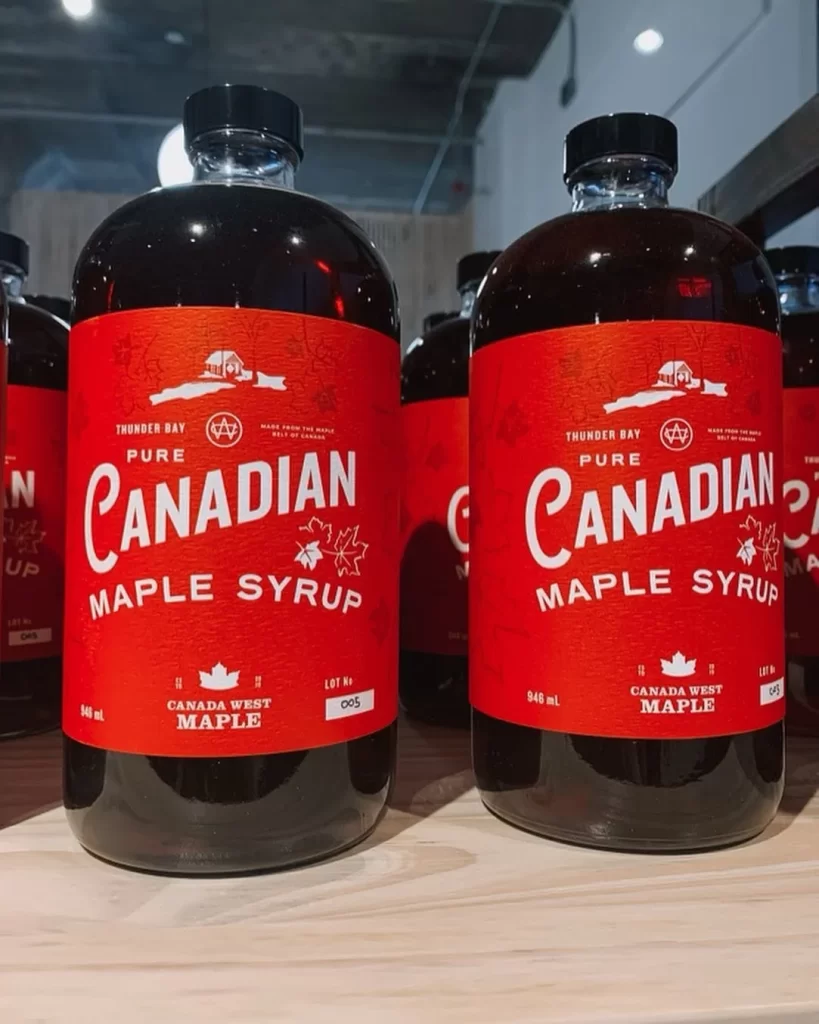
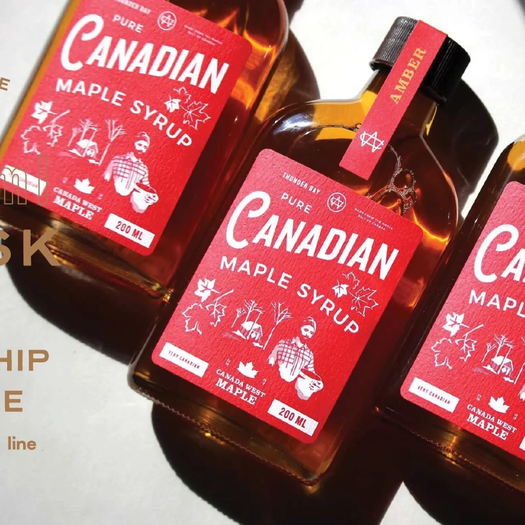
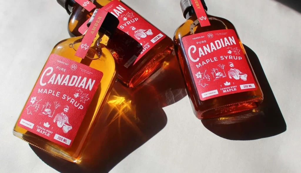
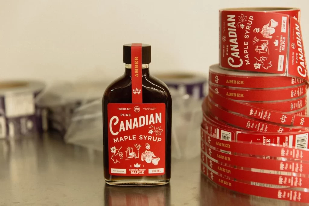
A single glass bottle of Thunder Bay Canada West Maple syrup stands prominently in the foreground, featuring a bold red label with white typography and a black screw cap. To the right of the bottle sits a tall stack of identical red adhesive labels, neatly wound into a large roll. The entire composition is set against a blurred industrial background with neutral tones that emphasize the vibrant red packaging.
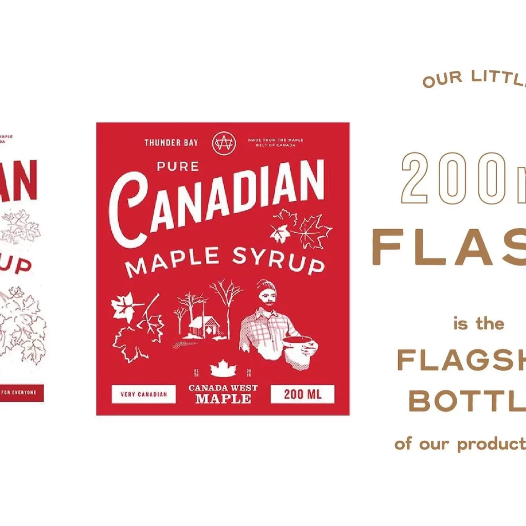
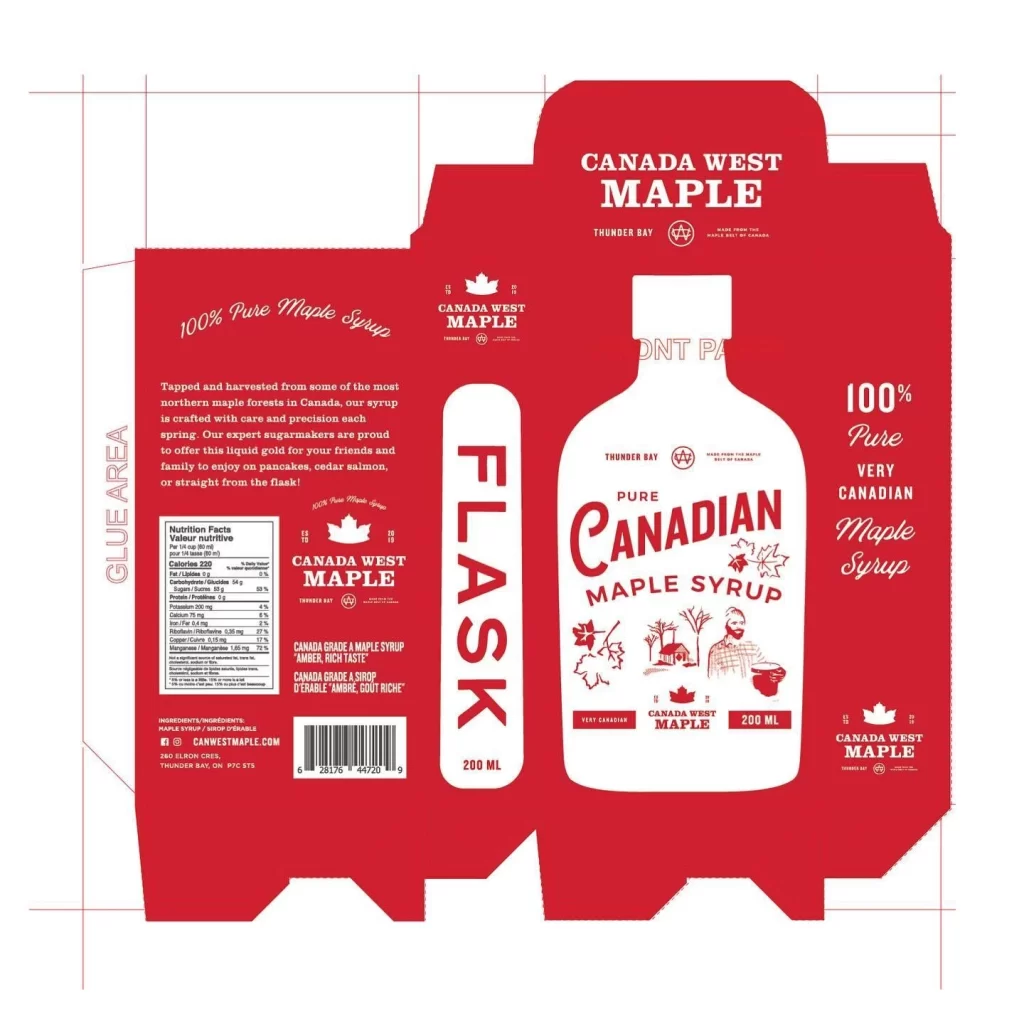
The label design employs a striking color palette of deep red, crisp white, and black to create high visual contrast. Typography is handled with a mix of bold serif fonts for the main product name and clean sans-serif text for supporting details. Illustrative elements include maple leaves and a figure in traditional attire, adding authentic character to the overall layout while maintaining clear hierarchy and readability.
Packaging designers frequently reference this image when developing concepts for artisanal food products or premium condiment branding. Label design students analyze the composition to understand how vintage aesthetics can be applied to modern consumer goods. Food brand managers use such visuals as benchmarks for creating distinctive identities in the competitive maple syrup market.