Canada West Blueberry Maple Pair
Topics
Details
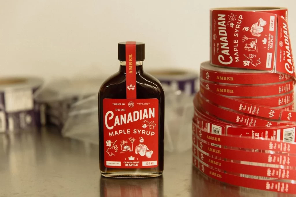
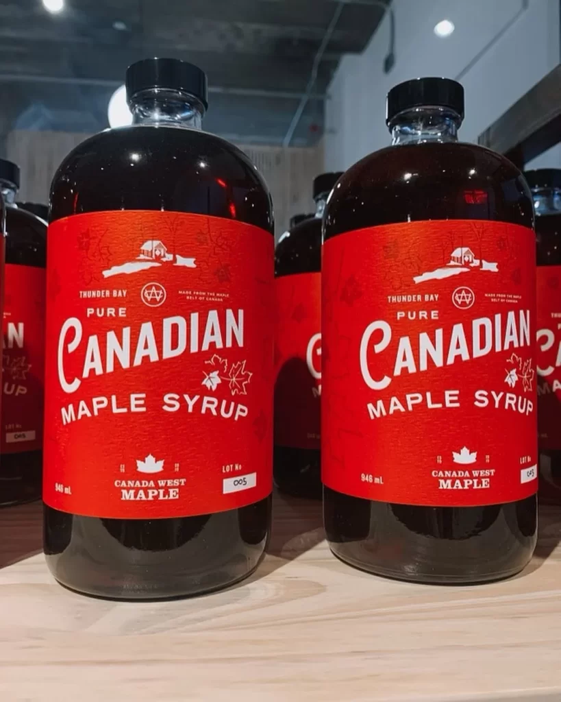
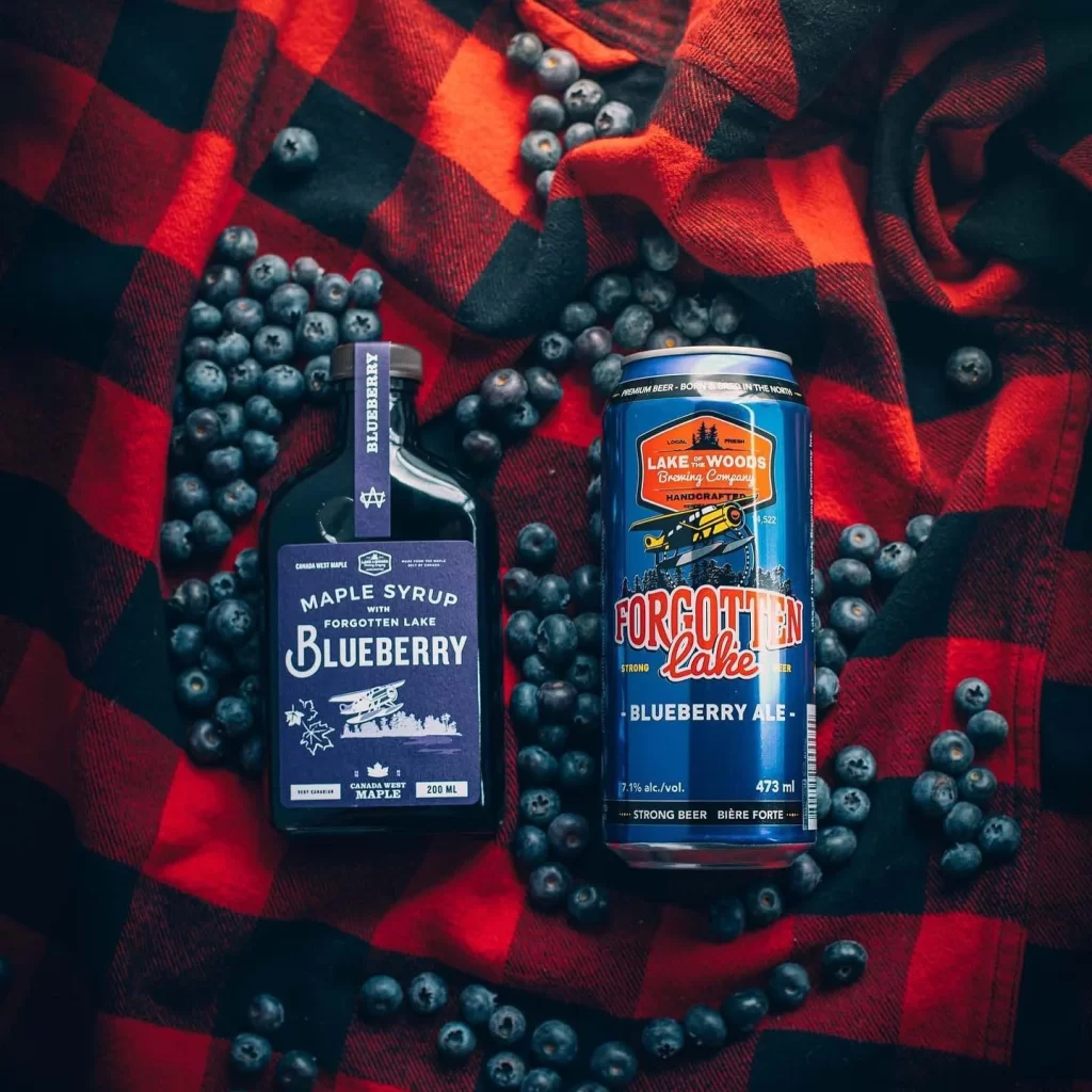
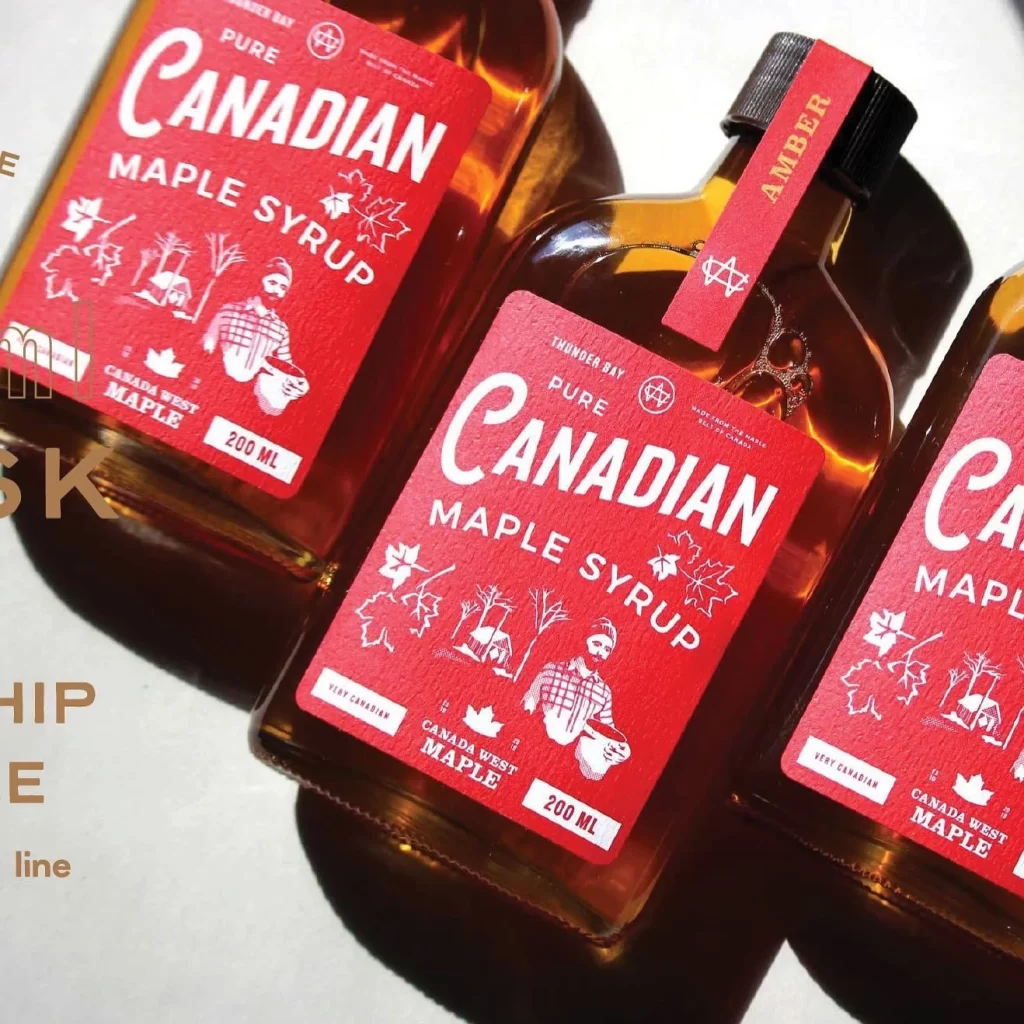
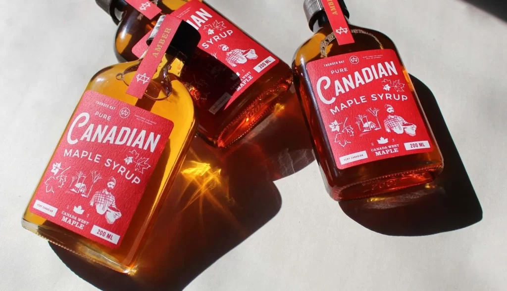
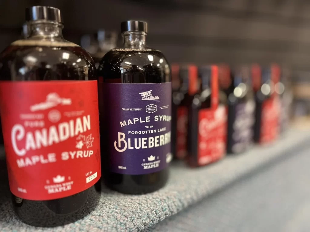
Two glass bottles of Canada West Maple syrup sit on a textured grey surface, with a larger red-labeled bottle in the foreground and a smaller purple bottle beside it. The red label identifies the product as Canada West Maple syrup, while the purple label specifies Maple Syrup with Forgotten Lake Blueberry. Additional bottles blur into the background, creating depth and suggesting a retail shelf display.
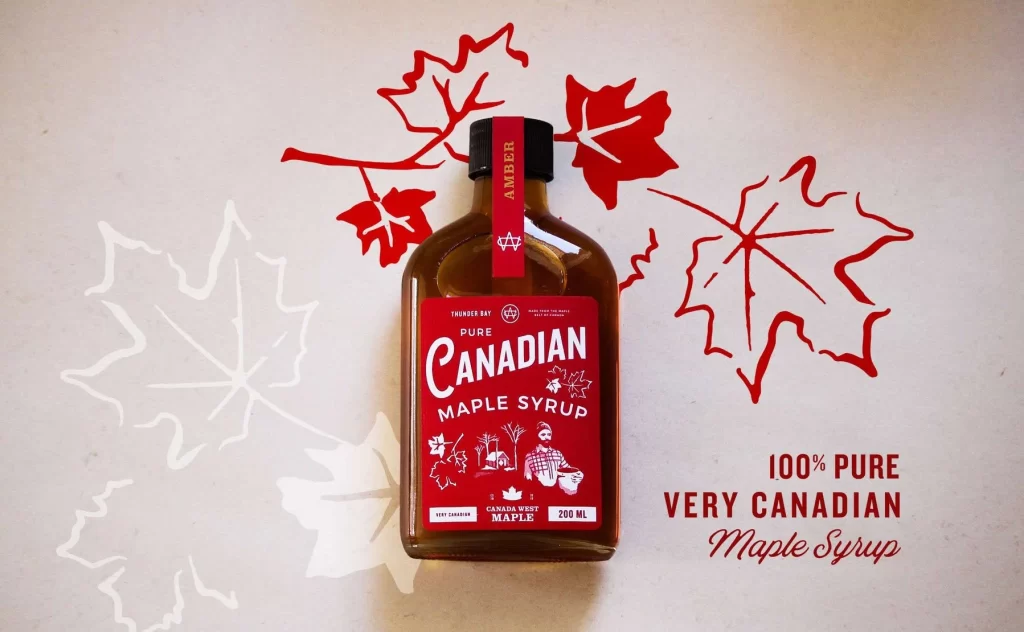
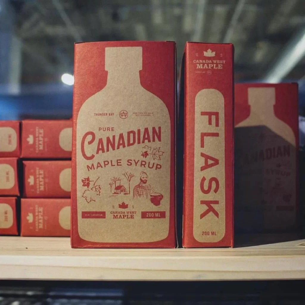
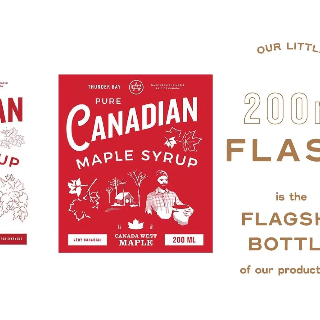
The packaging employs a vintage aesthetic through bold serif typography and distinct color blocking that differentiates the classic and flavored varieties. Red and deep purple backgrounds provide high contrast for the white text, while small maple leaf icons and crown motifs reinforce the brand’s heritage. Label layouts balance large product names with smaller origin details, creating clear visual hierarchies that guide the eye efficiently.
Packaging designers frequently reference this composition when studying how color coding helps consumers distinguish between product lines within a single brand. Food brand strategists use such examples to analyze effective ways of communicating flavor variations without compromising core identity. Students of label design examine the typographic choices and spatial arrangements that make both variants instantly recognizable as part of a cohesive family.