Canada West Maple Sugar Bag
Topics
Details
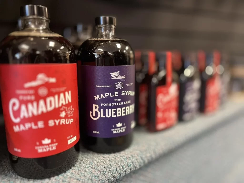
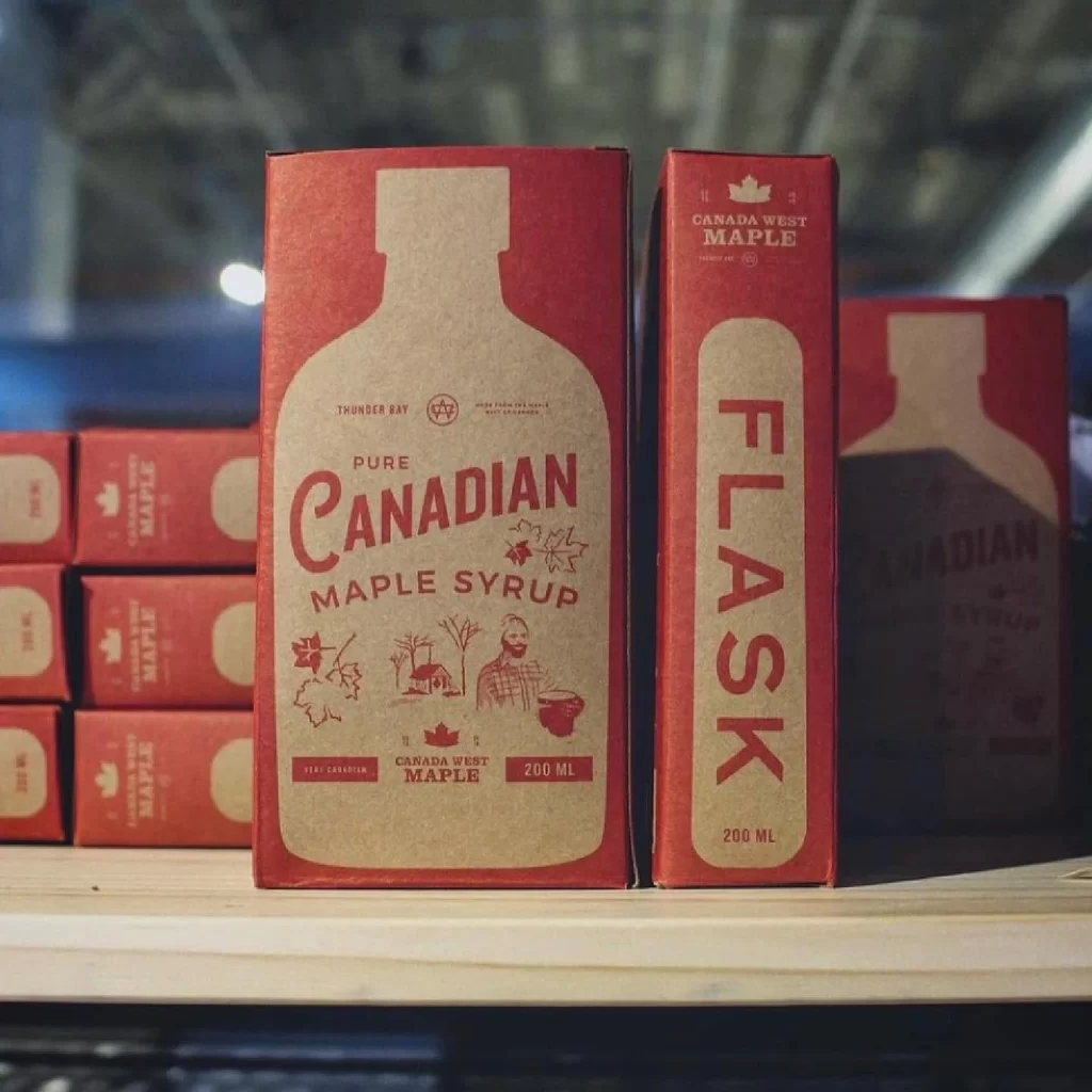
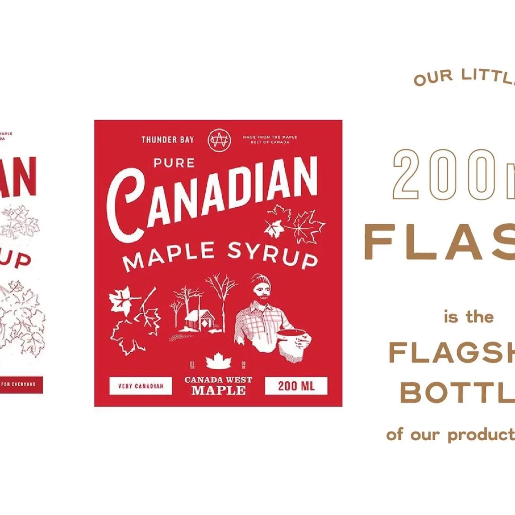
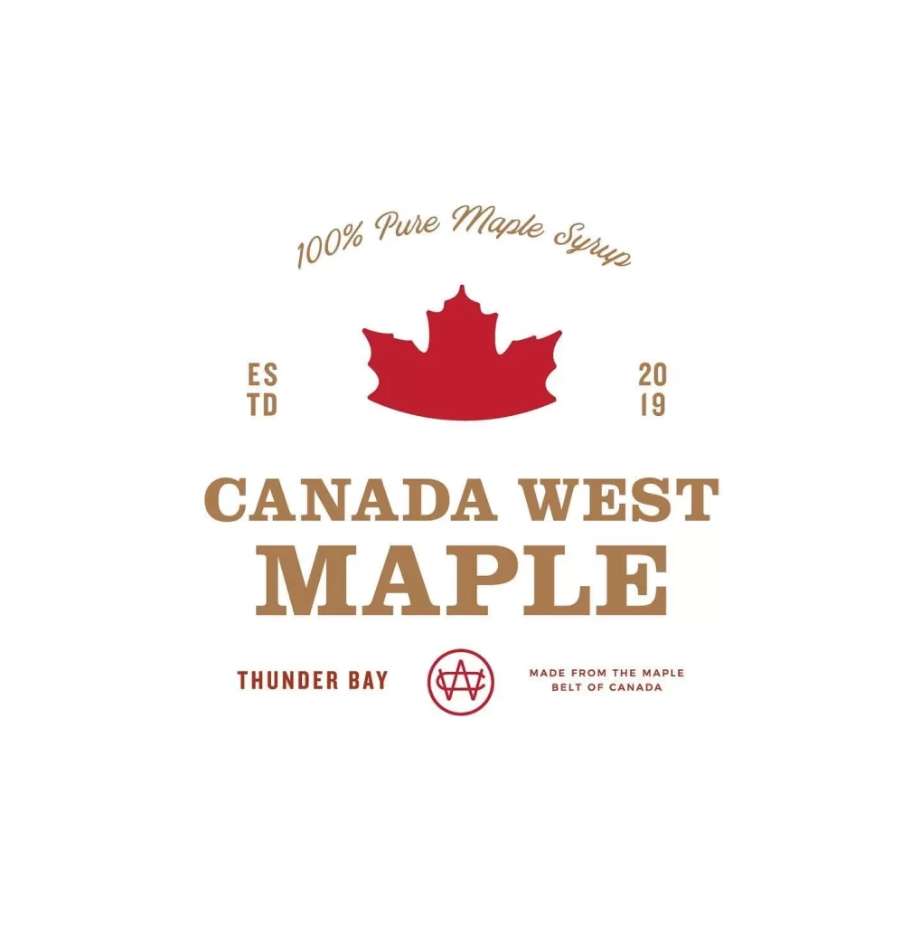
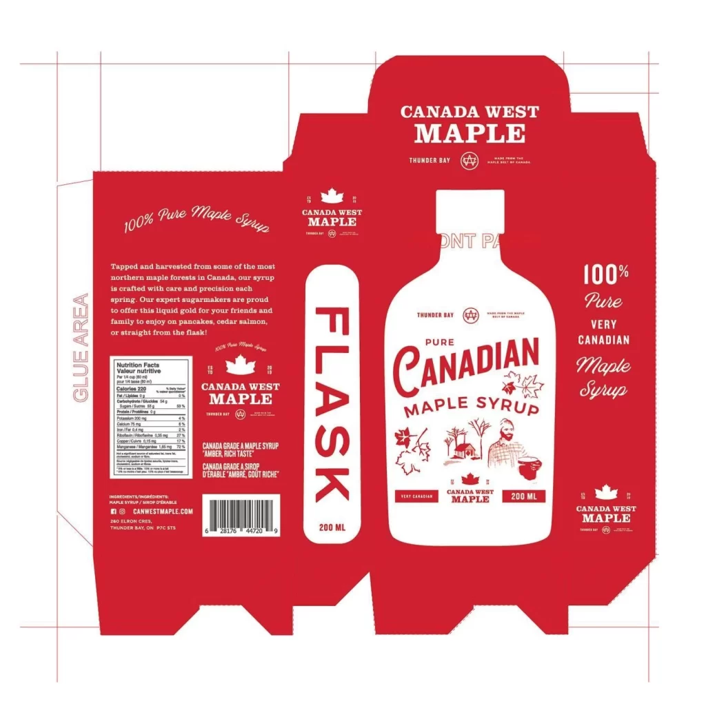
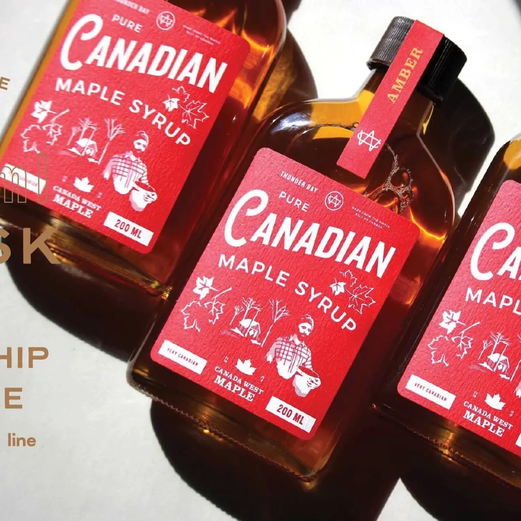
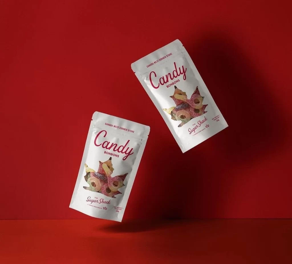
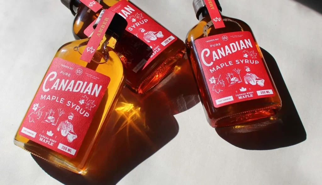
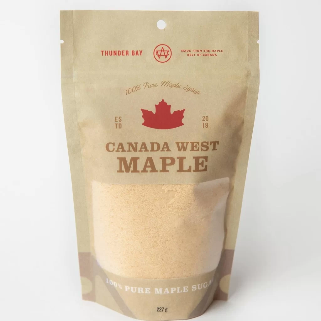
The image displays a stand-up pouch of Canada West Maple Sugar from Thunder Bay, featuring a kraft paper background with a transparent window revealing the granular product inside. A bold red maple leaf sits at the center, surrounded by text indicating the product is 100% pure maple sugar weighing 227 grams. The packaging prominently displays the establishment date of 2019 and notes its origin from the maple belt of Canada.
Label layout employs a clean, centered hierarchy with serif typography for the main brand name and smaller sans-serif details for origin and purity claims. The color palette combines natural brown tones of the paper with deep red accents for the leaf and logo, creating a rustic yet premium aesthetic. Typography choices balance traditional elegance with modern readability, ensuring key information like the brand and weight stand out clearly against the textured background.
Packaging designers frequently reference this example when studying minimalist approaches to natural food products that emphasize authenticity through material choice. Label design students analyze its effective use of negative space and typographic contrast to convey quality without visual clutter. Food brand managers use such imagery to benchmark how regional identity symbols like the maple leaf can be integrated into contemporary packaging systems.