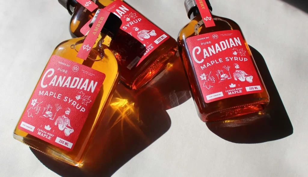
Canada West Maple Flask Red
Topics
Details
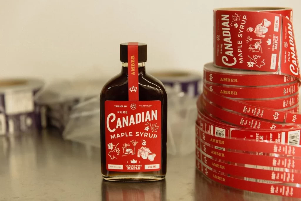
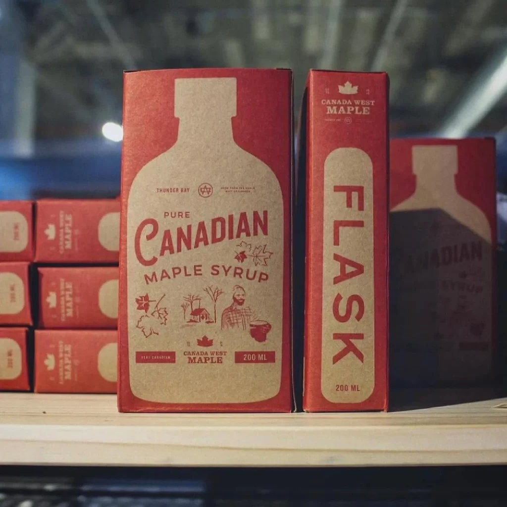
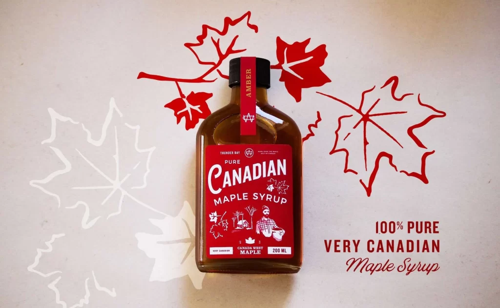
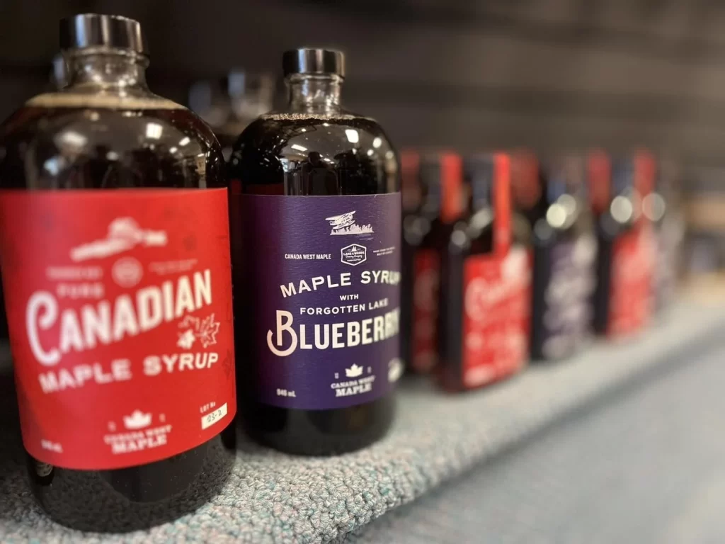
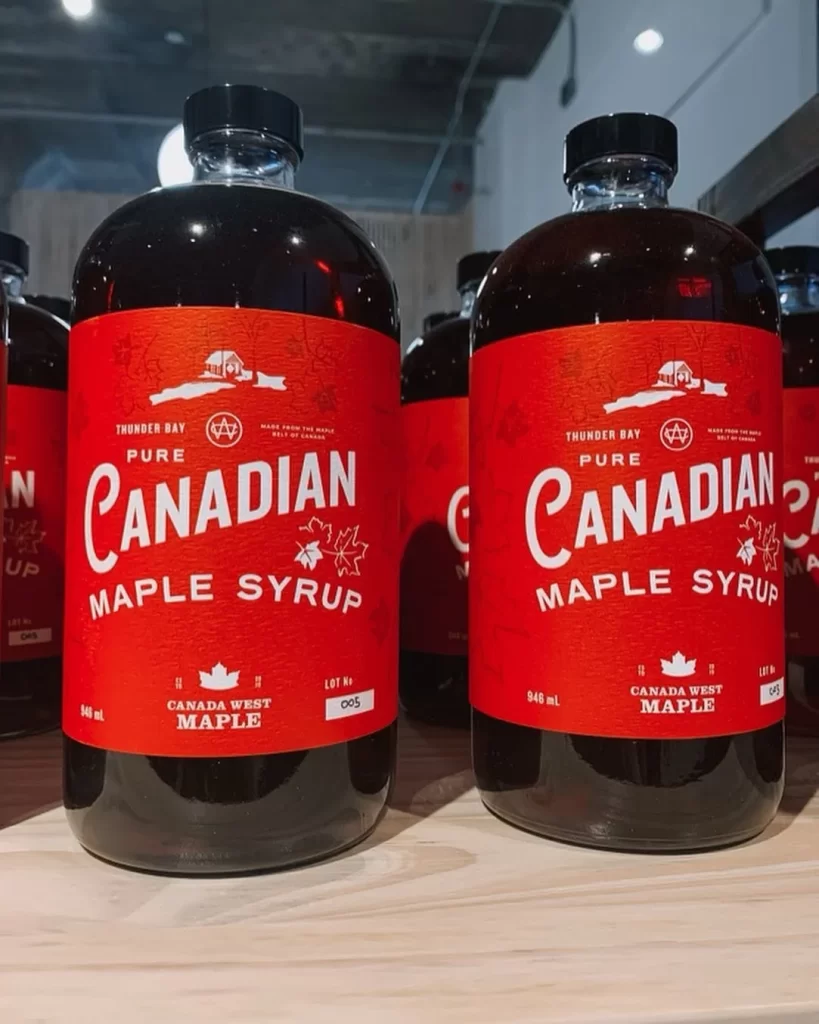
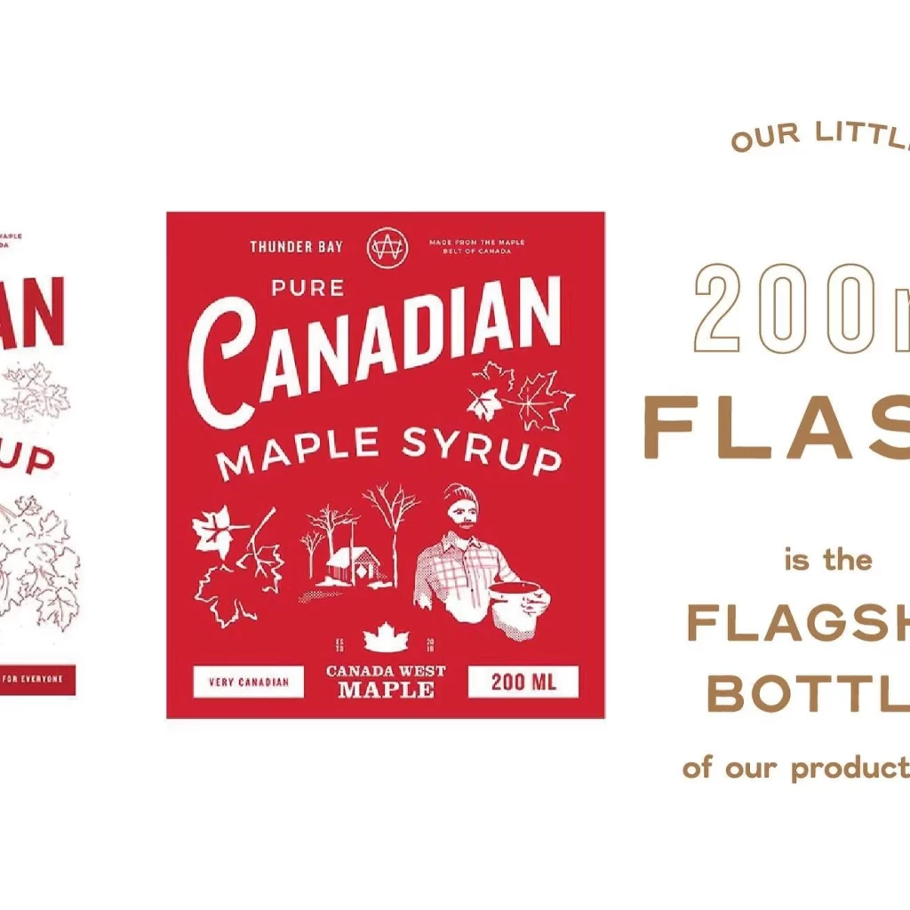
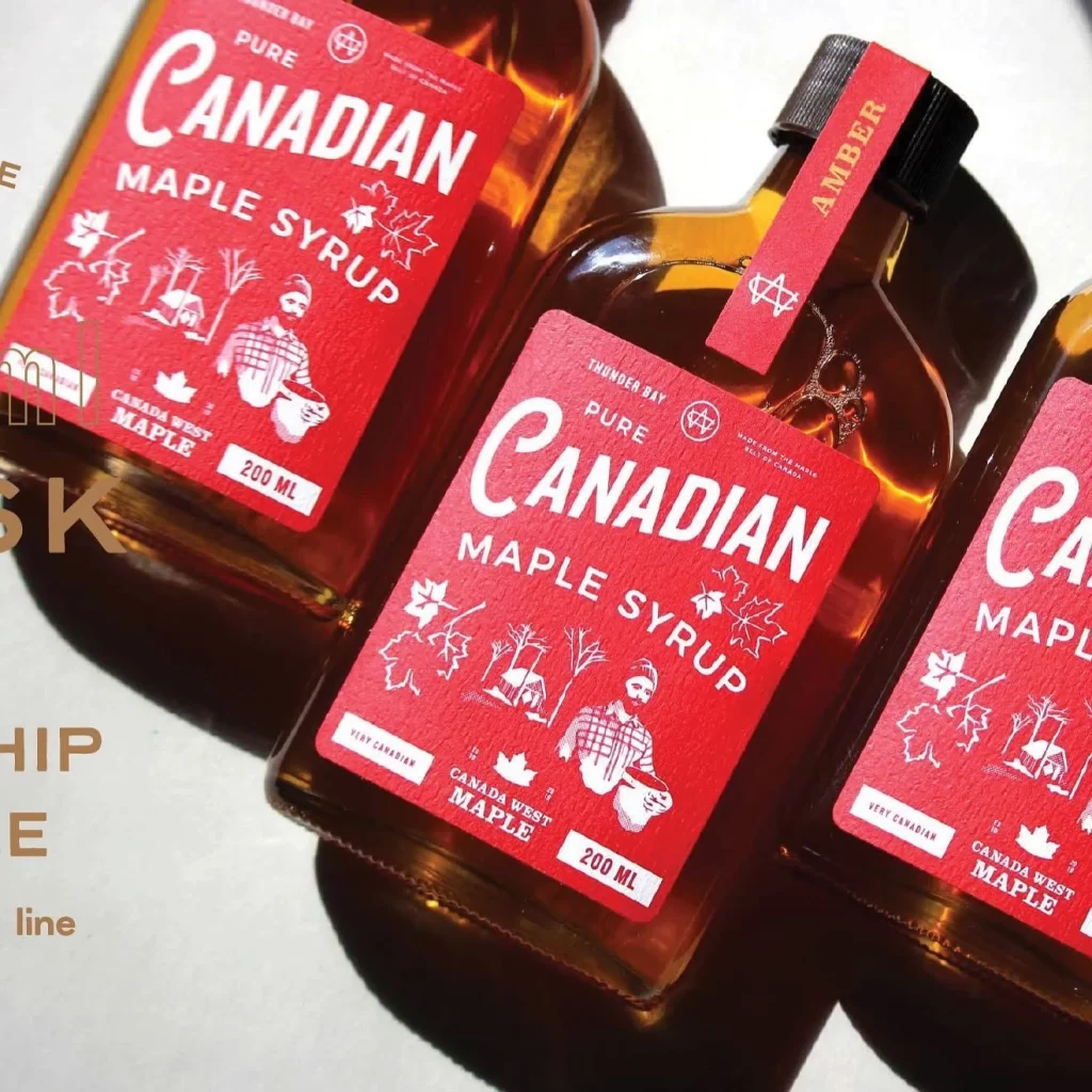
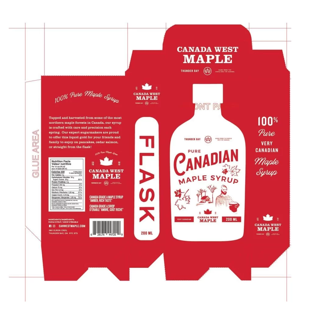
Classic red branding dominates this red cardboard packaging die-cut for a Canada West Maple syrup flask, which features a central white bottle illustration with "Pure Canadian Maple Syrup" branding. The design includes side panels with nutritional facts, origin text from Thunder Bay, and a barcode, all rendered in a bold two-tone palette of deep red and white with black typography.
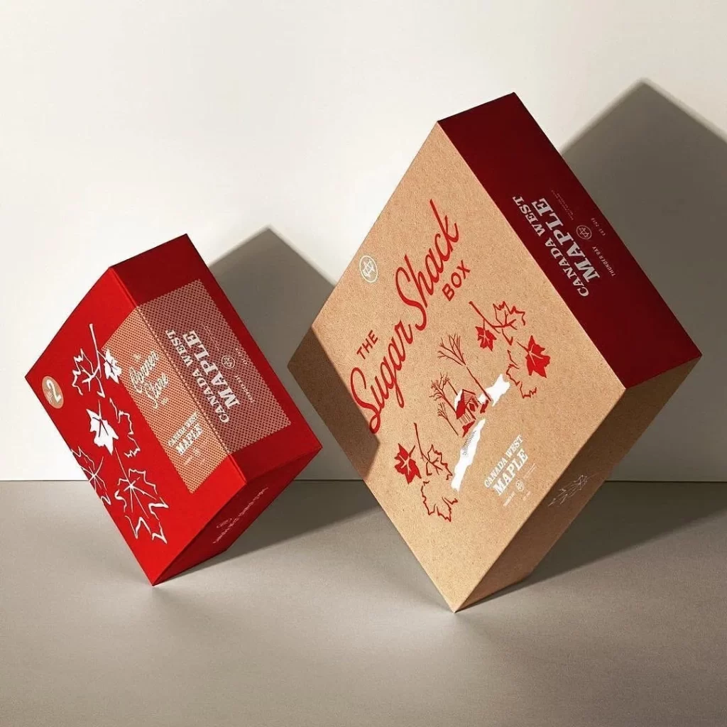
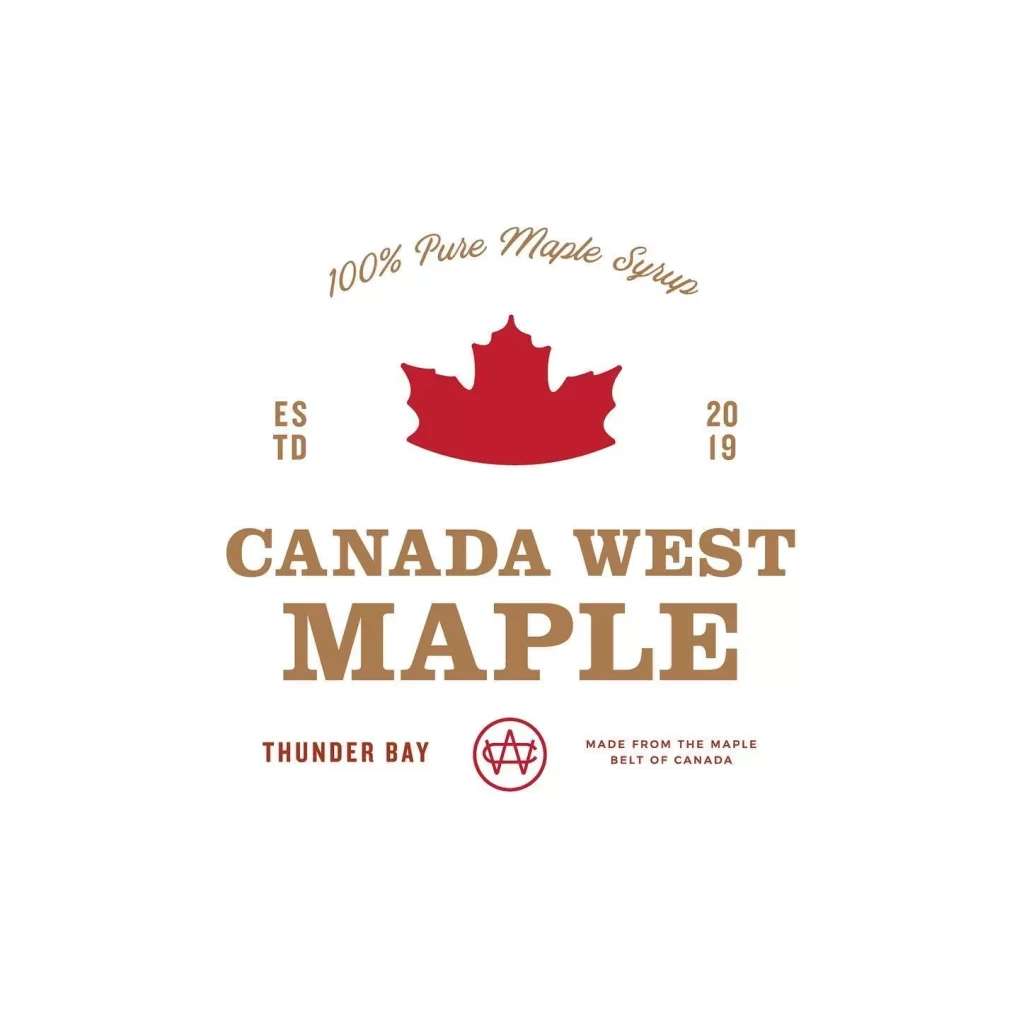
Typography combines bold sans-serif headers like ‘FLASK’ with elegant script fonts for product descriptions. The layout balances the central bottle graphic against informational panels, using maple leaf icons and a sugar shack illustration to reinforce Canadian heritage. Red dominates as the primary background color, creating high contrast for white text elements and the bottle silhouette.
Packaging designers utilize this reference to study die-cut structures for liquid containers and flask-style retail boxes. Label design students examine the integration of nutritional information within branded visual systems. Food brand managers review such imagery when developing premium Canadian product identities for export markets.