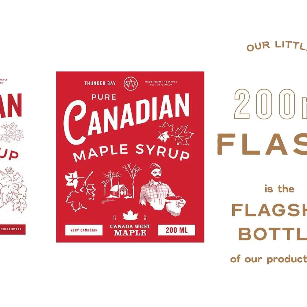
Canada West Maple 200ml Label
Topics
Details
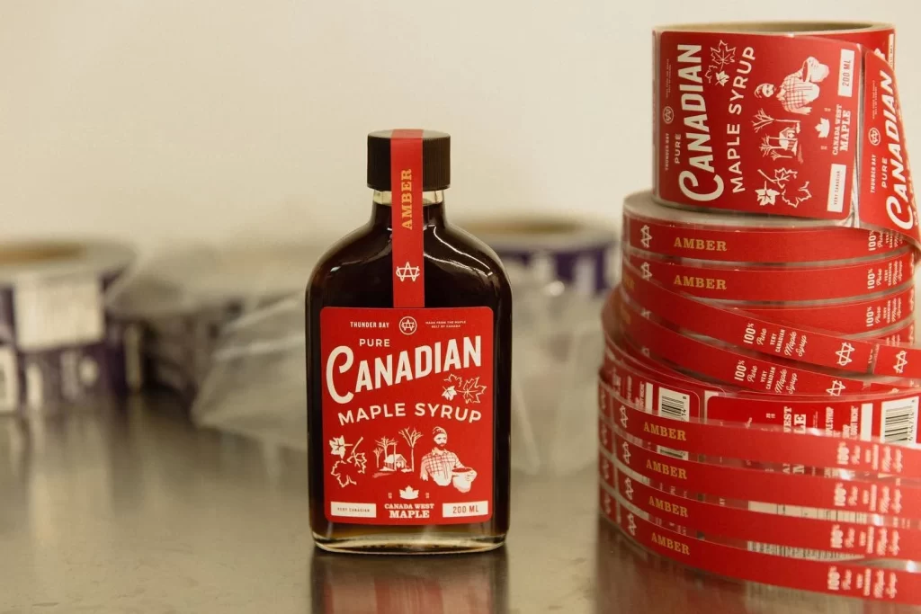
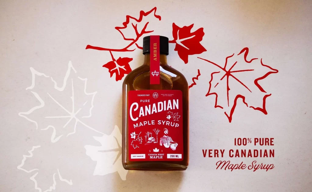
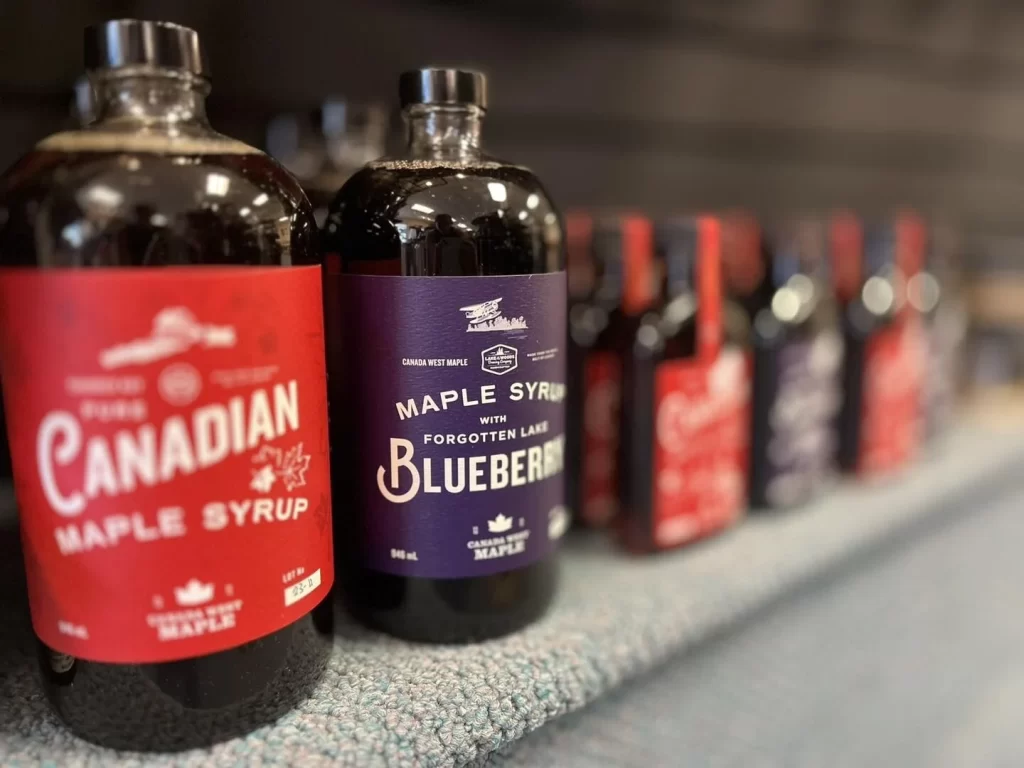
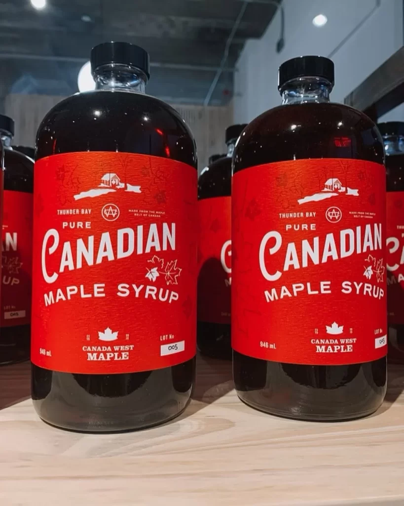
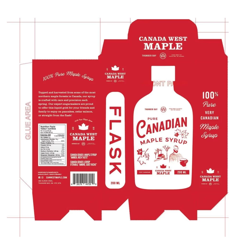
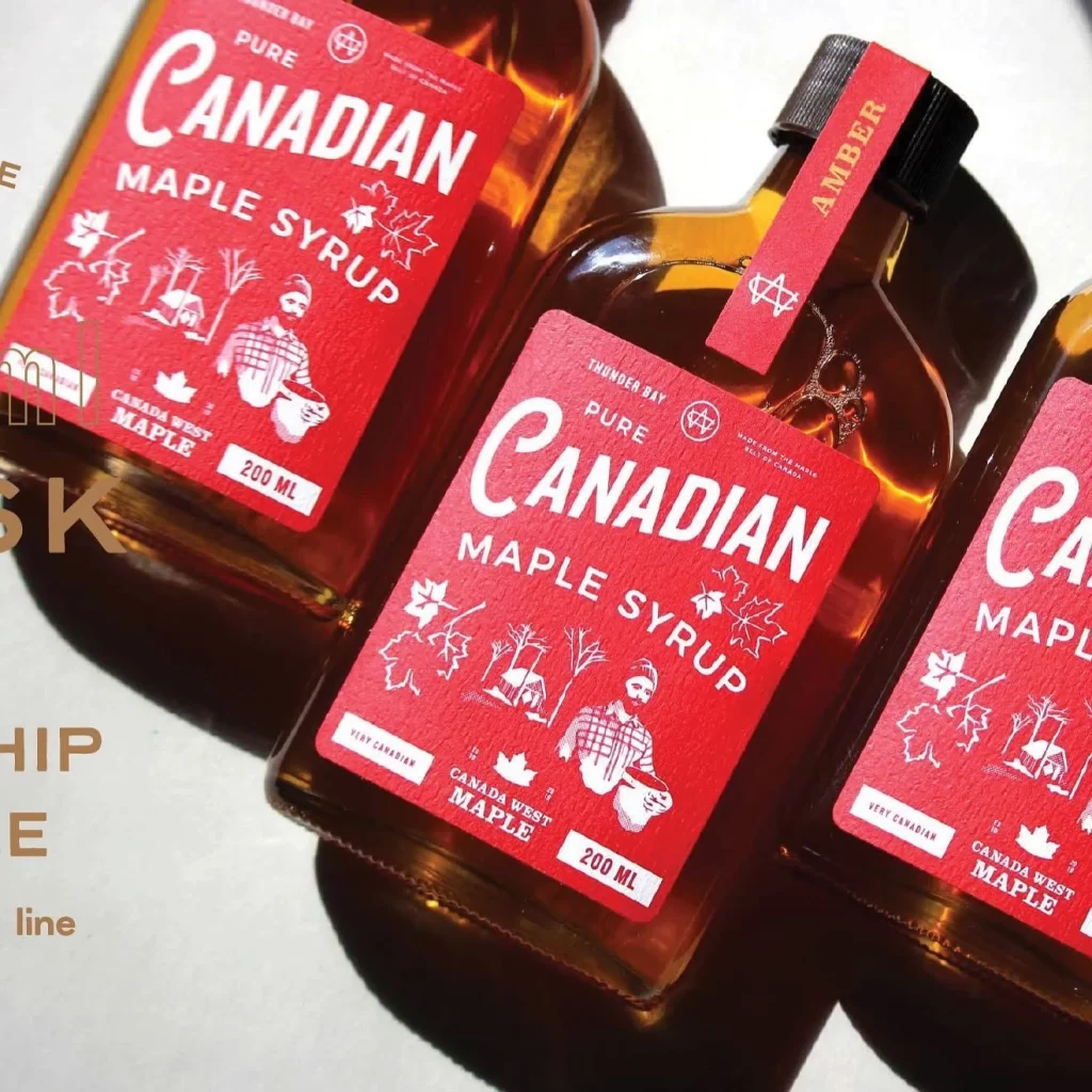
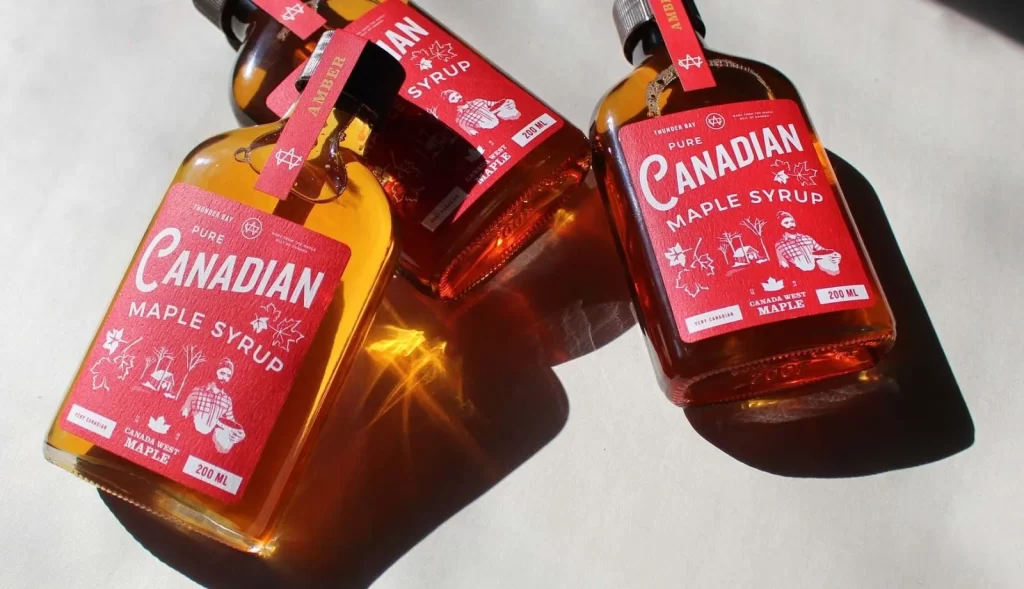
Warm wooden textures frame a vibrant red square label for Canada West Maple’s 200ml bottle of Pure Canadian Maple Syrup, featuring white line-art illustrations of a bearded lumberjack holding a container, surrounded by maple leaves, bare trees, and a small cabin. Text elements include ‘Thunder Bay’ at the top, the prominent product name in mixed serif and script fonts, and ‘Very Canadian’ branding at the bottom.
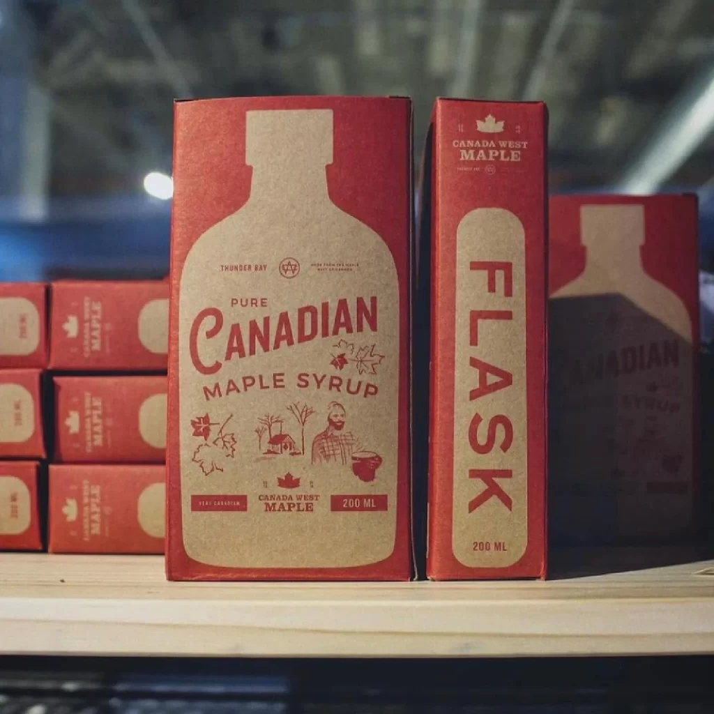
Bold red serves as the primary background, creating high contrast with white typography and minimalist iconography. The layout balances large-scale lettering for ‘Canadian’ with smaller descriptive text and decorative botanical motifs arranged symmetrically. This retro-inspired aesthetic combines vintage woodcut-style graphics with clean, modern type hierarchy to establish visual authority.
Packaging professionals frequently reference this label when studying effective color blocking and regional food branding strategies. Students of graphic design analyze its composition to understand how illustration styles communicate product authenticity. Food industry marketers also examine such examples to benchmark premium positioning within artisanal syrup categories.