Canada West Maple Twin Bottles
Topics
Details
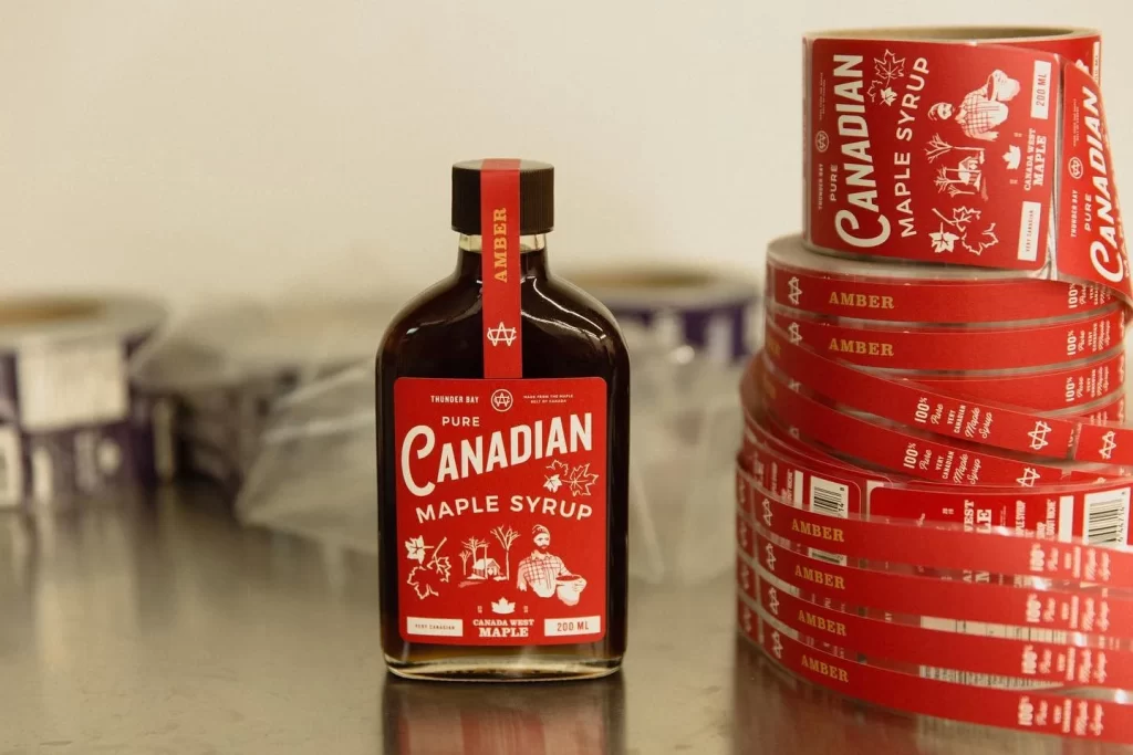
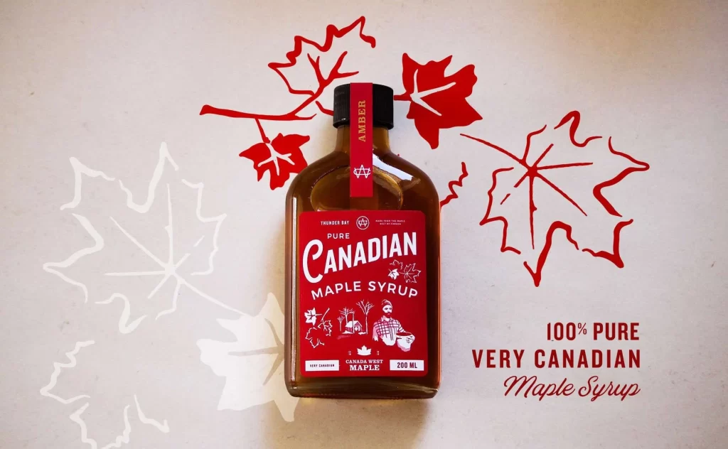
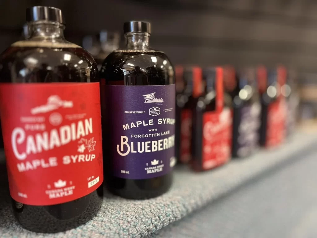
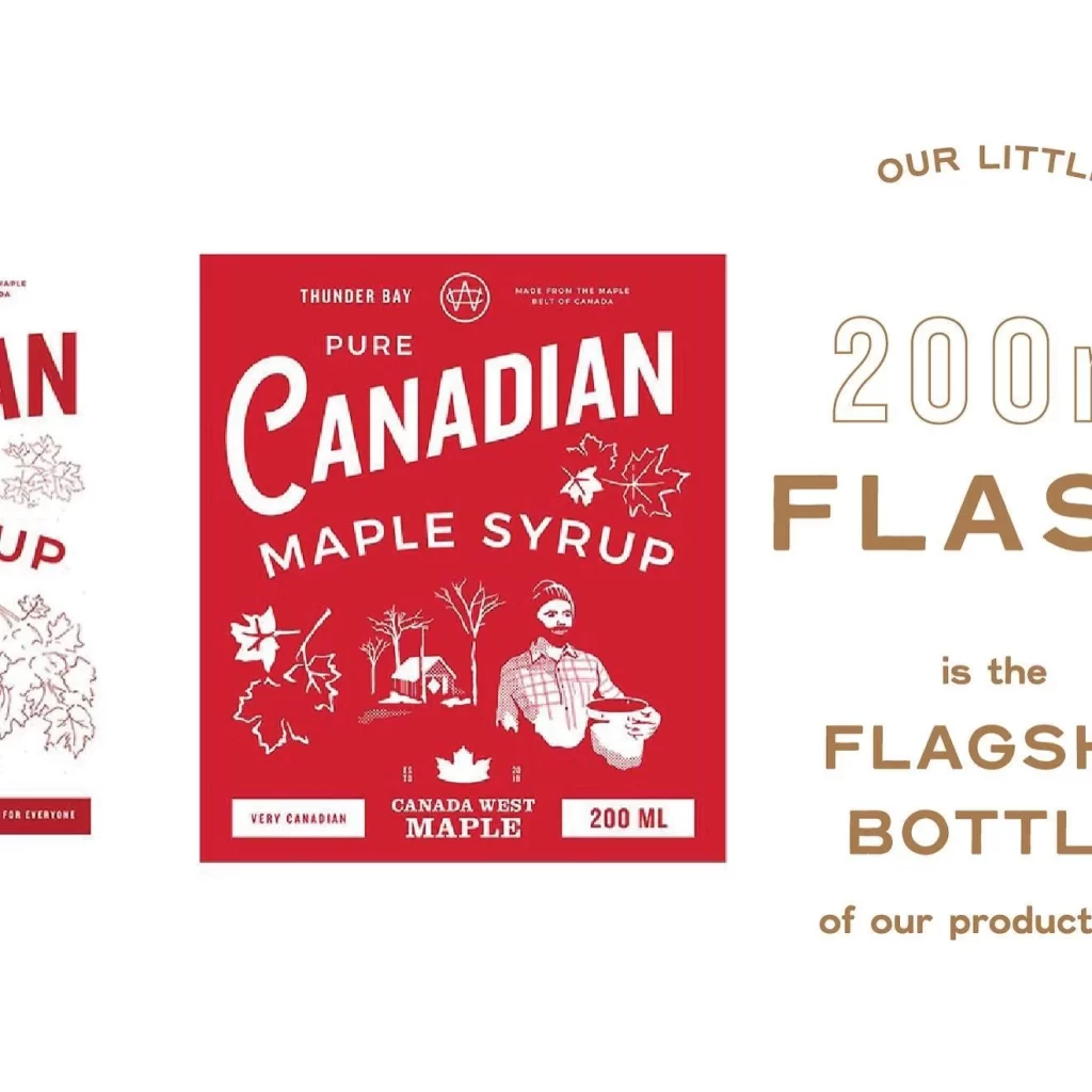
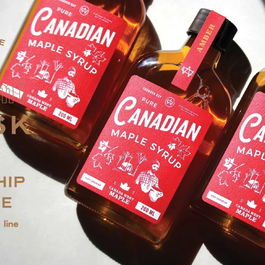
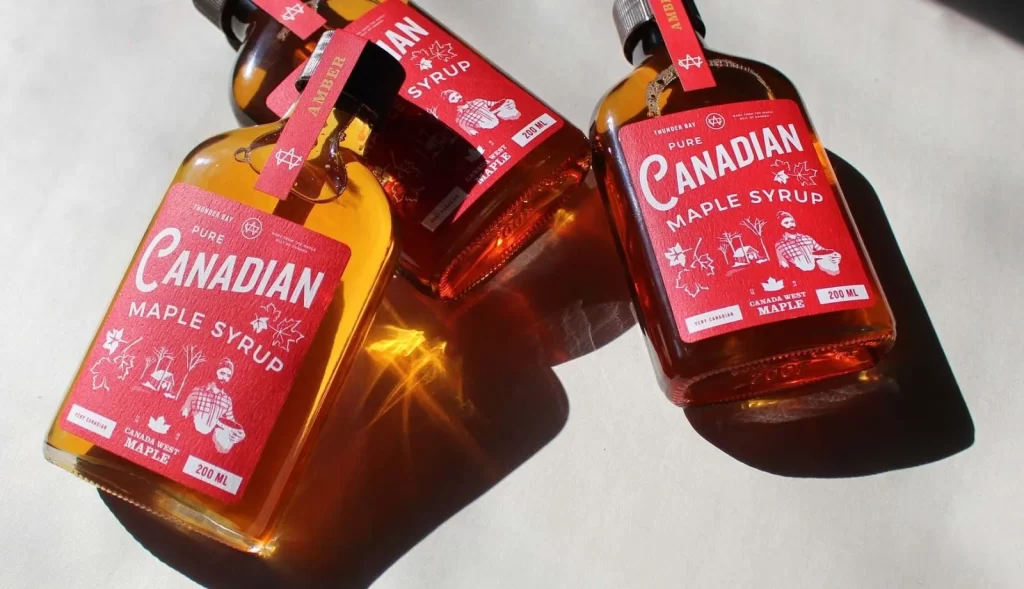
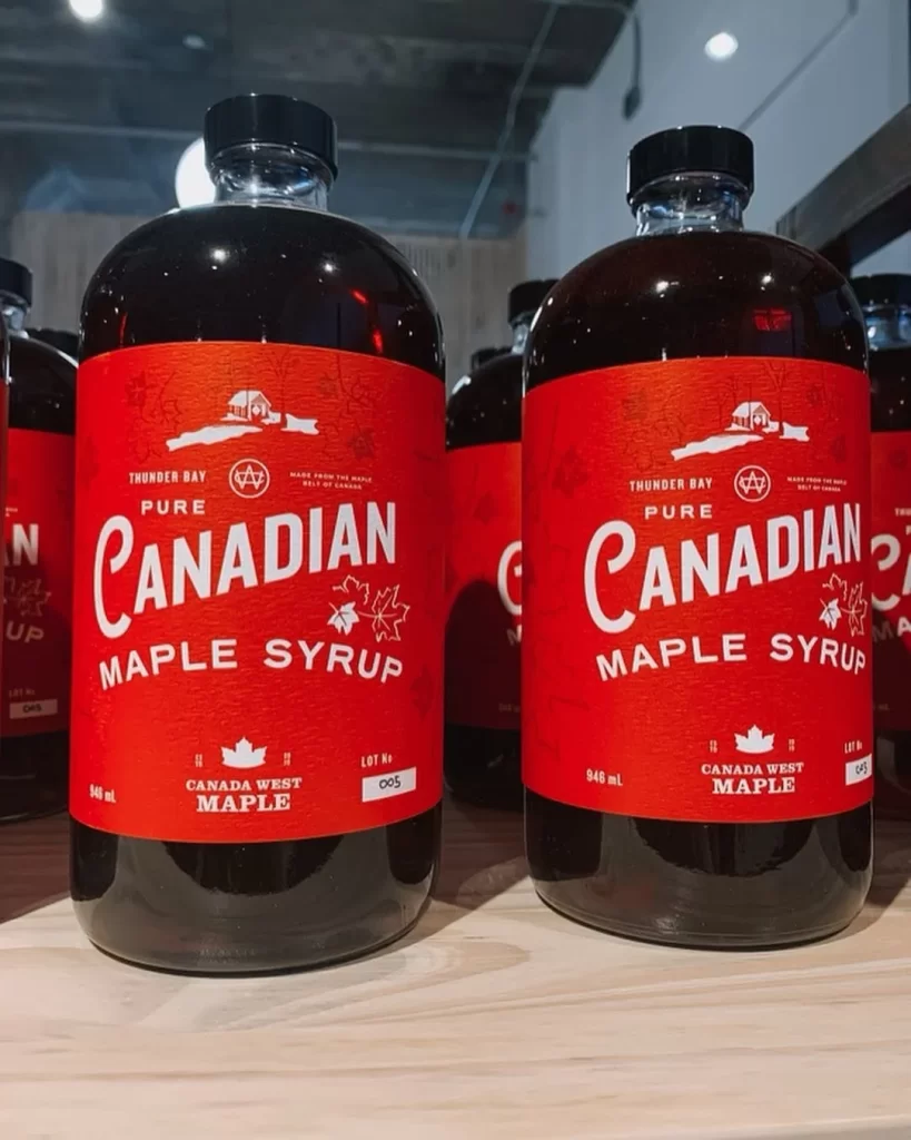
Heritage label typography anchors the visual presentation of two glass bottles of Canada West Maple syrup standing side by side on a light wooden surface. Each bottle features a bright red label with white text, black screw caps, and contains dark amber liquid, while the branding prominently displays Thunder Bay as the origin point alongside maple leaf graphics.
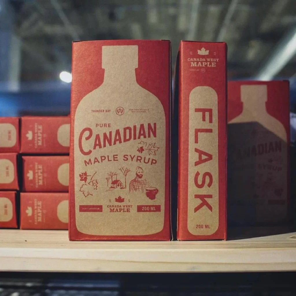
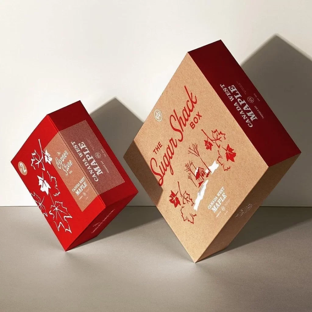
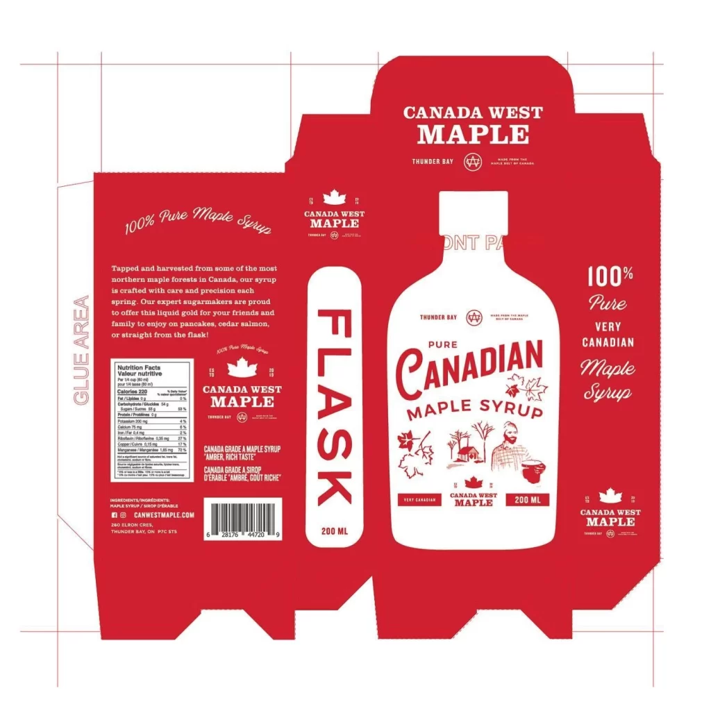
Bold serif typography dominates the label hierarchy with ‘Canadian’ rendered in the largest scale above ‘Maple Syrup’. A striking red and white color palette creates high contrast while decorative elements like sugar shack illustrations and leaf motifs frame the text. The layout balances vintage aesthetics with modern clarity through careful spacing and alignment of product details.
Packaging designers frequently reference this composition when developing premium food and beverage identities. Label design students analyze the typographic weight distribution and color blocking techniques used here. Food brand managers utilize such imagery to benchmark visual standards for artisanal syrup products in retail environments.