Canada West Maple Thunder Bay
Topics
Details
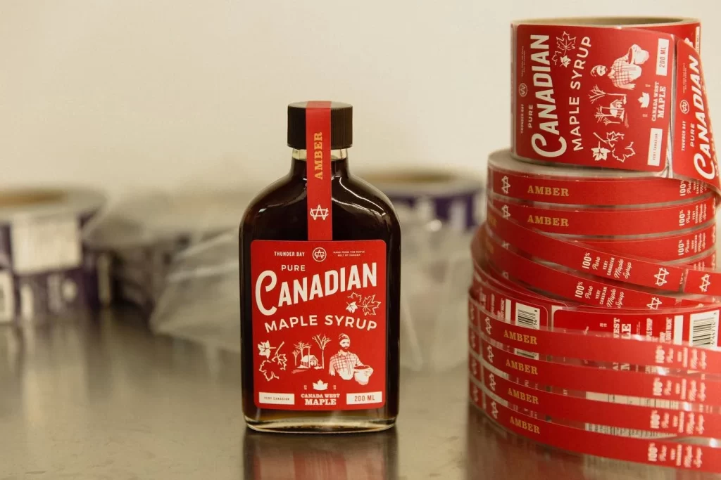
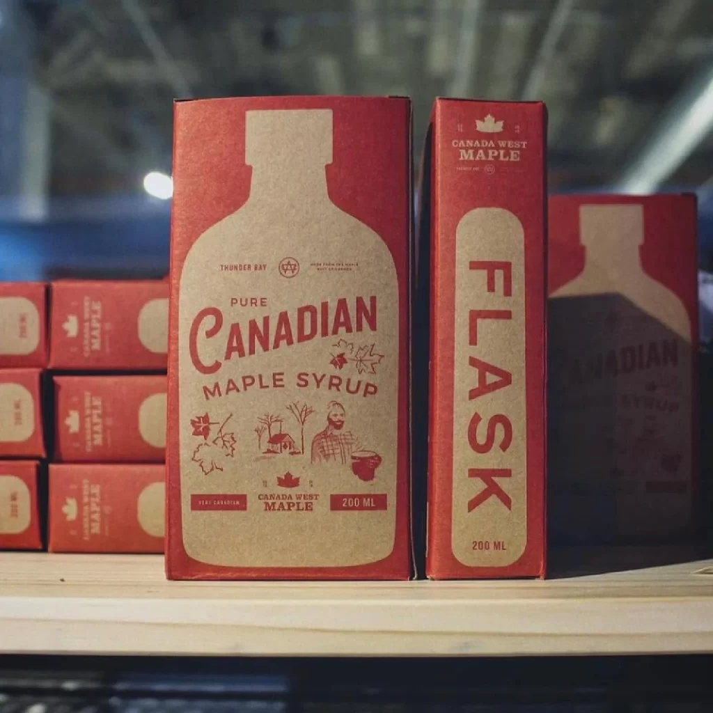
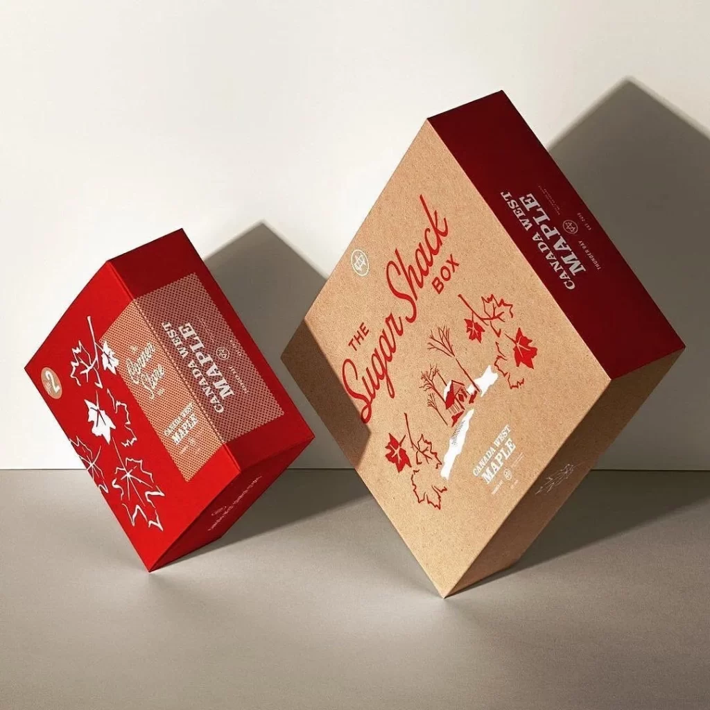
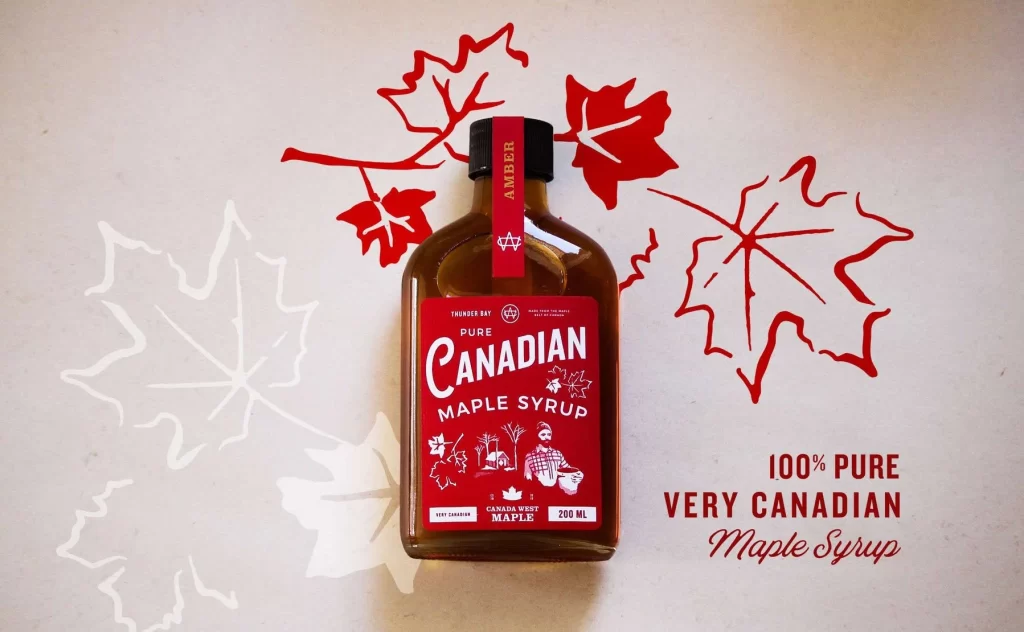
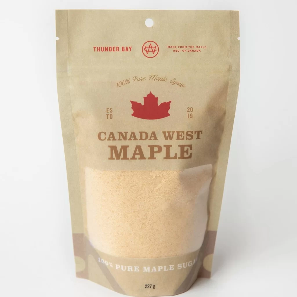
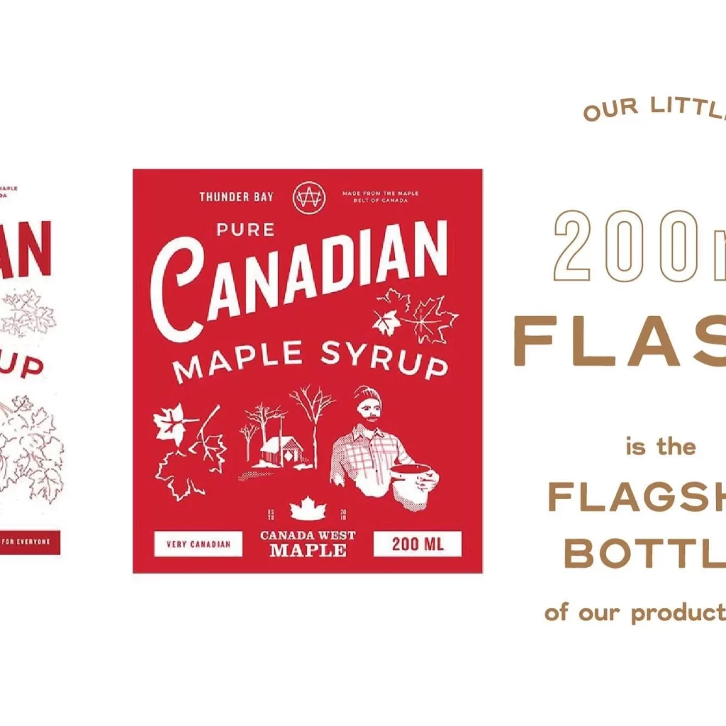
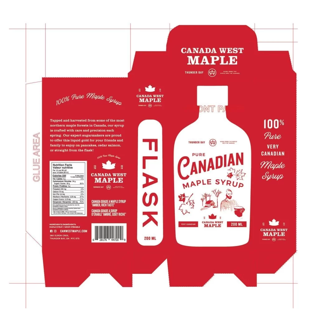
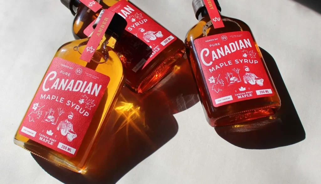
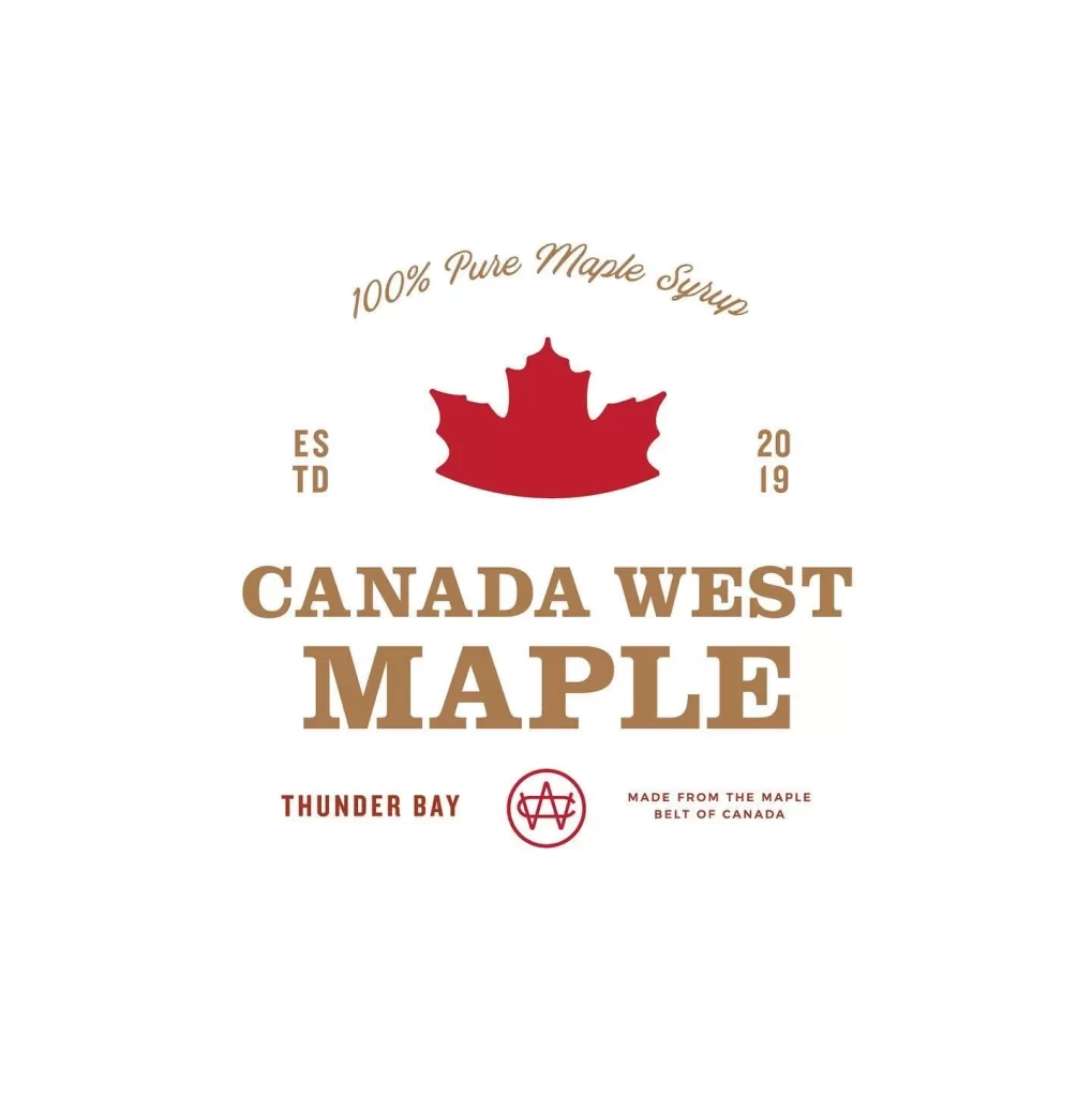
Centered on a clean white background, the label features a bold red maple leaf as its primary icon. The text hierarchy includes '100% Pure Maple Syrup' in an elegant script at the top, followed by the establishment date 'ESTD 2019' flanking the leaf. Dominating the center is the brand name 'CANADA WEST MAPLE' in large, capitalized serif lettering, with 'THUNDER BAY' and origin details positioned below.
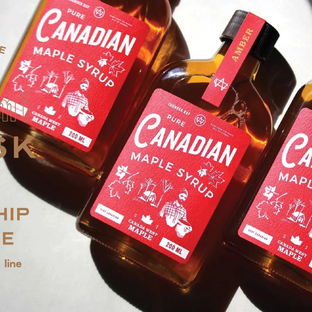
The layout employs a symmetrical, badge-like structure that draws the eye toward the central maple motif. A sophisticated palette of deep crimson and muted gold creates a premium, rustic aesthetic suitable for artisanal goods. Typography choices contrast flowing cursive for product claims with sturdy slab serifs for the brand identity, ensuring readability and visual impact.
Graphic designers specializing in food branding often examine such layouts to understand effective use of negative space. Students of packaging design utilize these examples to study how regional symbols like the maple leaf reinforce product authenticity. Marketing teams reference this style when developing visual identities for Canadian agricultural exports or gourmet pantry staples.