Instant Oatmeal Flavor Variety
DownloadTopics
Details
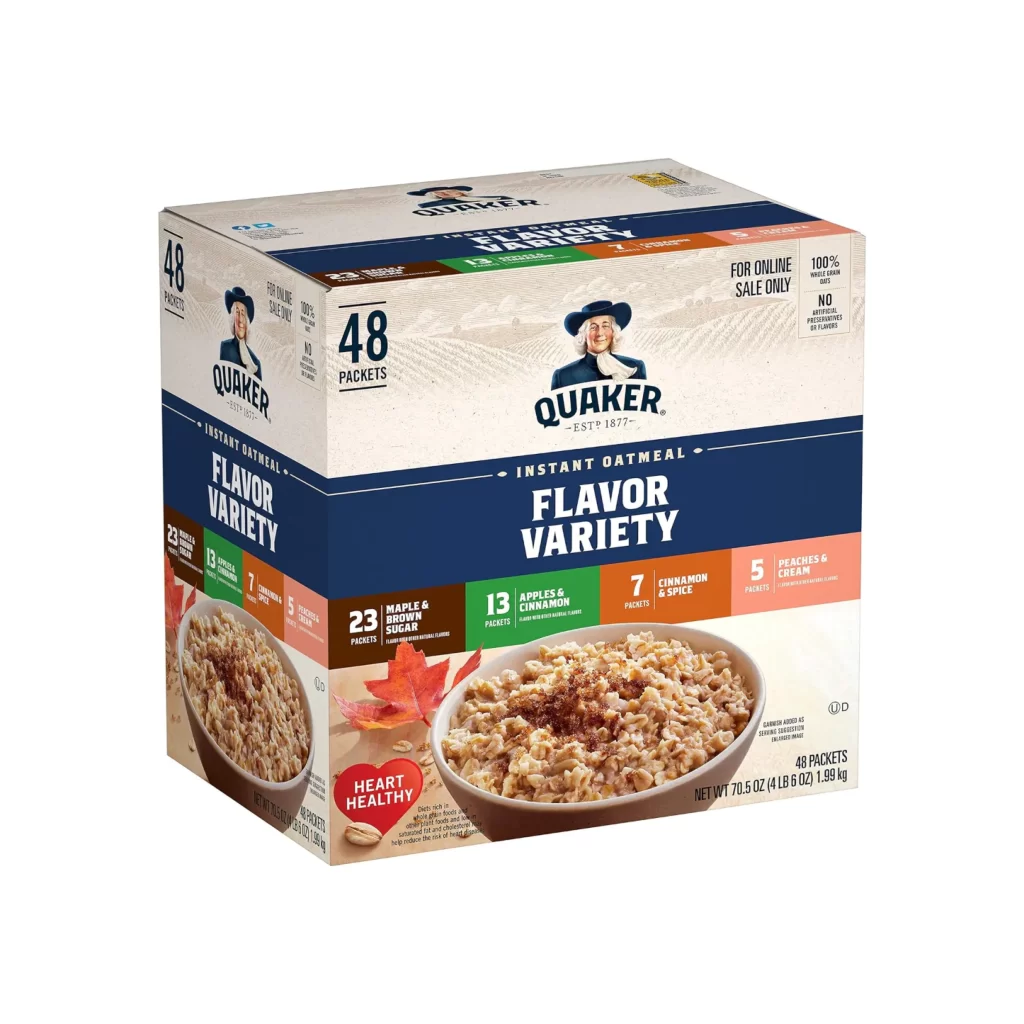
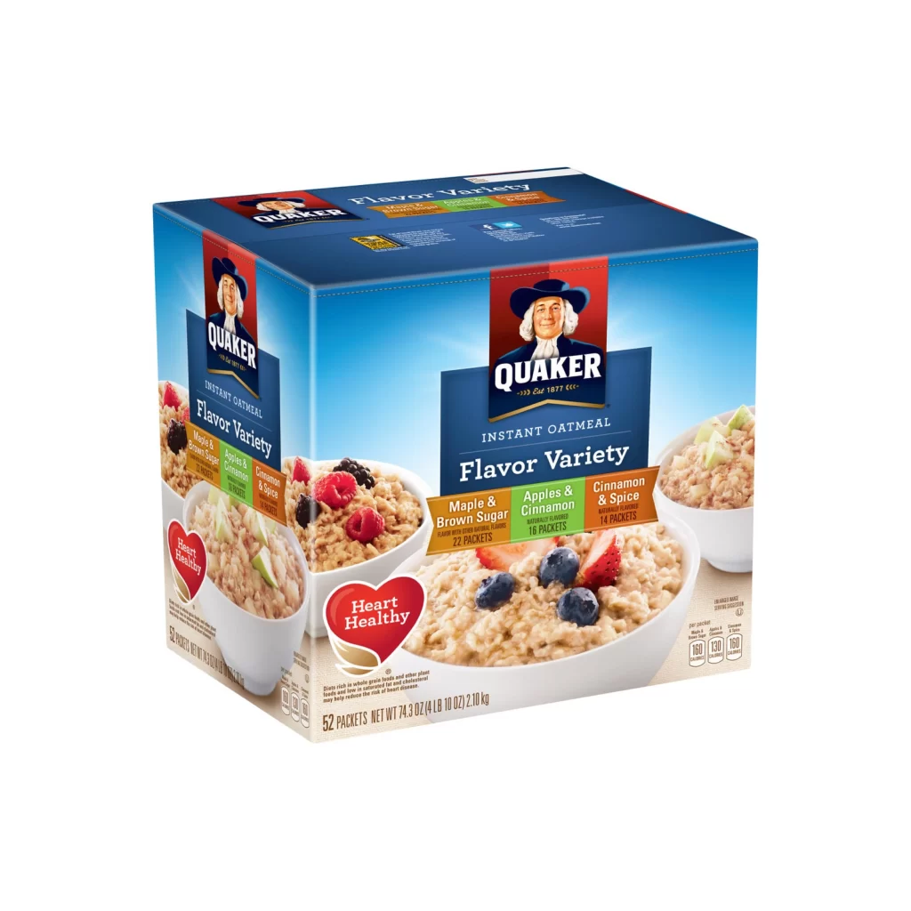
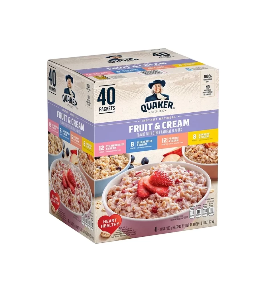
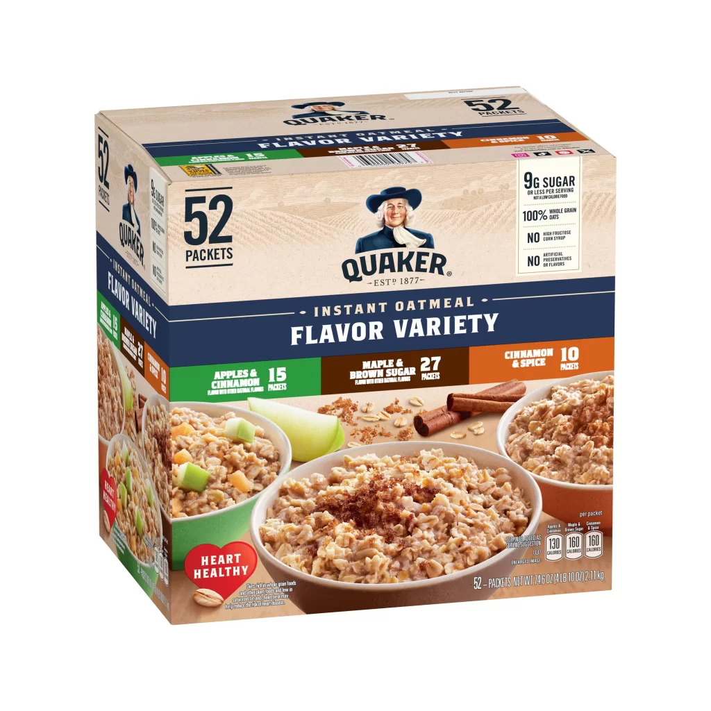
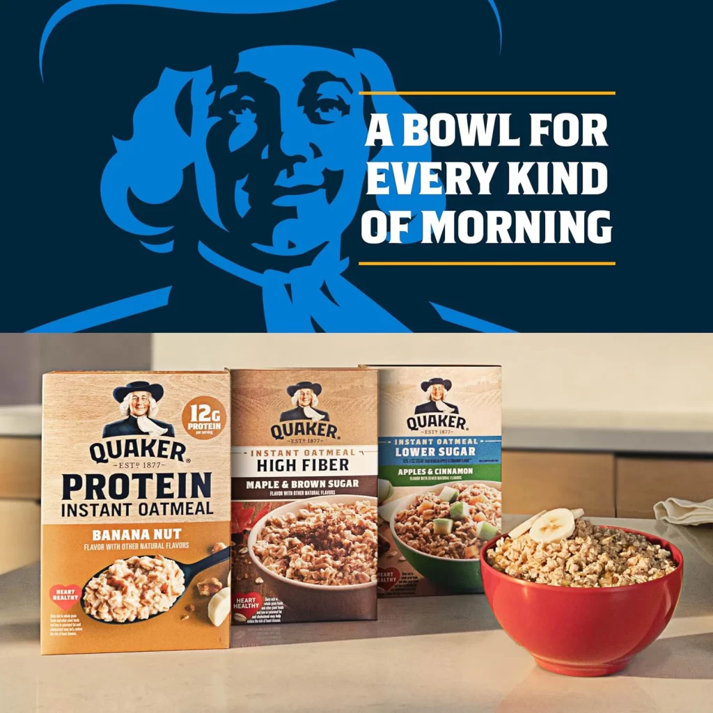
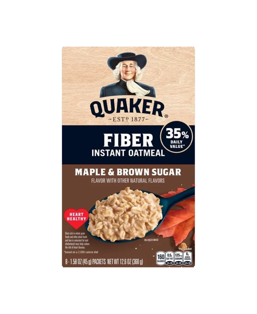
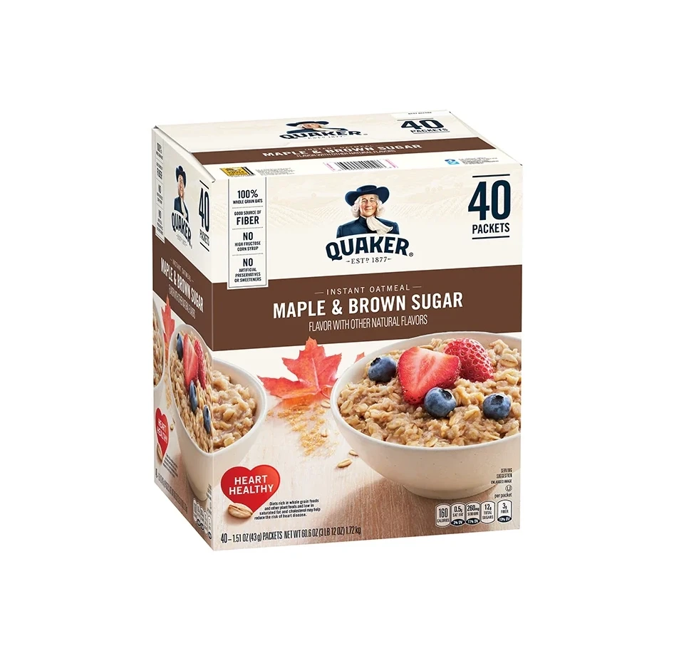
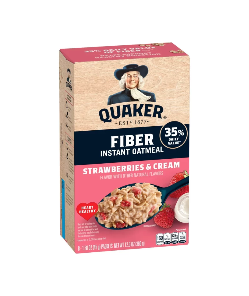
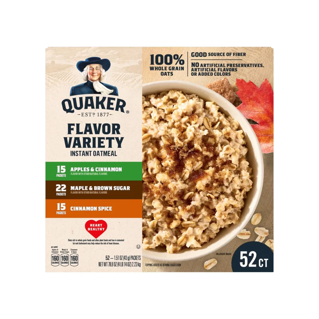
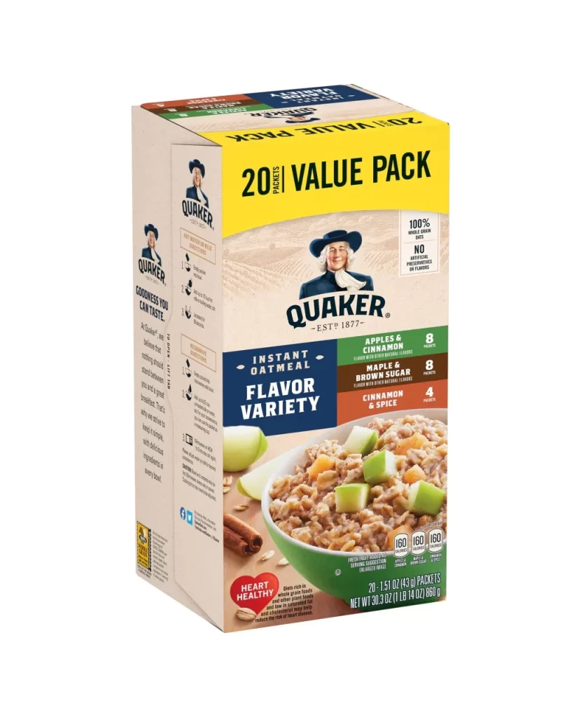
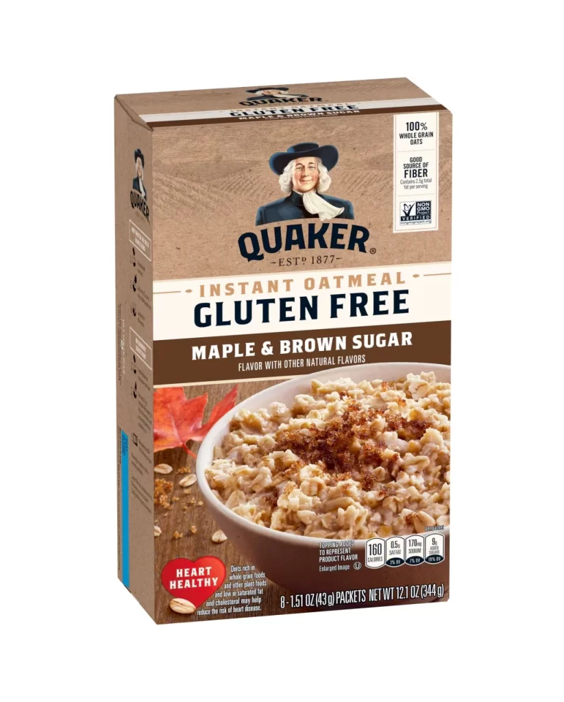
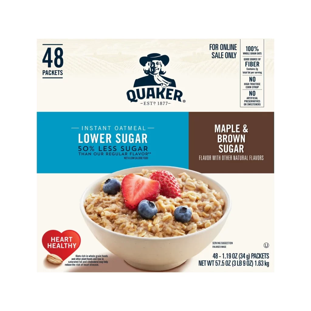
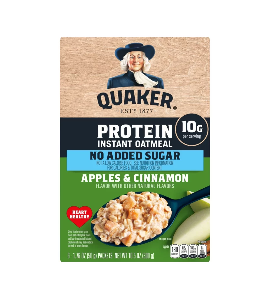
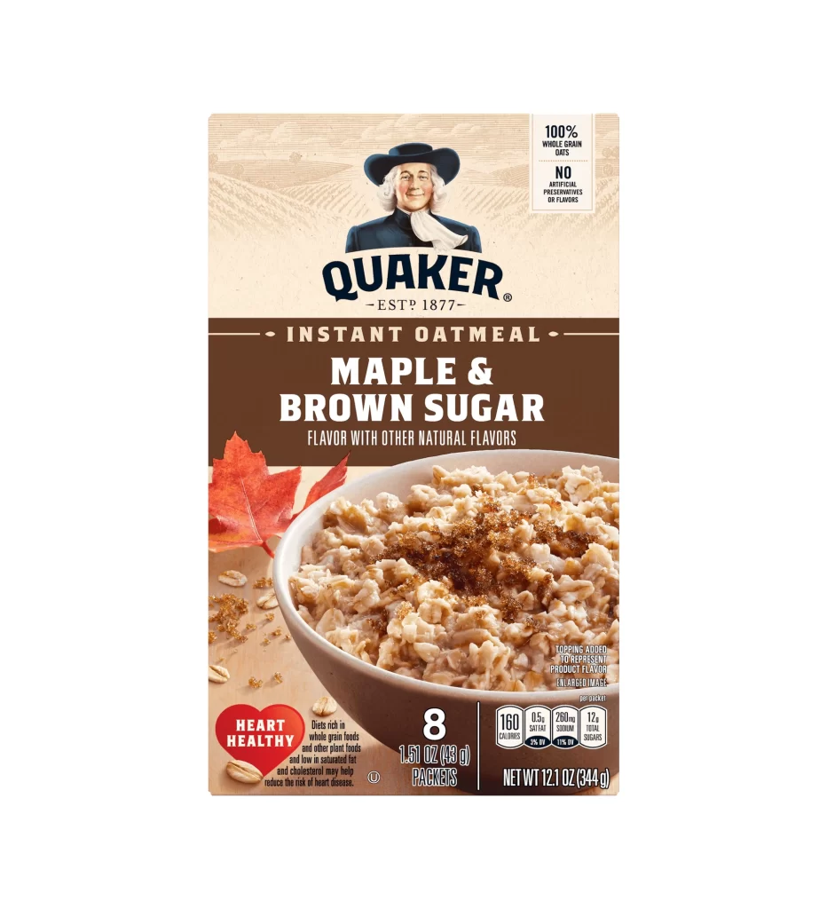
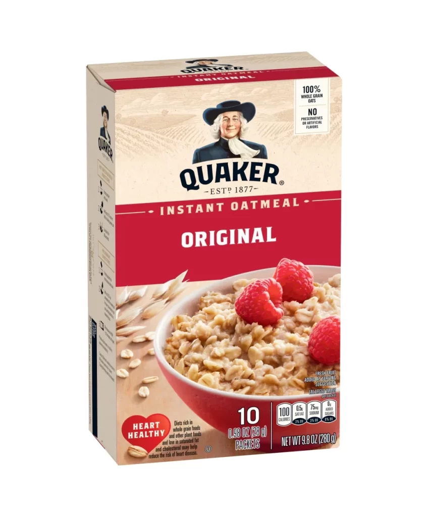
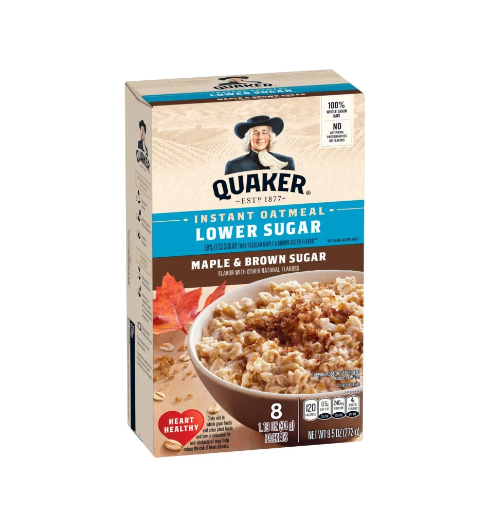
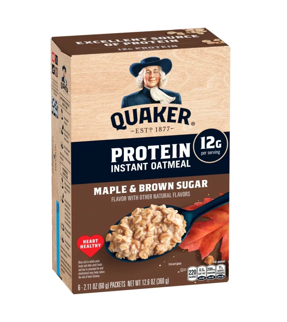
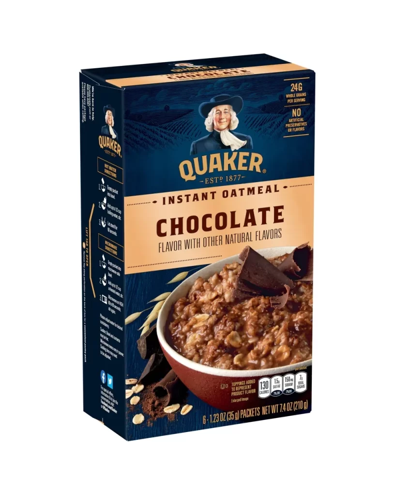
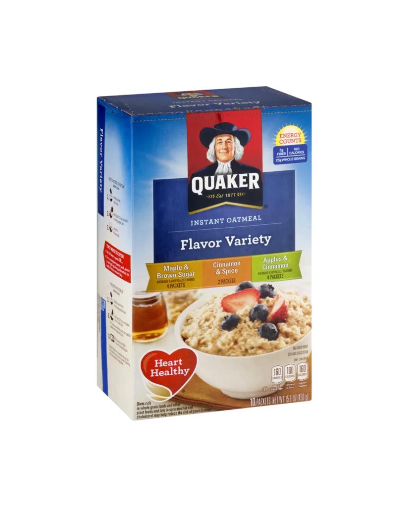
A rectangular cardboard box of Quaker Instant Oatmeal stands at a slight three-quarter angle, revealing its front and left side panels against a clean white backdrop. The packaging features a dominant blue field with a central red rectangle containing the iconic Quaker man logo in black and white, positioned above the bold 'QUAKER' wordmark. Below this, the text 'INSTANT OATMEAL' and 'Flavor Variety' appear in clean typography, while three horizontal flavor banners—gold for Maple & Brown Sugar, tan for Cinnamon & Spice, and green for Apples & Cinnamon—span the middle section above a photographic image of prepared oatmeal topped with fresh strawberries and blueberries.
Visual hierarchy on this package relies heavily on color-coded flavor differentiation, allowing consumers to quickly identify variety options through distinct banner hues and consistent packet count labeling. The composition balances brand heritage elements like the 1877 establishment date with modern nutritional callouts, including a yellow sunburst badge for energy counts and a red heart icon promoting heart-healthy benefits. Designers studying retail food packaging will appreciate how the warm oatmeal photography contrasts with the cool blue background to create appetite appeal while maintaining legibility for essential product information.
Product photographers and packaging students can utilize this reference to analyze standard grocery item presentation techniques, particularly the integration of nutritional claims with lifestyle imagery. E-commerce teams might employ this shot as a baseline for catalog listings requiring clear visibility of flavor variants and net weight specifications. Anyone needing detailed texture references for cardboard finishes or printed food photography can access the full-resolution file without cost directly from the resource library.