Quaker Instant Oatmeal Packaging
Topics
Details
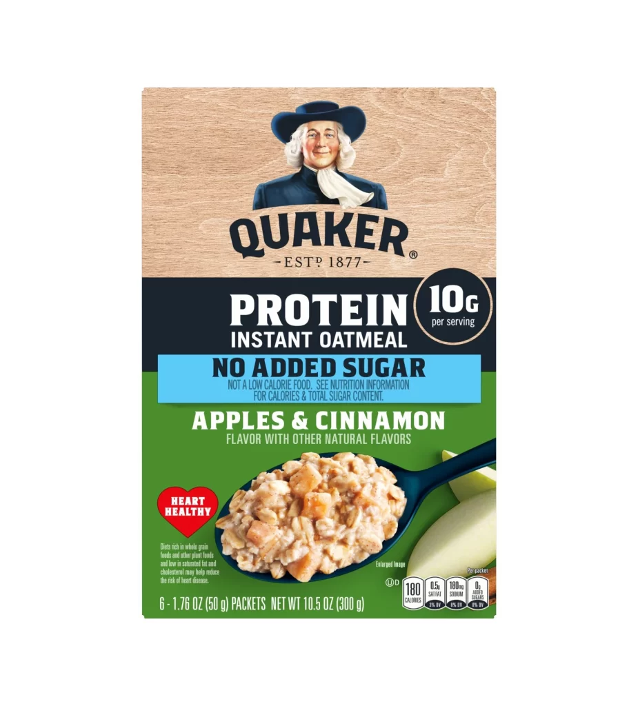
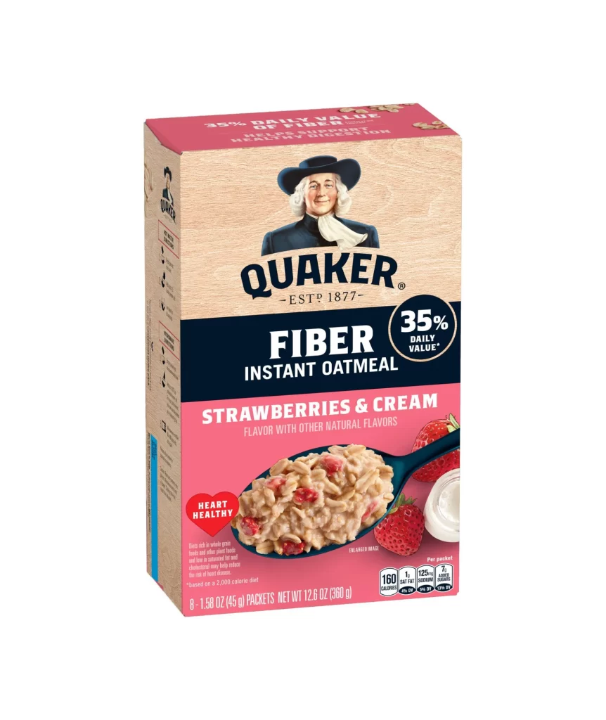
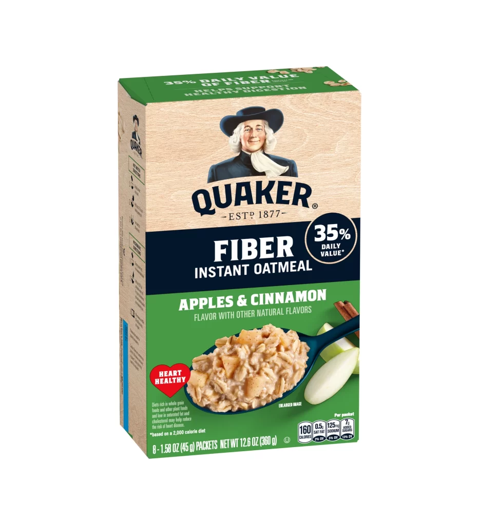
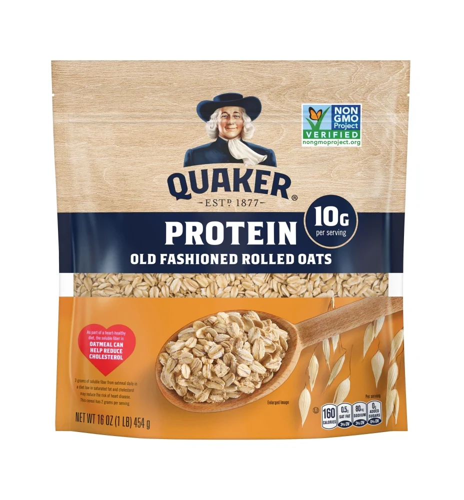
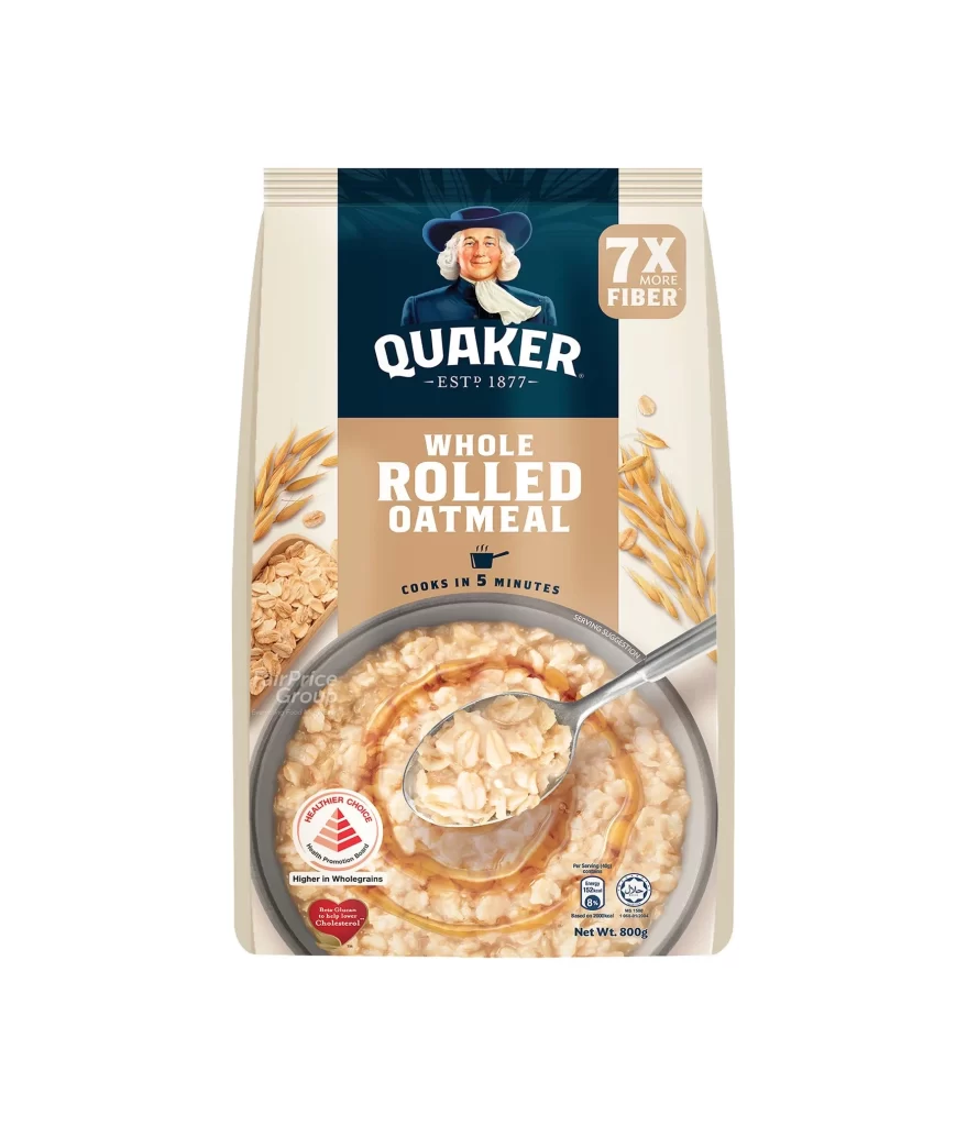
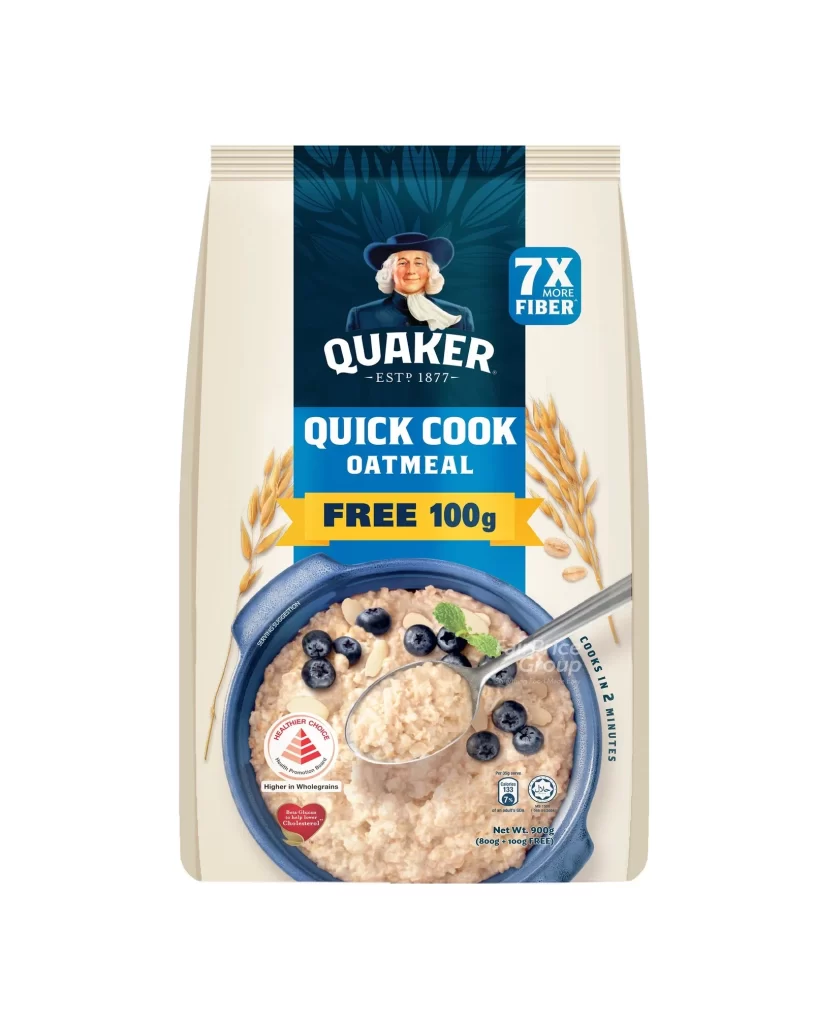
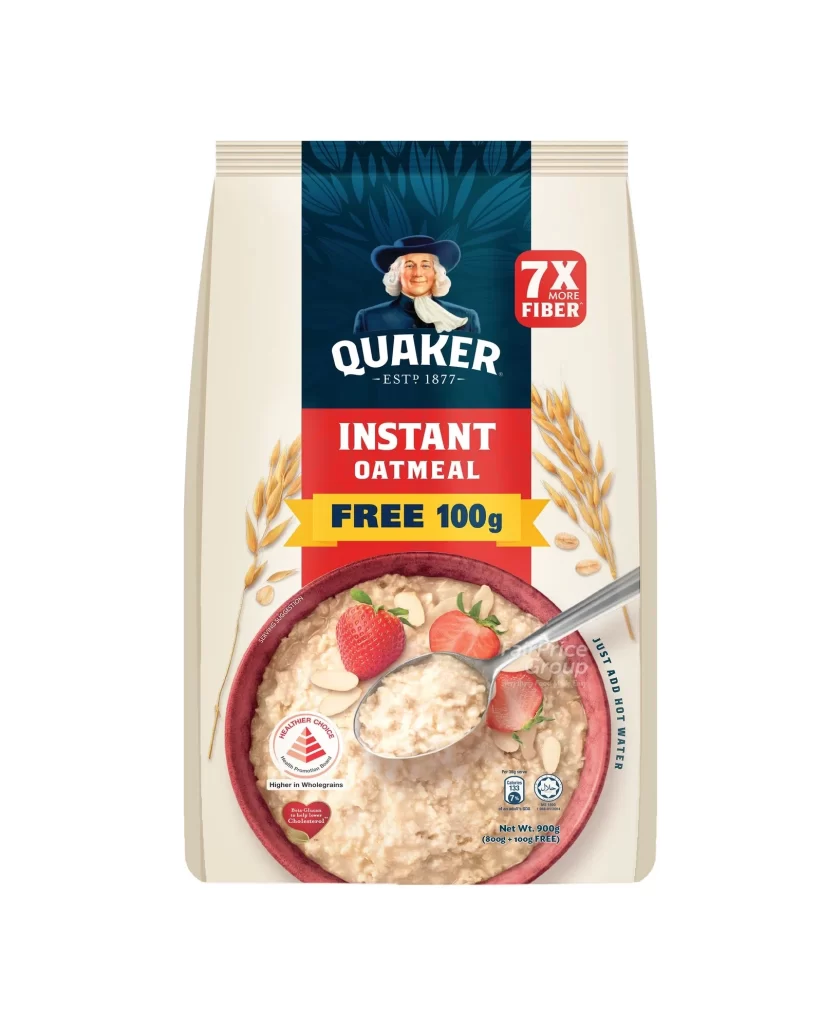
The front panel features a tall paper box set against a pure white background, anchored by a vertical blue center panel displaying the iconic Quaker oats man logo and the ‘ESTD 1877’ heritage mark. Below this branding, a bold red section highlights the product name ‘INSTANT OATMEAL’, which is immediately followed by a bright yellow banner announcing a ‘FREE 100g’ bonus offer.
Targeting the Singapore market, the packaging emphasizes convenience through the vertical text ‘JUST ADD HOT WATER’ and a serving suggestion bowl filled with oatmeal, strawberries, and almond slices. Health positioning is reinforced by the ‘7X MORE FIBER’ red square, the Healthier Choice circular logo, and specific claims regarding Beta Glucan and wholegrain cholesterol management within the 900g total pack.
Packaging designers can study this layout as an effective model for shelf-facing nutrition communication that balances visual appeal with mandatory regulatory information. The strategic use of color-coded panels ensures that key value propositions like the extra weight and health benefits are instantly recognizable to busy shoppers.