Integrate Pro Finish SPF38 Foundation Compact Packaging
Topics
Details
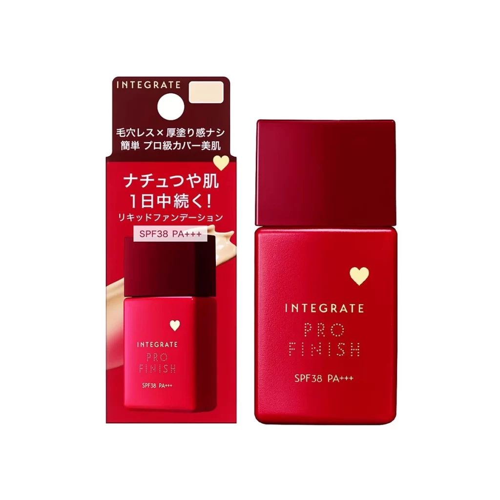
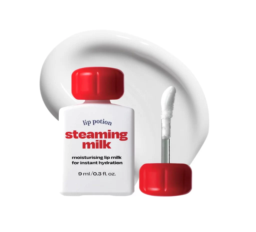
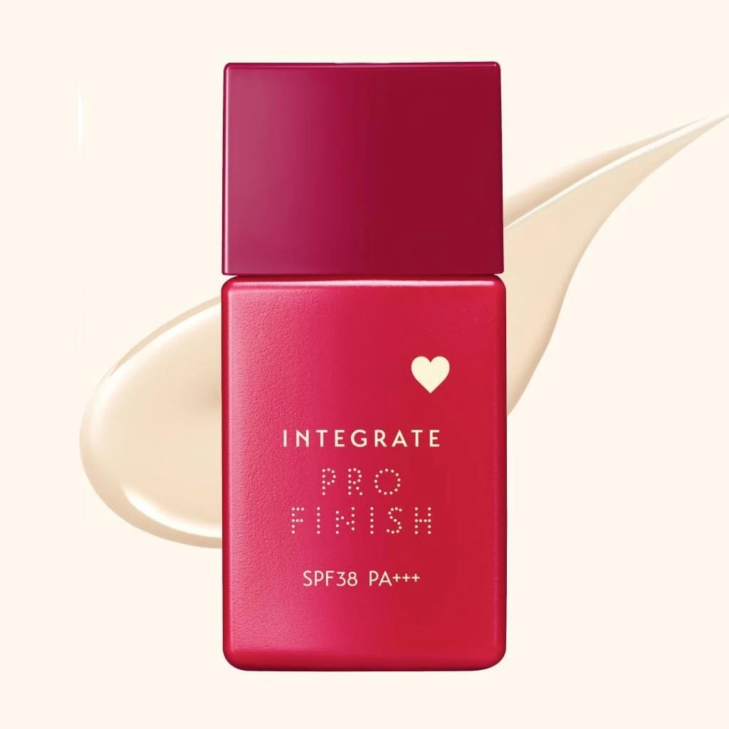
The image presents a single compact bottle of INTEGRATE PRO FINISH SPF38 PA+++ foundation resting against a clean white backdrop. A smooth cream product swatch is positioned nearby. The primary packaging features a deep crimson red and maroon color scheme, accented by bright white. Notably, the brand name is rendered in dotted typography, accompanied by a small heart icon, creating a distinct visual focal point on the container.
Stylistically, the composition relies on stark contrast and minimalism to emphasize the product. The deep maroon and crimson red hues pop intensely against the pristine white background, drawing the eye immediately to the compact. The dotted typography introduces a playful, modern texture that balances the bold color blocking. This clean presentation highlights the packaging form while ensuring the heart icon and lettering remain highly legible.
Graphic designers and packaging analysts will find this reference useful for studying bold color application and minimalist cosmetic branding. Art directors developing visual assets for beauty campaigns can utilize this clean studio shot to understand spatial composition. Additionally, typographers examining letter spacing and decorative icon integration in commercial product design will appreciate the clear, uncluttered view of the container.