Shiseido Synchro Skin Self-refreshing Foundation Bottle Packaging
Topics
Details
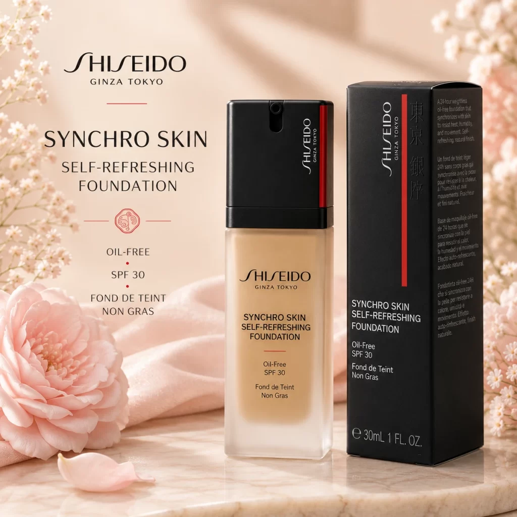
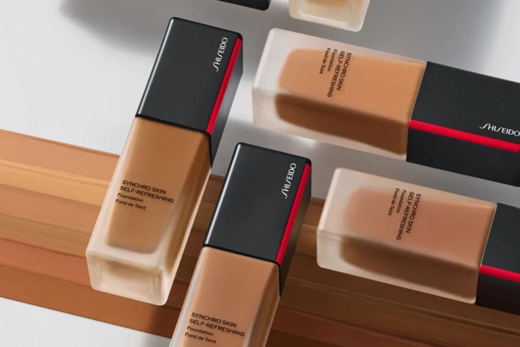
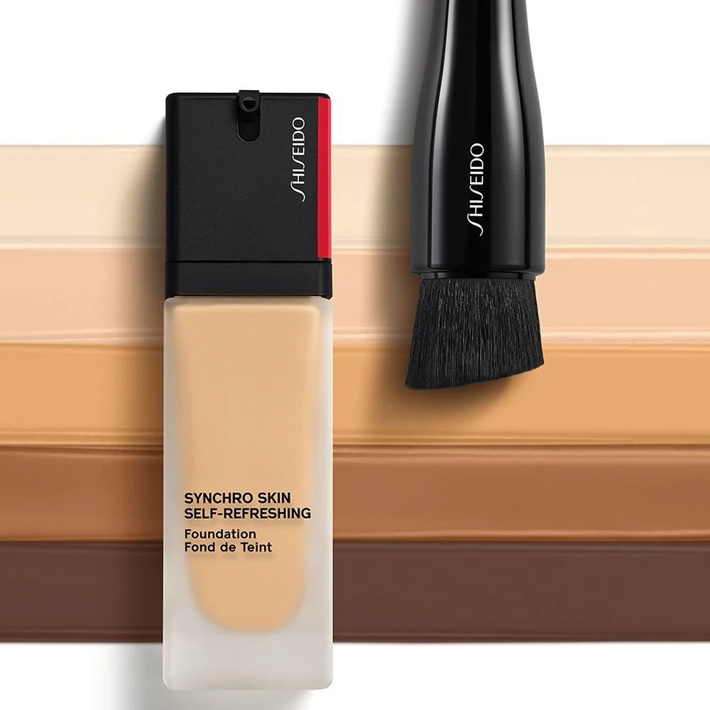
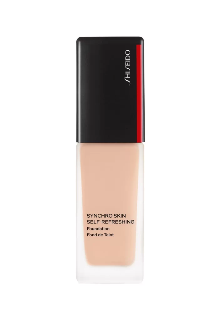
The image displays a single frosted white bottle of Shiseido Synchro Skin Self-Refreshing Foundation against a plain white studio background. The container features a sleek black cap accented by a signature vertical red stripe. The bottle's body showcases a soft nude beige hue at the base, transitioning seamlessly into the translucent frosted white upper section. The minimalist setting emphasizes the product's clean silhouette.
Shiseido merges modern utility with iconic branding in this packaging design. The contrasting black cap provides a bold visual anchor, while the signature red stripe injects energy and immediate brand recognition. The frosted white body softens the overall aesthetic, and the nude beige base adds warmth. This color blocking creates a sophisticated, lightweight appearance that communicates both advanced skincare technology and luxury.
Graphic designers and packaging specialists utilize this reference for studying premium cosmetic container aesthetics. Brand strategists analyze the integration of signature colors to maintain corporate identity within a minimalist framework. Industrial designers examine the bottle's ergonomic proportions and material transitions. Additionally, marketing teams use this clean studio shot to understand high-end beauty product visual merchandising and competitive brand positioning.