IQOO Z10 Turbo Plus Advertisement
Topics
Details
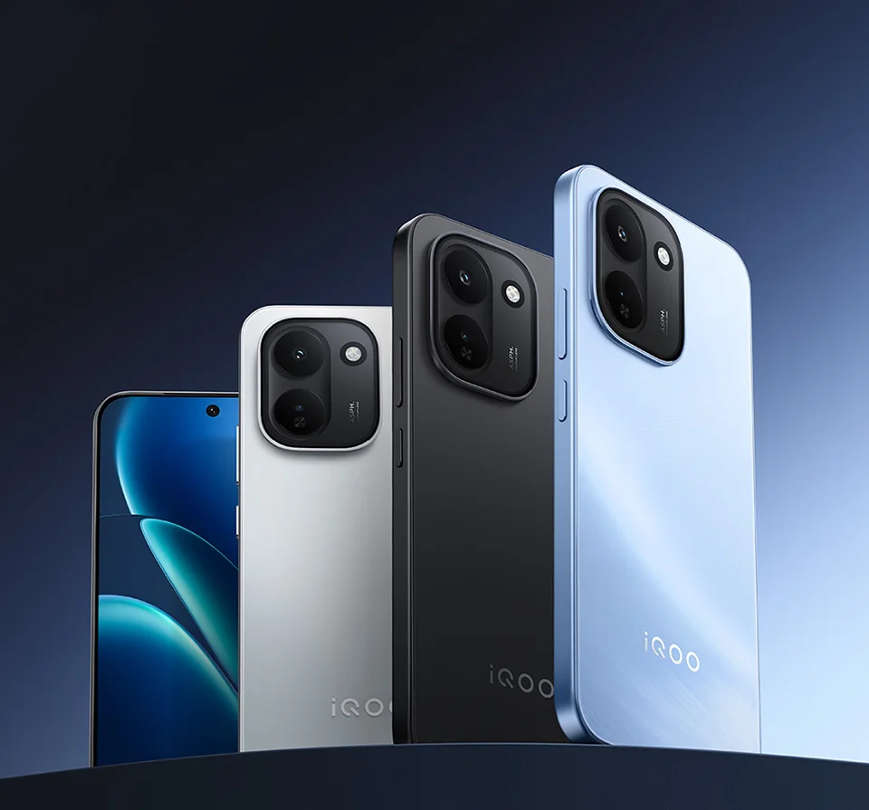
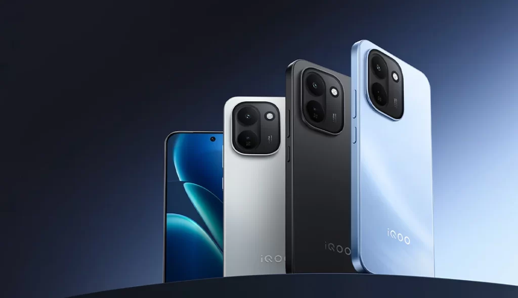
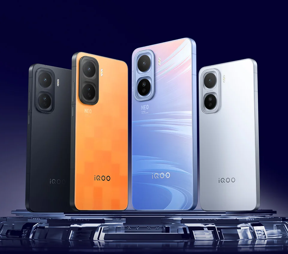
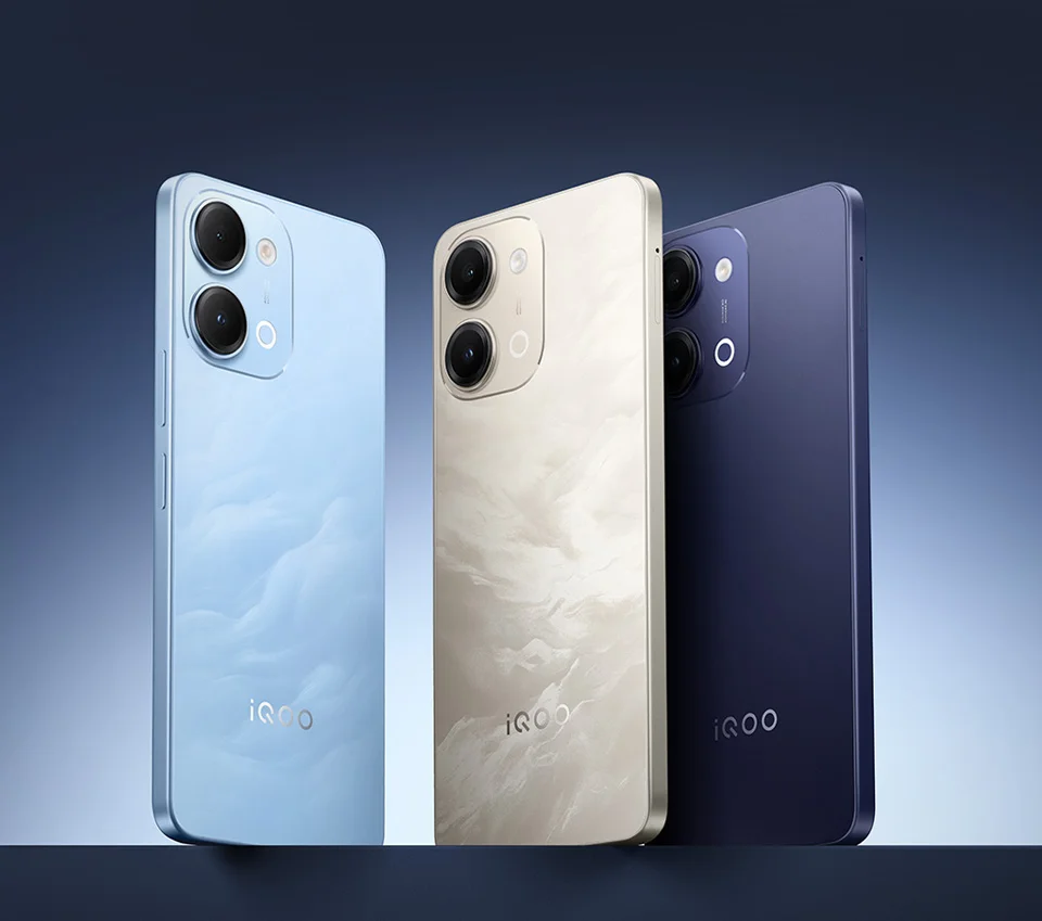
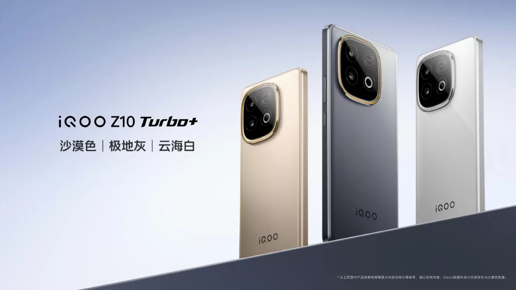
Elegant slim silhouettes of three iQOO Z10 Turbo+ smartphones are arranged in a staggered diagonal line against a soft blue-to-white gradient background. The devices are presented in their available color options: a gold ‘Desert’ shade on the left, a dark gray ‘Polar Gray’ in the center, and a white ‘Cloud Sea White’ on the right. Bold black text on the left side identifies the product model name in English and lists the three color variants in Chinese characters beneath it.
The layout employs a clean, minimalist aesthetic with ample negative space that draws immediate attention to the product lineup and branding elements. Typography uses a modern sans-serif font with varying weights to establish clear visual hierarchy between the model name and color descriptions. Photography highlights the phones’ square camera modules with distinctive metallic trim, using subtle lighting to emphasize the different finish textures of each color variant.
Marketing professionals and graphic designers utilize such compositions as case studies for effective product visualization and color palette presentation strategies. Academic researchers in consumer electronics advertising analyze these materials to understand current trends in mobile device positioning and visual communication. Technology enthusiasts and reviewers also reference these official renders to compare physical design features across different market regions and release cycles.