Keepers Citrus Sparkling Coffee Can Packaging
Topics
Details
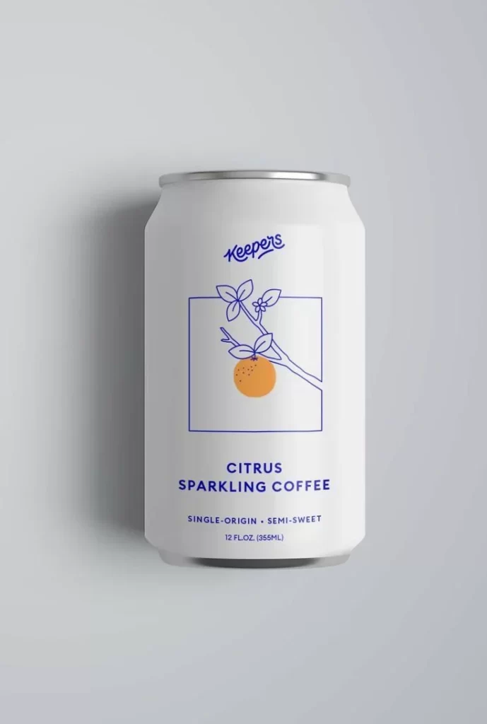
A matte aluminum beverage can stands in direct frontal view, its cylindrical body coated in an off-white finish that catches soft, diffused light from the upper left. Deep cobalt blue ink forms the brand name 'keepers' in a flowing script at the top, while below it sits a square-framed botanical illustration of a citrus branch bearing one orange fruit and three leaves. The product name 'CITRUS SPARKLING COFFEE' appears in bold sans-serif capitals beneath the graphic, followed by smaller text reading 'SINGLE-ORIGIN • SEMI-SWEET' and the volume measurement '12 FL.OZ. (355ML)' near the silver rim.
Visual restraint defines this packaging through its limited two-tone palette of cream and indigo, eliminating any gradient fills or photographic textures in favor of flat color fields. The central illustration employs delicate line work for the branch structure while using a solid orange circle to represent the fruit, creating a focal point that balances geometric precision with organic form. Typography establishes clear hierarchy between the casual handwritten logo, authoritative product title, and utilitarian specification text, each occupying distinct vertical zones on the curved surface.
Brand strategists developing beverage identity systems might study how the botanical motif communicates flavor notes without literal photography. Packaging engineers could reference the spatial distribution of information elements when planning label layouts for cylindrical containers. Art directors overseeing natural product launches may find value in the restrained chromatic approach that signals artisanal positioning through minimal visual means.