Supergoop Unseen Sunscreen Spf 50 50ml Sunscreen Packaging
Topics
Details
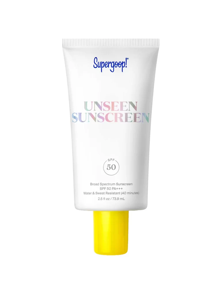
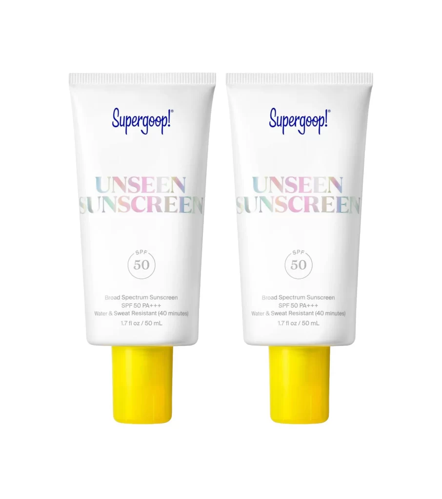
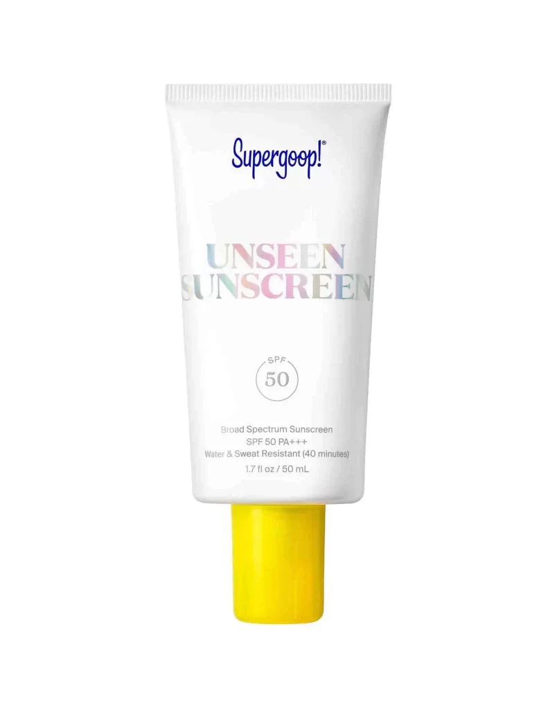
The Supergoop! Unseen Sunscreen tube stands upright with a bright yellow cap anchoring the bottom of its cylindrical white body. Deep blue cursive script spells out the brand name at the top, while 'UNSEEN SUNSCREEN' appears below in an iridescent gradient shifting between pastel hues. A circular badge declares SPF 50, with smaller text beneath specifying Broad Spectrum protection, PA+++, and water resistance for forty minutes on a white surface.
Visual interest emerges primarily from the holographic treatment applied to the product name, which creates a subtle rainbow effect that contrasts sharply with the otherwise minimalist monochrome palette. The vibrant yellow cap provides a bold color pop against the clinical white packaging, establishing immediate brand recognition through this signature accent. Typography hierarchy remains disciplined throughout, guiding the eye from the playful logo down to technical specifications without visual clutter.
Packaging designers studying cosmetic branding will find value in analyzing how limited color palettes can still achieve memorability through strategic accent placement. Marketing teams developing skincare lines might reference this layout when balancing regulatory information requirements with aesthetic appeal. Photographers specializing in product shoots could examine the even lighting technique used here to eliminate shadows while maintaining material texture visibility on the matte tube surface.