Title
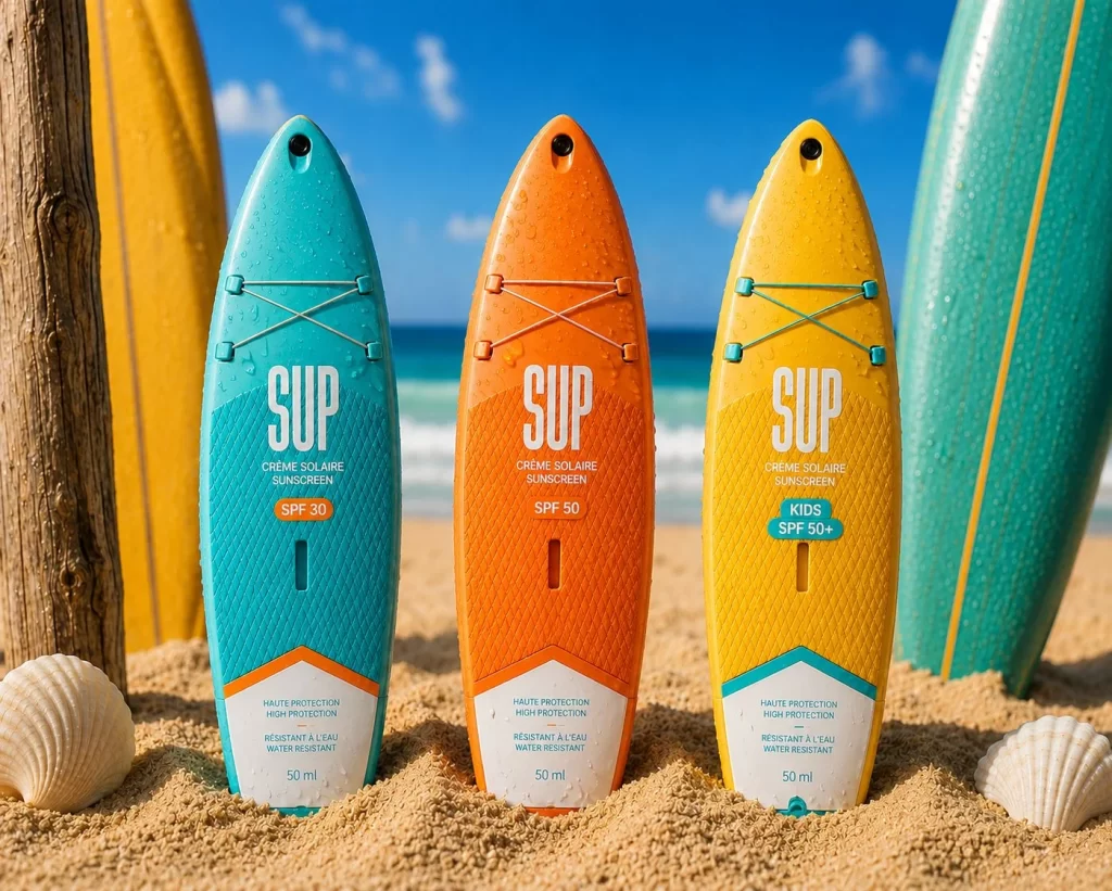
SUP Sunscreen Designed Resemble Surfboards Packaging
Topics
Details
Uploaded user:
Leo
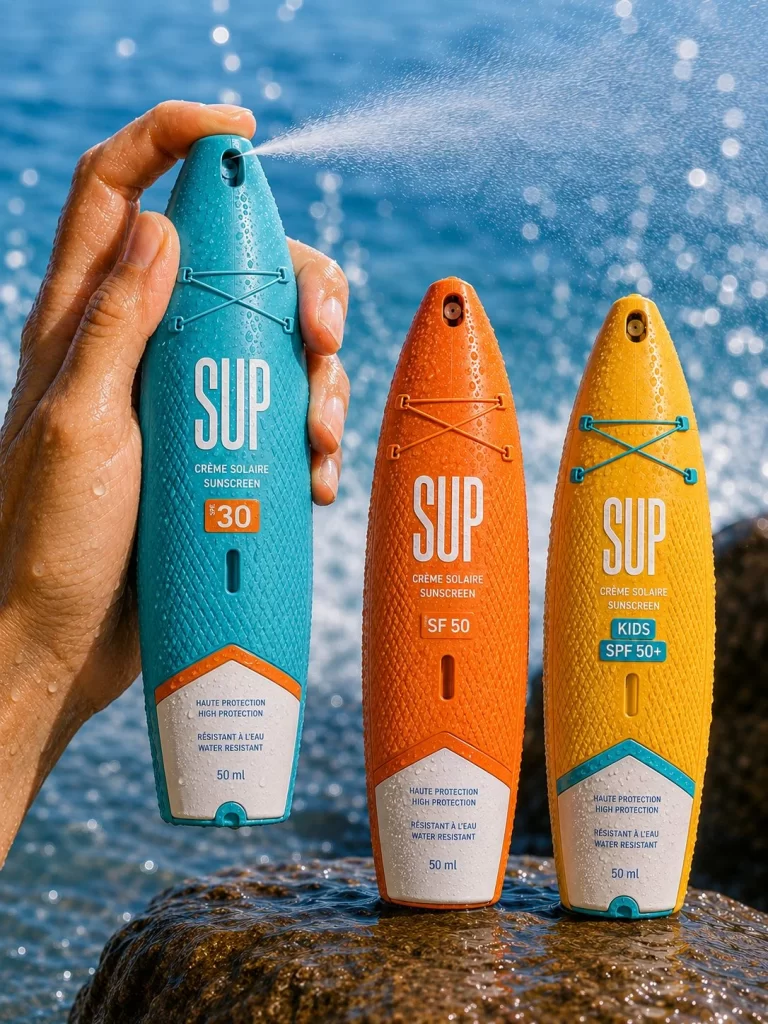
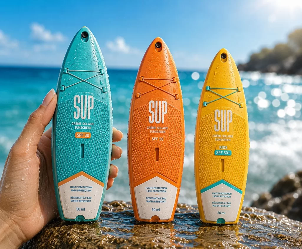
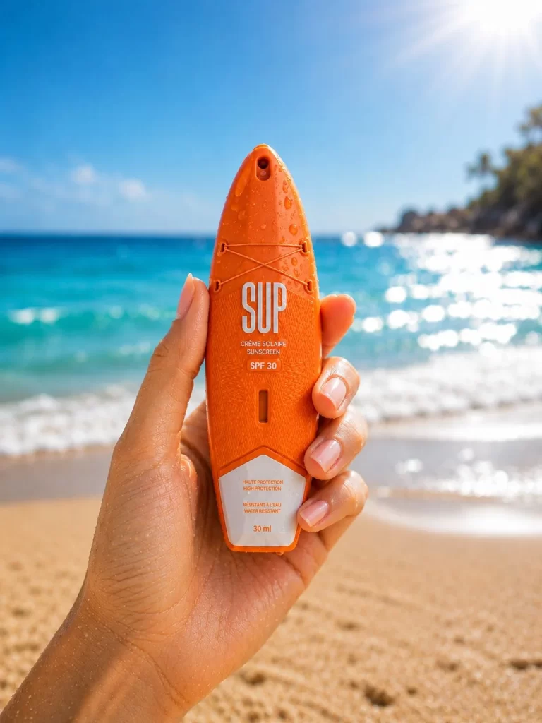
Reference image of SUP Sunscreen Designed Resemble Surfboards Packaging. The packaging is designed to resemble surfboards, with three distinct colors: turquoise, orange, and yellow. Each has the brand name 'SUP' prominently displayed, along with 'Crème Solaire' and 'Sunscreen'. The SPF values are indicated as 30, 50, and 50+ for kids. The packaging is water-resistant and features a textured surface with a small hole at the top, likely for hanging. The labels are white with black text, and the overall design conveys a beach and surf theme.
Ideal for designers studying brand packaging and product design.