Title
SUP Sunscreen Designed Resemble Packaging
Topics
Details
Uploaded user:
Leo
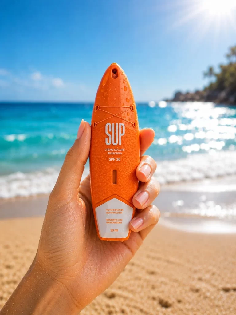
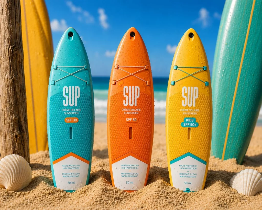
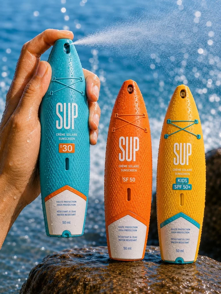
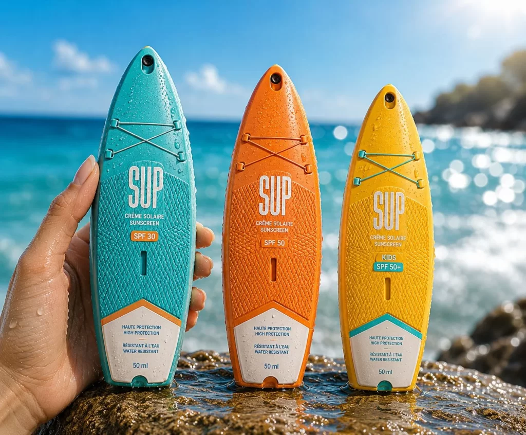
Reference image of SUP Sunscreen Designed Resemble Packaging. The packaging is designed to resemble surfboards with a textured surface. The colors are vibrant, with the left bottle in teal, the middle in orange, and the right in yellow. Each bottle has the brand name 'SUP' prominently displayed, along with 'CREME SOLAIRE SUNSCREEN' and SPF ratings (30, 50, 50+). The design includes a crisscross pattern on the top, resembling a surfboard's deck, and the bottles are labeled as 'HAUTE PROTECTION' and 'RESISTANT A L'EAU' (water-resistant). Each bottle contains 50 ml of product.
Ideal for designers studying brand packaging and product design.