Vaseline Body Care Product
Topics
Details
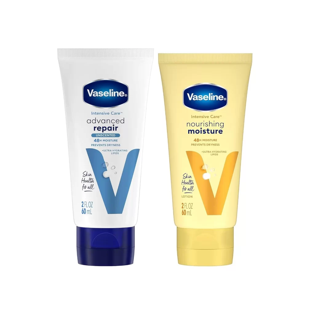
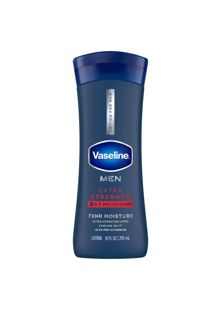
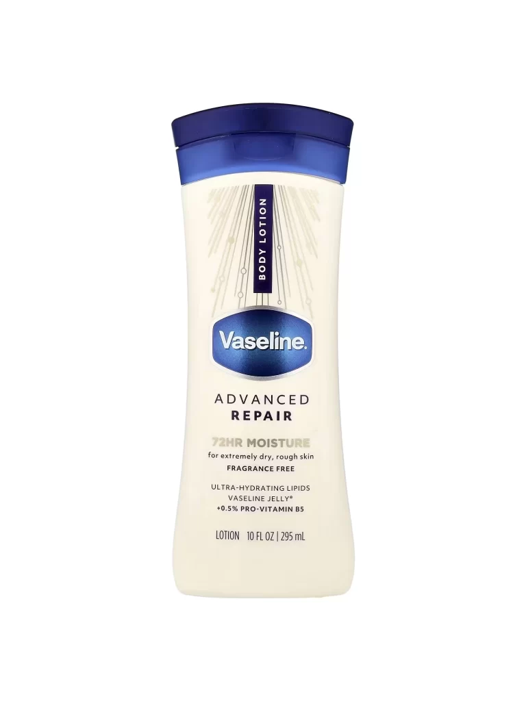
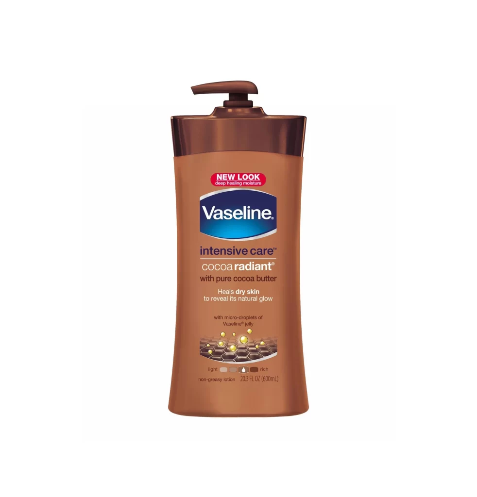
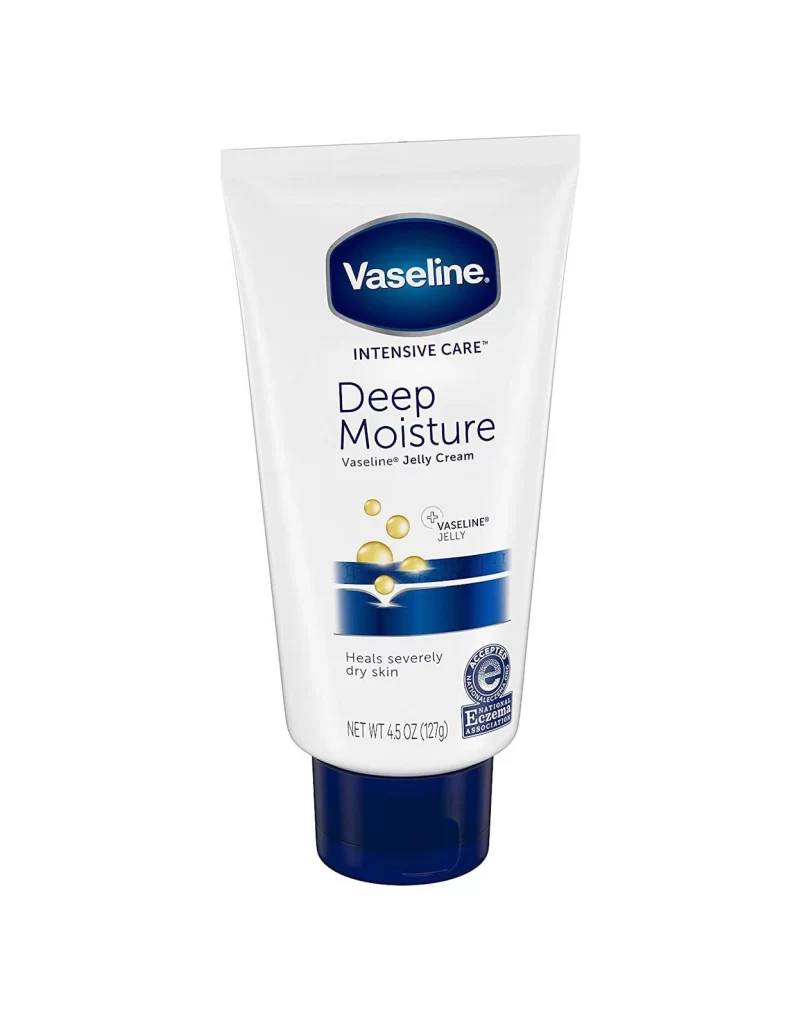
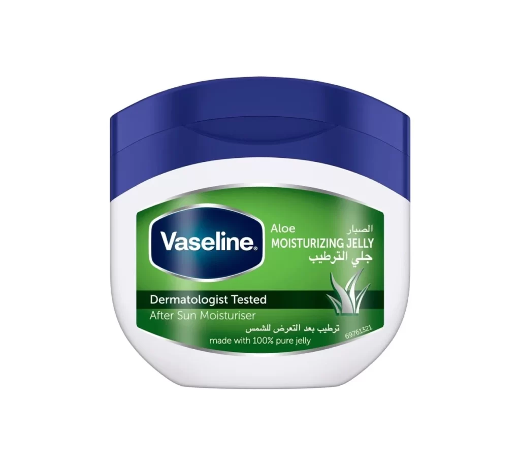
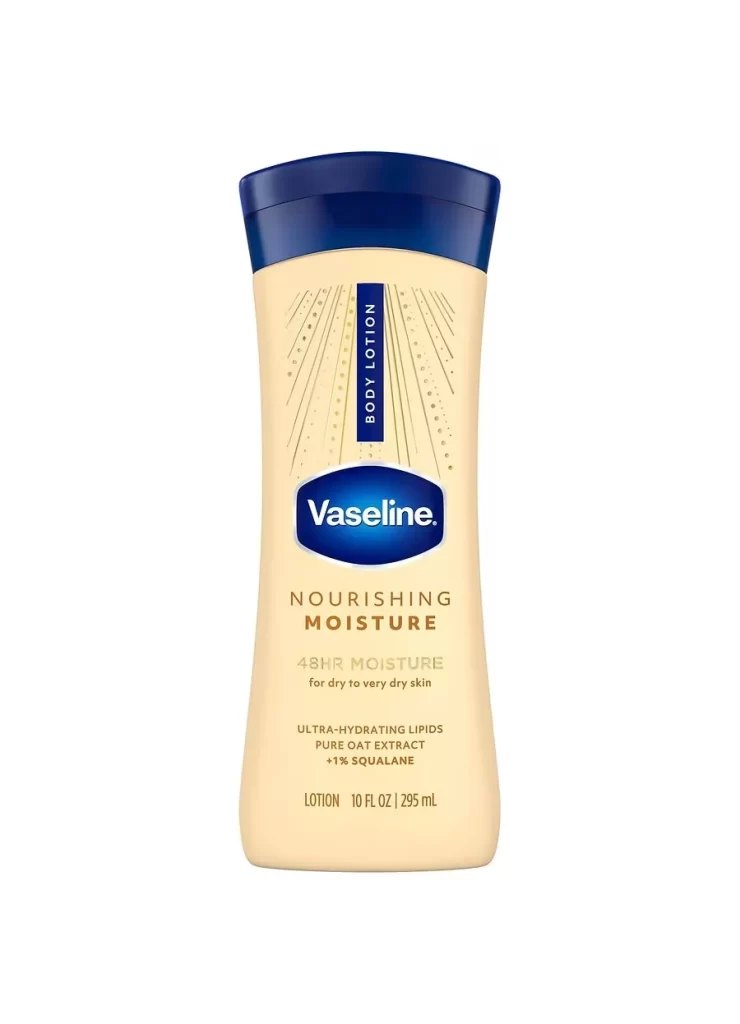
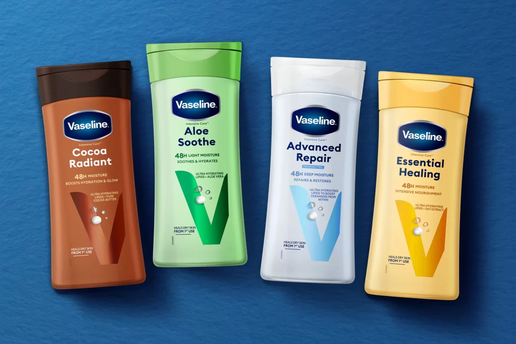
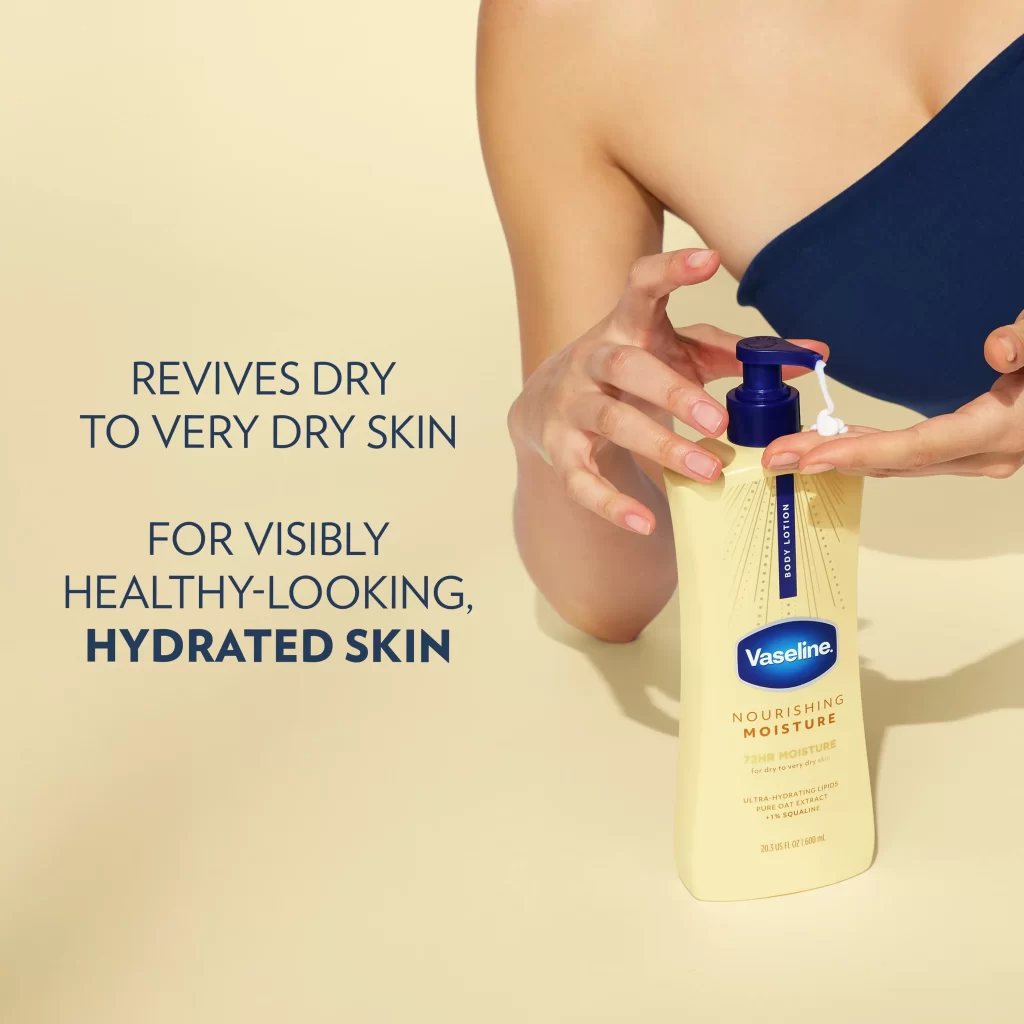
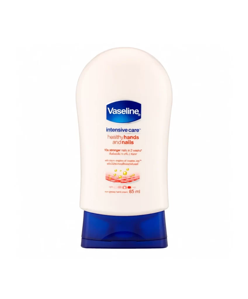
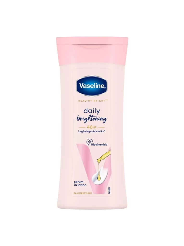
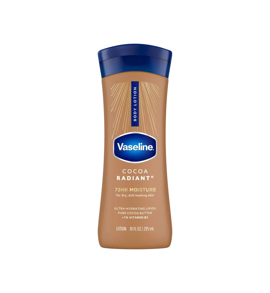
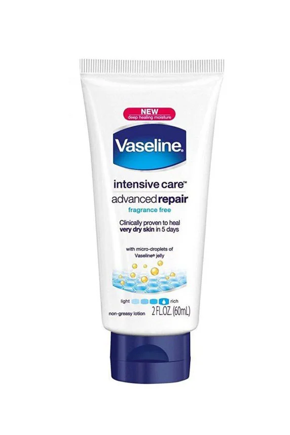
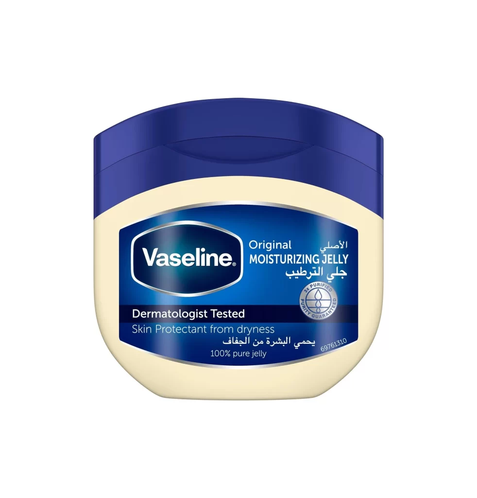
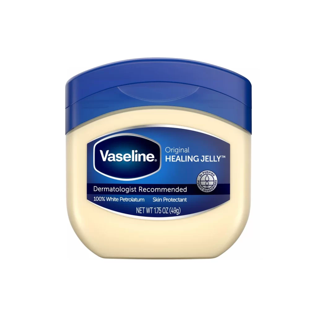
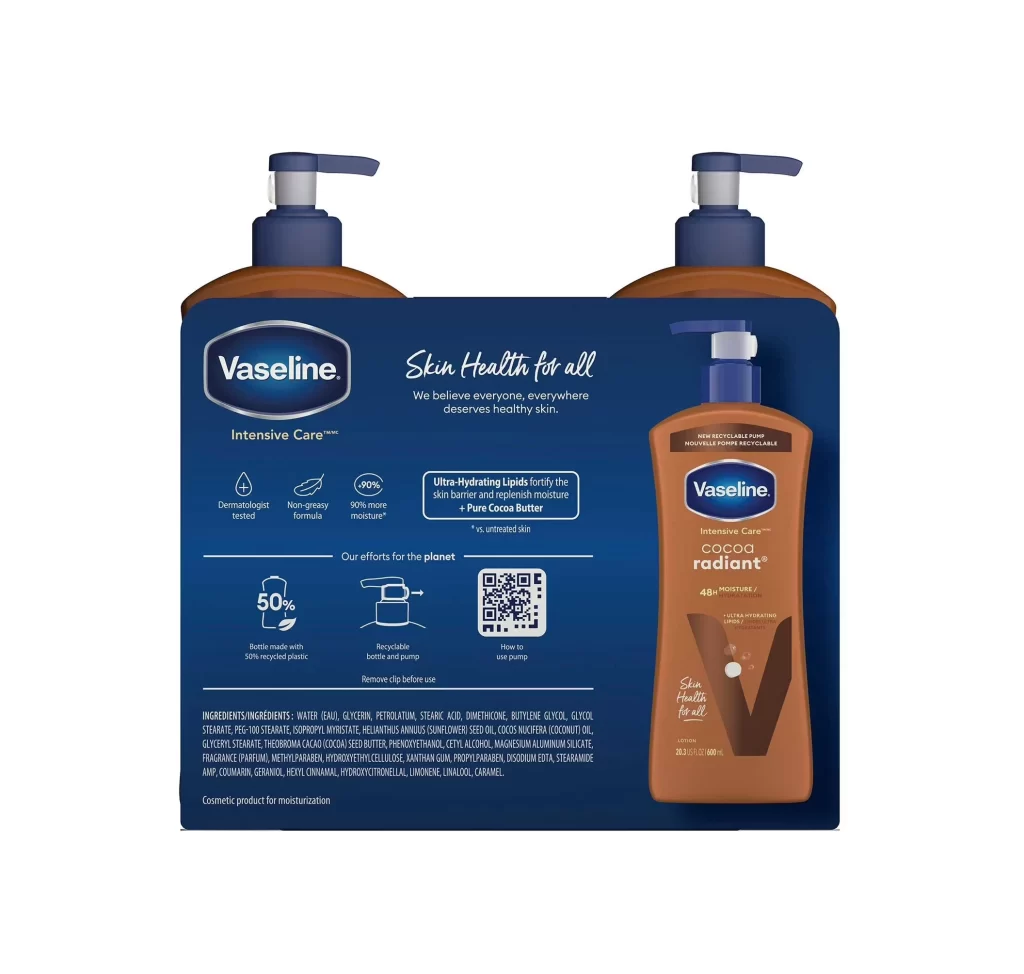
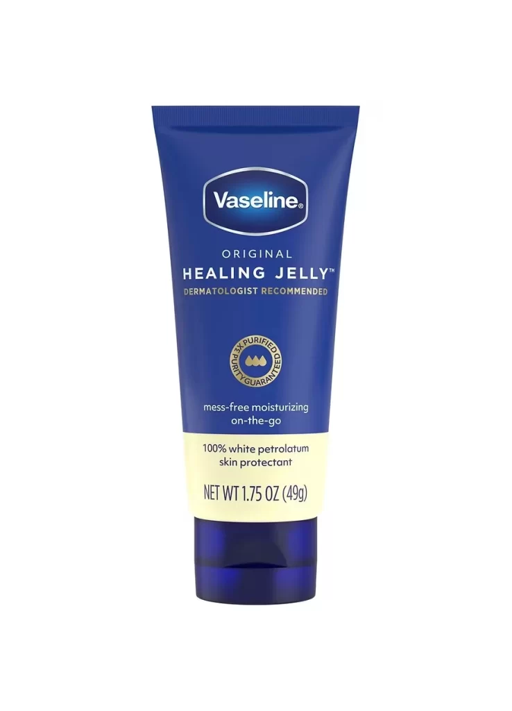
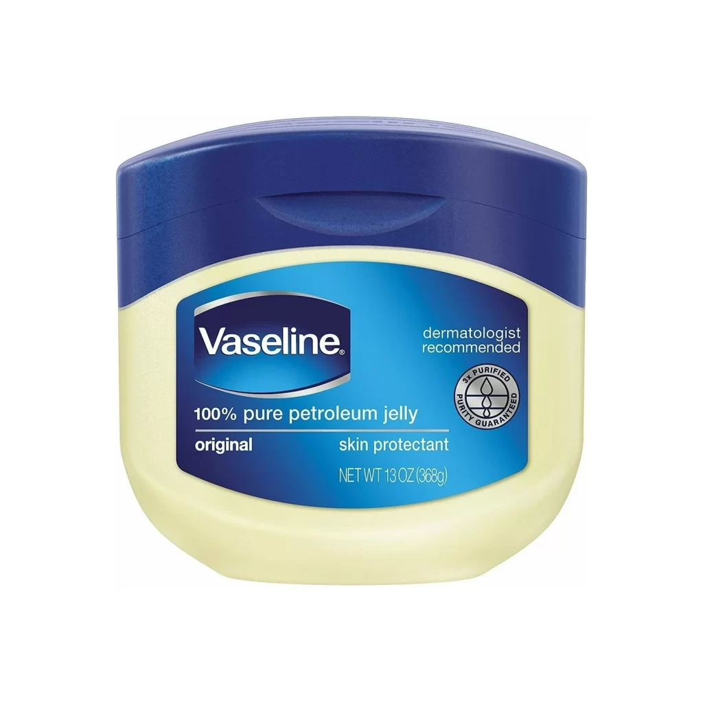
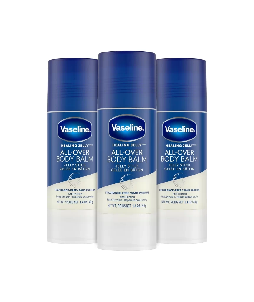
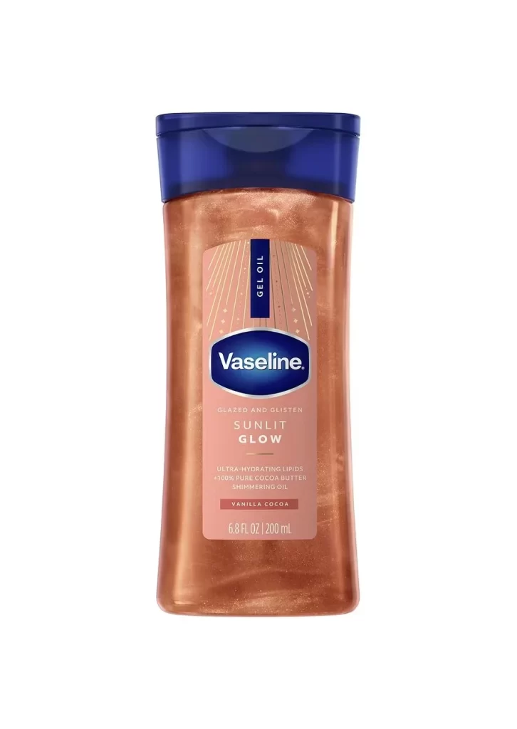
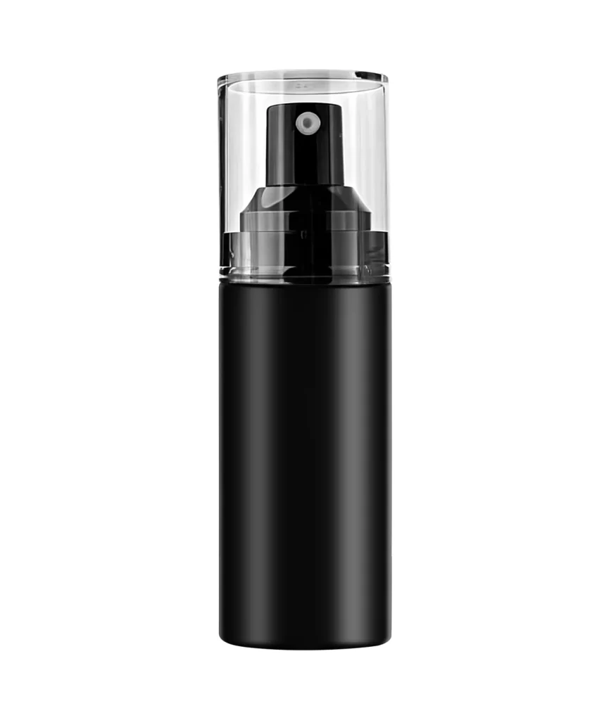
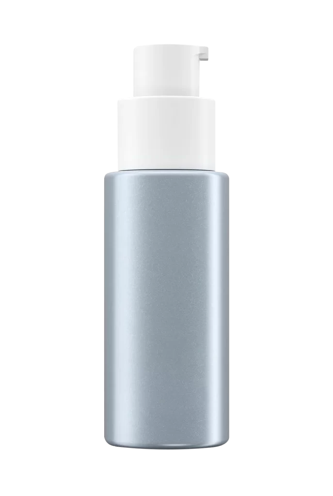
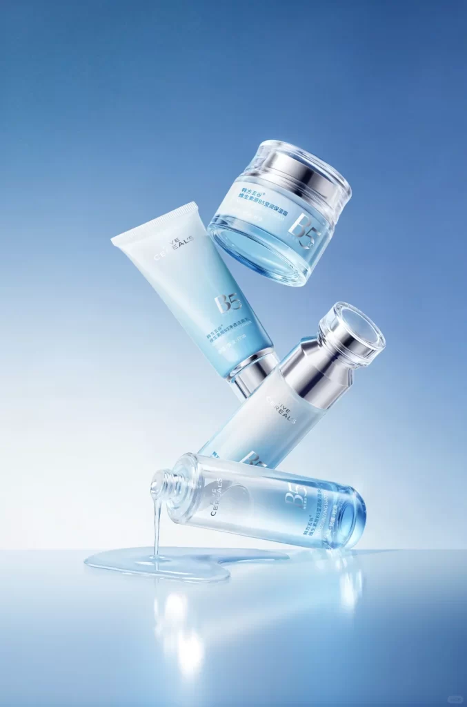
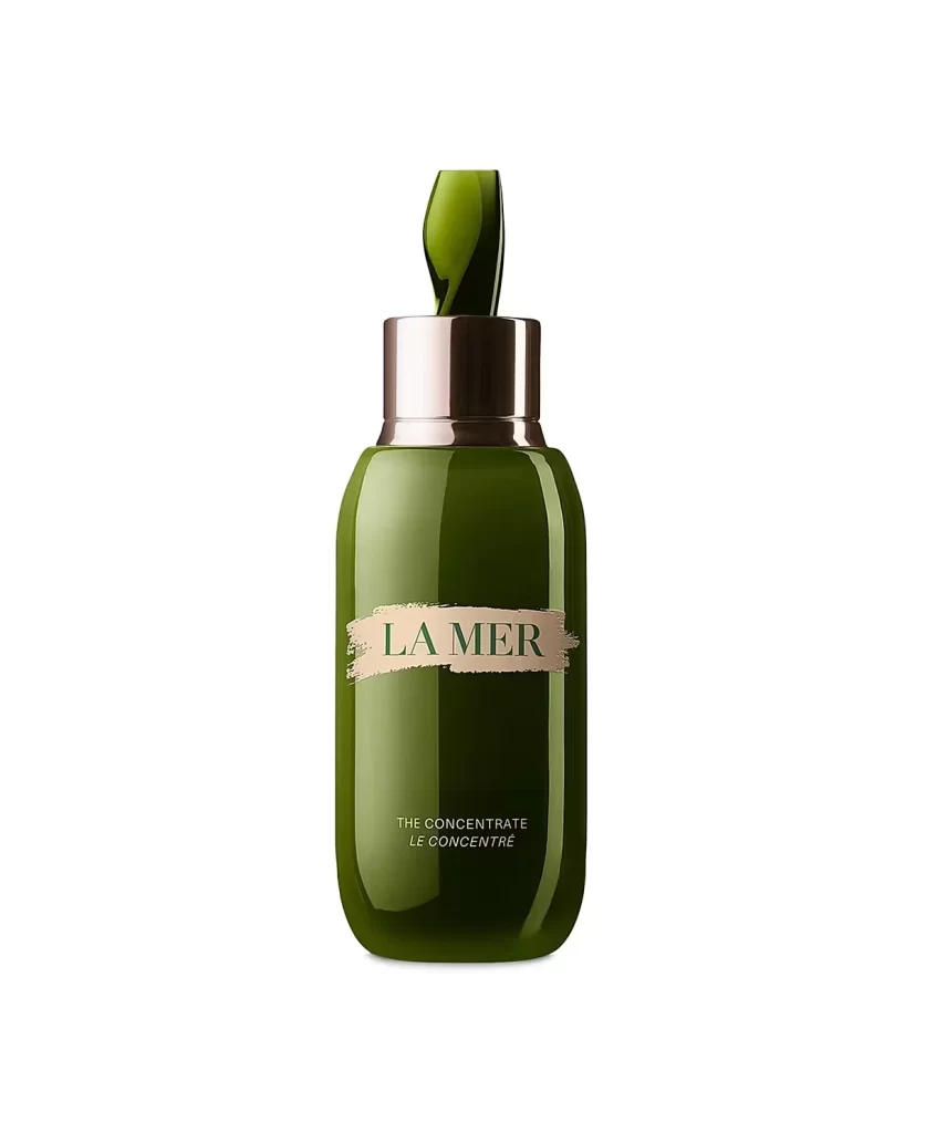
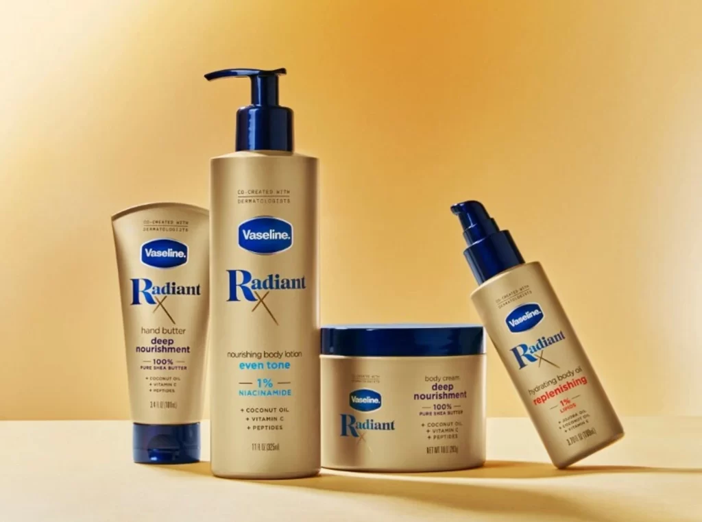
Against a seamless gradient background that shifts from pale cream to warm amber, four Vaseline Radiant X skincare containers are arranged in a gentle arc. The collection features a tall pump bottle, a squat jar with a navy lid, a squeeze tube, and a slender spray bottle, all unified by matte champagne-colored packaging and deep cobalt blue accents. Soft directional lighting from the upper left casts subtle shadows to the right, emphasizing the cylindrical forms while the camera maintains a straight-on perspective that keeps every label legible.
What distinguishes this particular product lineup is the sophisticated interplay between the metallic gold substrate and the crisp, high-contrast typography. The bold blue 'Radiant X' lettering creates immediate visual hierarchy against the neutral base, while the consistent use of rounded pump mechanisms and tapered shapes establishes a cohesive family aesthetic. Notably, the color-coded ingredient callouts—teal for niacinamide and coral for lactic acid—add functional visual interest without disrupting the overall minimalist elegance.
Packaging designers studying premium mass-market positioning will find valuable lessons in how this arrangement balances luxury cues with accessibility. Art directors planning beauty e-commerce shoots could reference the lighting setup and spacing to achieve similar depth without clutter. Meanwhile, brand strategists analyzing cross-category line extensions might examine how the shared visual language successfully ties together diverse formats like jars, tubes, and spray bottles into one recognizable system.