Vaseline Intensive Care Lotion Tube
Topics
Details
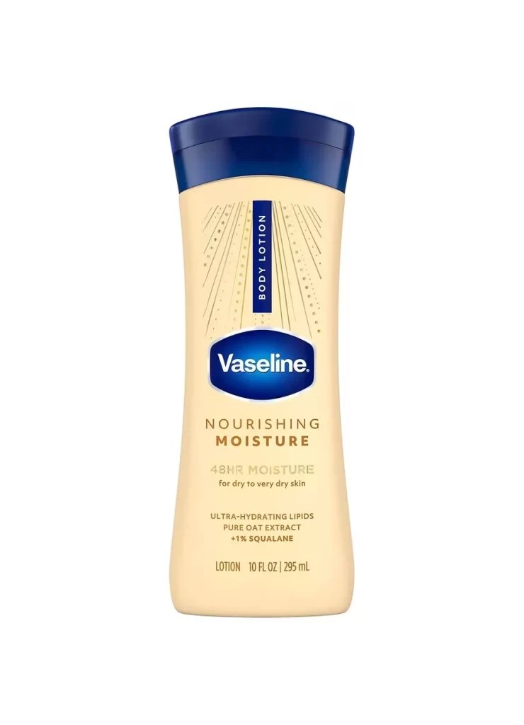
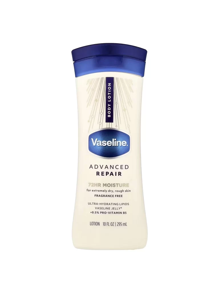
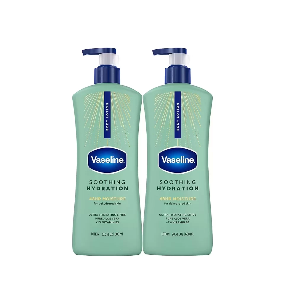
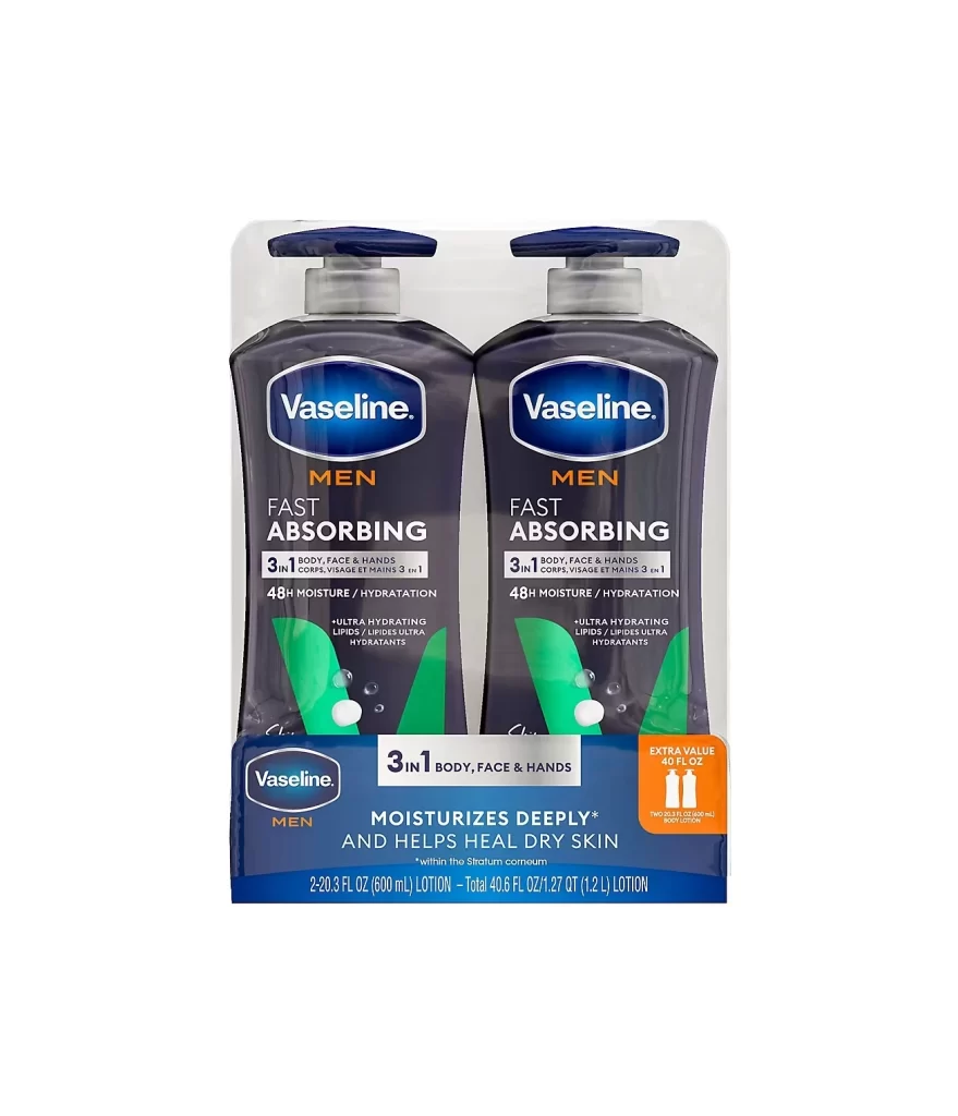
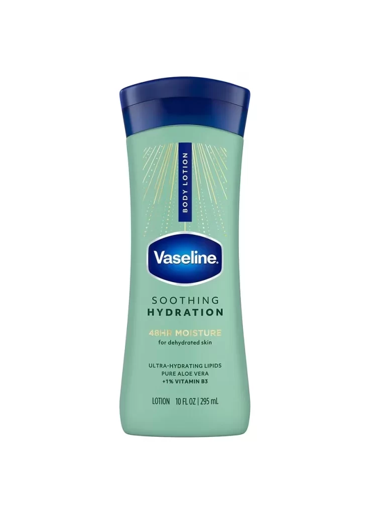
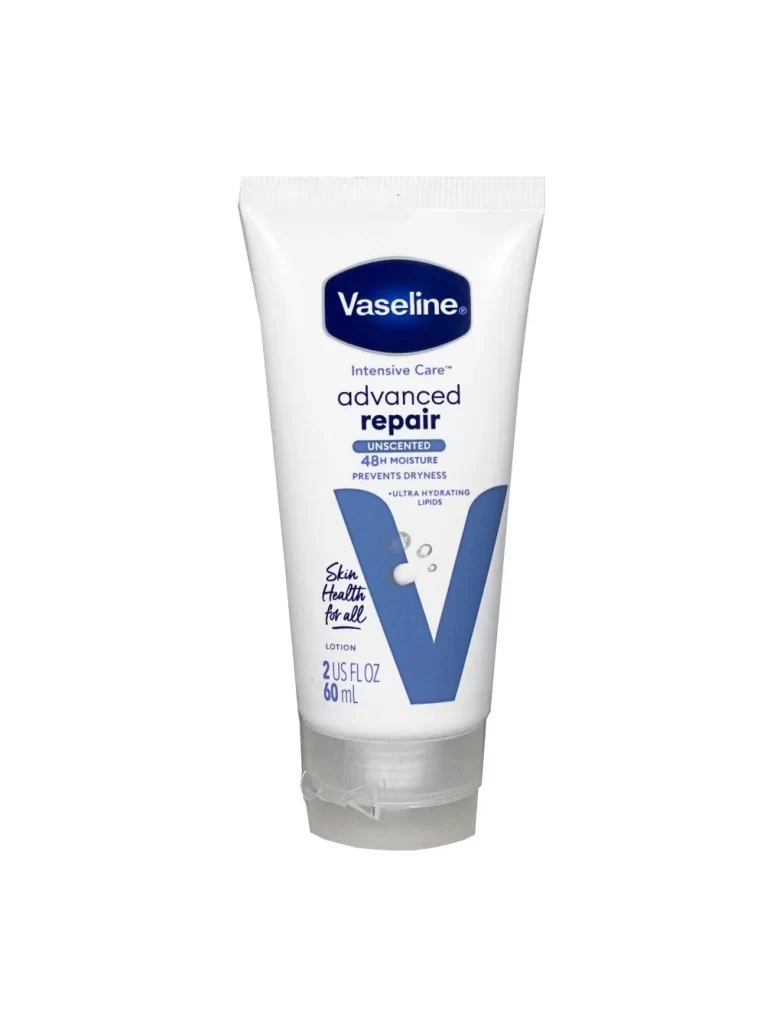
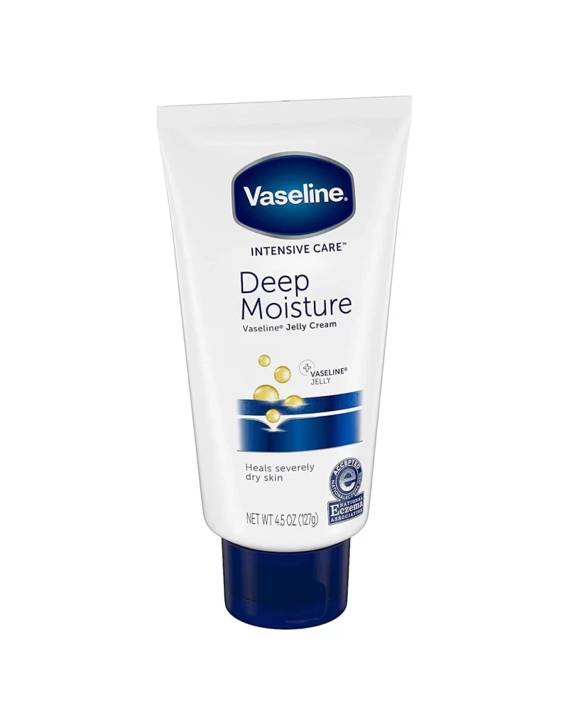
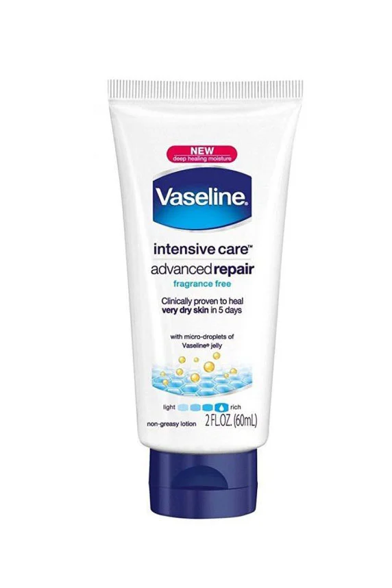
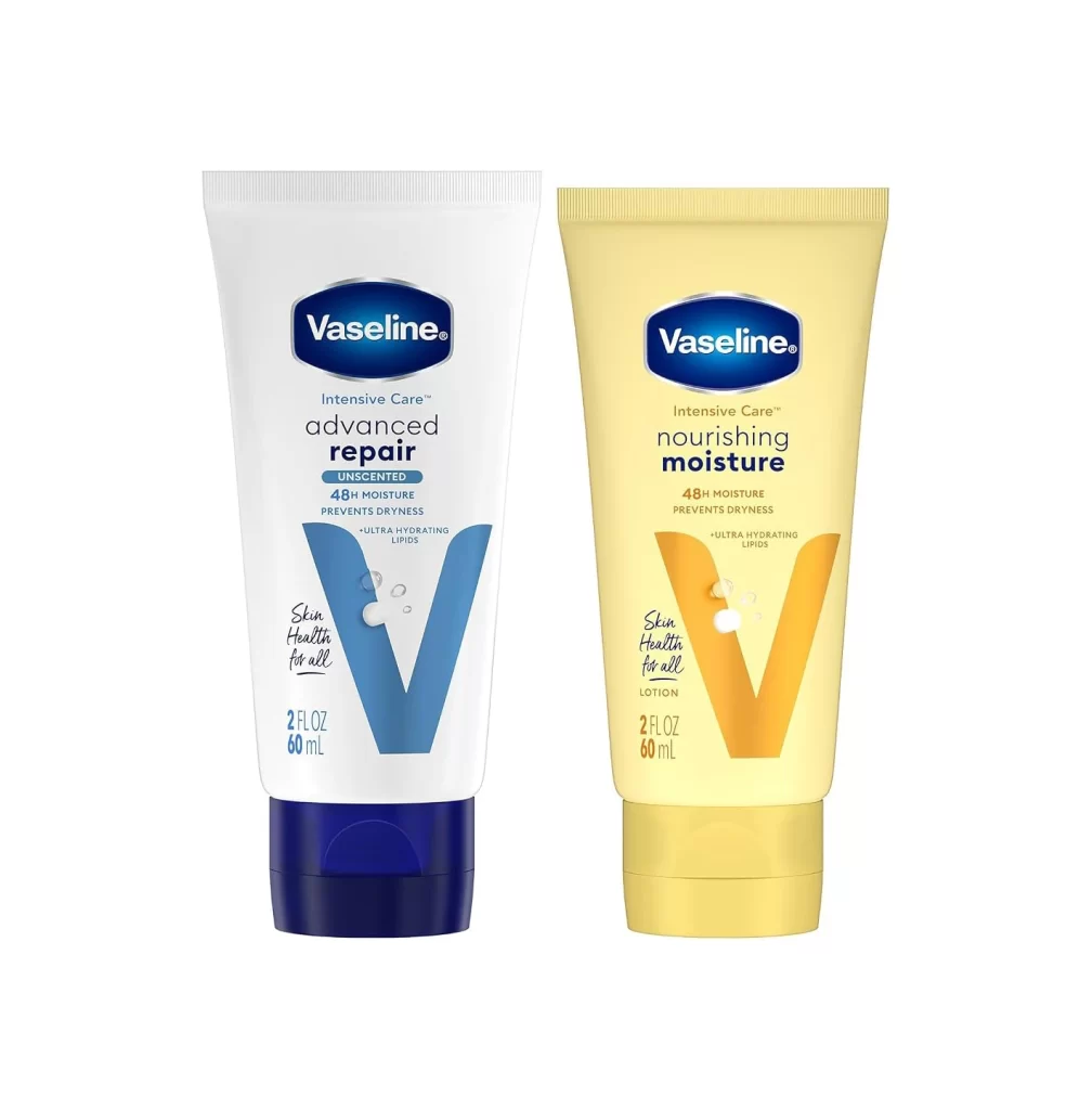
Two Vaseline Intensive Care lotion tubes stand side by side, each containing 2 fluid ounces of product. The left tube features a white body with a dark blue cap and a large blue 'V' graphic, labeled as the unscented advanced repair variant. Its companion on the right displays a pale yellow body with a matching gold cap and an orange 'V', identifying it as the nourishing moisture formula.
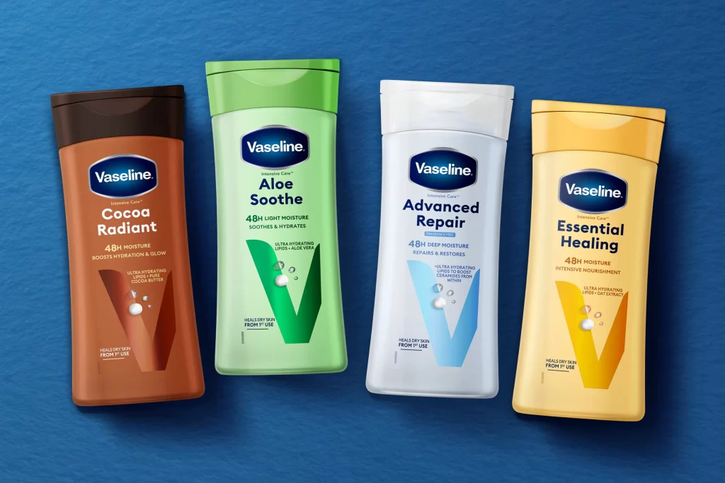
Visual distinction emerges through the deliberate color-coding system that differentiates the variants while maintaining cohesive brand identity. The oversized ‘V’ letterforms serve as bold graphic anchors, each adorned with subtle droplet illustrations suggesting hydration properties. Typography hierarchy guides the eye from the prominent brand name down to functional claims like ’48H MOISTURE’ and ‘ULTRA HYDRATING LIPIDS’, creating an information architecture that balances aesthetic appeal with practical communication. Matte finishes on the tubes contrast with the slight sheen of the caps, adding tactile dimensionality to the overall presentation.
Packaging designers analyzing color psychology in personal care branding would find this comparison particularly valuable for understanding how hue variations affect consumer perception of product benefits. Marketing teams developing visual identity systems can study the consistent application of graphic elements across different SKUs to ensure line extension coherence. Retail merchandisers planning shelf layouts might reference the spatial relationship between variants to optimize in-store navigation, while industrial designers evaluating squeeze-tube ergonomics could examine the cap proportions and material textures for user experience insights.