Vaseline Lip Therapy Jar
Topics
Details
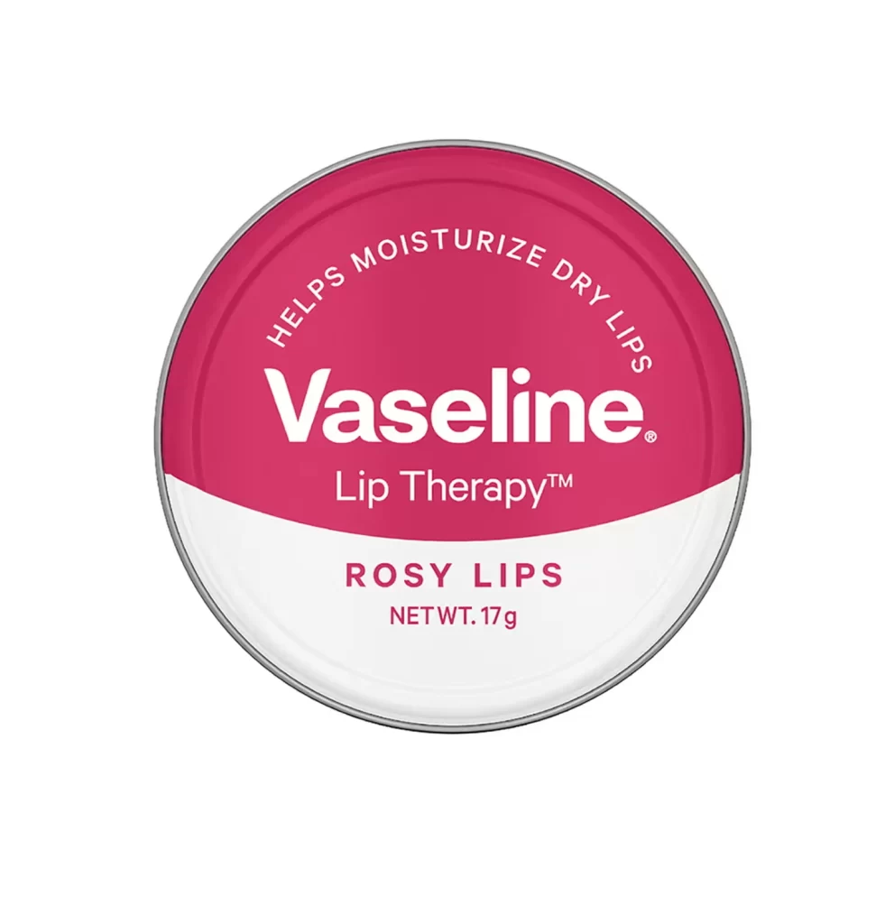
A circular metal tin dominates the frame, featuring a two-tone color scheme with a deep magenta upper half and crisp white lower section. The brand name 'Vaseline' appears in bold white sans-serif lettering at the center, while the phrase 'HELPS MOISTURIZE DRY LIPS' curves along the top arc in smaller capital letters. Below the main logo, 'Lip Therapy™' sits above the variant name 'ROSY LIPS' and net weight of 17g, all rendered in matching magenta against the white background. The object is photographed straight-on against a pure white backdrop, revealing a thin silver rim that defines its circular perimeter.
Visual interest stems from the clean geometric division between the saturated pink and neutral white zones, creating immediate product recognition through color blocking. The curved typographic treatment of the functional claim adds dynamic movement to an otherwise static circular composition, guiding the eye naturally from the benefit statement down to the specific flavor variant. This particular packaging iteration relies on high contrast and minimal ornamentation, making it an excellent study in pharmaceutical branding where clarity outweighs decorative complexity.
Product photographers might examine this reference to understand standard cosmetic packaging presentation angles and lighting setups for reflective metal surfaces. Packaging designers could analyze the hierarchy of information placement, noting how weight and positioning establish visual priority among competing text elements. Color theorists will find value in documenting how the specific magenta shade communicates the 'rosy' flavor profile while maintaining brand consistency with Vaseline's broader identity system.