Vaseline Body Lotion Bottle Angle
Topics
Details
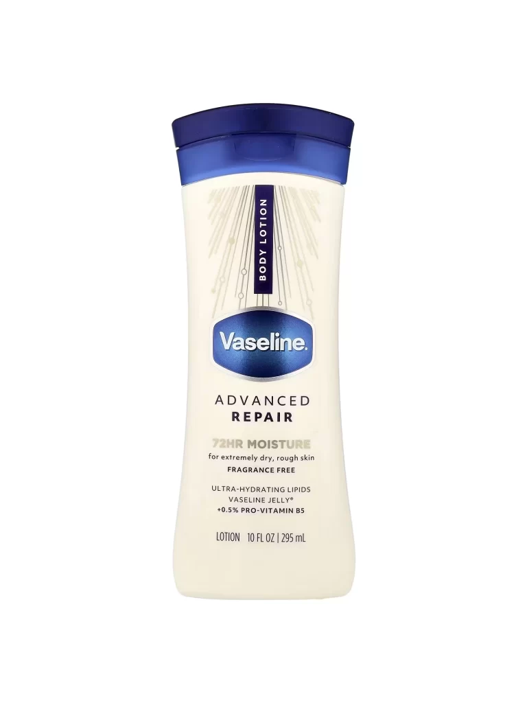
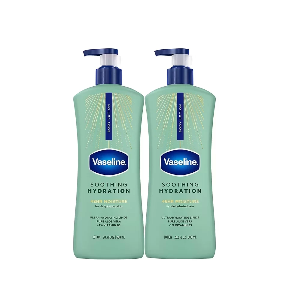
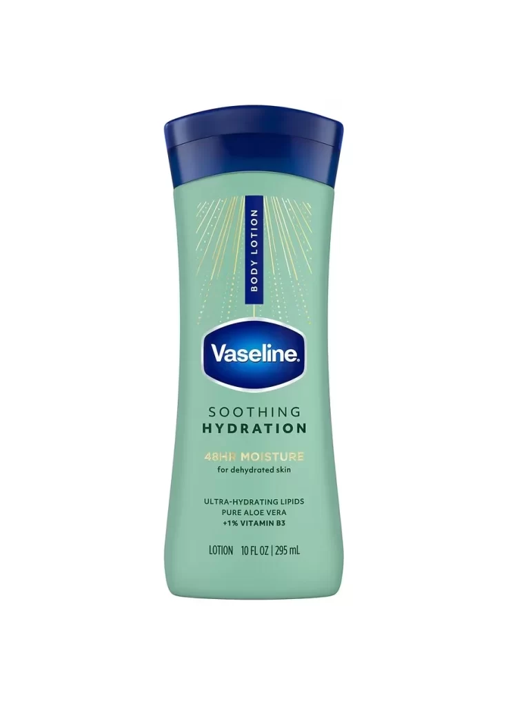
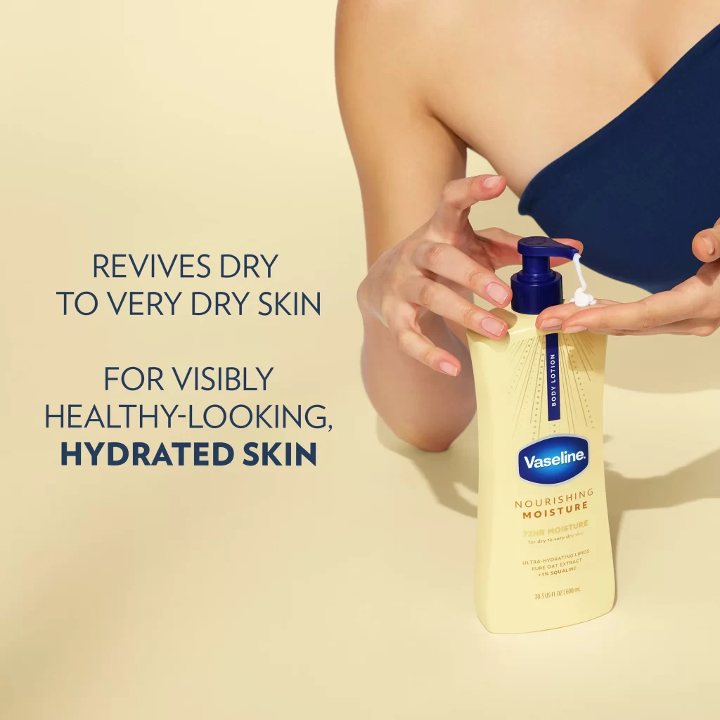
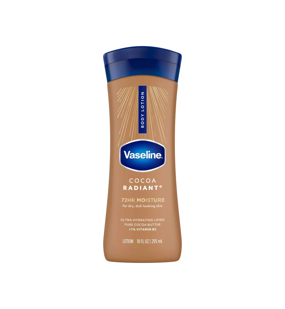
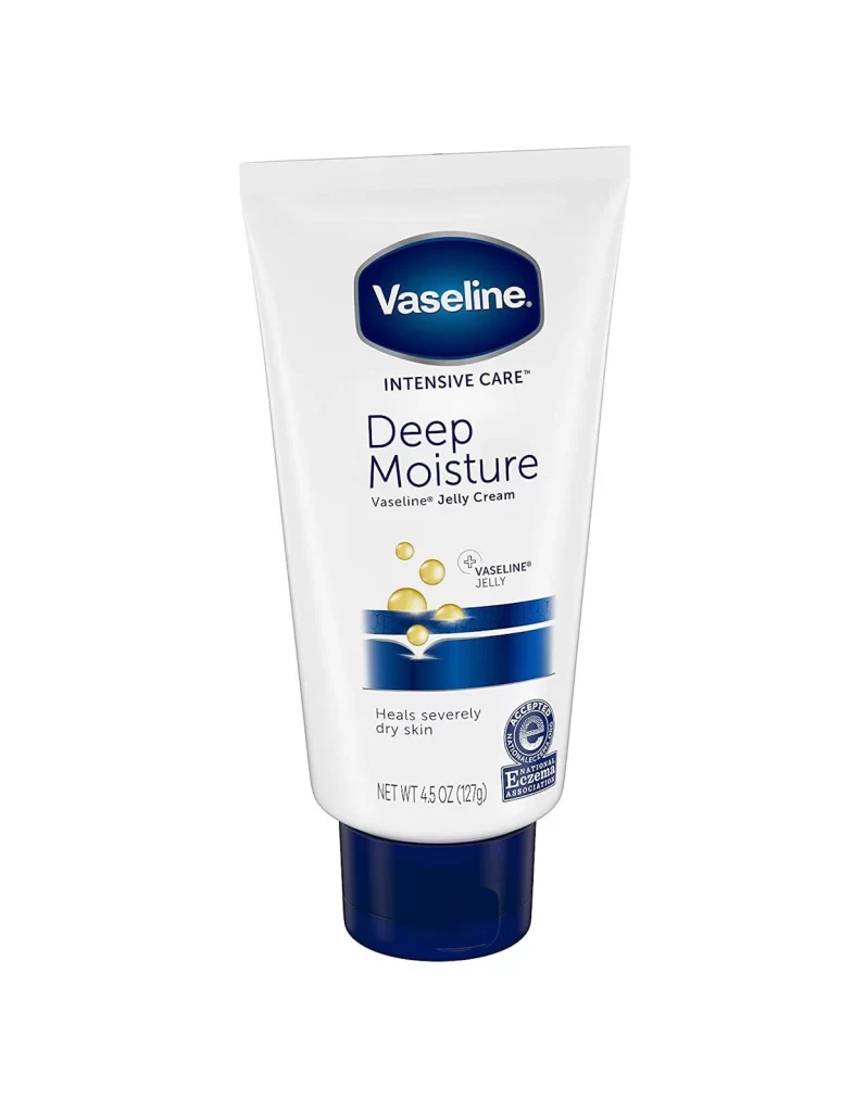
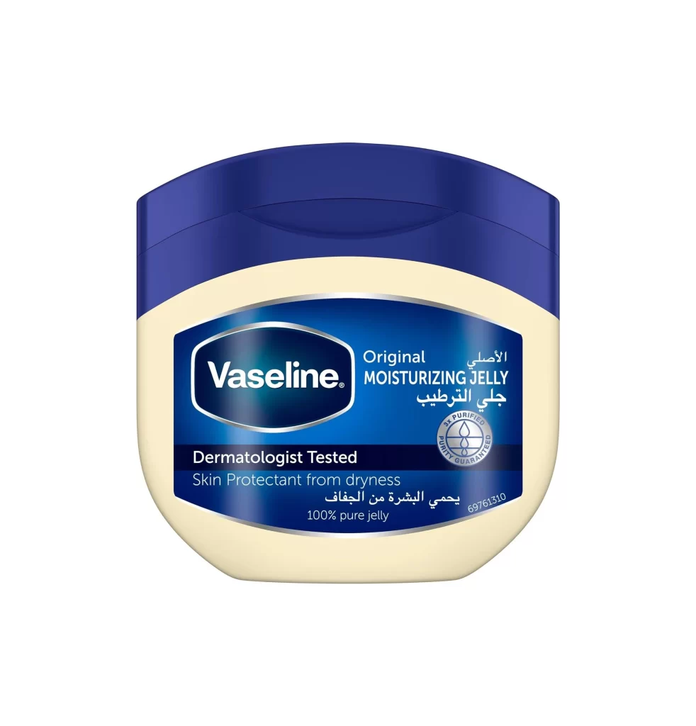
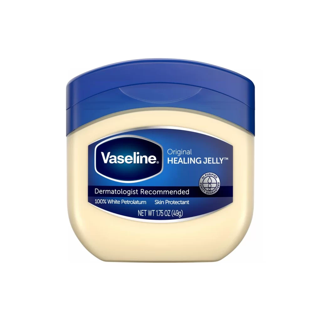
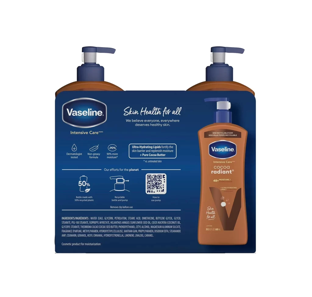
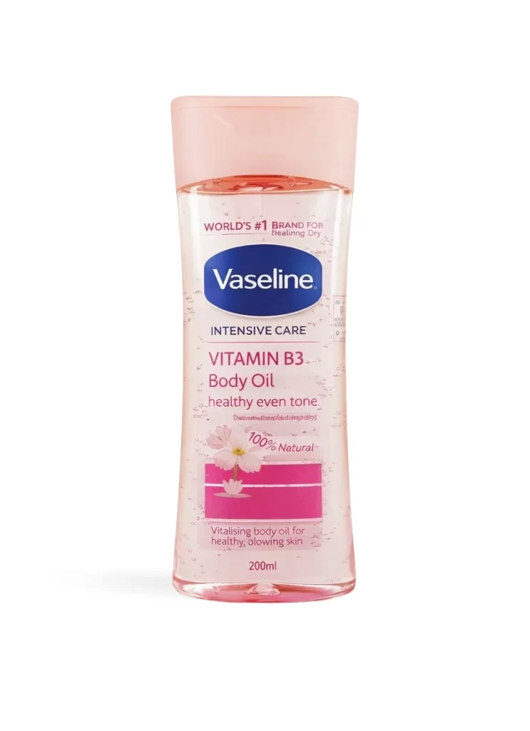
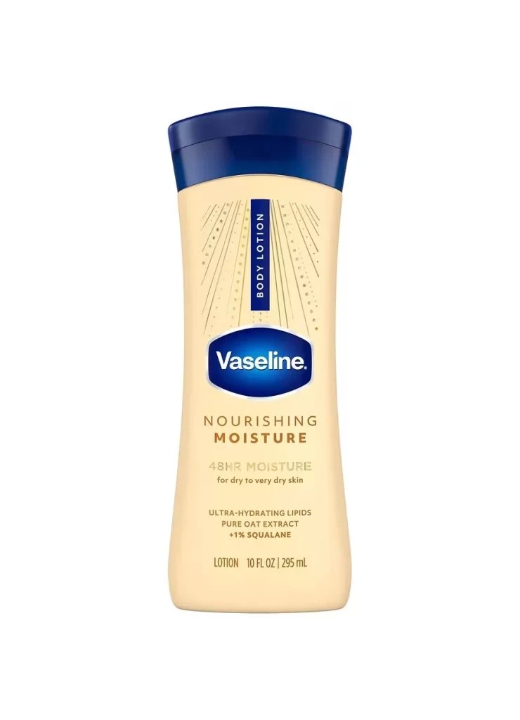
A curved, cream-colored plastic bottle with a dark blue cap stands upright against a plain white background. The Vaseline logo appears in white text inside a blue oval at the center of the bottle, with 'BODY LOTION' printed vertically in a blue rectangle above it. Gold and gray text below the logo identifies the product as 'Nourishing Moisture' with 48-hour hydration benefits for dry skin.
What makes this particular packaging visually compelling is its elegant hourglass silhouette that tapers gracefully at both ends, creating a sophisticated profile compared to standard cylindrical bottles. The restrained color palette—combining warm cream, rich navy, and metallic gold accents—conveys a sense of premium skincare without overwhelming the viewer. Strategic typography hierarchy guides the eye from the iconic logo down to specific product benefits, demonstrating effective information architecture on curved surfaces.
Product photographers studying consumer goods packaging will find this angle useful for understanding how soft studio lighting eliminates harsh shadows while maintaining dimensional clarity. Industrial designers working on personal care containers can analyze the ergonomic proportions and cap-to-body ratio that suggests both stability and ease of grip. Marketing teams developing visual assets for e-commerce listings might reference this composition when planning their own product photography shoots for similar moisturizers.