Vaseline Lip Therapy Tube
Topics
Details
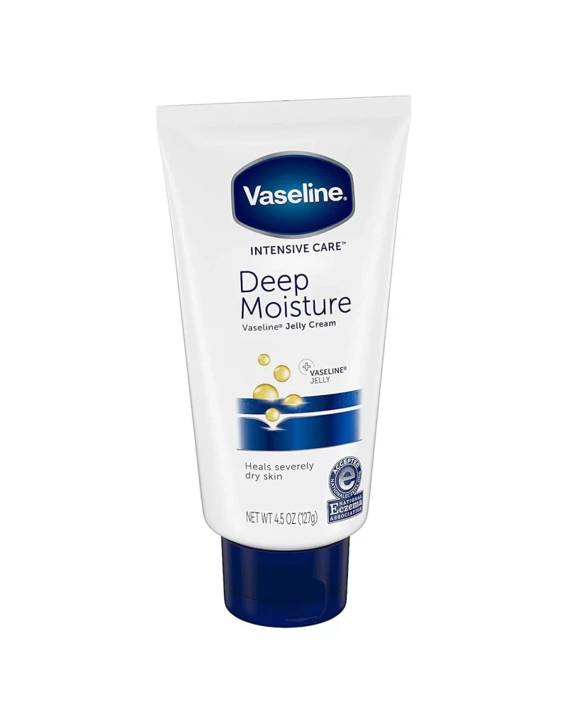
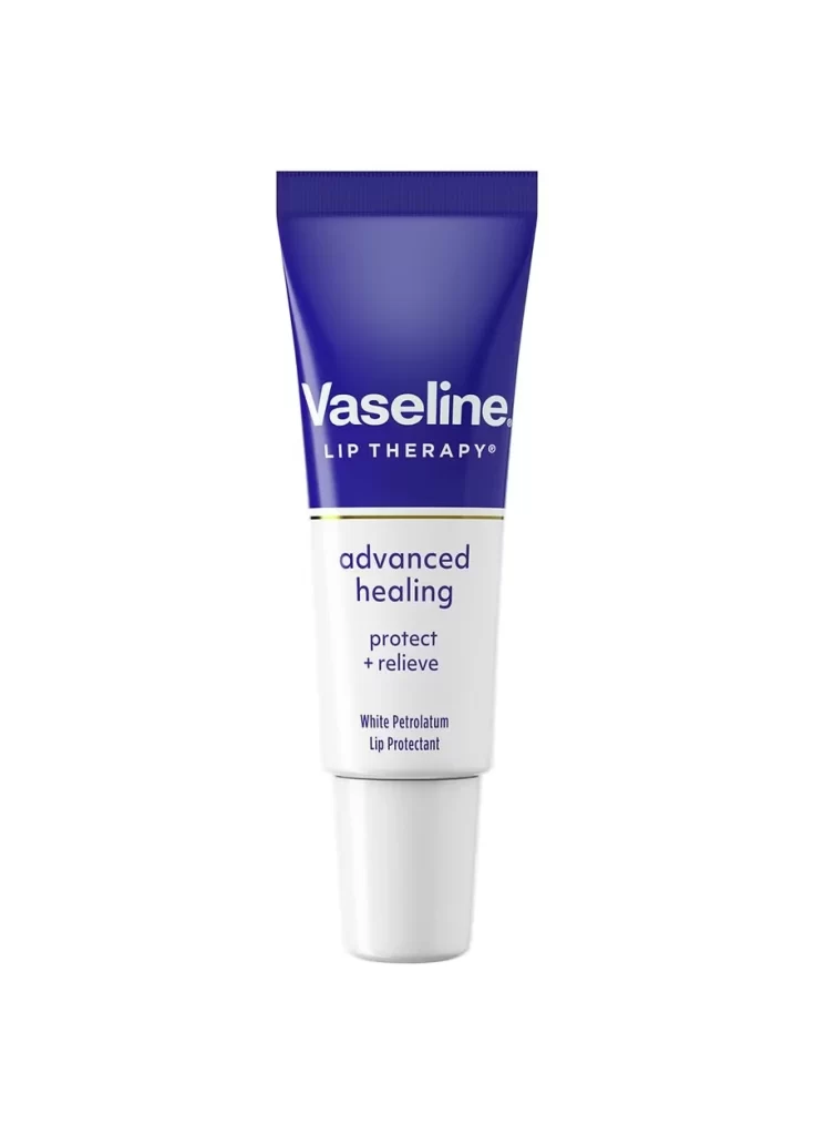
Deep royal blue dominates the upper half of this squeezable tube, transitioning sharply to a clean white lower section via a thin metallic gold band. The Vaseline logo appears in bold white sans-serif type against the dark background, with 'LIP THERAPY' registered beneath it in smaller capitals. Below the color break, 'advanced healing' and 'protect + relieve' stack in dark purple lettering, while 'White Petrolatum Lip Protectant' anchors the bottom in a more diminutive font. A ribbed blue cap seals the top, and the entire object stands vertically on a pure white surface under even, shadowless lighting that emphasizes its smooth plastic texture.
Visual hierarchy here relies on a disciplined two-tone palette that immediately communicates product function through color psychology—the clinical blue suggests medicinal relief while the white implies purity and gentleness. Typography scales deliberately from brand dominance down to ingredient specificity, guiding the eye through benefit claims before revealing the active component. That horizontal gold accent serves as a sophisticated visual anchor, elevating an otherwise utilitarian pharmaceutical package into something approaching cosmetic elegance.
Packaging designers studying pharmaceutical-to-cosmetic crossover aesthetics would find this composition particularly instructive for understanding how color blocking creates shelf presence. Industrial photographers could reference the lighting setup for achieving flawless product isolation without losing material texture. Brand strategists might analyze the typographic weight distribution to inform their own label hierarchies, while 3D modelers seeking accurate tube geometry and cap detailing would appreciate the orthogonal perspective's clarity.