Vaseline Body Lotion Bottle Set
Topics
Details
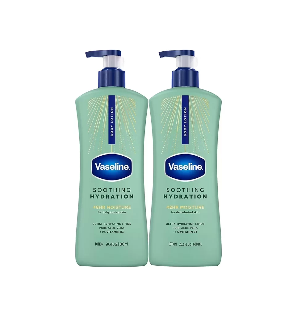
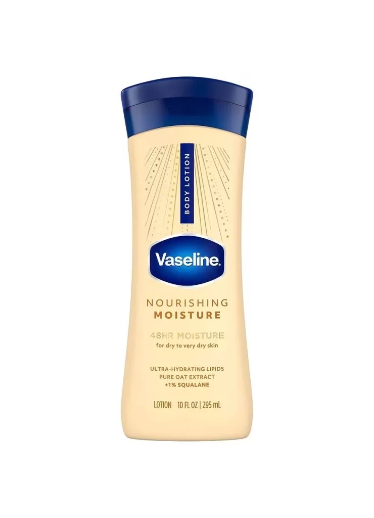
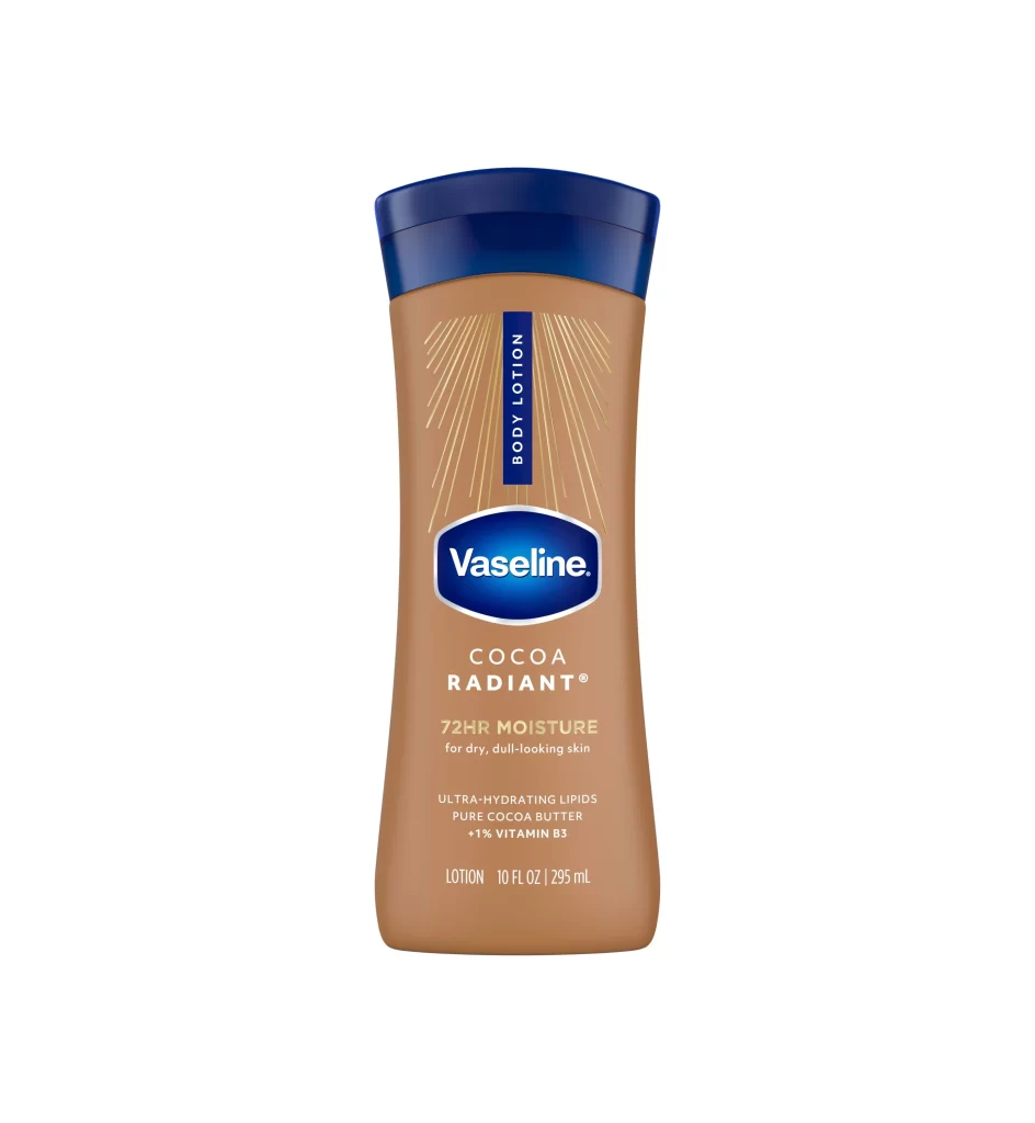
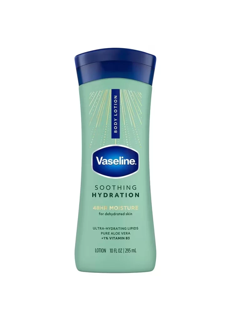
A soft sage-green plastic vessel dominates the frame, tapering elegantly toward a deep navy-blue cap that creates a sharp tonal contrast. Centered on the front, the iconic Vaseline logo sits within a dark blue oval, while a vertical navy strip above it bears the words 'BODY LOTION' in white sans-serif type. Radiating golden lines fan out from behind this central branding, adding subtle texture to the matte surface. Below the main logo, the text 'SOOTHING HYDRATION' appears in dark green capitals, followed by '48HR MOISTURE' in a lighter gold hue that complements the decorative rays.
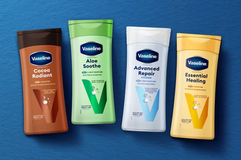
The color palette here departs significantly from the brand's traditional white and blue identity, utilizing the muted green to signal specific product benefits like aloe content. That vertical orientation of the 'BODY LOTION' label breaks the horizontal flow of the other text elements, creating a visual anchor that guides the eye downward through the information hierarchy. Such deliberate use of metallic gold accents against the organic background suggests a premium positioning within the mass-market skincare category.
Industrial designers studying ergonomic bottle shapes for personal care packaging would find the curved silhouette and grip-friendly proportions particularly instructive. Brand strategists analyzing how established identities adapt to sub-line extensions could examine the way core equity elements remain recognizable despite the non-standard colorway. Packaging engineers might also reference the structural relationship between the wide screw-cap and the narrow neck when developing similar dispensing systems for viscous liquids.