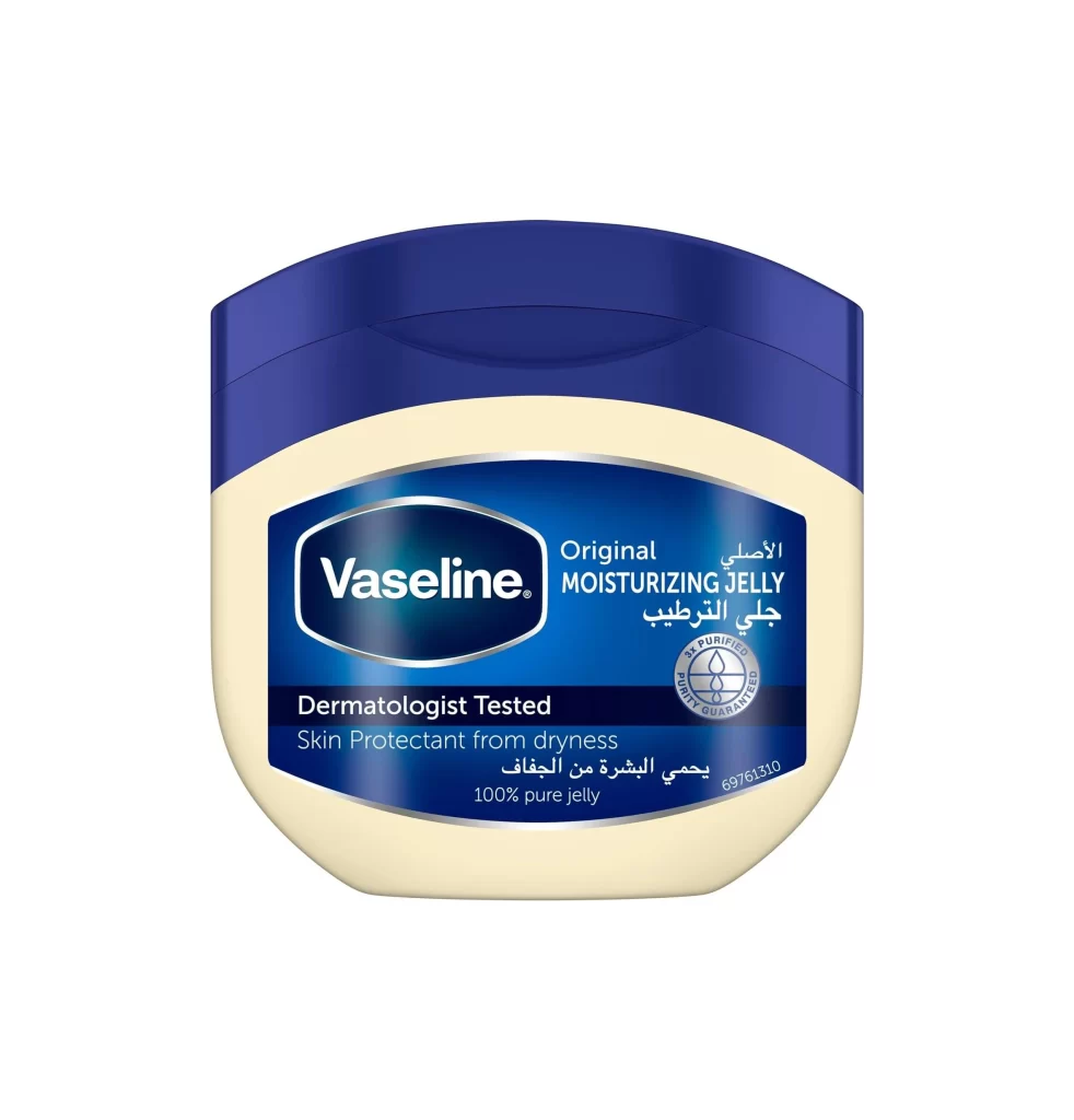
Vaseline Petroleum Jelly Jar
Topics
Details
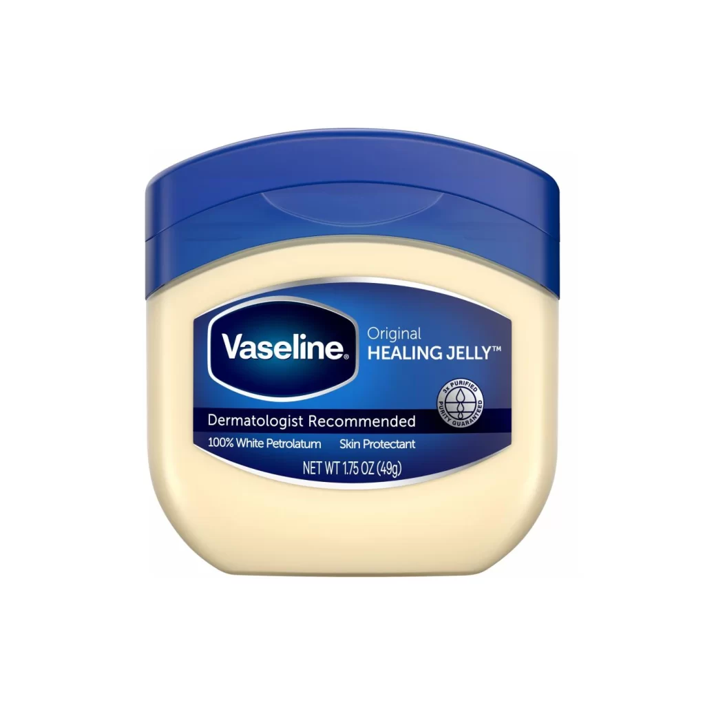
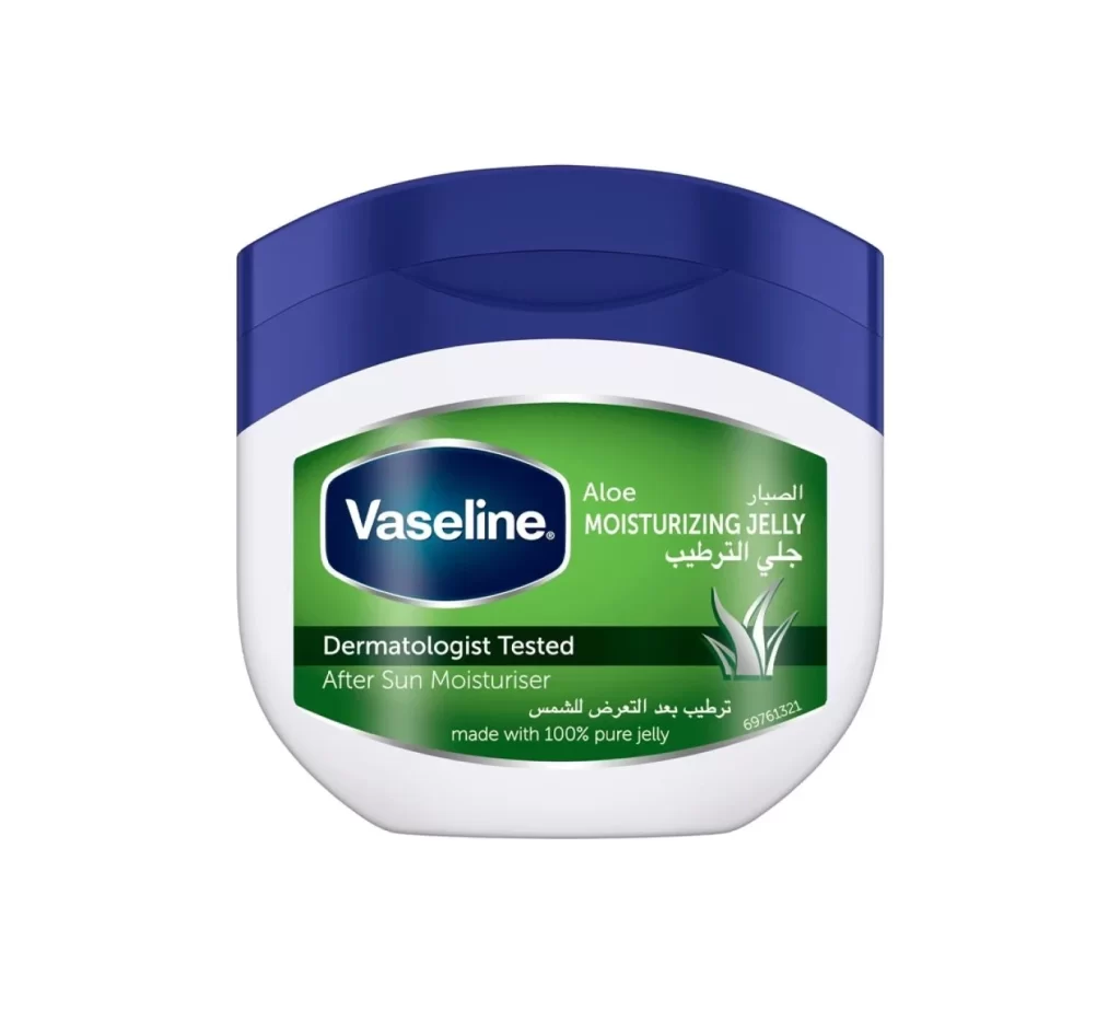
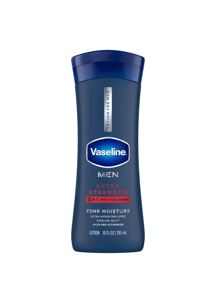
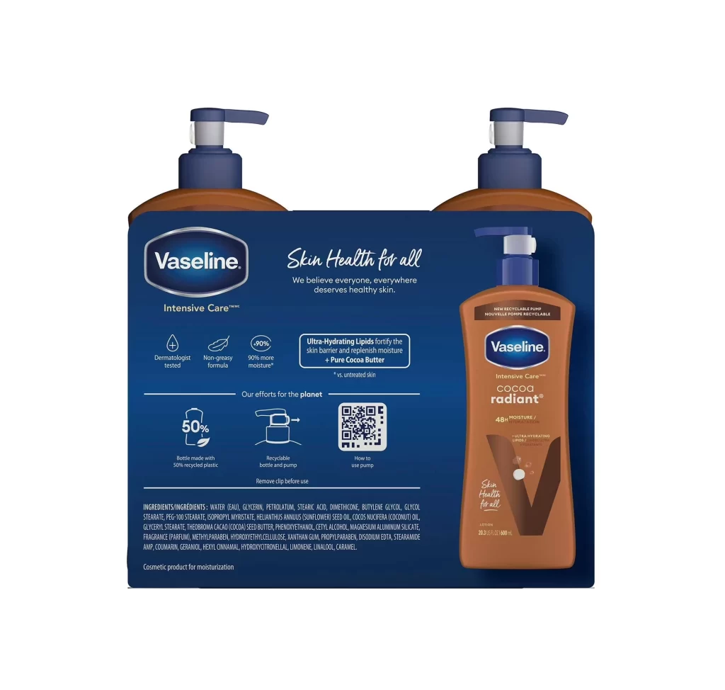
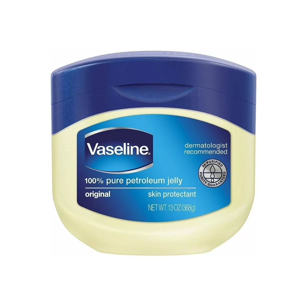
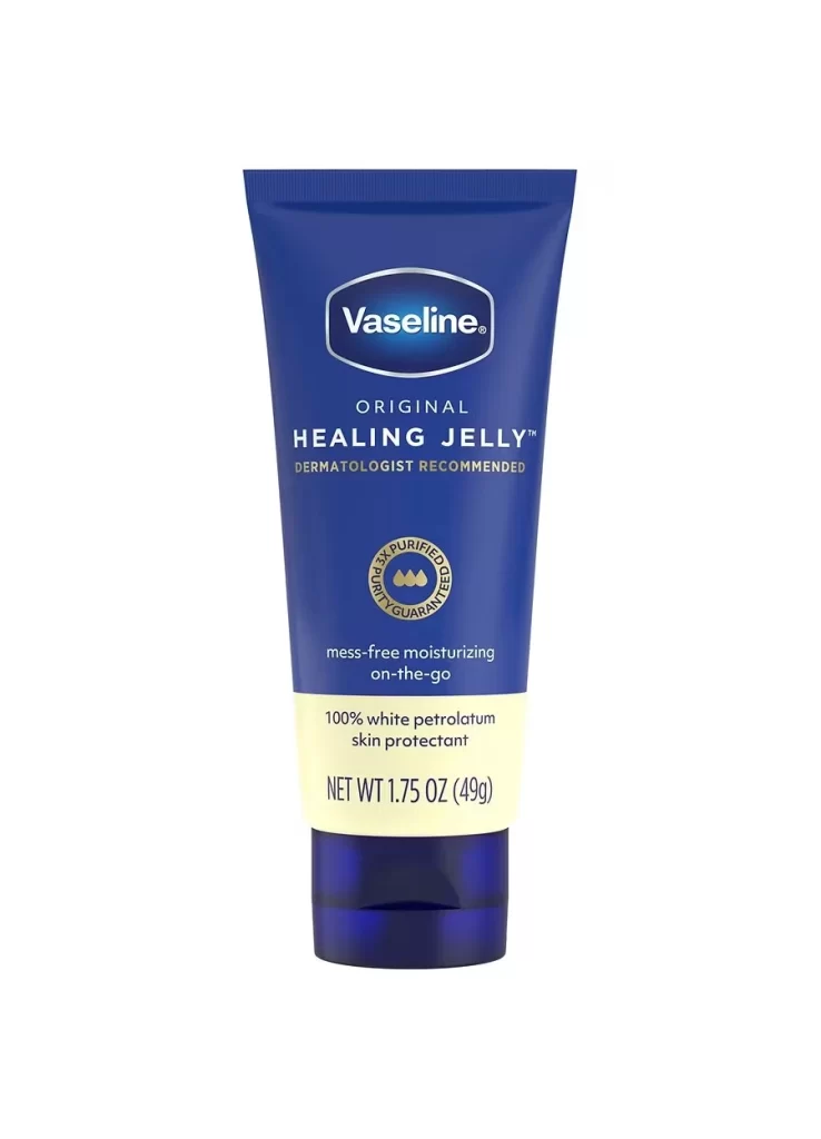
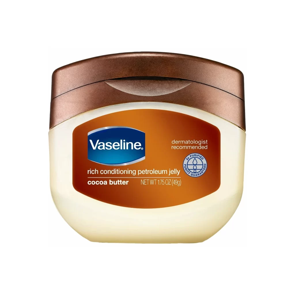
A rounded white plastic jar with a metallic bronze lid displays a prominent orange label featuring the blue Vaseline logo. White text identifies this as 'rich conditioning petroleum jelly' in cocoa butter flavor, with additional claims of dermatologist recommendation and triple purification visible on the right side. The container sits at a slight angle under even studio lighting that highlights its glossy surfaces and curved contours.
What distinguishes this particular variant from standard petroleum jelly packaging lies in its sophisticated color palette and textural interplay. The warm bronze hardware contrasts elegantly with the pale ivory plastic body, while the deep amber label creates a visual bridge between the two elements that suggests richness and indulgence. This specific cocoa butter iteration abandons the traditional blue-and-white Vaseline scheme for an earthier, more luxurious aesthetic that communicates moisturizing intensity through color psychology alone.
Product photographers might study this composition to understand how neutral backgrounds can make metallic and saturated colors pop without distraction. Packaging designers could analyze the hierarchy of information on the label, noting how brand recognition remains paramount while variant-specific details occupy secondary visual space. 3D artists seeking to model cosmetic containers would find the soft specular highlights on the curved lid particularly useful for understanding how light interacts with brushed metal surfaces.