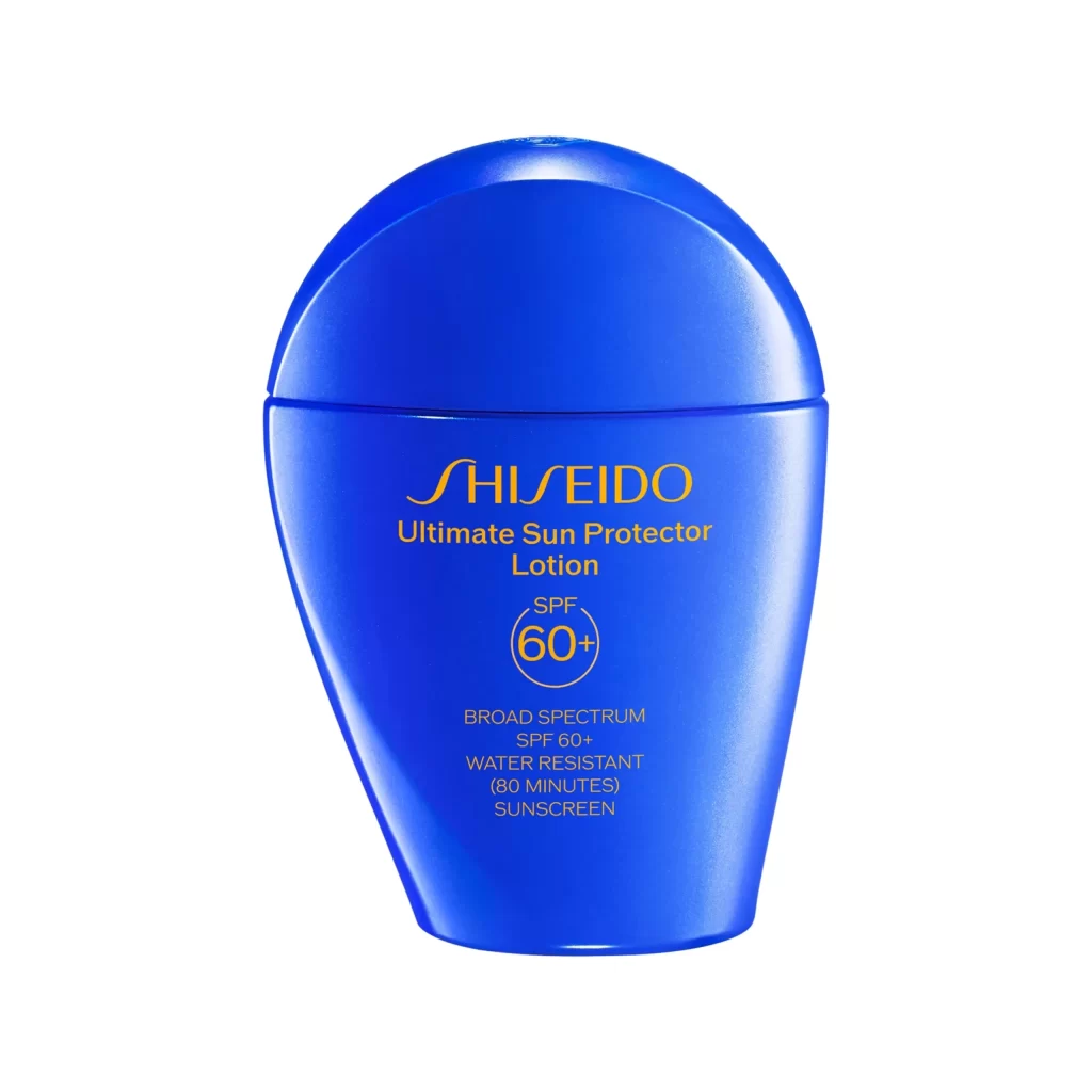
Shiseido Ultimate Sun Protector Lotion Bottle Packaging
Topics
Details
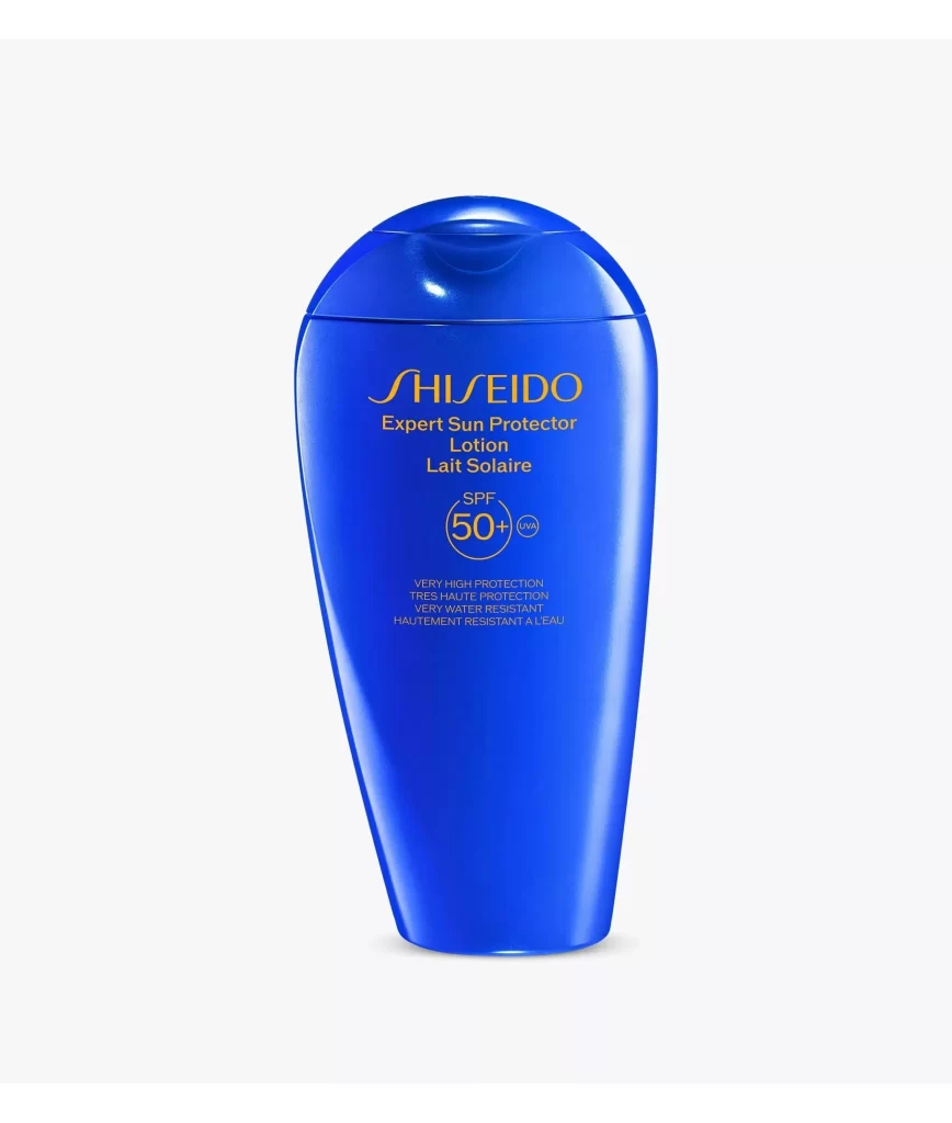
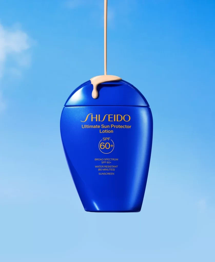
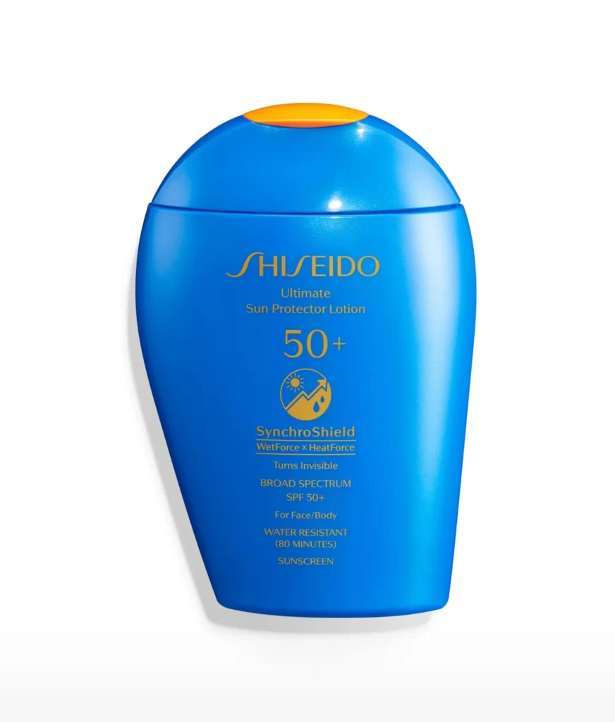
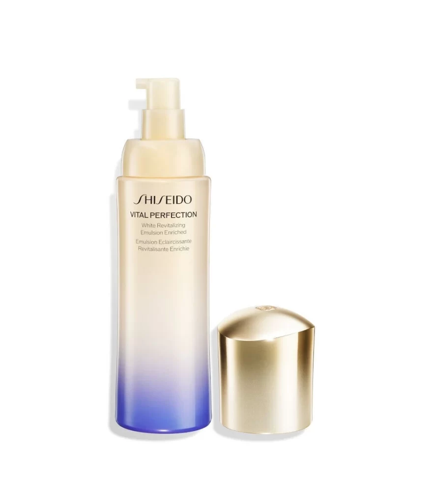
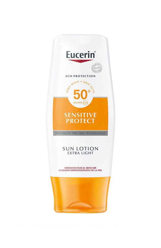
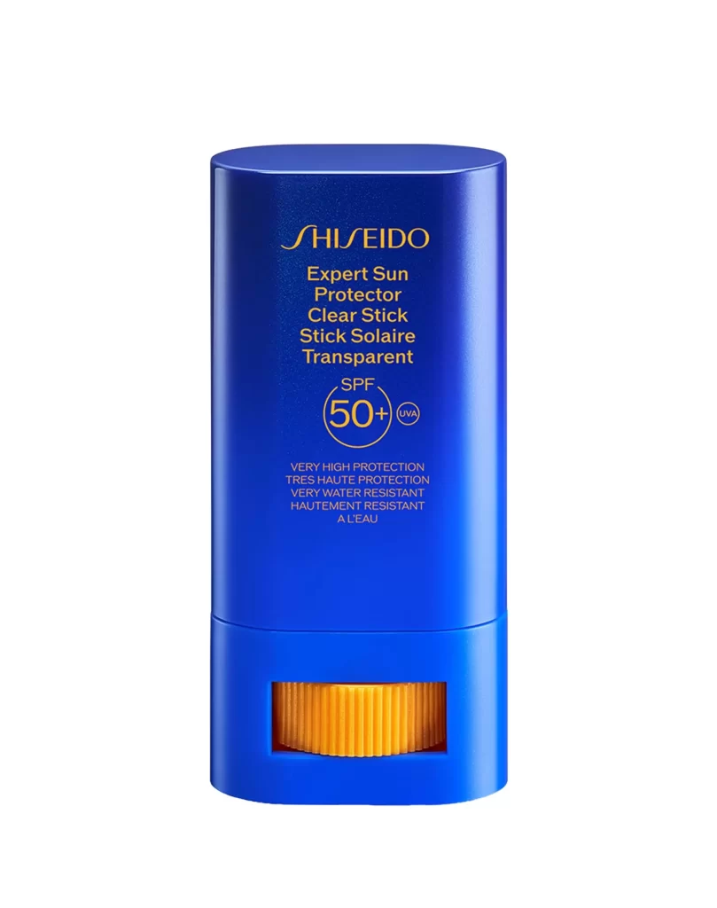
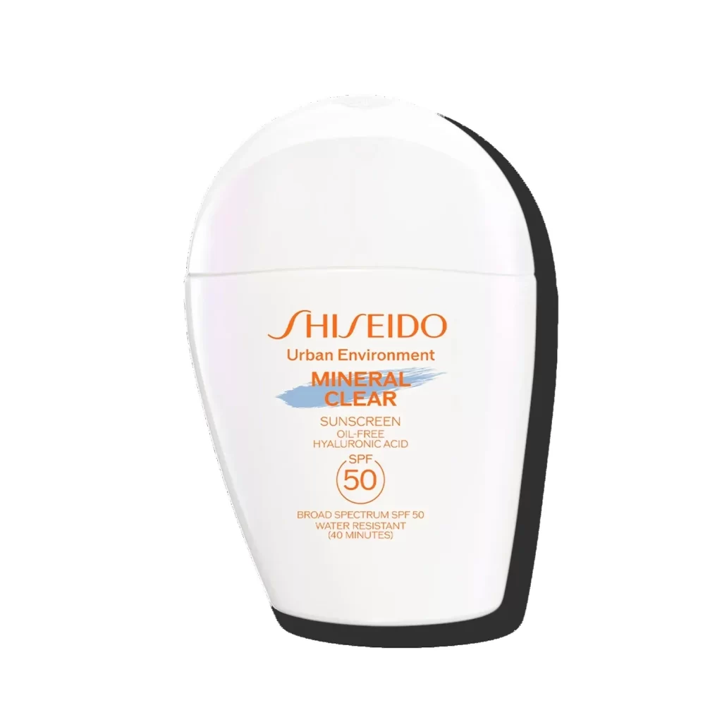
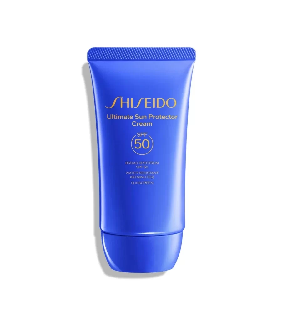
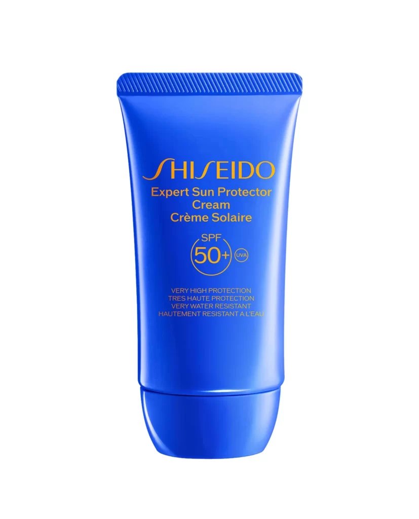
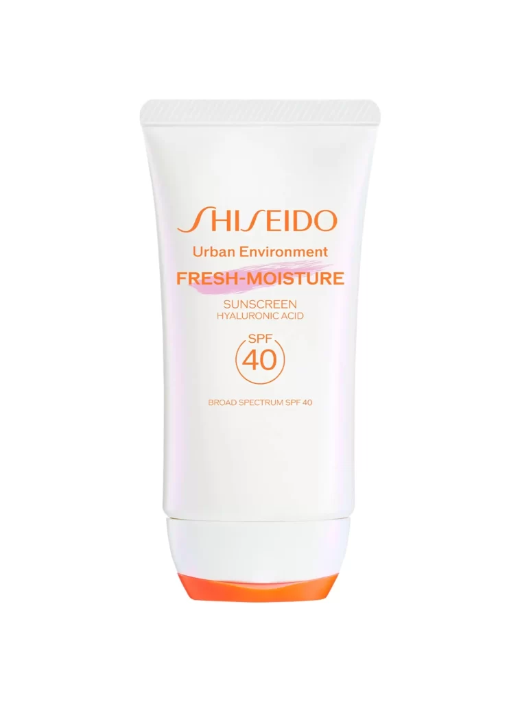
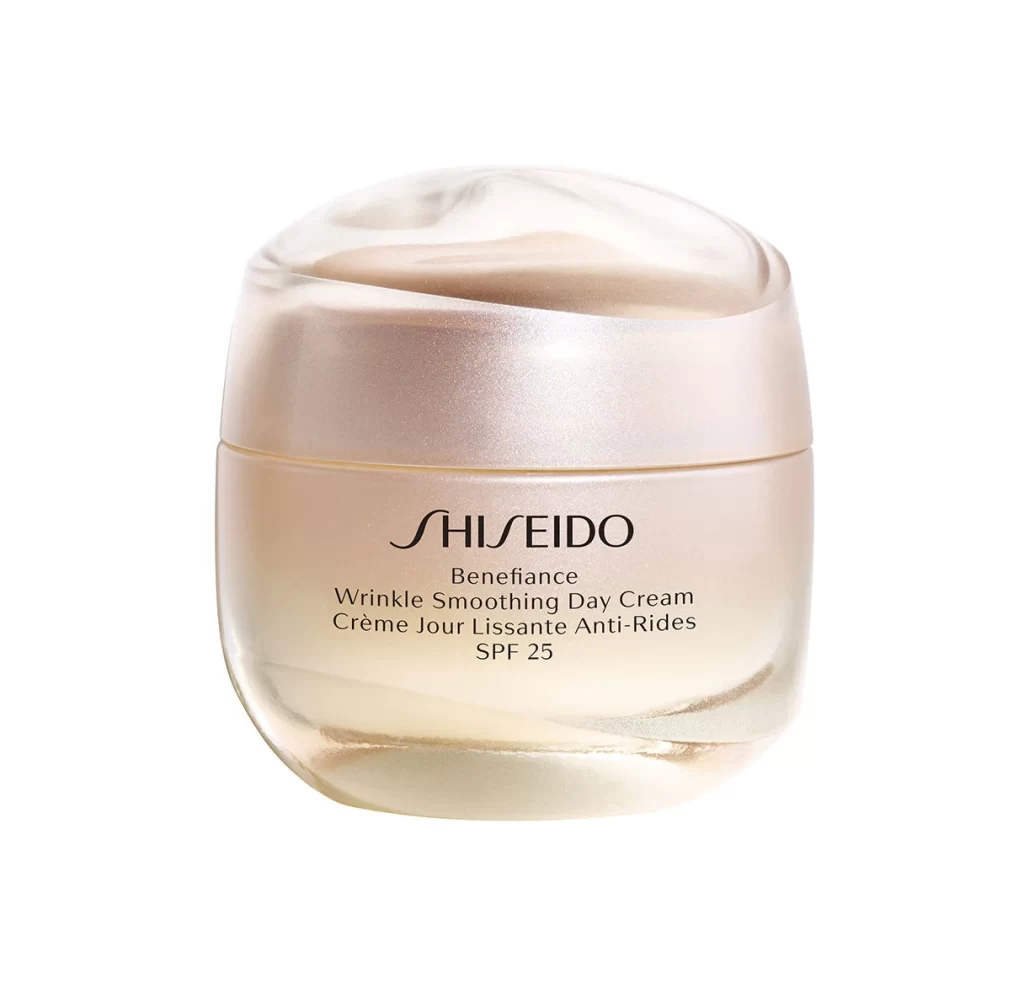
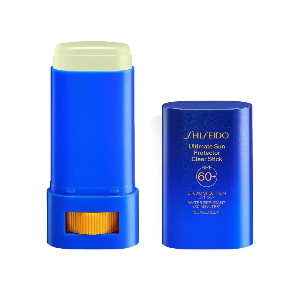
The image displays a single Shiseido Ultimate Sun Protector Lotion bottle positioned upright against a plain white background. The bottle features a prominent royal blue cap and coordinating accents, paired with a gold lower body. Clear typography on the front label identifies the product name and its SPF 60+ broad spectrum water resistant sunscreen formulation. No additional props, text, or distracting elements are present in the frame.
Styling choices emphasize premium skincare aesthetics through a minimalist approach. The stark white backdrop isolates the bottle, allowing the royal blue and gold color scheme to anchor visual focus. This palette communicates clinical efficacy and luxury, while the sans serif typography maintains modern pharmaceutical clarity. The balanced proportions of the cap and body create a stable, ergonomic silhouette that reflects the protective function of the contents.
Graphic designers, packaging engineers, and cosmetic brand managers utilize this type of reference for competitive analysis and mood board development. Professionals studying luxury beauty merchandising or evaluating sunscreen container architecture benefit from examining the color integration and label hierarchy. The isolated presentation also serves digital asset libraries needing clean product cutouts for retail layouts, promotional materials, or editorial design projects focused on skincare.