Shiseido Ultimate Sun Protector Lotion SPF 50 Plus Bottle Packaging
Topics
Details
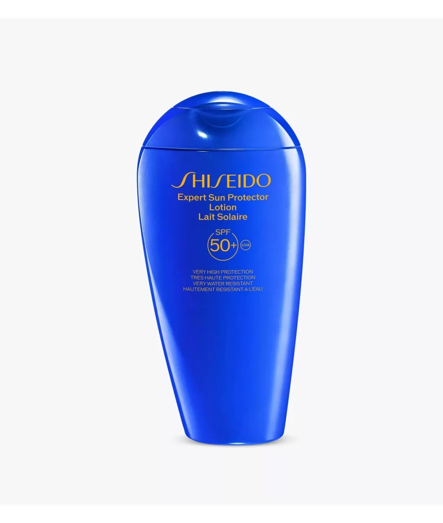
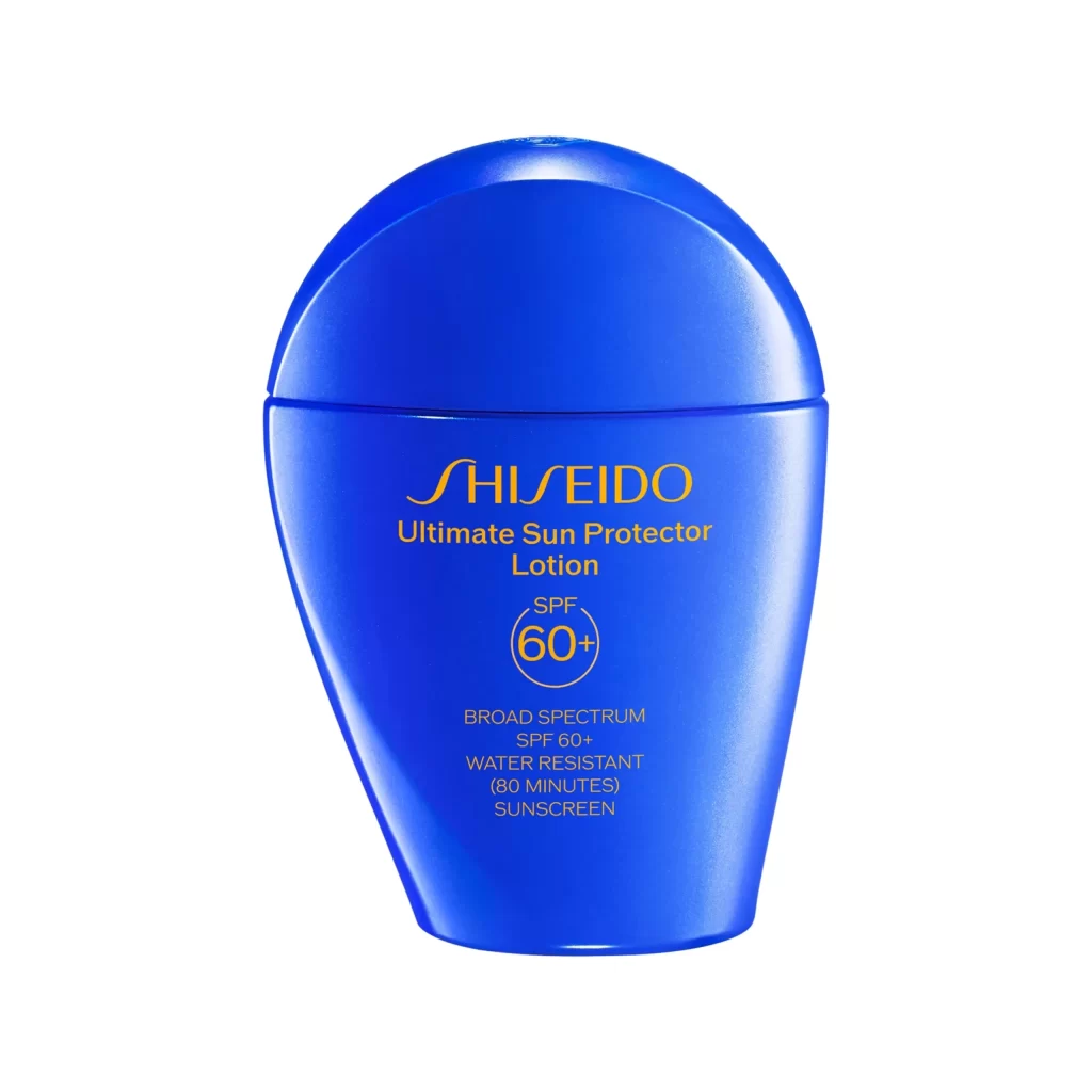
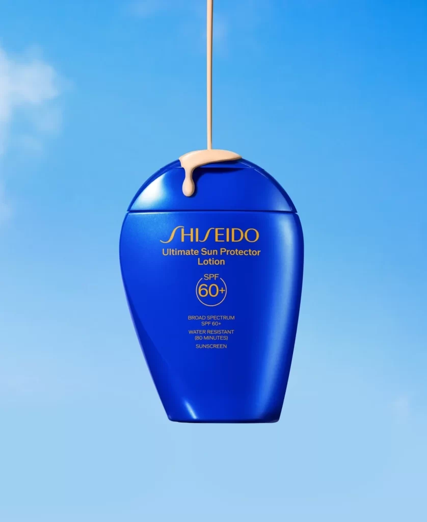
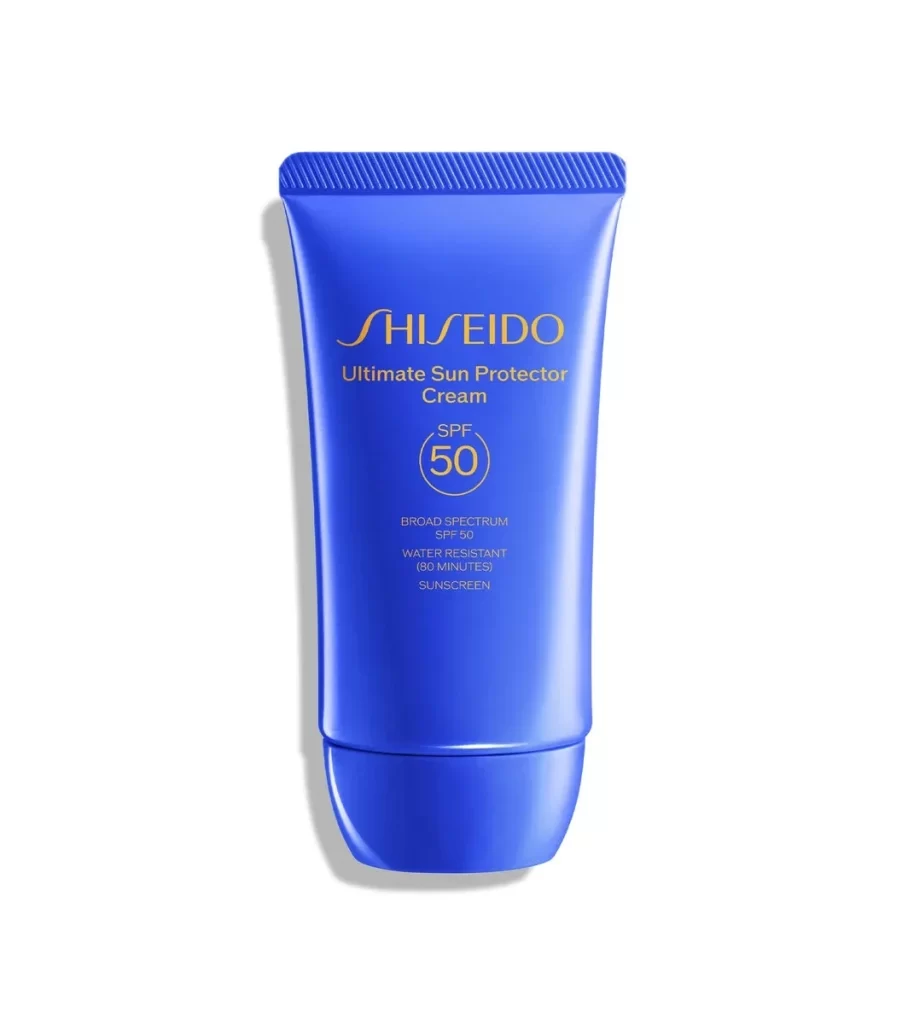
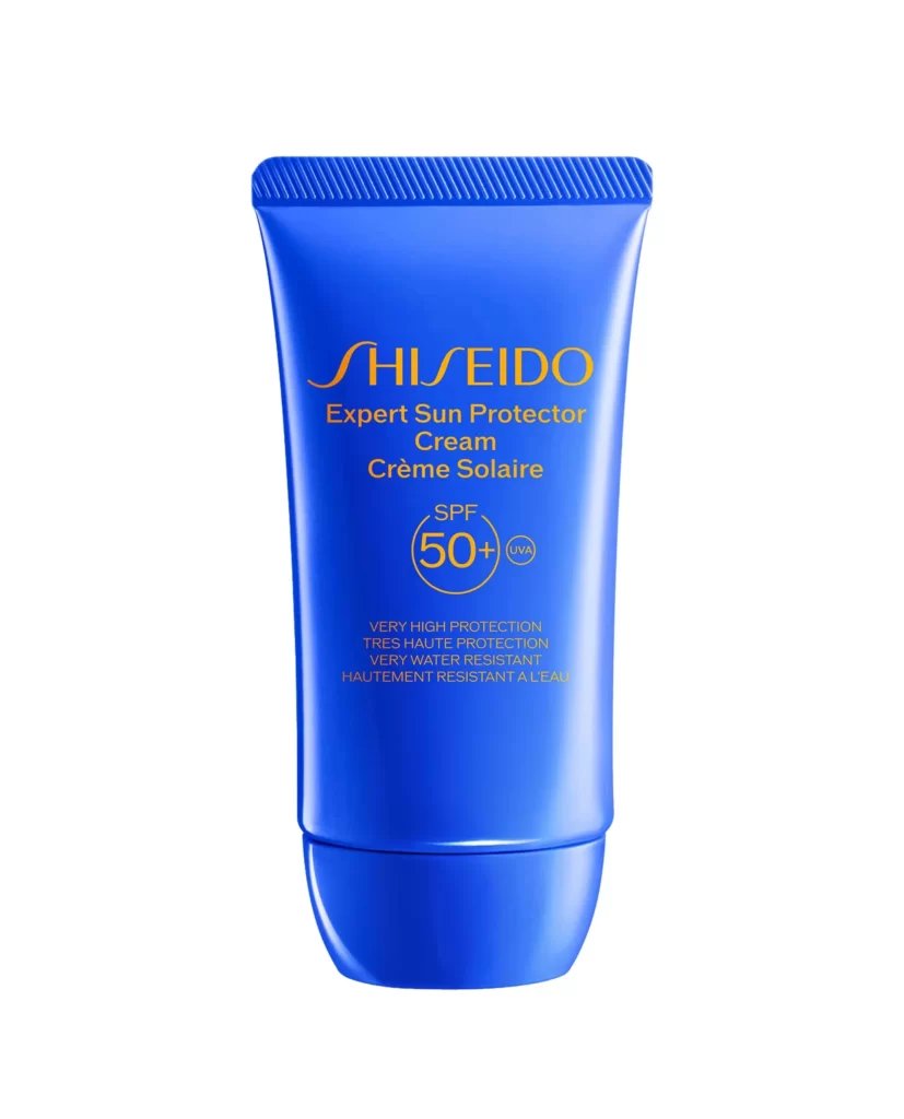
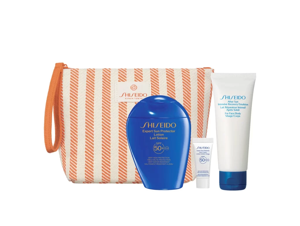
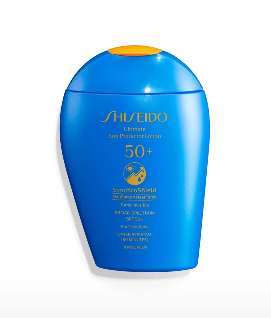
The image displays a single SHISEIDO Ultimate Sun Protector Lotion SPF 50+ bottle centered against a clean white studio background. The vibrant blue container features a contrasting orange flip-cap at the top. A gold band encircles the upper neck, adding a premium accent. Front label text reads SynchroShield WetForce x HeatForce Turns Invisible, clearly presenting the standalone sunscreen product.
Stylistically, the packaging leverages a striking complementary color palette. The deep blue bottle evokes oceanic resilience, while the bright orange cap creates an energetic, functional pop that draws immediate attention to the dispensing mechanism. Gold accents elevate the visual hierarchy, signaling luxury skincare. Minimalist typography and ample negative space on the white background ensure the vibrant container remains the undisputed focal point of the composition.
Graphic designers and packaging strategists utilize this type of reference to study color blocking techniques within cosmetic branding. Art directors developing summer skincare campaigns or luxury beauty visual identities analyze the balance of functional vibrancy and premium detailing. Additionally, industrial designers may reference the flip-cap integration and silhouette for functional bottle prototyping in the personal care sector.