Shiseido Essential Energy Hydrating Day Cream Broad Spectrum SPF 20 Sunscreen Jar Packaging
Topics
Details
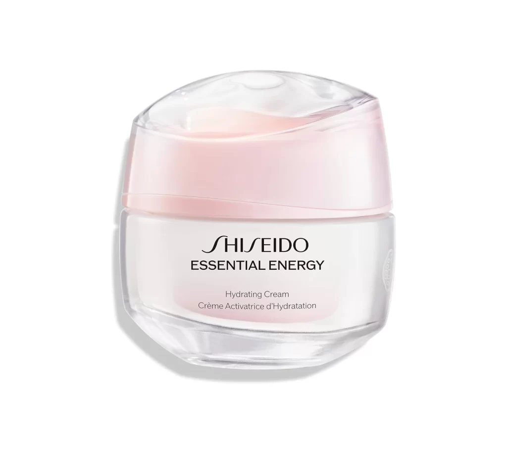
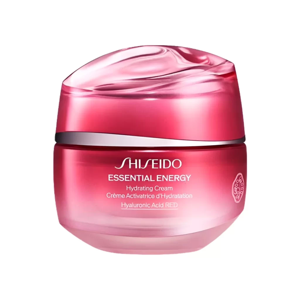
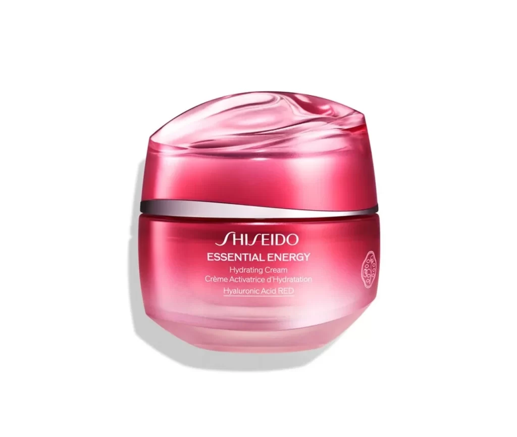
The image displays a single Shiseido Essential Energy Hydrating Day Cream jar against a plain white background. The container features a white base with a translucent pink cap, accented by black text. The packaging clearly identifies the product as a broad spectrum SPF 20 sunscreen. This clean presentation highlights the jar's minimalist form and distinct color contrast without any additional props or text.
The design utilizes a restrained color palette of clear, pink, white, and black to convey both clinical efficacy and feminine softness. The translucent pink cap introduces a delicate, luminous quality that contrasts sharply with the opaque white base. Bold black typography provides a grounded, authoritative anchor, ensuring the SPF 20 messaging remains highly legible. This styling choice emphasizes modern luxury through simple geometric forms.
Graphic designers and packaging analysts will find this reference useful for studying premium cosmetic branding strategies. The image serves as a strong visual example for projects focused on minimalist skincare container design, color theory in beauty packaging, and effective typographic hierarchy. It is particularly valuable for creatives developing mood boards centered on elegant daytime moisturizers that balance protective sunscreen attributes with gentle aesthetics.