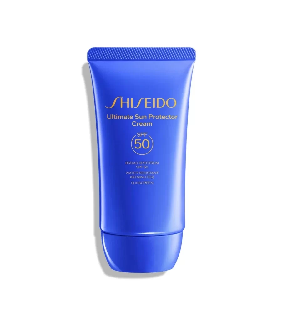
Shiseido Ultimate Sun Protector Lotion Bottle Advertisement
Topics
Details
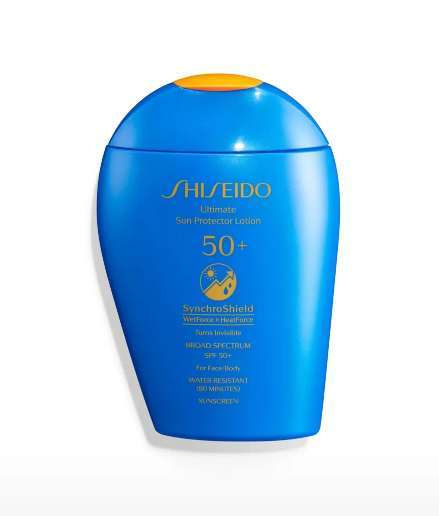
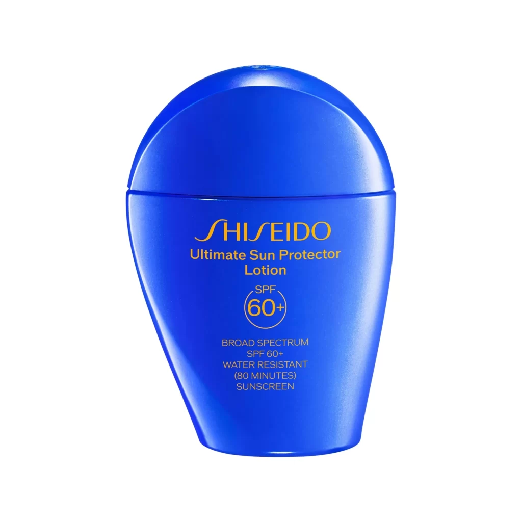
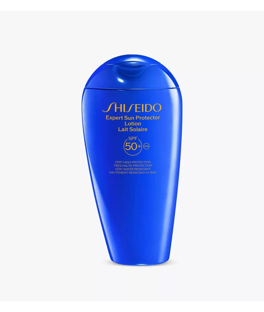
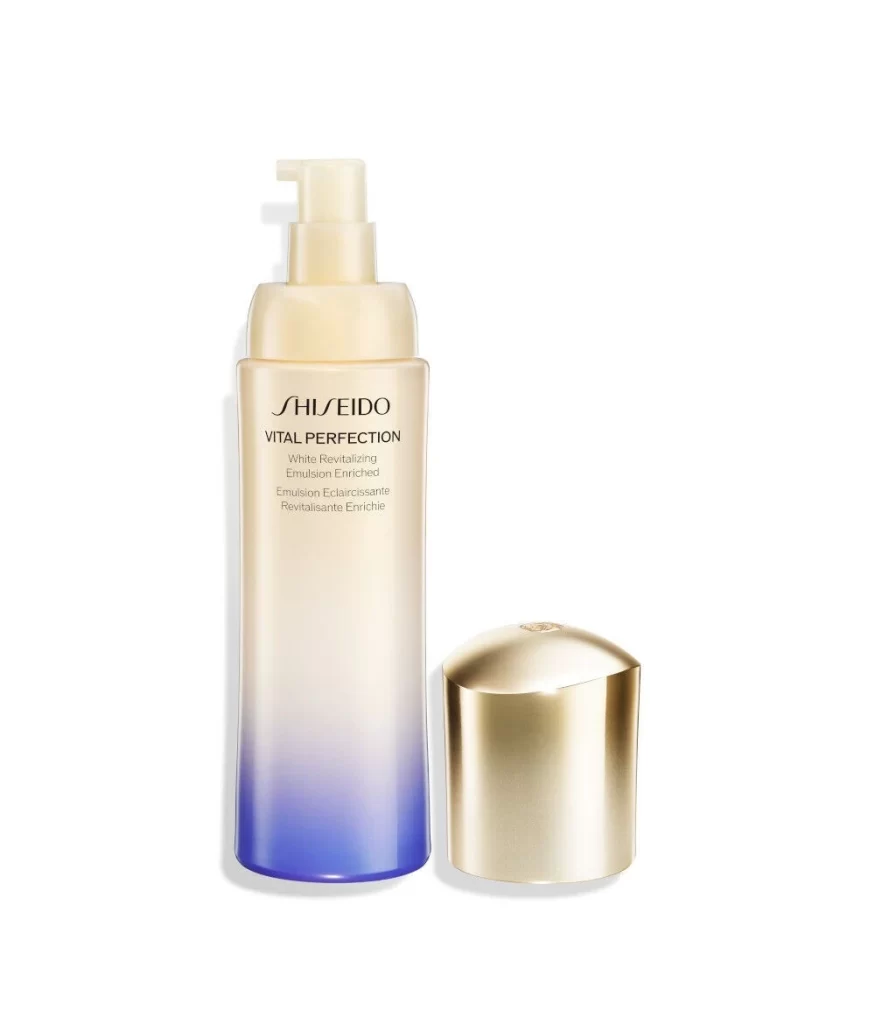
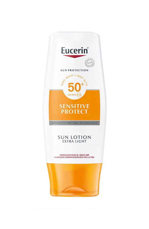
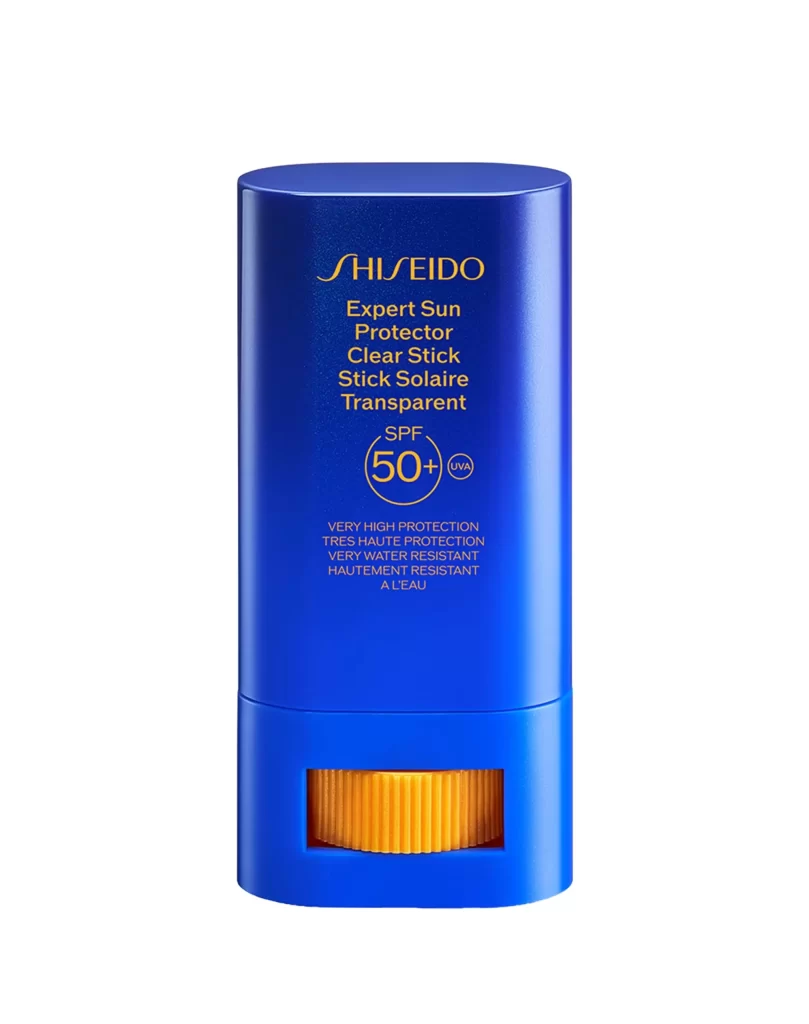
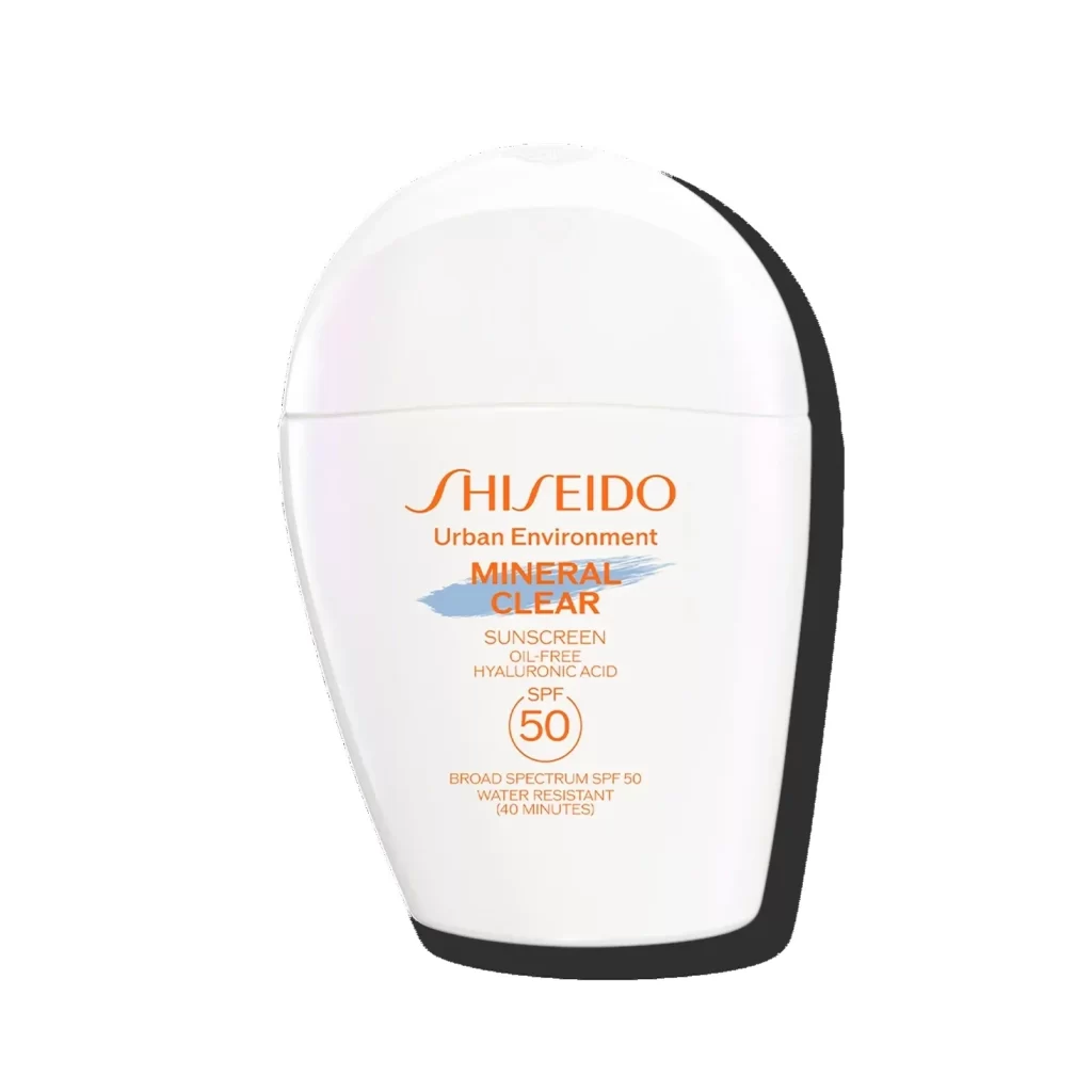
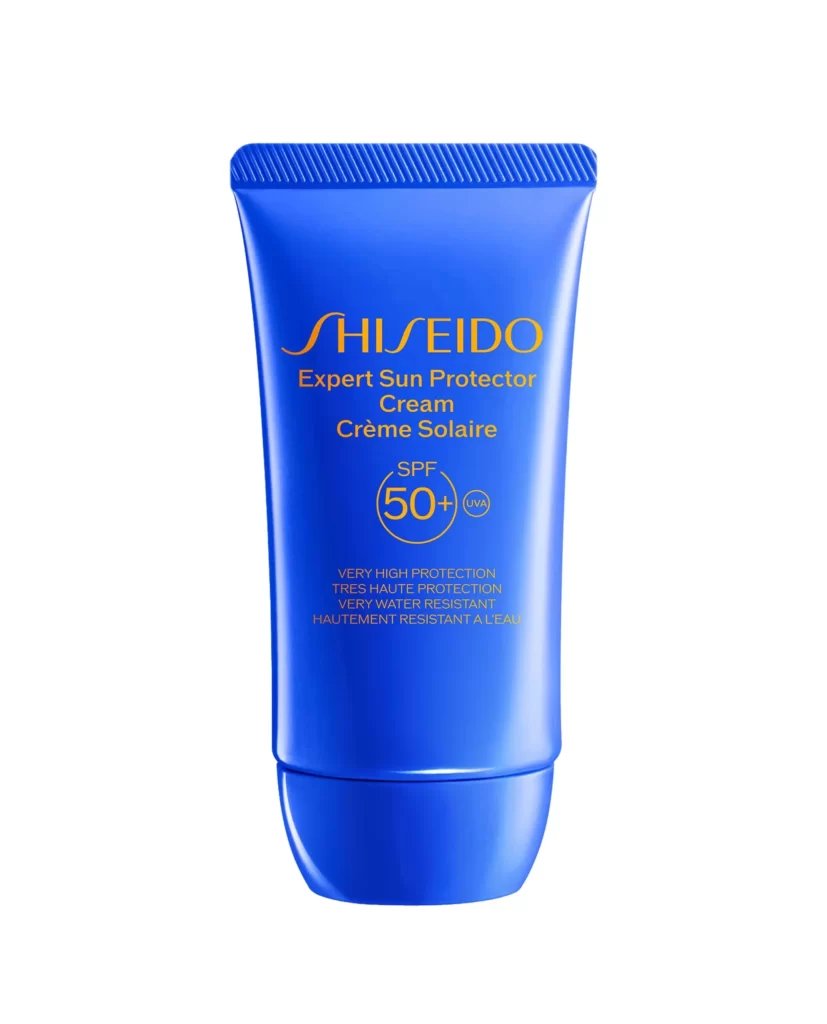
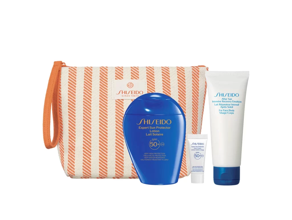
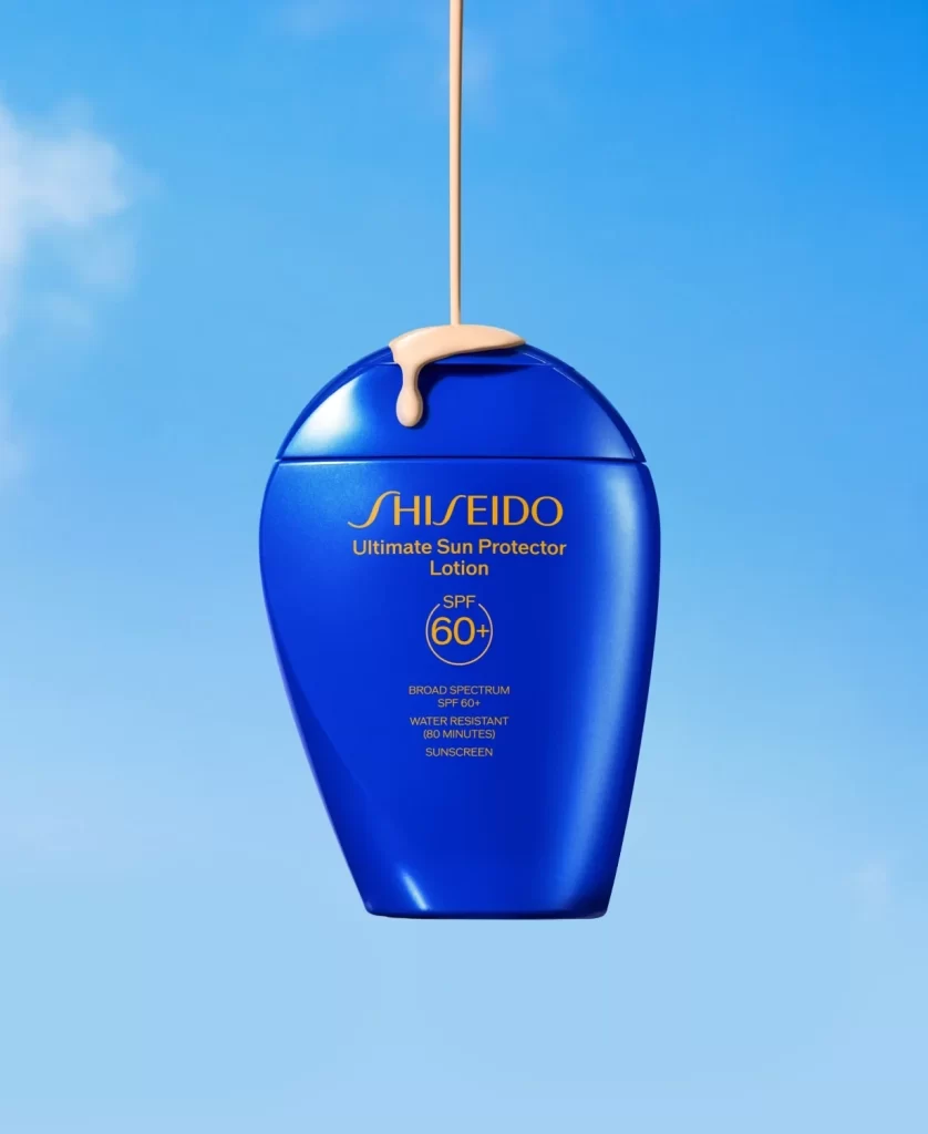
The advertisement features a single Shiseido Ultimate Sun Protector Lotion bottle positioned against a styled blue sky gradient. The container prominently displays the brand name alongside the product line. Royal blue, gold, and beige tones define the visual palette. Notably, a dollop of white lotion is visible dripping from the cap, emphasizing the creamy texture of the sunscreen formula.
Styling choices leverage a serene sky gradient to instantly communicate solar protection and outdoor vitality. The royal blue label establishes brand authority, while gold accents suggest premium quality. Beige elements ground the composition with warmth. The deliberate lotion drip from the cap acts as a tactile focal point, transforming a standard bottle shot into a dynamic, sensory experience.
Graphic designers and art directors reference this visual when developing cosmetic packaging campaigns or skincare advertisements. It serves as a study for integrating tactile product cues into luxury branding. Creative teams analyzing color theory in beauty marketing also utilize this asset to understand how sky motifs and premium palettes communicate efficacy and elegance.