PROYA Skincare Packaging Lotion Emulsion Firming
DownloadTopics
Details
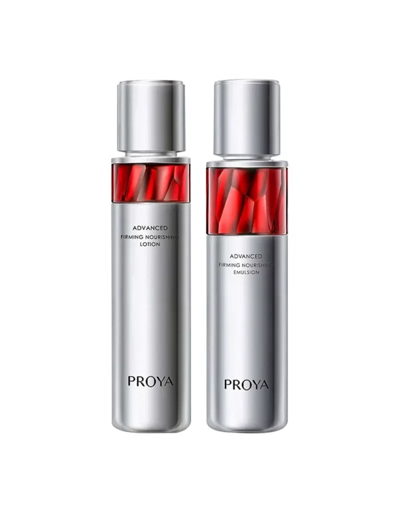
Cylindrical silver vessels with brushed metallic finishes stand in parallel formation, each capped by a matching cylindrical lid. A translucent crimson band wraps the upper shoulder of both containers, revealing faceted geometric patterns that suggest crystalline or liquid depth beneath the surface. Black sans-serif typography identifies the left unit as 'ADVANCED FIRMING NOURISHING LOTION' and its counterpart as 'ADVANCED FIRMING NOURISHING EMULSION,' while the brand name 'PROYA' anchors the lower third of each bottle against a neutral white field.
The visual tension between cool industrial silver and warm organic red creates a sophisticated dual-material aesthetic that signals premium anti-aging positioning. That ruby-hued window serves as both a structural accent and a conceptual metaphor for cellular vitality, breaking the monochrome metallicity without compromising the clinical precision of the overall form language. Symmetrical pairing reinforces product-line cohesion while allowing subtle typographic differentiation to distinguish formulation types.
Cosmetic packaging designers studying luxury tier-straddling aesthetics will find this composition particularly instructive for balancing mass-market accessibility with prestige cues. Brand identity teams developing skincare sub-lines can analyze how color-blocking at the shoulder creates immediate shelf recognition without requiring full-body hue changes. Anyone needing production-ready assets for mood board development can access the full-resolution file at no cost directly from the resource library.