Packaging Soap Body Lotion Coconut Vanilla
DownloadTopics
Details
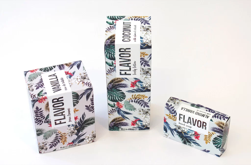
Three rectangular cartons of varying heights stand in a loose triangular formation, each wrapped in a dense botanical print of deep emerald fronds, crimson blossoms, and pale ivory petals. Bold black sans-serif typography dominates the white central labels, with 'FLAVOR' running vertically alongside specific scent names like 'VANILLA,' 'COCONUT,' and 'ALMOND VANILLA.' Soft studio lighting casts gentle shadows beneath the boxes on a clean, light-toned surface, while the camera maintains a straight-on perspective that emphasizes the geometric precision of the packaging.
The visual tension between the wild, organic leaf patterns and the rigid typographic grid creates a compelling aesthetic that feels both tropical and modern. This particular arrangement demonstrates how scale variation across product lines can maintain brand cohesion while offering visual hierarchy on a shelf. Designers seeking to study this composition can access the full-resolution file at no cost directly from the resource page.
Art directors developing cosmetic branding for indie beauty startups will find these proportions and color palettes particularly useful for mood boards. Packaging engineers might reference the label placement and structural dimensions when drafting dielines for similar rectangular containers. Students learning about visual merchandising could also analyze how the staggered heights guide the viewer's eye through the group.