La Tua Ancora Calendar Label
Topics
Details
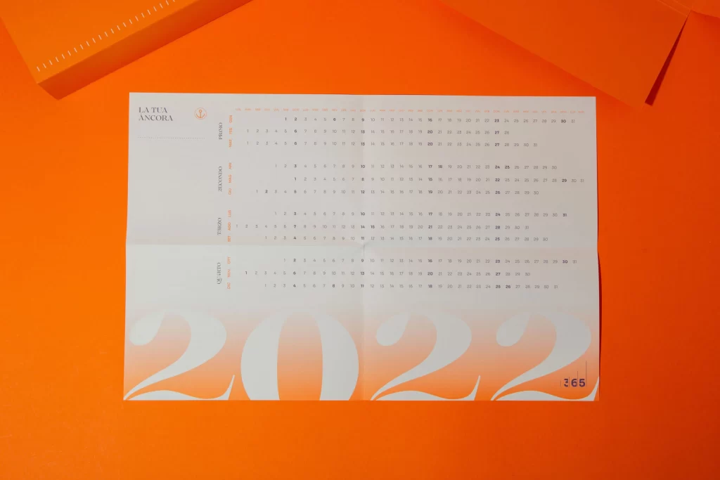
Set against a vibrant, saturated orange surface that fills the entire frame, a single sheet of white paper rests at a slight angle, revealing a minimalist 2022 calendar layout. The composition features the brand name 'LA TUA ANCORA' in a clean serif font at the top left, positioned above four distinct monthly grids labeled in Italian: Maggio, Giugno, Luglio, and Agosto. Dominating the lower half of the page are oversized, semi-transparent numerals spelling out '2022' in a soft cream tone, while a small purple '365' badge anchors the bottom right corner.
Visual interest is generated through the sophisticated interplay between the rigid typographic data and the fluid, oversized background graphics that bleed across the fold. The choice of a stark white substrate against the high-energy orange backdrop creates a bold chromatic contrast that emphasizes the calendar's structural clarity. Furthermore, the integration of Italian nomenclature alongside the subtle watermark-style year designation lends the piece an elegant, editorial quality that transcends standard utilitarian scheduling tools.
Art directors seeking to master the balance between functional information design and expressive branding will find this arrangement particularly instructive for annual report layouts. Print production specialists can analyze the precise registration required to align delicate grid lines with large-scale graphic elements without losing legibility. Additionally, color theorists might utilize this specific palette interaction to study how complementary hues affect the perception of whitespace and hierarchy in physical collateral.