Brush Stroke Black White
Topics
Details
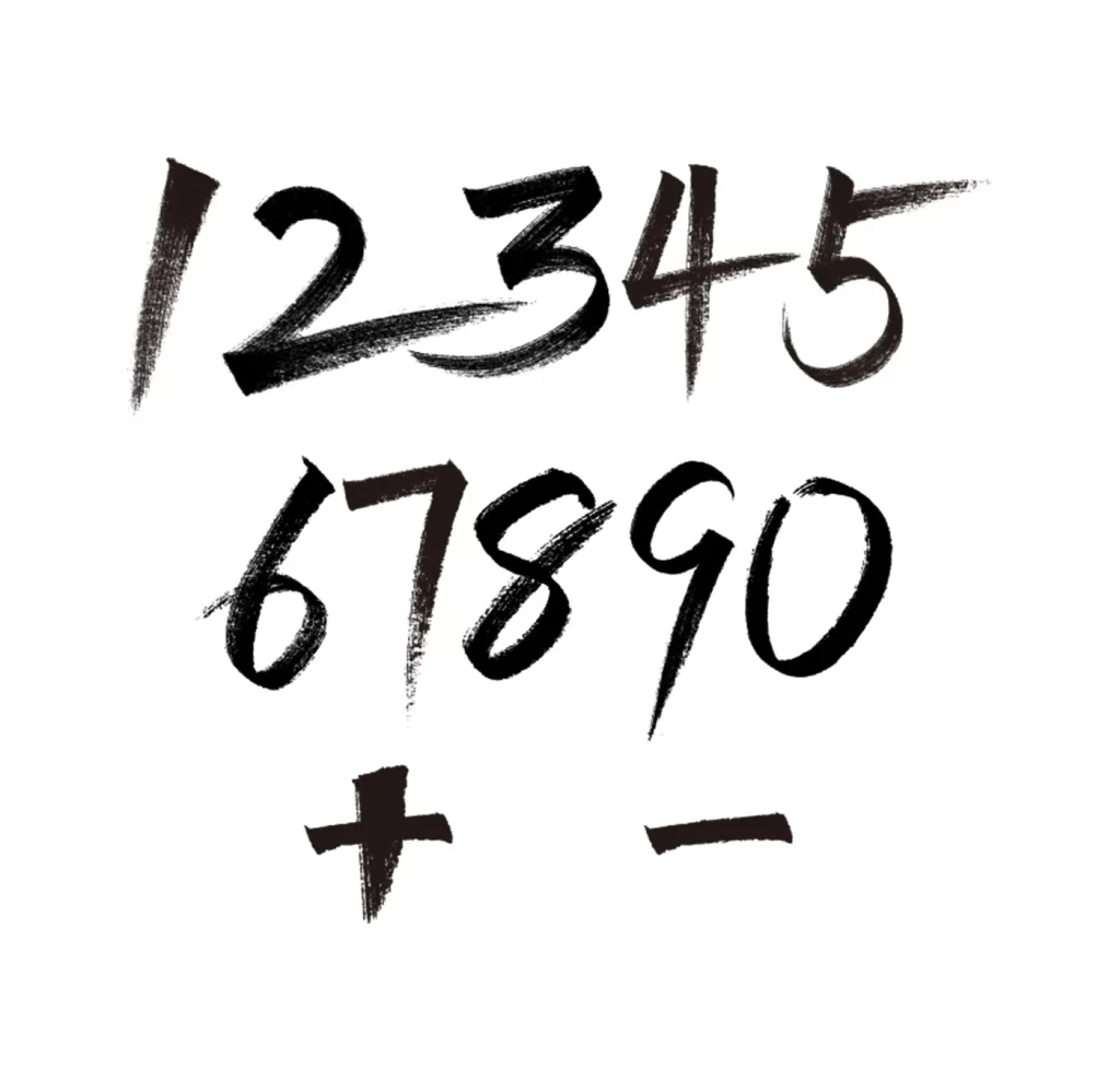
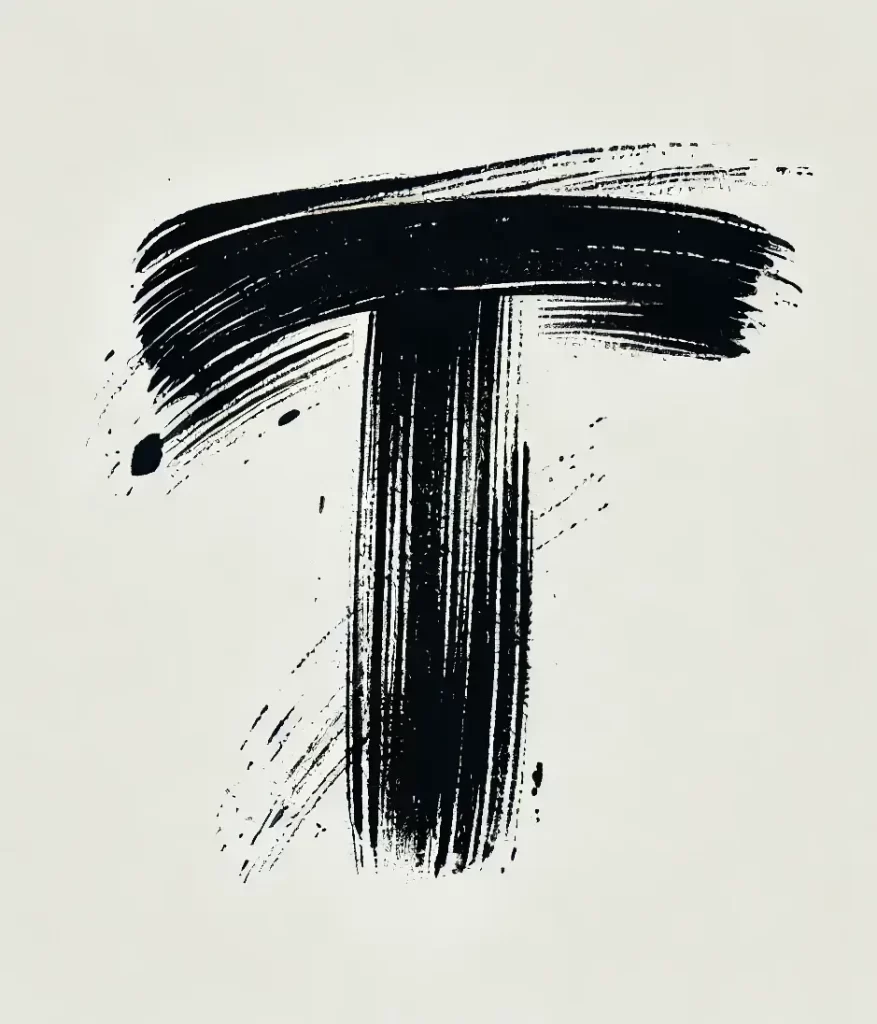
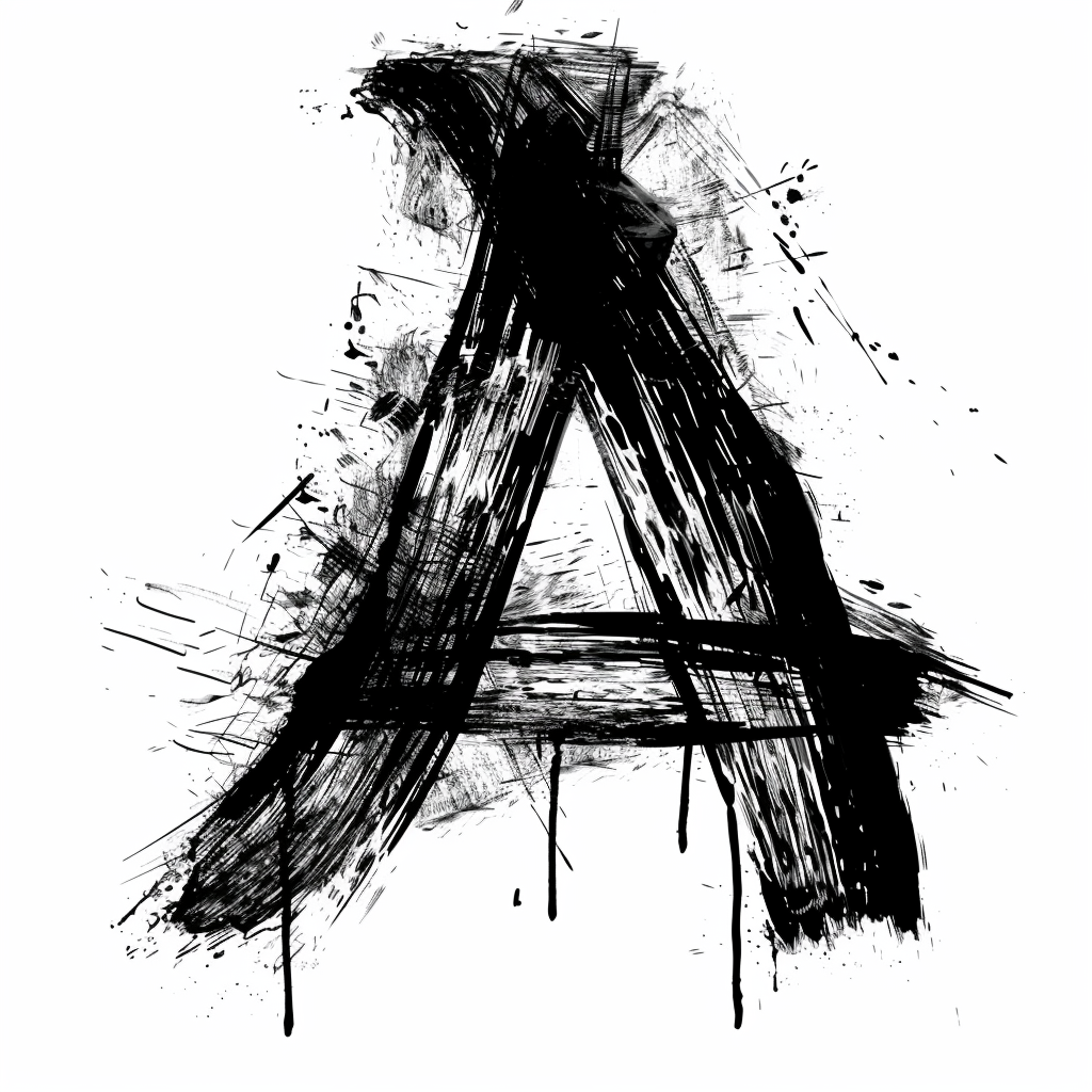
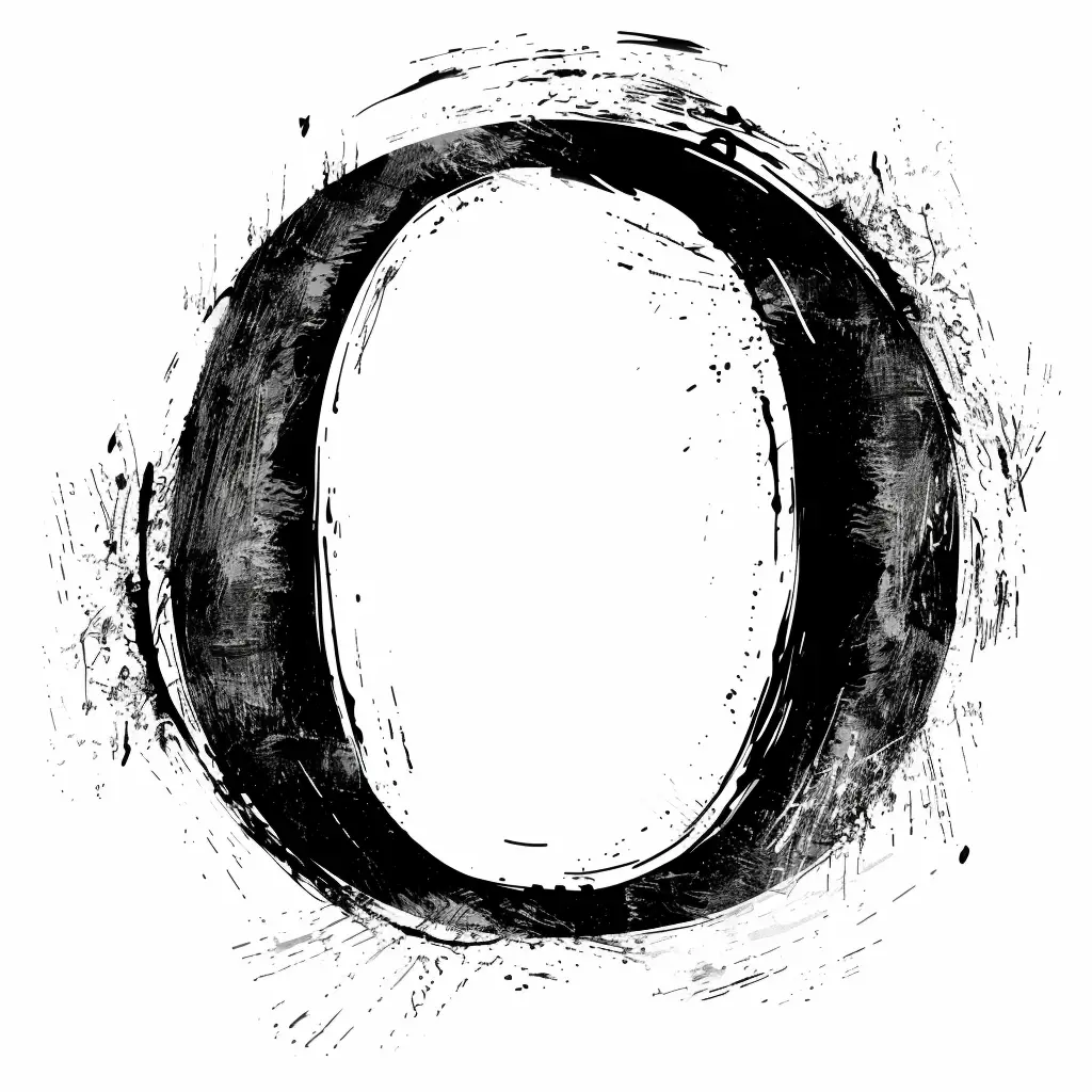
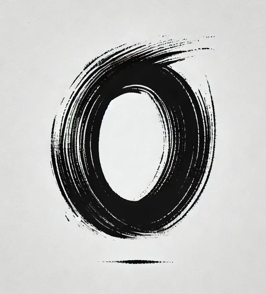
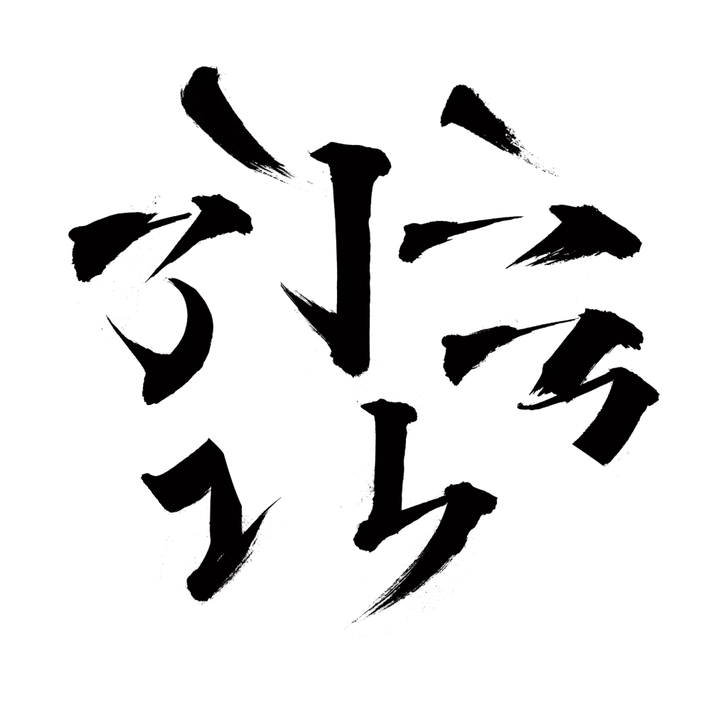
Thick black ink strokes form Japanese katakana characters across a bright white surface, with each letter showing the textured edges and varying pressure of a traditional brush. The composition arranges six distinct symbols in a loose, slightly tilted cluster, where some strokes taper to fine points while others end with blunt, saturated marks. A faint, dry-brush texture appears around certain character edges, suggesting the natural absorption of liquid into paper fibers.
What distinguishes this particular calligraphy is its raw, unrefined energy—each stroke carries visible speed and confidence, creating organic shapes that feel handmade rather than digitally perfected. The contrast between the deep black pigment and the surrounding white space emphasizes the physical gesture behind every mark, making the text feel alive with motion. Subtle variations in line weight reveal how the brush was held and moved, offering a study in authentic hand-lettering technique.
Typography enthusiasts might examine these forms to understand brush dynamics for their own lettering projects, while brand designers could reference the organic irregularities when crafting logos that need a human touch. Motion graphics artists could trace the stroke paths to animate text that mimics real ink behavior, and printmakers might use the texture patterns as inspiration for screen-printing or woodblock techniques. Anyone working on editorial layouts featuring East Asian content would find this useful for establishing authentic visual tone.