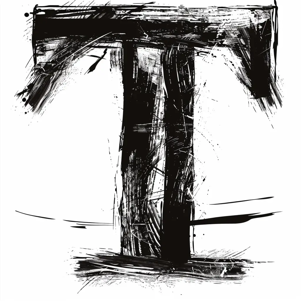
Brush Stroke Letter T
Topics
Details
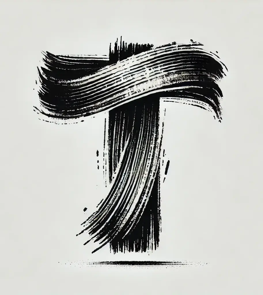
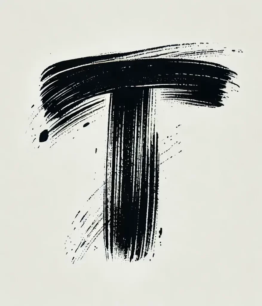
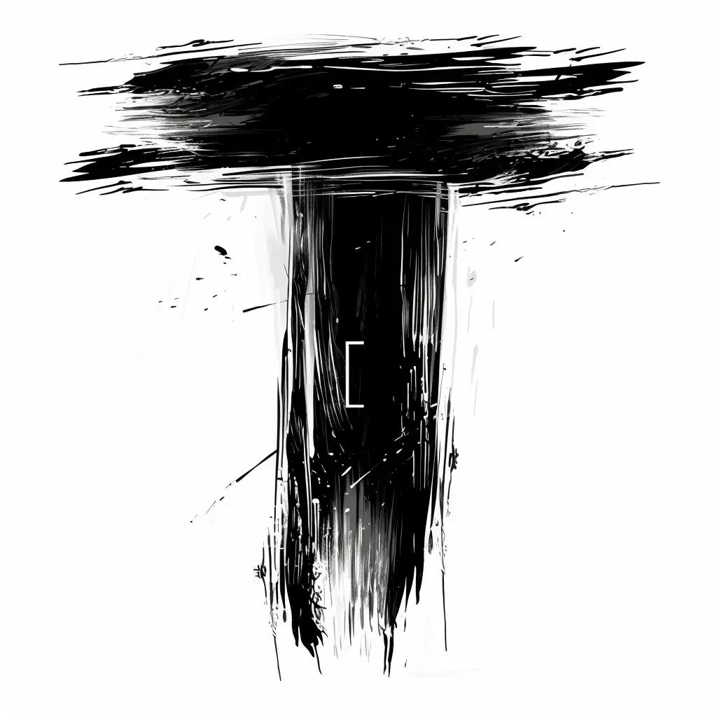
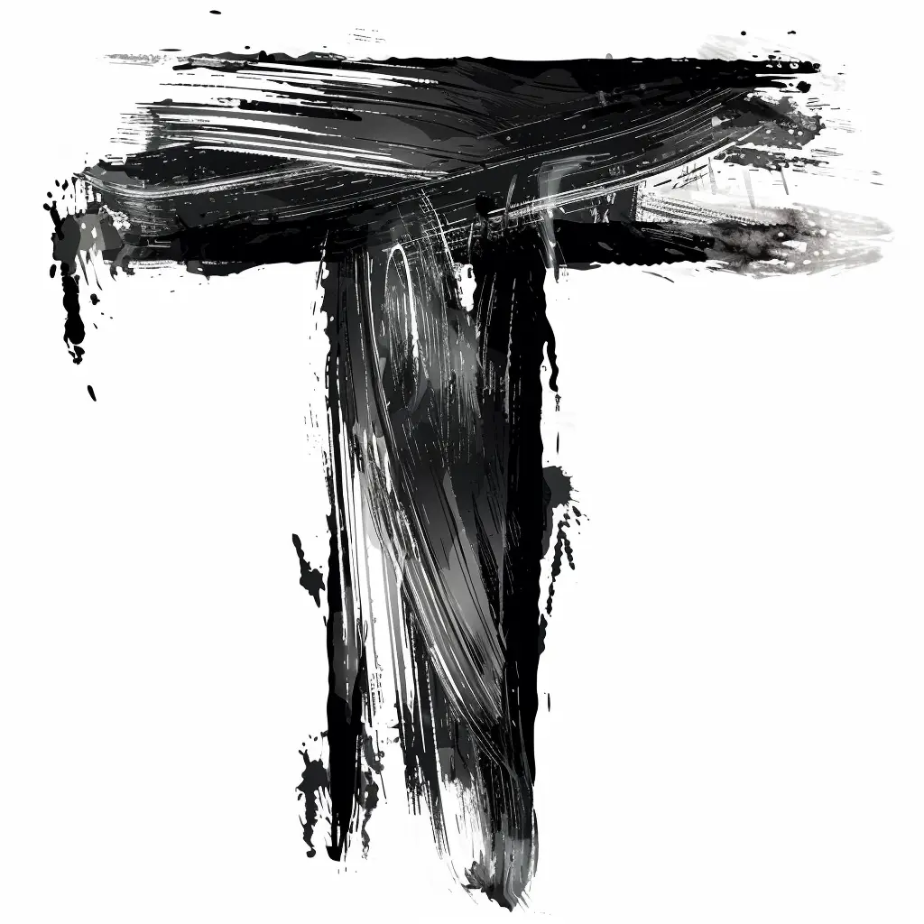
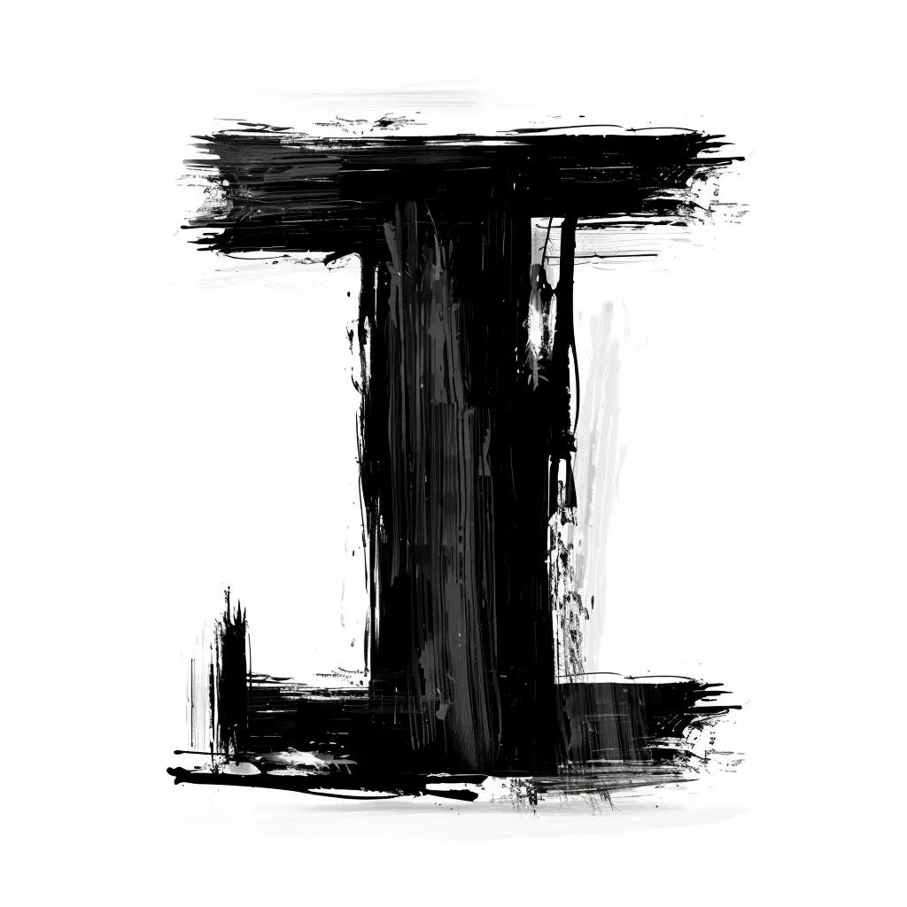
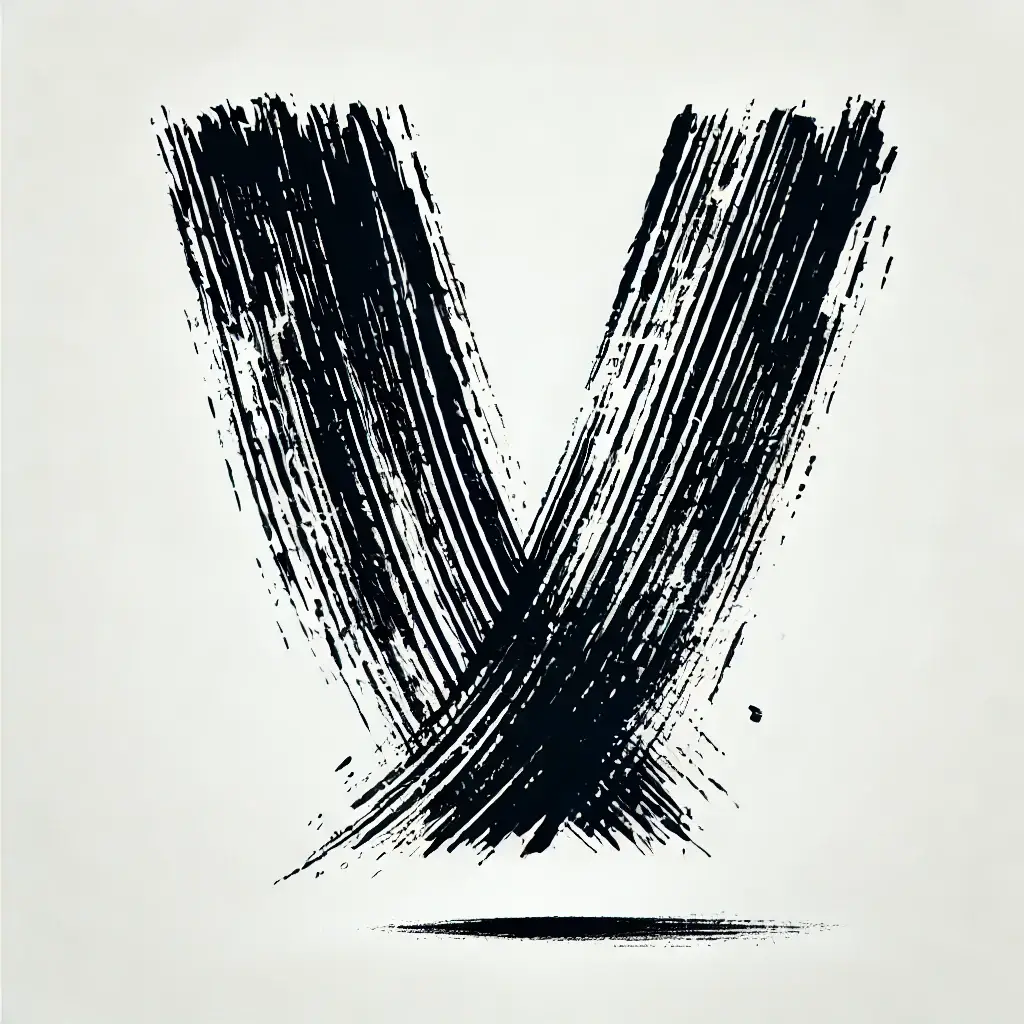
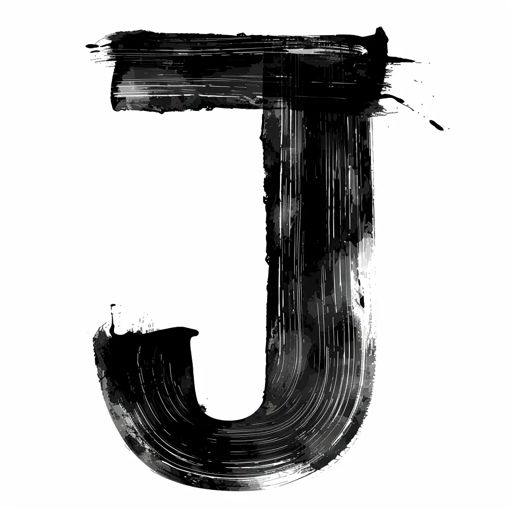
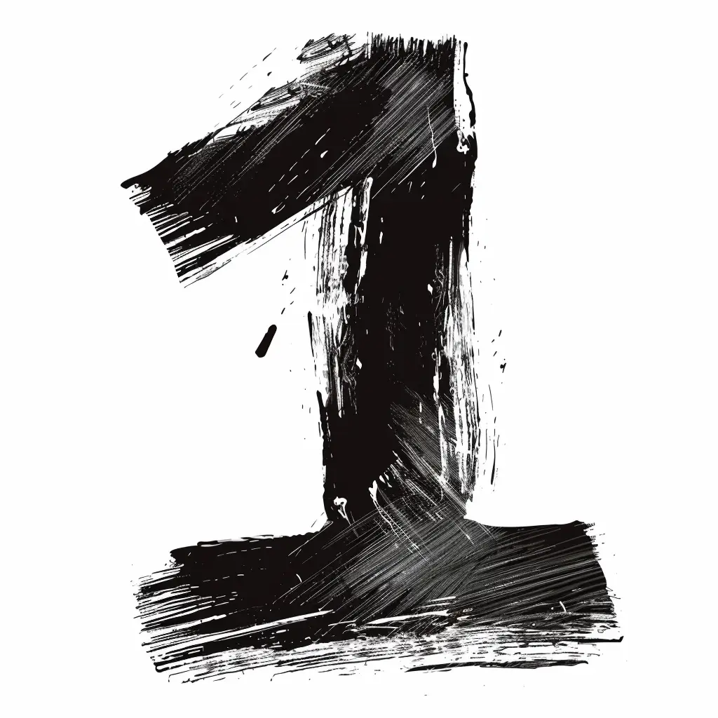
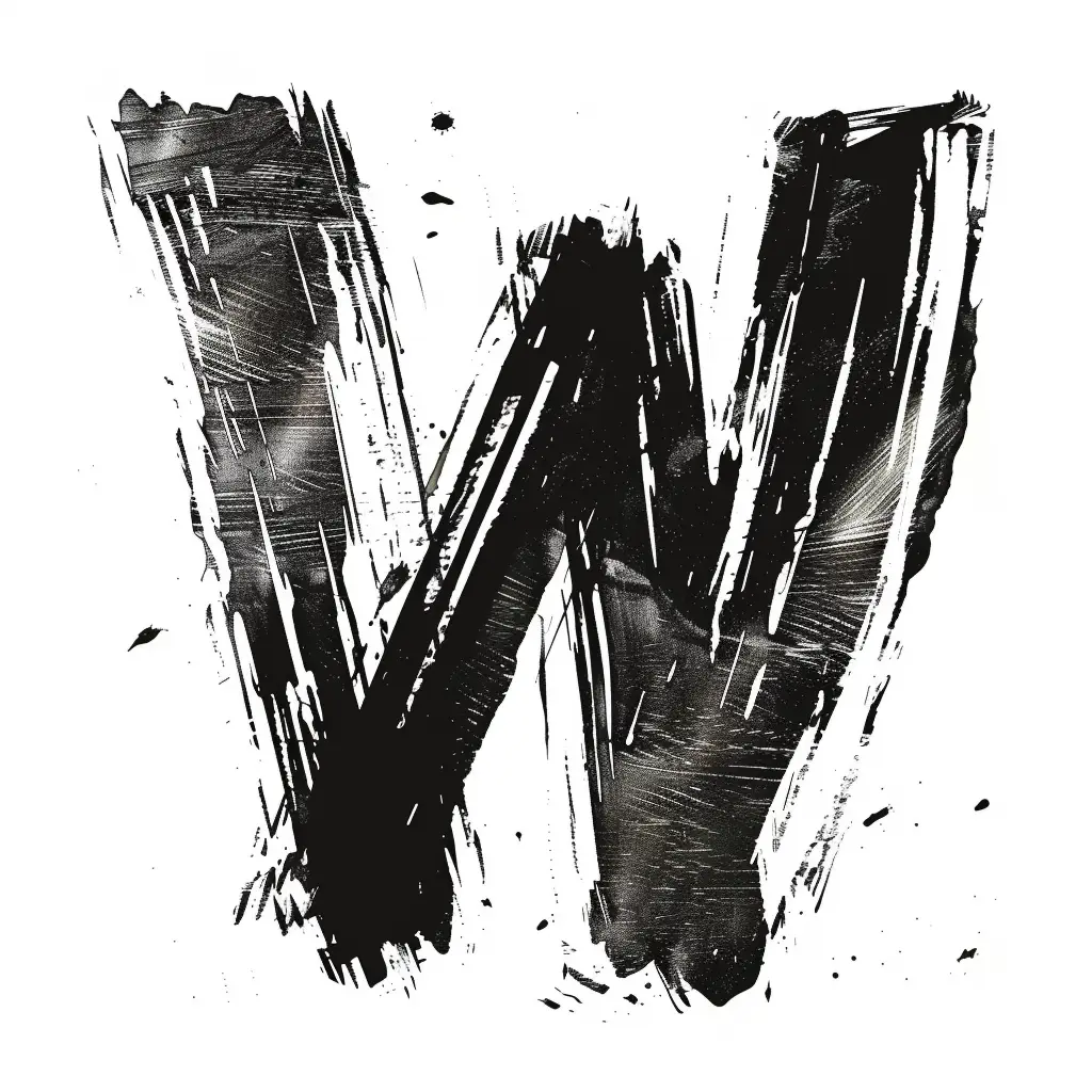
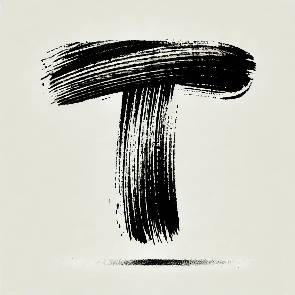
Thick black paint forms a bold capital letter T, its surface marked by visible bristle striations that reveal the texture of the brush. The horizontal bar curves slightly upward at the right edge, while the vertical stem tapers into ragged, uneven strokes. A soft drop shadow anchors the form beneath on a pale cream background, suggesting studio lighting from directly above.
What distinguishes this glyph is its raw, gestural quality—the individual brush hairs create parallel lines of varying density, giving the letter an organic, handmade character absent in digital typefaces. The slight asymmetry in the crossbar’s thickness and the feathered edges of the vertical stroke introduce subtle imperfections that convey movement and physical pressure. Such textural detail transforms a simple alphabetic shape into a study of material interaction between tool and medium.
Typography researchers might analyze this specimen to understand how brush dynamics affect letterform construction, particularly in sign-painting or calligraphic traditions. Brand identity developers could reference its rugged aesthetic when designing logos for artisanal goods or streetwear labels requiring an unpolished, tactile feel. Motion graphics artists might trace these stroke patterns to animate text reveals that mimic real-world painting behavior.