Brushstroke Letter T
Topics
Details
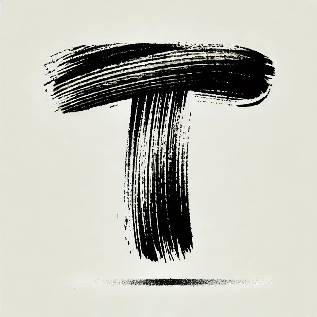
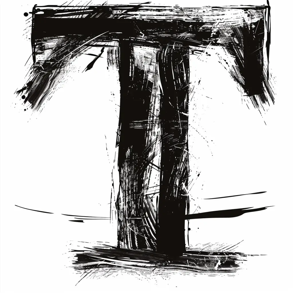
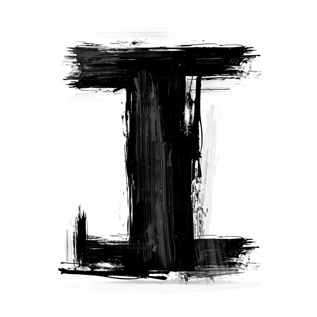
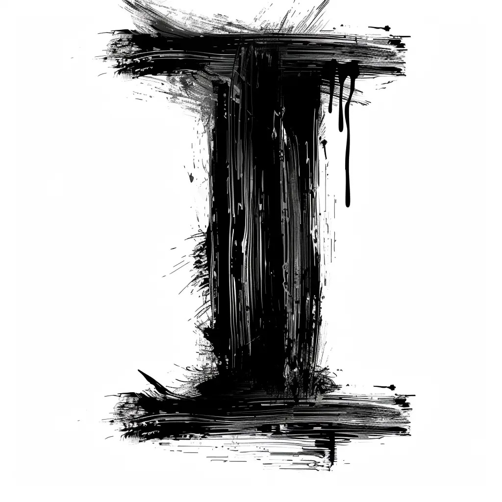
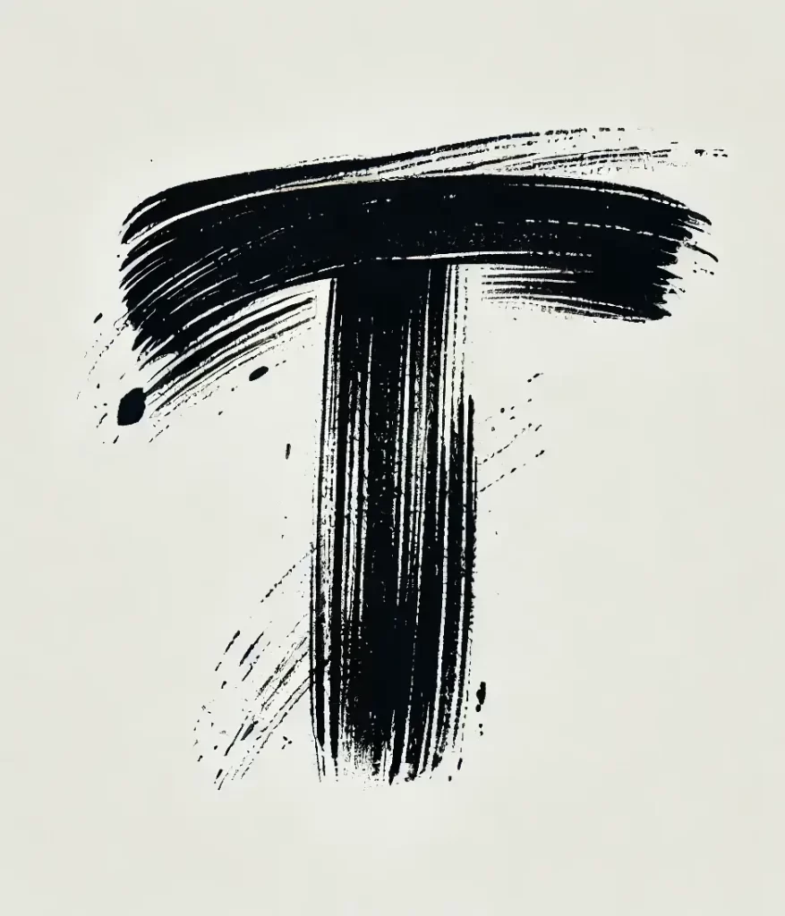
Dense black pigment forms a bold capital letter T, its surface marked by visible bristle striations and distinct parallel grooves from individual brush hairs. The horizontal bar curves slightly upward at the right edge while the vertical stem tapers toward the bottom, both components exhibiting raw, textured quality with scattered ink splatters on the pale, warm-toned background.
Visual tension arises from the interplay between solid mass and linear texture, as the thick body of each stroke reveals its construction through thousands of fine internal lines. The irregular edges—feathered on the right side of the crossbar, more abrupt on the left—create an organic asymmetry that resists mechanical perfection. Such deliberate imperfection transforms a typographic character into evidence of physical action, preserving the velocity and pressure of the artist’s hand within the static image.
Typography historians might employ this specimen to document expressive brush-lettering techniques or analyze ink behavior on smooth substrates. Contemporary illustrators could reference the specific textural density when developing hand-drawn logotypes requiring authentic material presence. Motion graphics artists studying the physics of liquid media would find value in analyzing how the splatter patterns correlate with stroke direction and termination points.