Logo Typography Branding
Topics
Details
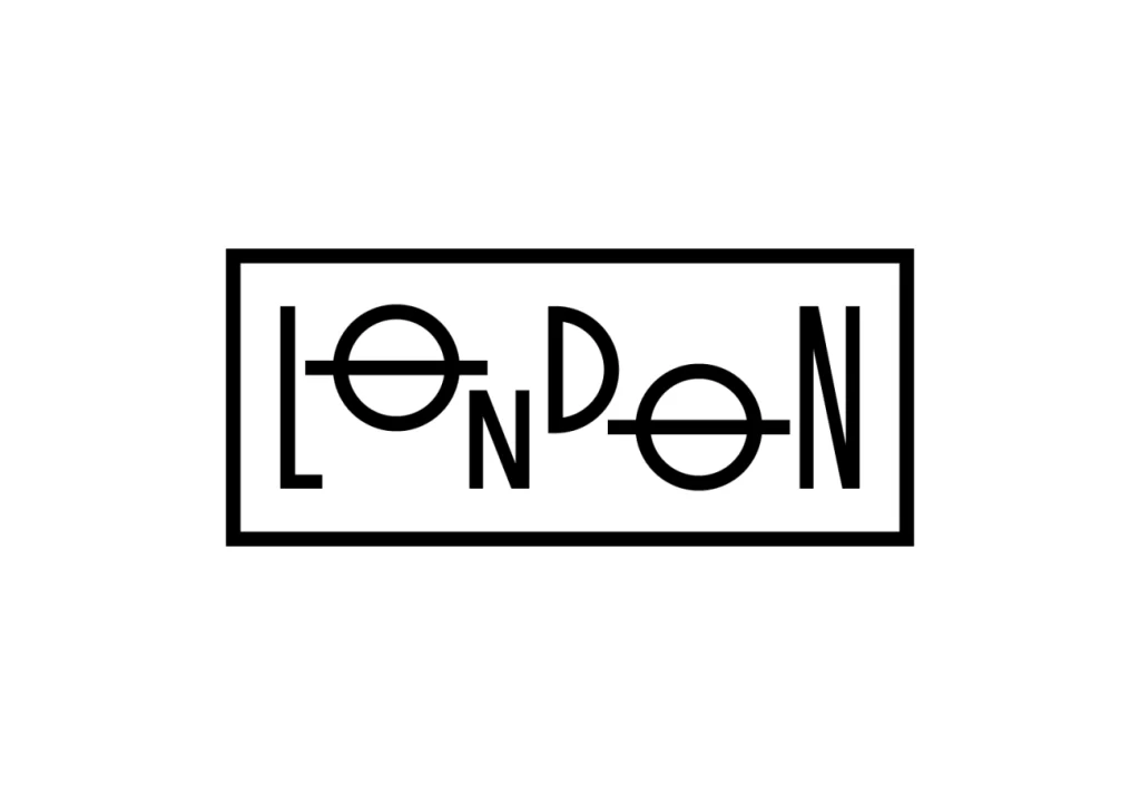
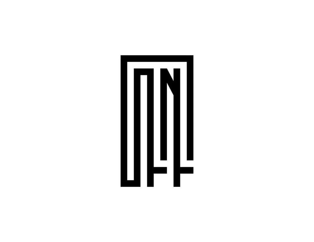
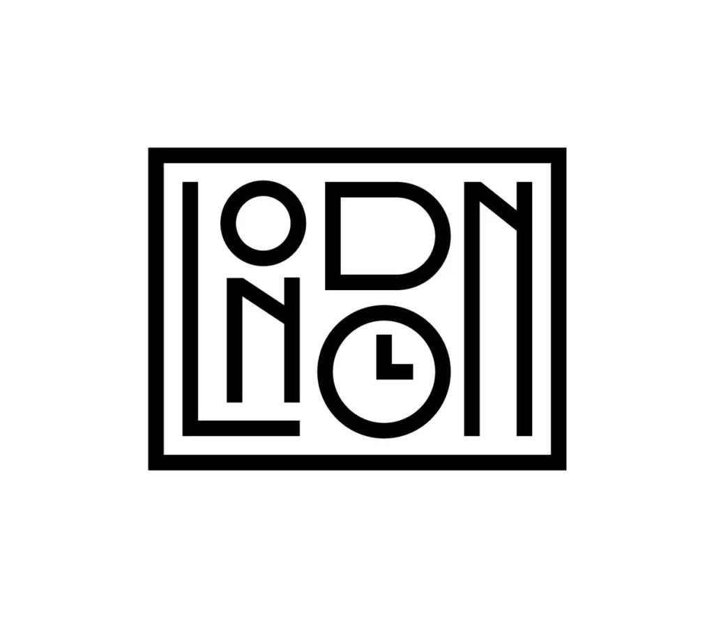
Rendered in stark black against a pure white void, this typographic composition is contained within a heavy rectangular border. The word 'LONDON' appears in a bold, geometric sans-serif, though the letters are rearranged into a tight 2x3 grid that disrupts standard reading order. A clock face icon, indicating approximately three o'clock, replaces the final 'O', introducing a functional symbol into the linguistic structure.
Clever negative space manipulation allows the outer frame to double as the vertical stems of the initial 'L' and the terminal 'N'. By stacking the characters rather than aligning them on a baseline, the designer forces the eye to navigate a puzzle-like layout where text becomes texture. The uniform stroke weight across both the alphabet and the timepiece creates a seamless visual language, merging industrial utility with playful wit.
Brand strategists might study this mark to understand how to embed secondary meanings—like punctuality or locale—directly into a wordmark's anatomy. Art directors could utilize such a grid-based approach when developing visual identities for urban lifestyle brands or transit systems requiring high-impact, minimal iconography. It serves as a prime example of how rigid constraints can yield memorable, modular branding solutions.