Thanks Typography
Topics
Details
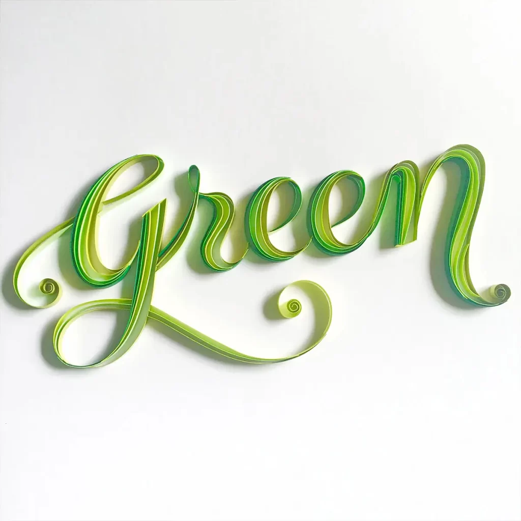
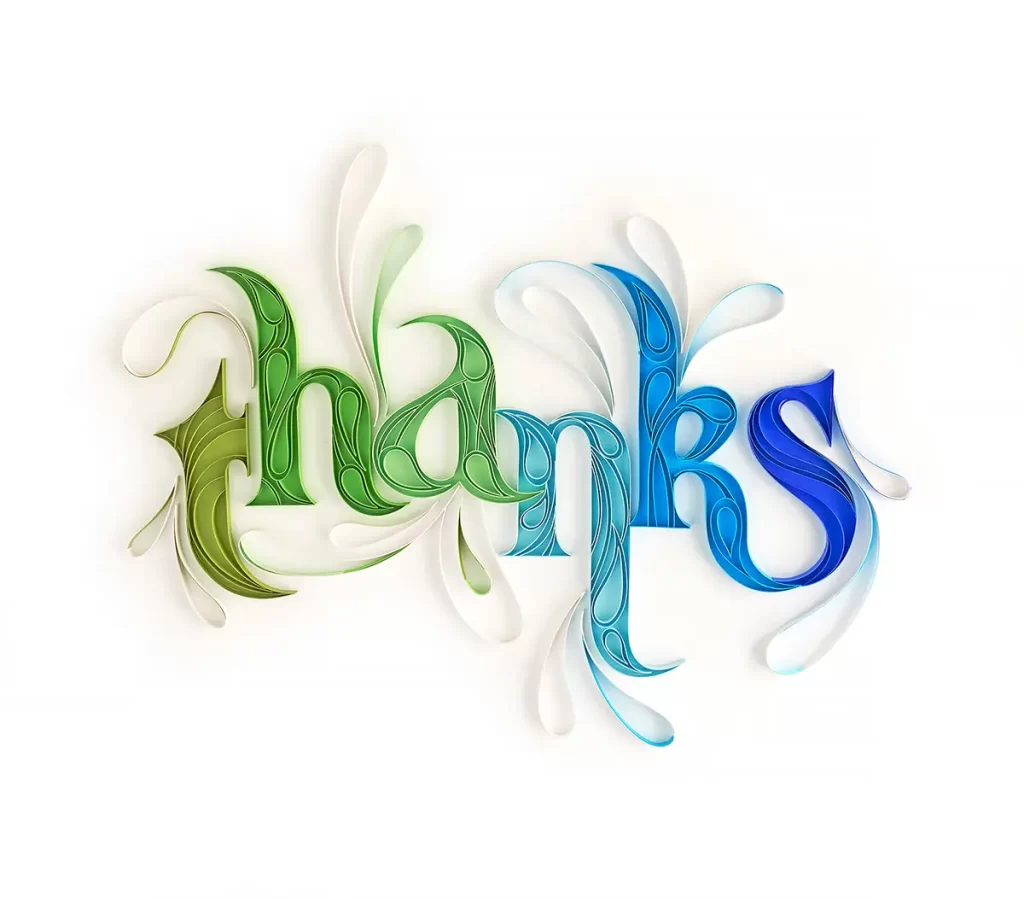
Tightly coiled paper strips form the word 'thanks' in a flowing, calligraphic script that mimics the delicate structure of quilled art. Letterforms transition from organic olive green on the left through pale aqua to deep cobalt blue on the right, with each character displaying intricate internal filigree patterns. The three-dimensional typography rests on a white surface with decorative flourishes extending from the letters.
What distinguishes this typographic study is its simulation of three-dimensional paper craft through digital rendering techniques. The color gradient functions as a visual timeline across the word, while the varying thickness of the simulated paper strips adds tactile depth and rhythmic movement to the composition. Internal line work within each letter suggests the layered texture of actual rolled paper, creating a convincing illusion of physical materiality that bridges traditional handicraft and modern vector aesthetics.
Art directors developing branding for eco-friendly or wellness industries might reference this piece when seeking organic yet refined logotype concepts. Motion designers could analyze the flow of the trailing elements to plan fluid animation paths for text reveals or transitions. Additionally, illustrators working on editorial projects about gratitude or nature themes could adapt this specific color progression and ornamental style for custom headline treatments.
![[No Readable Text] Typography](https://gropicture-1323946364.cos.na-siliconvalley.myqcloud.com/wp-content/uploads/2025/04/gropicture-typography-letter-K-1024x1024.webp)