San Francisco California Typography City Name
Topics
Details
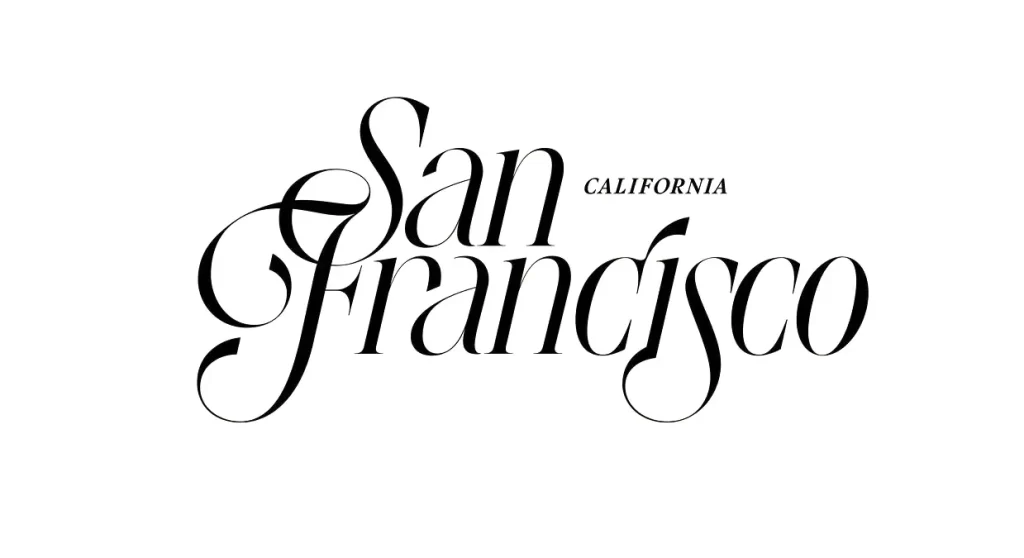
Rendered in stark black ink against a pure white void, the composition centers on the words 'San Francisco' executed in a sophisticated, high-contrast serif typeface. The letterforms exhibit dramatic variation between thick vertical stems and hair-thin horizontal strokes, with the capital 'S' and 'F' featuring elaborate, sweeping swashes that intertwine to create a singular graphic unit. Positioned in the upper right quadrant, the word 'CALIFORNIA' appears in a much smaller, understated sans-serif font, providing a utilitarian counterpoint to the ornate main text.
Visual interest derives primarily from the masterful interplay of negative space and the fluid, almost calligraphic movement of the capital initials. The elongated tail of the 'F' curls gracefully beneath the baseline while the 'S' arches overhead, framing the interior letters and establishing a dynamic rhythm that guides the eye across the wordmark. Such deliberate manipulation of traditional typography transforms a standard geographic designation into an elegant piece of editorial art, balancing classical refinement with modern legibility.
Urban planners or tourism boards might employ this aesthetic for high-end promotional materials targeting luxury travelers or cultural events. Editorial designers could adapt this specific typographic treatment for magazine mastheads or book covers requiring a sense of established sophistication. Additionally, branding specialists working on boutique hospitality projects might reference these letterform relationships to evoke a specific coastal elegance without relying on clichéd imagery.