Green Paper Art Typography
Topics
Details
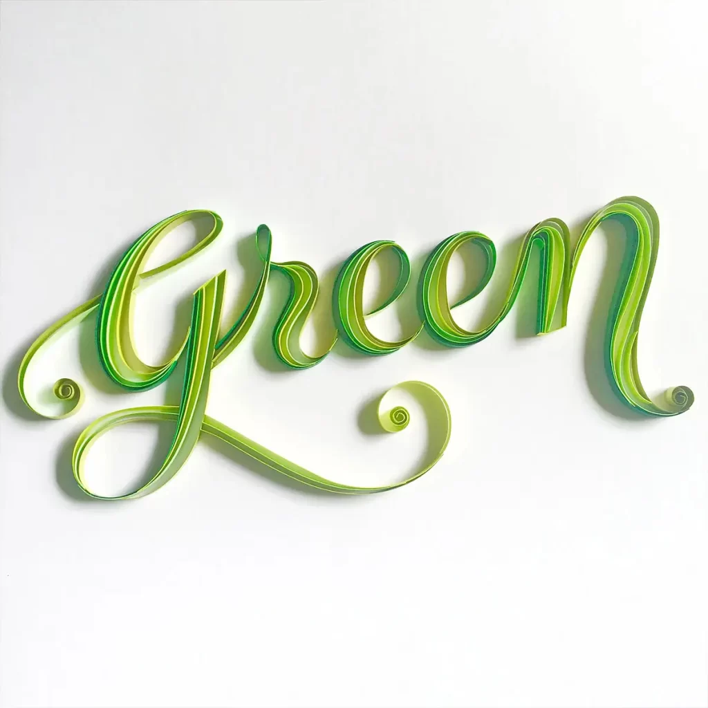
Tightly coiled paper strips form the word 'Green' in elegant, cursive lettering that displays a vibrant gradient shifting from pale lime to deep emerald. Multiple layered ribbons construct each character to create subtle three-dimensional depth, with soft diffused lighting casting gentle shadows beneath the swirling descenders on a white surface.
What sets this piece apart is the ingenious use of color variation within individual letters to simulate natural light hitting curved surfaces. The material texture of paper adds an organic, tactile quality that flat digital type cannot replicate, making the word itself embody its meaning through both hue and medium. Each stroke demonstrates masterful control over the quilling technique, where parallel bands of green create visual rhythm and the illusion of metallic sheen without actually using any metal.
Environmental branding specialists might study this execution when developing sustainable packaging concepts that require literal yet artistic interpretations of eco-friendly themes. Hand-lettering enthusiasts could analyze the coil spacing and gradient application to inform their own mixed-media typographic experiments. Event planners organizing garden parties or organic product launches would find this aesthetic perfect for invitations that need to communicate freshness and artisanal care through physical materials rather than printed ink.
![[No Readable Text] Typography](https://gropicture-1323946364.cos.na-siliconvalley.myqcloud.com/wp-content/uploads/2025/04/gropicture-typography-letter-K-1024x1024.webp)