Lowercase Letter A Typography Design
Topics
Details
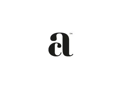
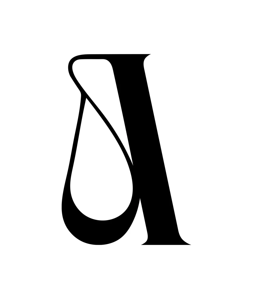
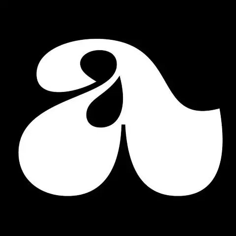
A singular white lowercase 'a' dominates the frame with extreme contrast between its thick, bulbous bowls and hairline connectors. An asymmetrical teardrop counter leans dramatically toward the upper terminal, while the character occupies the center of an absolute black void.
Visual tension derives primarily from the manipulated weight distribution, where the lower bowl swells to an almost circular mass while the ascender tapers into a fluid, organic curve. That internal negative space functions not merely as a typographic necessity but as a compositional pivot point, drawing the eye inward before releasing it along the sweeping exterior path. Such exaggerated modulation suggests a custom display face rather than a standard text font, prioritizing graphic impact over legibility at small scales.
Type designers might deconstruct these specific curves to study how extreme stress angles affect overall letterform balance and rhythm. Brand identity projects requiring bold, editorial logotypes could adapt this gestural quality for luxury fashion or boutique publishing contexts. Additionally, motion graphics artists could trace these contours to generate fluid animation paths that maintain the original’s sense of weighted momentum.