Mielies Soap Box
Topics
Details
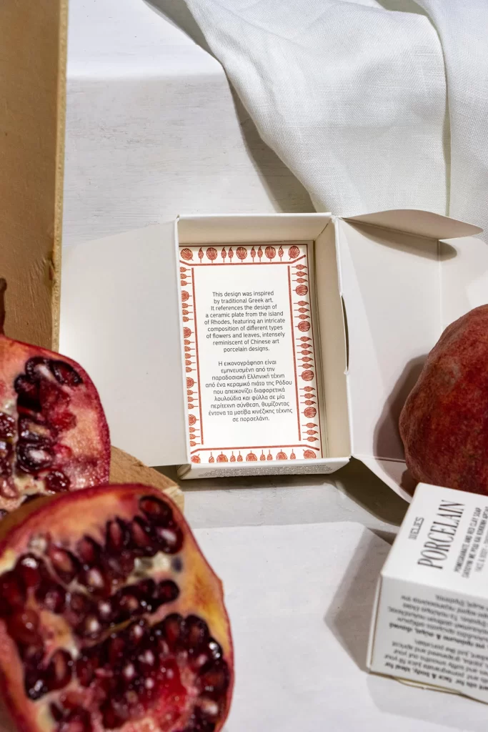
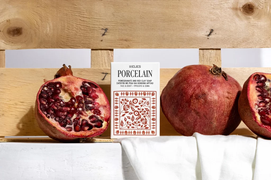
Set within a rustic wooden crate of pale honey-toned planks, the composition centers a white soap box flanked by three pomegranates—one halved to reveal glistening ruby arils, one whole with matte burgundy skin, and a third partial slice. The box displays 'MIELIES' above bold serif lettering for 'PORCELAIN,' followed by smaller text identifying the product as pomegranate and red clay soap for face and body, plus Greek translation. Below the typography sits a square decorative field of terracotta floral motifs framed by a border of stylized seed pods, all resting on rumpled white linen that catches soft diffused light from a frontal angle.
Visual distinction emerges from the deliberate juxtaposition of organic irregularity against geometric print precision—the fruit's wet, jewel-like interior contrasts sharply with the box's flat matte surface and disciplined ornamental pattern. Color harmony operates through a restrained palette where deep crimson seeds echo the reddish-brown illustration ink, while warm wood grain bridges natural and manufactured elements. The bilingual typography establishes cultural specificity without overwhelming the delicate botanical artwork, creating a balanced hierarchy between informational text and decorative branding.
Packaging designers studying natural-ingredient cosmetics would examine this arrangement to understand how raw materials can reinforce product claims through visual proximity. Art directors developing artisanal brand identities might reference the interplay between folk-art inspired patterns and contemporary serif typefaces for heritage-positioned goods. Photographers specializing in still-life beauty work could analyze the lighting ratios that preserve texture detail in both glossy fruit membranes and absorbent paper stock simultaneously.