Varied Patterned Soap Boxes Box
Topics
Details
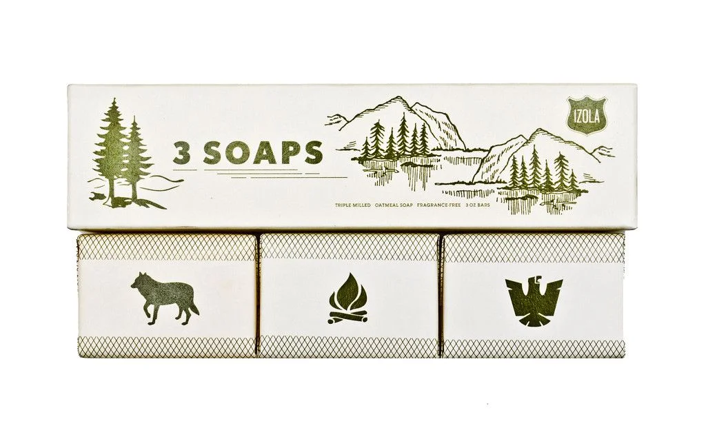
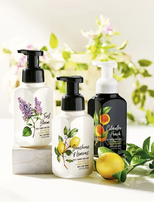
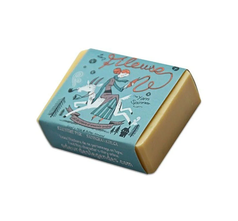
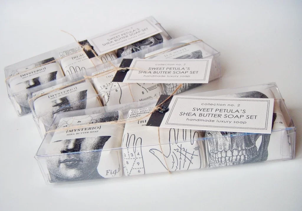
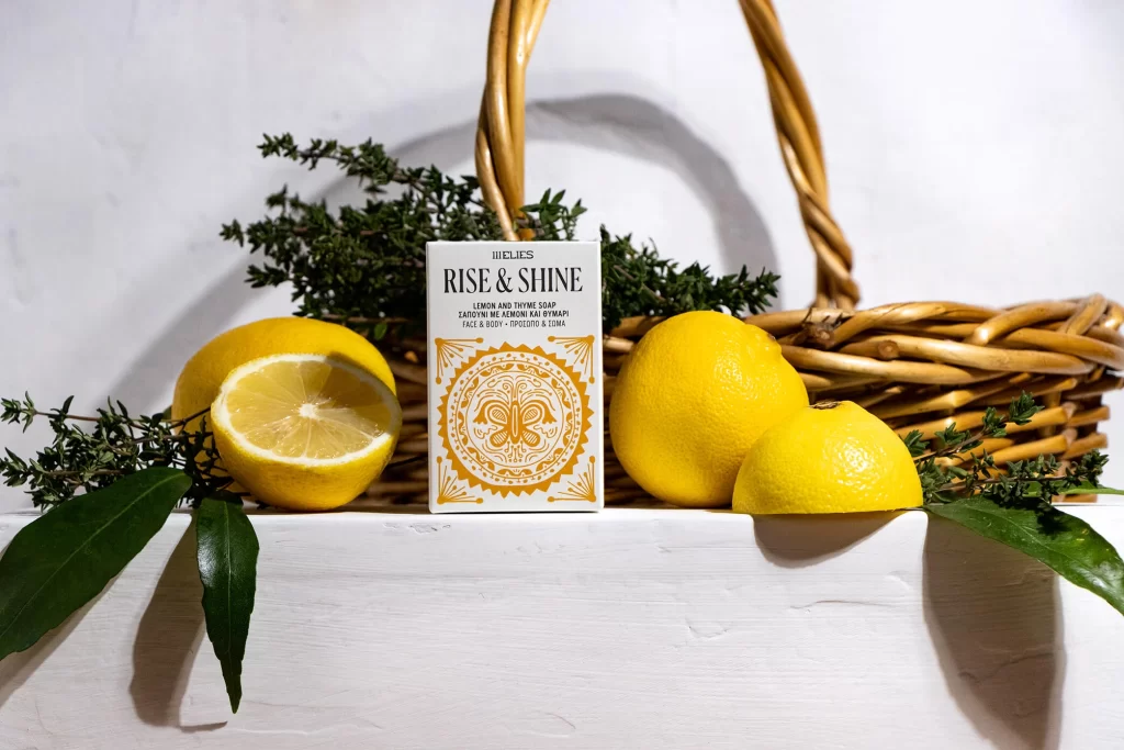
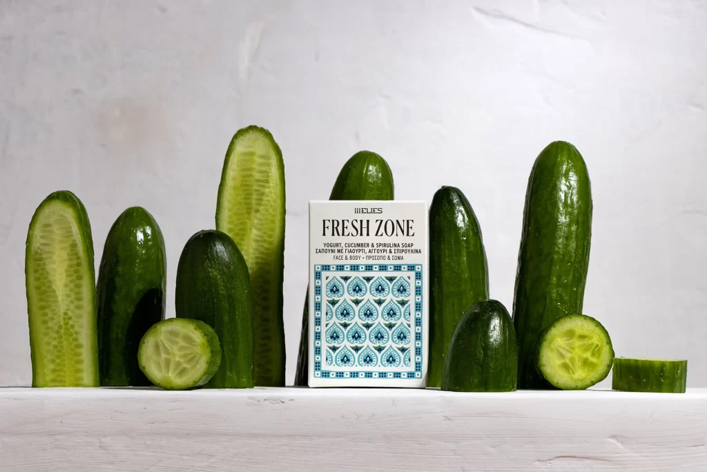
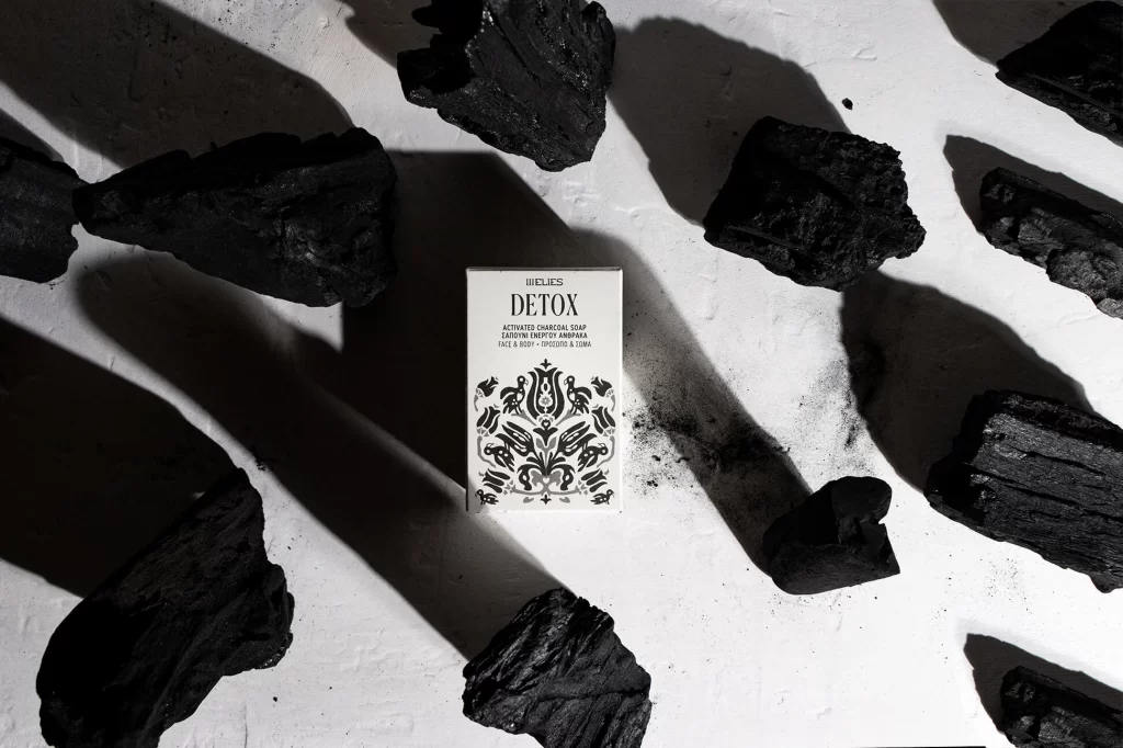
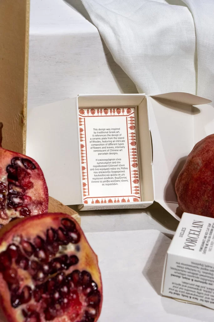
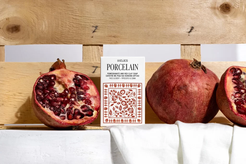
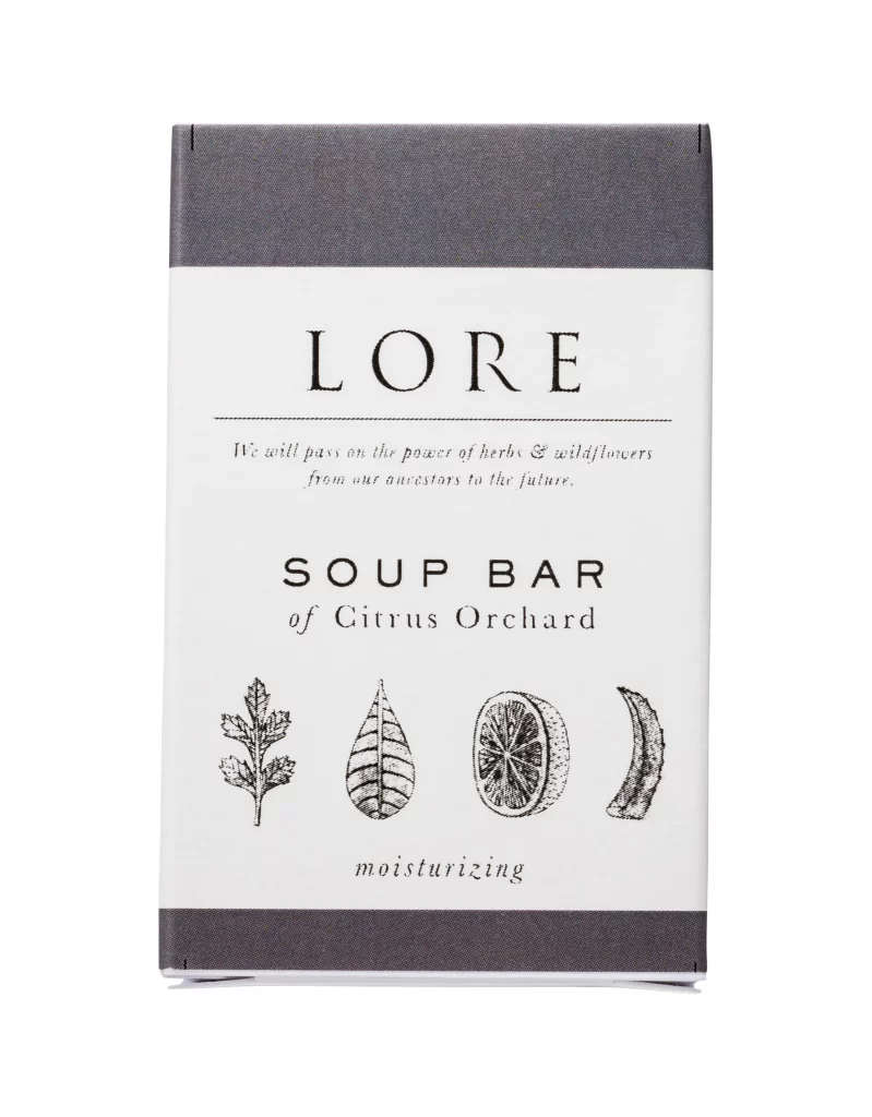
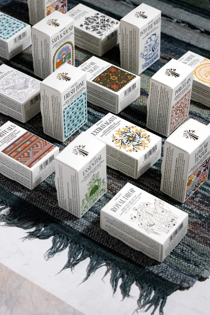
Arranged in a loose, staggered grid across a textured woven textile, numerous white rectangular cartons display a sophisticated interplay of typography and illustration. Each box features a consistent minimalist logo at the top—a stylized black tree or palm—while the front panels are dominated by distinct, intricate patterns ranging from geometric tessellations and floral mandalas to detailed line-art fauna. The color palette remains largely monochromatic on the packaging itself, with selective accents of teal, ochre, and crimson appearing within the decorative motifs, all illuminated by soft, diffused lighting that emphasizes the matte finish of the cardstock against the dark, fringed rug beneath.
Visual interest is generated through the deliberate juxtaposition of rigid structural uniformity and eclectic surface decoration, creating a cohesive yet diverse product family. The typographic hierarchy is particularly noteworthy, utilizing a clean serif for product names like 'Safe & Sound,' 'Fresh Zone,' and 'Royal Drop' that complements rather than competes with the ornate graphic elements. By maintaining identical box dimensions and logo placement while varying the artistic style of the central illustrations, the design achieves a strong brand identity that feels both systematic and artisanal.
Packaging designers studying this composition can analyze how modular systems allow for extensive customization without sacrificing shelf presence or brand recognition. Art directors working on lifestyle branding projects might reference the balance between informational density and white space to improve their own layout strategies. Furthermore, illustrators seeking to integrate complex patterns into commercial print work can observe how these designs function within the constraints of a three-dimensional rectangular format.