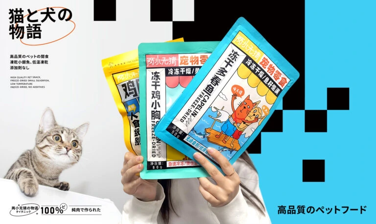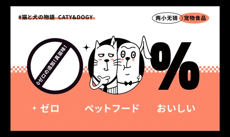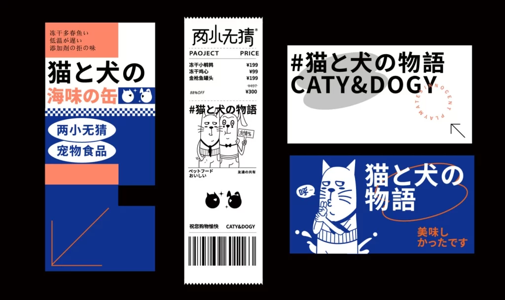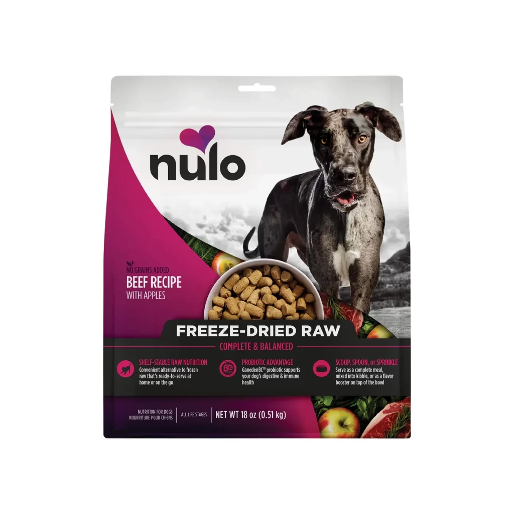
Natural Pet Treats Chocolate Chips Brown Box Illustration
Topics
Details
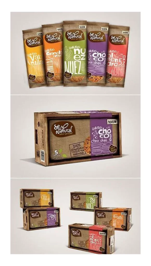
Five vertical pouches and a rectangular brown box display the 'So Natural' brand across three distinct compositions. The packaging features kraft paper textures with vibrant color-coded sleeves in yellow, orange, green, purple, and red, each bearing flavor names like Vanilla, Granola, Nuez, Choco Chips, and Almendra. A neutral gray backdrop supports the items under soft studio lighting that highlights the matte cardboard finish and glossy plastic windows revealing the treats inside.
Visual hierarchy relies on the contrast between earthy brown bases and saturated accent colors that differentiate flavors instantly. The hand-drawn typography on the sleeves creates an organic feel that complements the natural product positioning, while the consistent placement of the oval logo anchors the brand identity across all variants. Subtle details like the 'NUEVO' badges and '100% ingredientes naturales' seals add authenticity without cluttering the clean layout.
Packaging designers studying eco-friendly snack branding can analyze how color coding aids consumer navigation across product lines. Art directors planning pet food photography sessions might reference the arrangement techniques for showcasing multiple SKUs within a unified visual system. Students of commercial illustration could examine the balance between playful script fonts and structured information architecture on limited real estate.