Nishikigoi Red Sake Packaging
Topics
Details
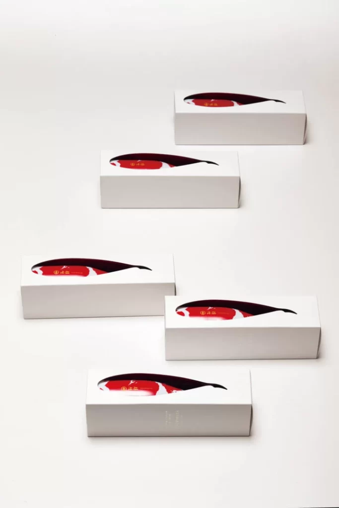
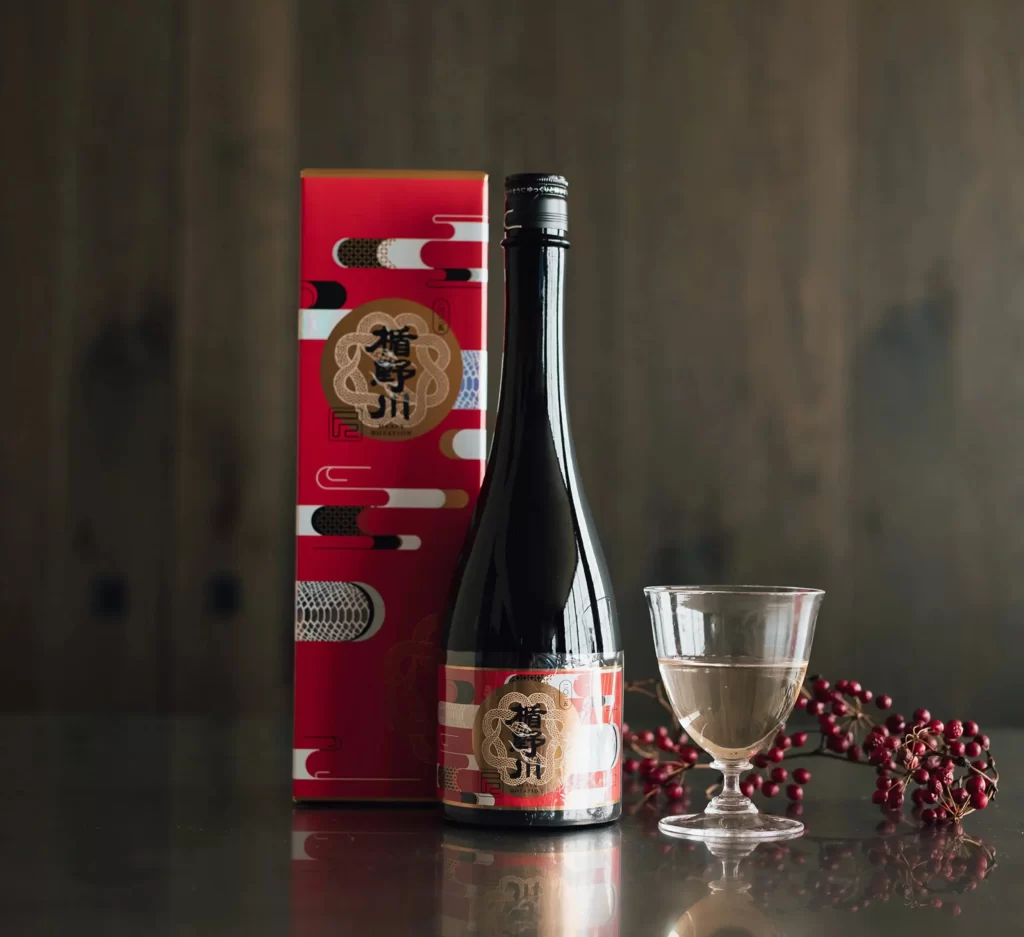
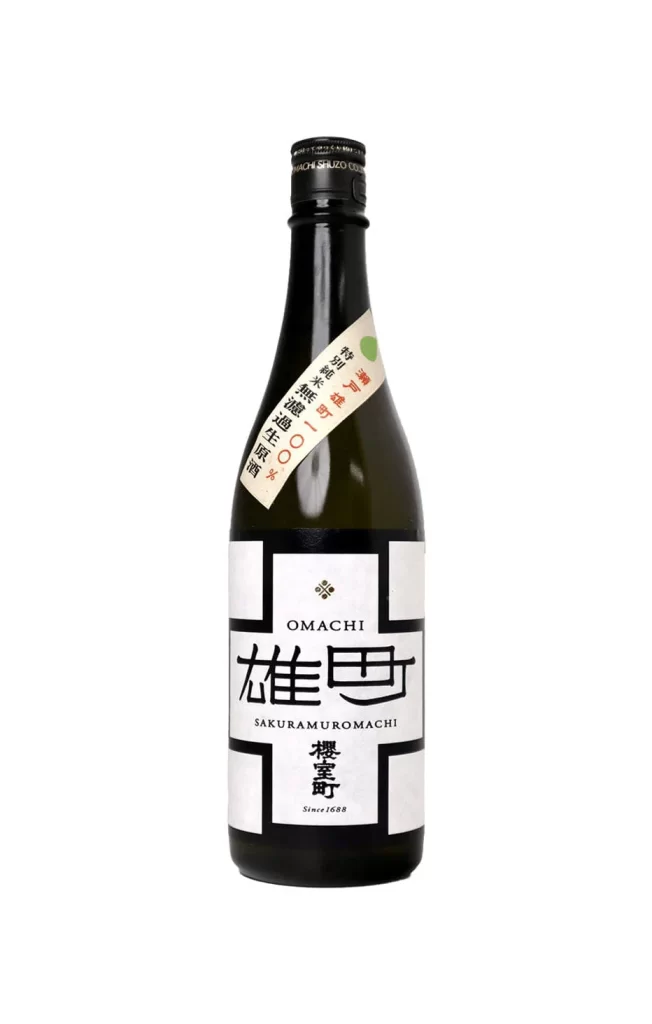
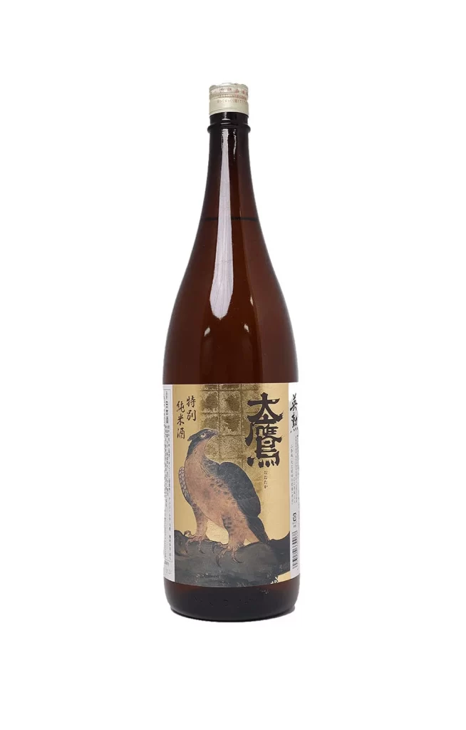
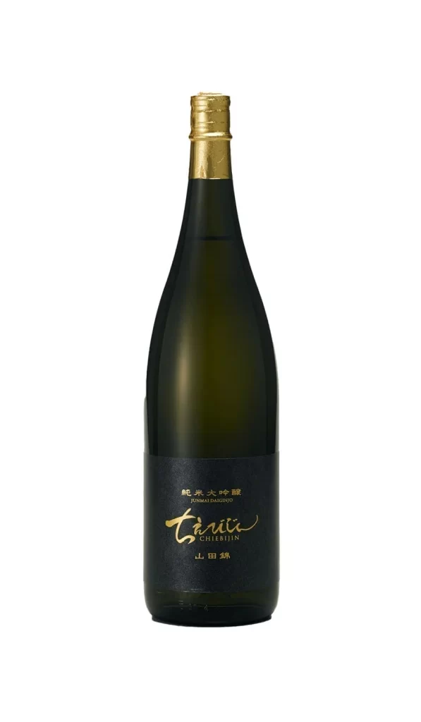
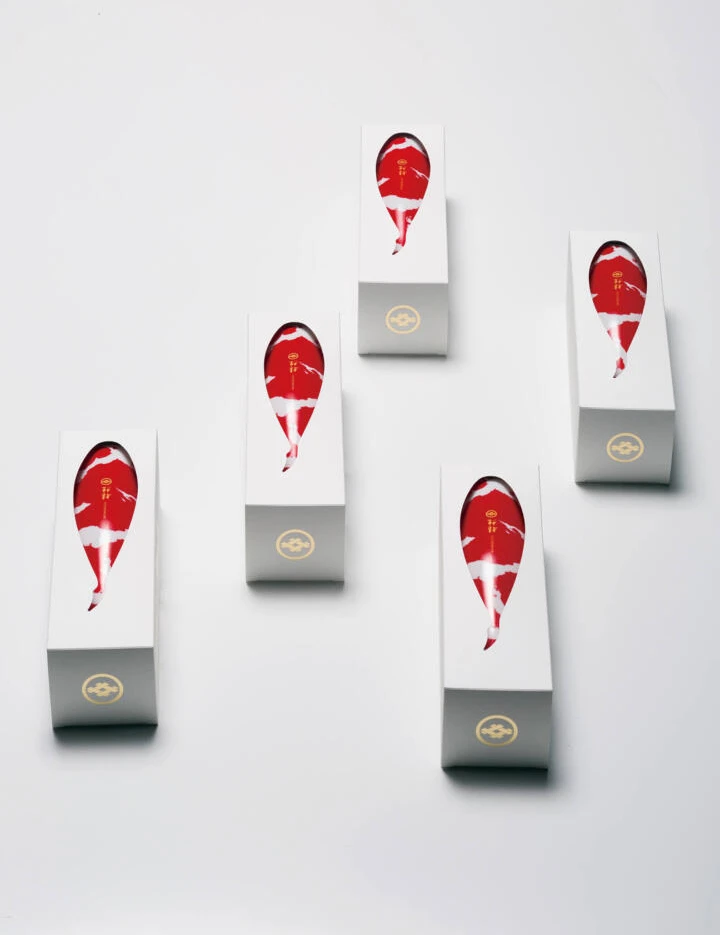
Five tall, rectangular white boxes are arranged in a loose, staggered formation across a clean, bright white surface. Each container features a prominent, teardrop-shaped graphic of a red and white koi fish that appears to wrap around the upper portion of the packaging. A subtle, circular gold emblem is stamped on the lower front face of every box, while soft, diffused lighting casts gentle shadows beneath each object from a slightly elevated camera angle.
The visual impact relies on the striking contrast between the minimalist white substrate and the vibrant, organic form of the Nishikigoi. By isolating the traditional Japanese carp motif within a modern, architectural silhouette, the design bridges cultural heritage with contemporary luxury aesthetics. This specific execution stands out because the fish graphic feels integrated into the structure rather than just printed on top, creating a sense of depth and premium quality.
Brand strategists developing high-end beverage lines could study this layout to understand how to balance negative space with bold iconography. Packaging engineers might reference the structural proportions to explore how elongated forms influence consumer perception of value. Furthermore, illustrators looking to incorporate traditional motifs into modern contexts will find the stylization of the koi a useful case study in simplifying complex organic shapes for commercial application.