Nishikigoi Sensai Red Sake Packaging
Topics
Details
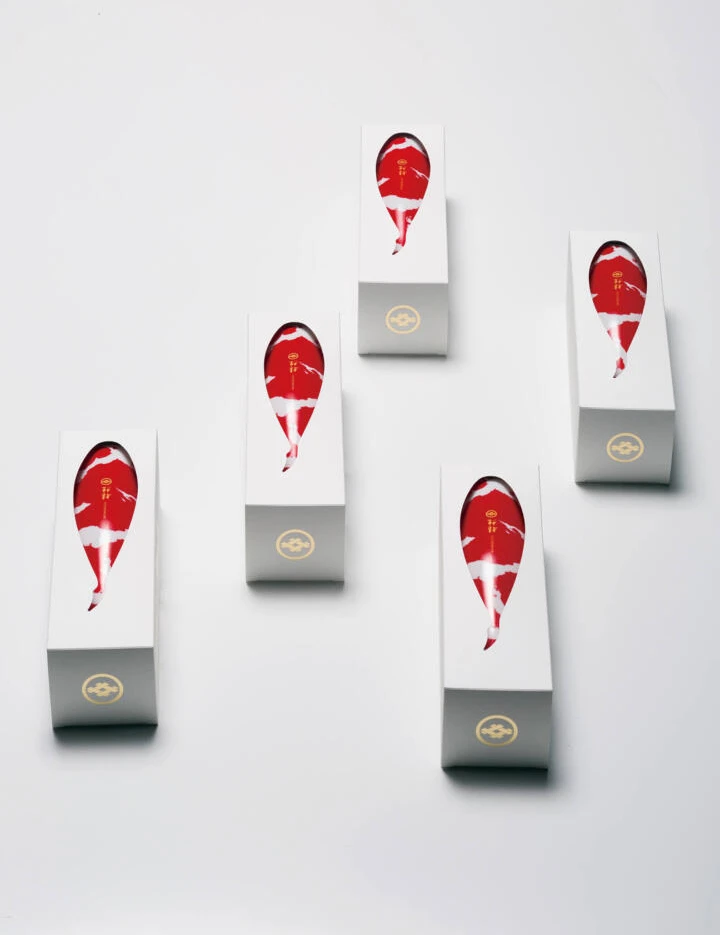
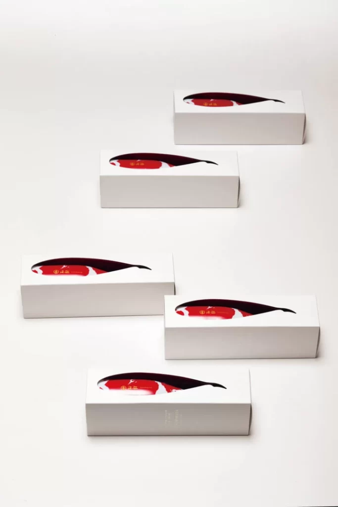
Five rectangular cartons of matte white cardstock feature prominent die-cut apertures revealing a stylized koi fish graphic rendered in deep crimson and obsidian black. Soft, diffused studio lighting eliminates harsh shadows to emphasize the smooth texture of the packaging, which sits on a clean, high-key surface in a loose staggered formation.
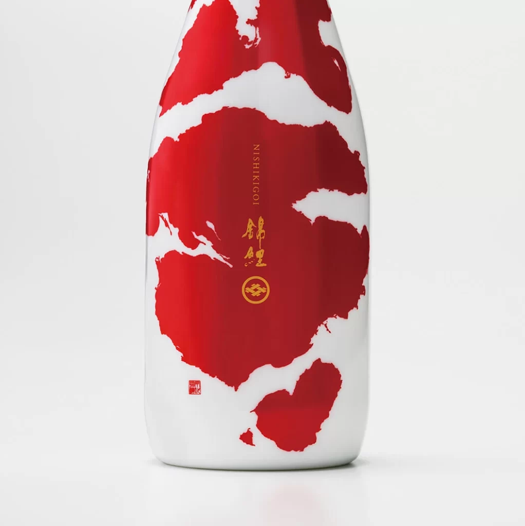
Visual interest is generated through the clever interplay between negative space and the vibrant internal graphics. By utilizing a physical cutout rather than a flat print, the design creates a layered depth that draws the eye immediately to the central red and black iconography. This approach transforms a standard rectangular prism into a dynamic object where the structural integrity of the box serves as a frame for the brand’s identity.
Structural designers and packaging engineers will find this arrangement useful for studying the mechanics of window-pane die-cuts on rigid substrates. Art directors might analyze the composition to understand how to balance multiple units within a product lineup photograph. Furthermore, color theorists can examine how the limited palette of white, red, and black achieves maximum contrast without overwhelming the minimalist aesthetic.