Title

Pasta Yum! Vibrant Colors Modern Design

Download

Topics

ColorsPastaYum!

Details

File type: WEBP
Uploaded user: Leo

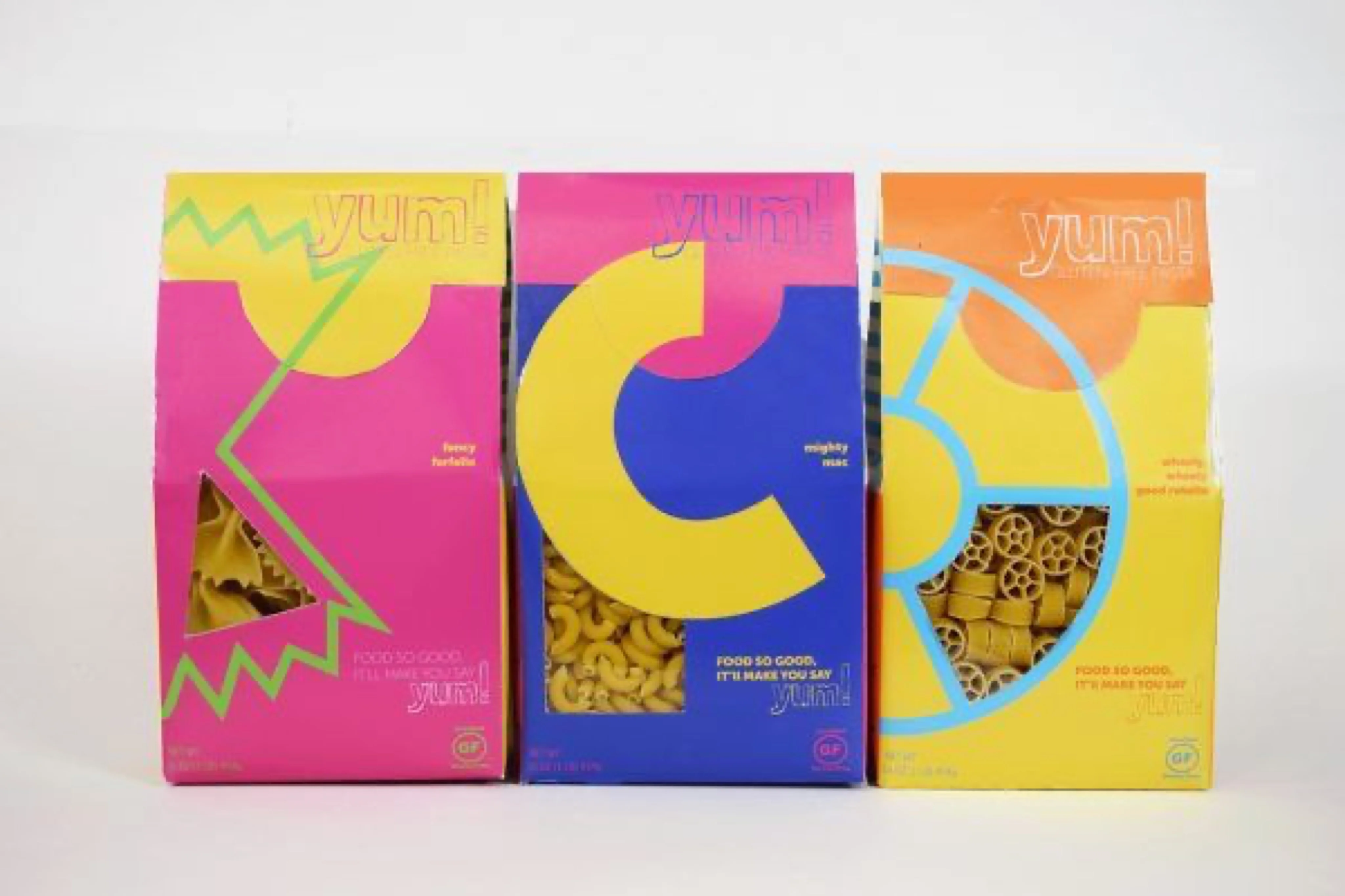
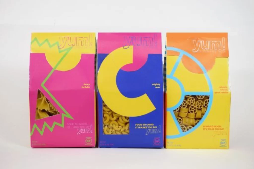
Three rectangular pasta boxes stand in a row, each featuring a distinct color-blocked palette of yellow, pink, blue, and orange. The leftmost box displays a jagged green lightning bolt over a pink field with a triangular window revealing bow-tie pasta inside, while the center package showcases a massive yellow letter 'C' against deep blue with a view of elbow macaroni. On the right, a cyan wheel graphic overlays an orange and yellow scheme exposing wagon-wheel pasta through its cutout sections, all bearing the 'yum!' brand name in varying typographic styles.

Bold geometric abstraction defines this packaging system, where oversized graphic shapes function as both decorative elements and structural windows into the product. The high-contrast color combinations create immediate visual separation between varieties while maintaining brand cohesion through consistent logo placement and tagline positioning. Designers can access the complete high-resolution file at no cost to study the precise interplay of typography and negative space across these three variations.
Packaging engineers and brand identity specialists would utilize these examples to analyze how die-cut windows integrate with flat graphic elements without compromising structural integrity. Art directors developing consumer goods for younger demographics might reference the scale relationship between the playful iconography and the visible food product. Students of commercial design could deconstruct the grid systems that allow such vibrant hues to remain legible while accommodating nutritional information and certification marks.