Perfect Fit Cat Food Chicken White Illustration
Topics
Details
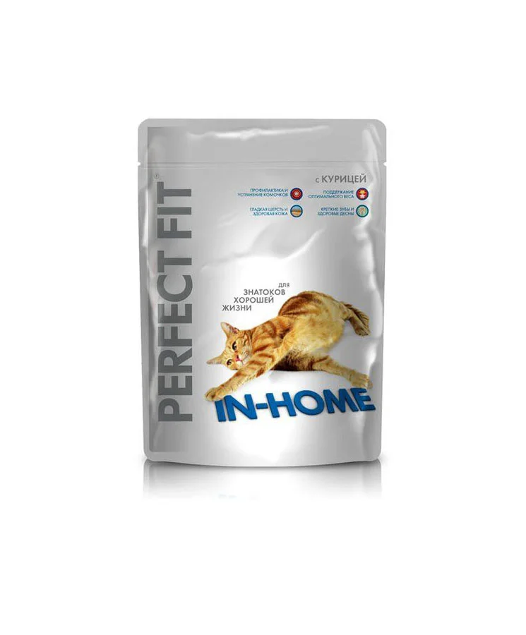
A metallic silver pouch with a matte, slightly textured finish dominates the frame, its surface catching soft highlights that suggest a flexible laminated material. Bold charcoal-gray lettering spelling 'PERFECT FIT' runs vertically along the left edge, while the lower center features 'IN-HOME' in large, saturated blue sans-serif type. An orange tabby cat stretches languidly across the middle of the package, its fur rendered in warm amber and cream tones with realistic shading. Above the feline image, smaller Cyrillic text indicates this is for indoor cats, and four circular icons in red and blue occupy the upper right quadrant alongside the phrase 'с КУРИЦЕЙ'.
The packaging achieves visual distinction through its strategic use of typographic hierarchy and color blocking, where the vertical brand name creates a strong anchor against the horizontal sprawl of the product line identifier. That vibrant blue 'IN-HOME' text acts as an immediate focal point, drawing the eye before it settles on the photorealistic cat illustration which adds organic warmth to the otherwise industrial silver substrate. The inclusion of functional iconography in the upper corner suggests a thoughtful information architecture designed for quick consumer scanning at retail.
Packaging designers studying pet food branding might examine how metallic substrates interact with both photographic elements and flat typography to create premium shelf presence. Marketing teams could analyze the spatial relationships between the Russian-language copy and English branding to understand localization strategies for international markets. Art directors working on animal-related products would find value in observing how the relaxed pose of the cat communicates lifestyle benefits without relying on explicit textual claims.