Quaker Recall Notice
Topics
Details
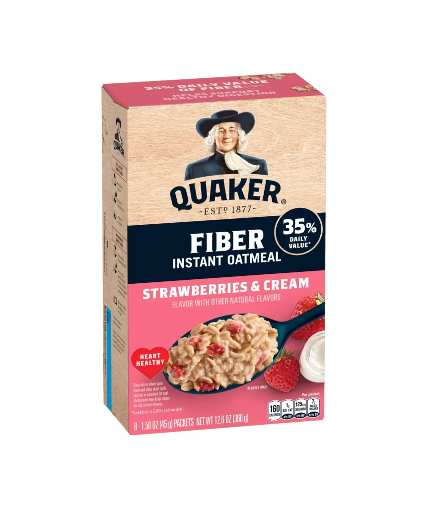
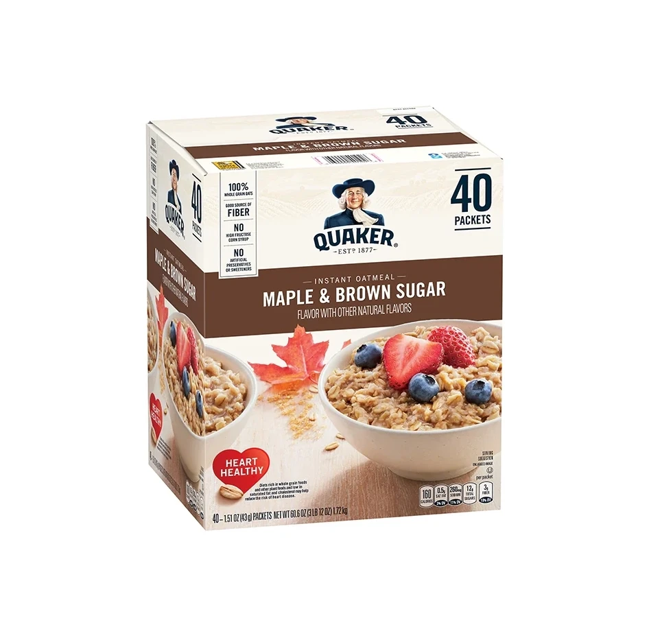
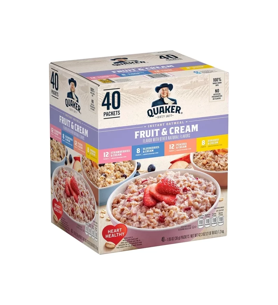
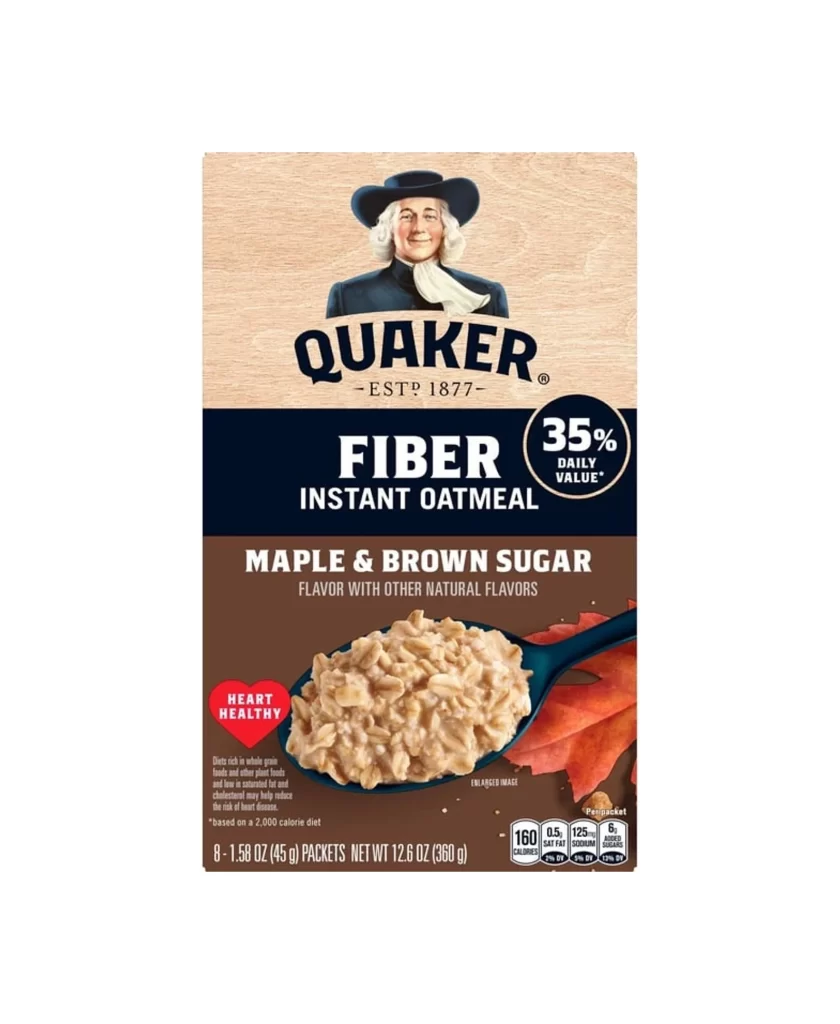
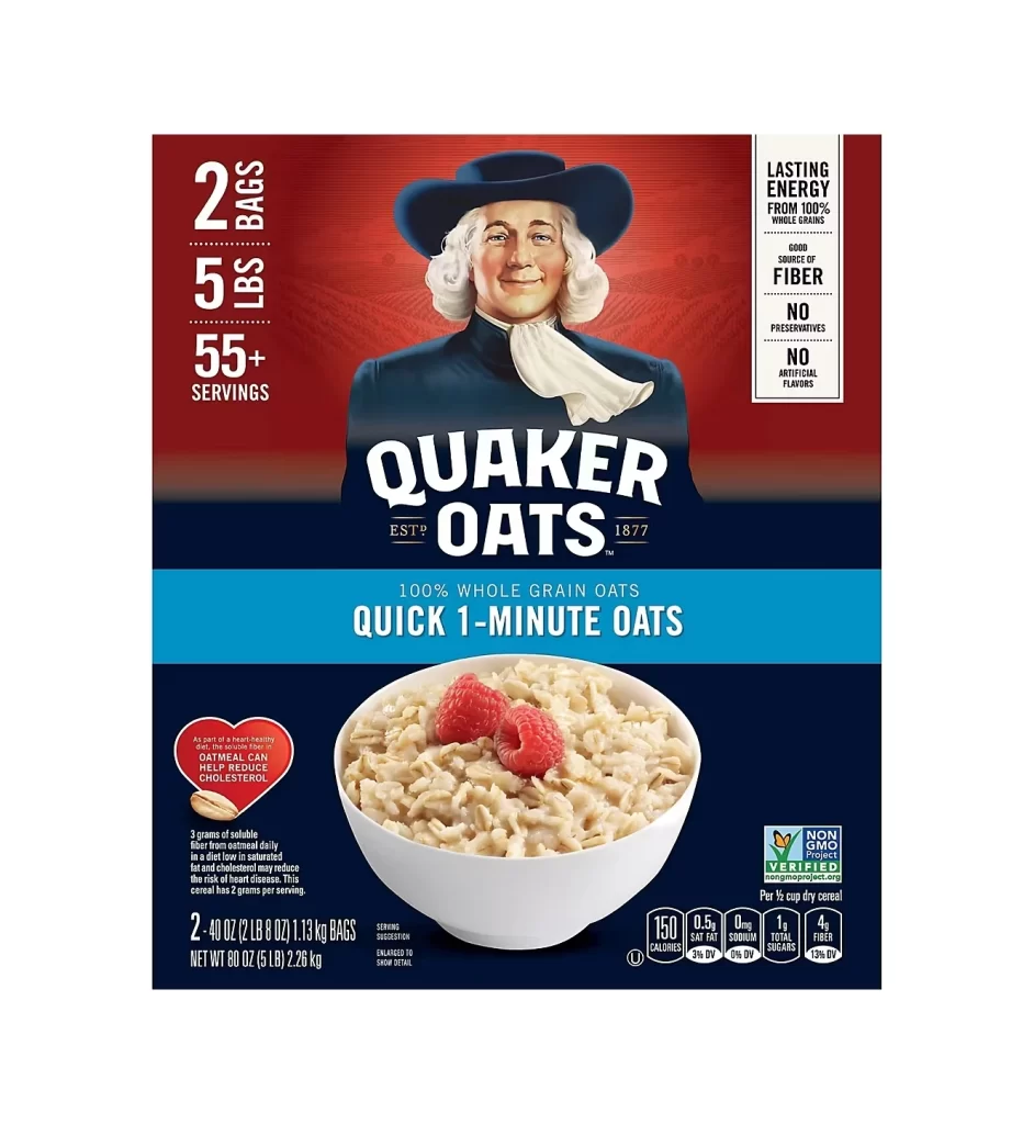
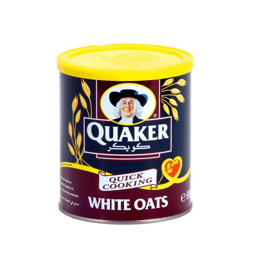
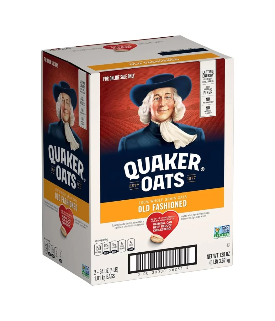
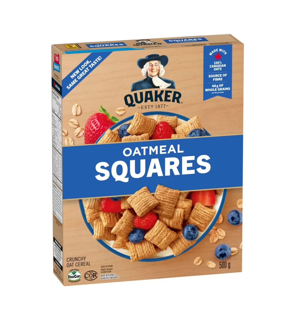
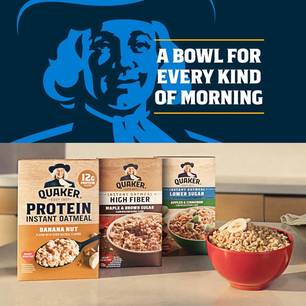
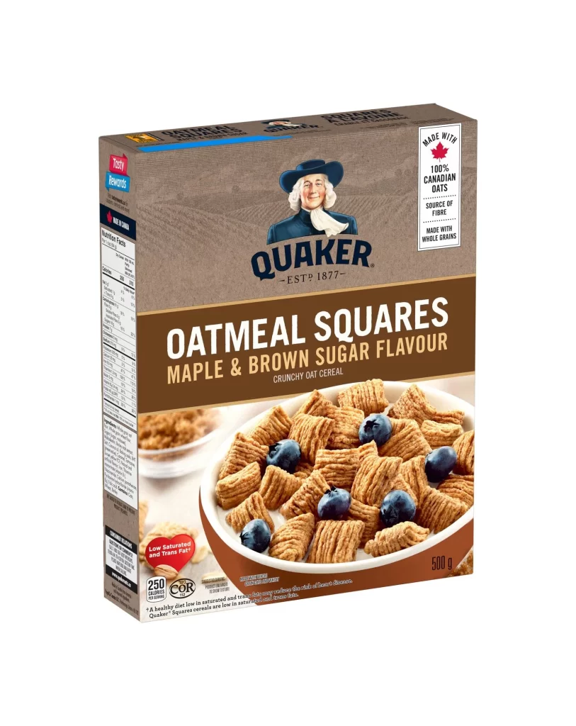
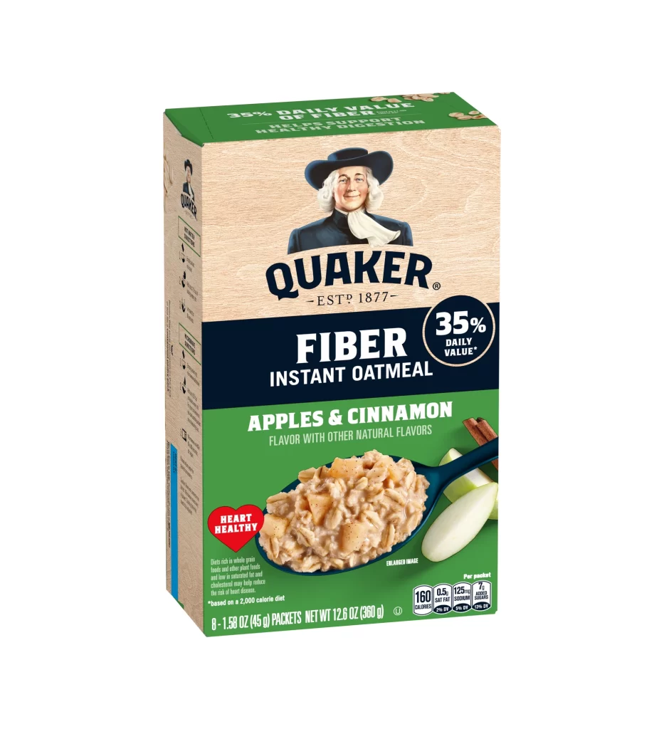
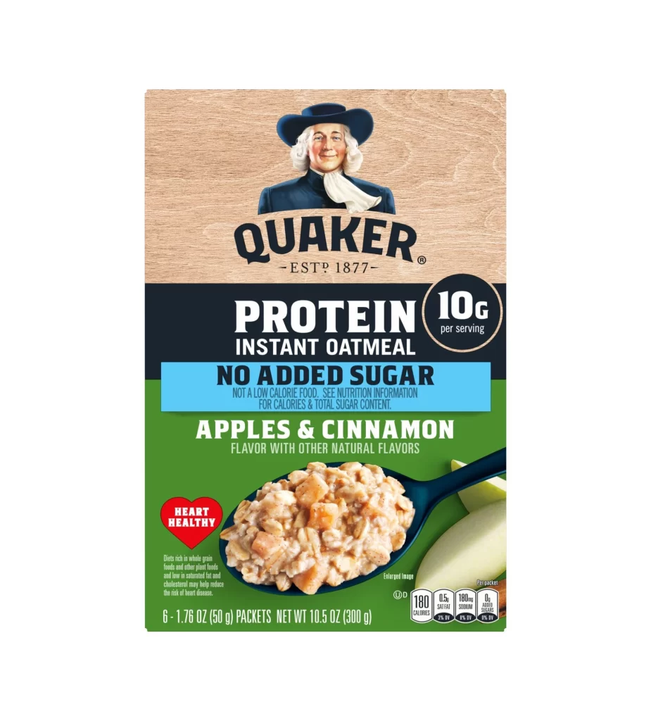
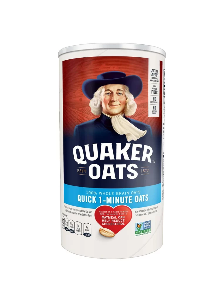
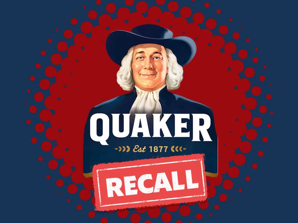
The Quaker mascot portrait anchors this layout, but the visual hook is the red distressed RECALL stamp overlaying his face. Behind the figure, a red halftone dot pattern background adds gritty texture. The styled backdrop elevates the traditional figure into a stark warning label. Bold typography reinforces the urgent tone without obscuring the recognizable character.
Designers will note the clever tension between heritage and alarm. The classic Quaker Oats mascot evokes decades of trust, immediately disrupted by the distressed red stamp. Layering the halftone dot pattern over the styled background creates visual friction, turning a familiar packaging asset into a striking mock recall notice. The contrast between warm portrait tones and aggressive red overlay is masterful.
This reference is essential for graphic designers exploring mock packaging, recall notices, or distressed overlay techniques. Branding students studying visual disruption can analyze how aggressive elements alter trusted mascots. Additionally, illustrators experimenting with halftone textures and stamp effects will find practical inspiration for creating urgency and tension within constrained commercial design frameworks.