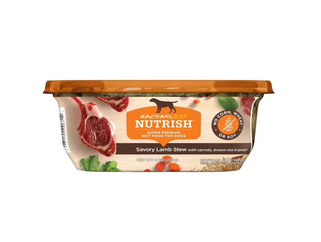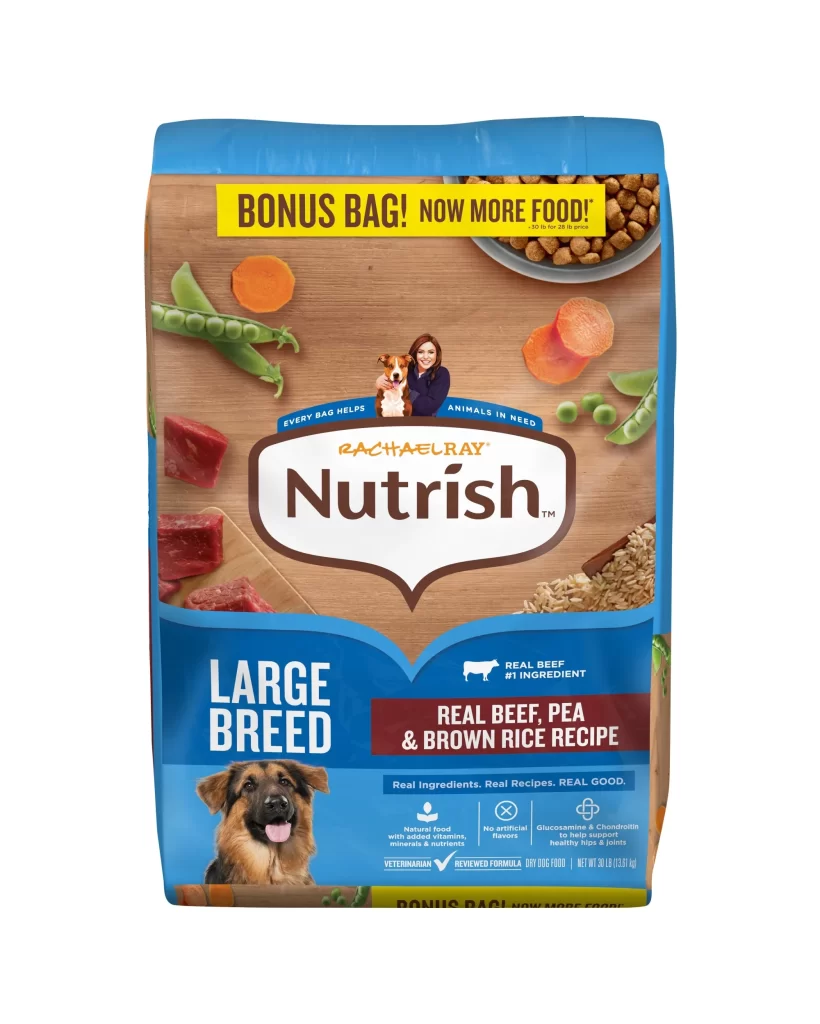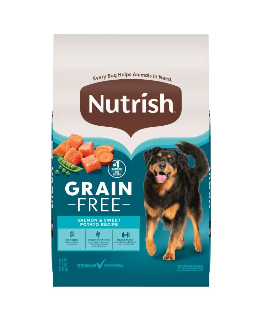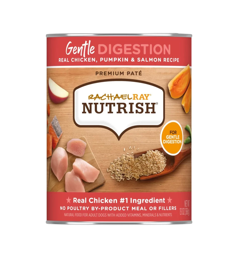
Rachael Ray Nutrish Little Bites Dog Food Bag Rebrand Packaging
Topics
Details
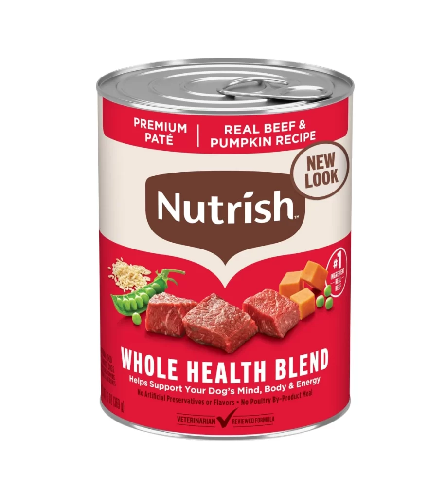
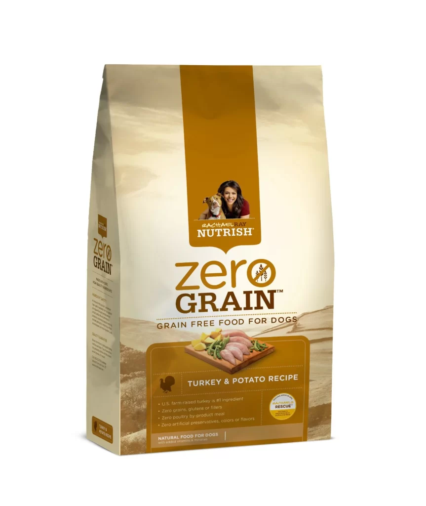
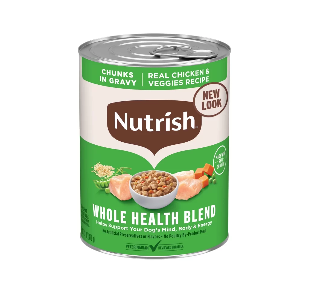
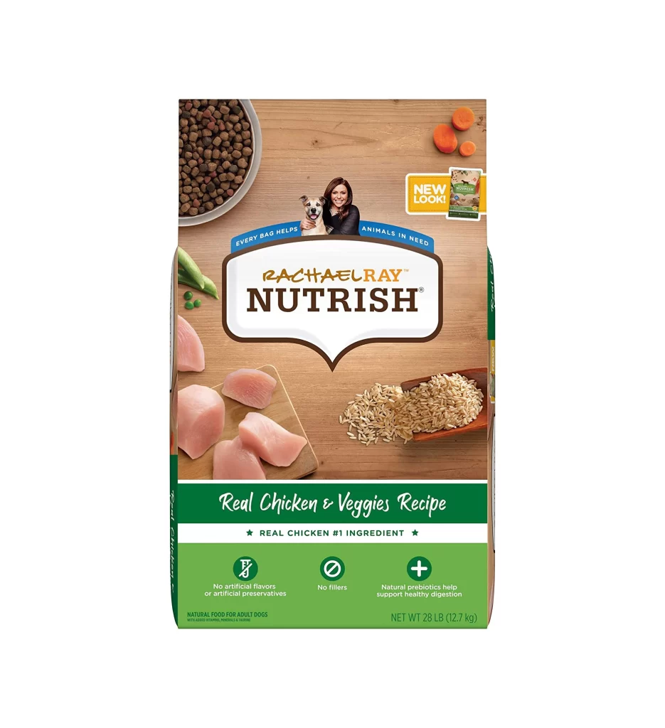
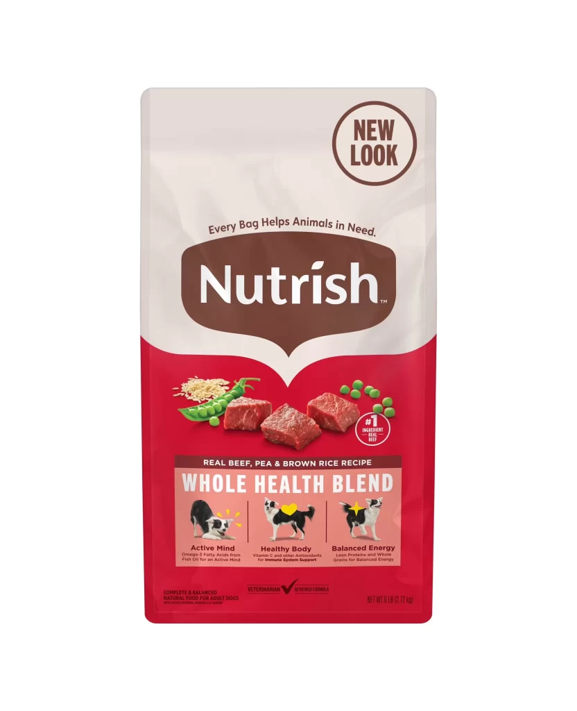
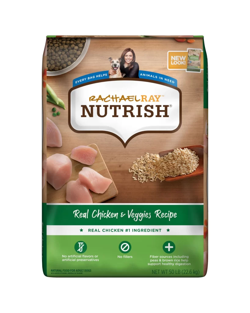
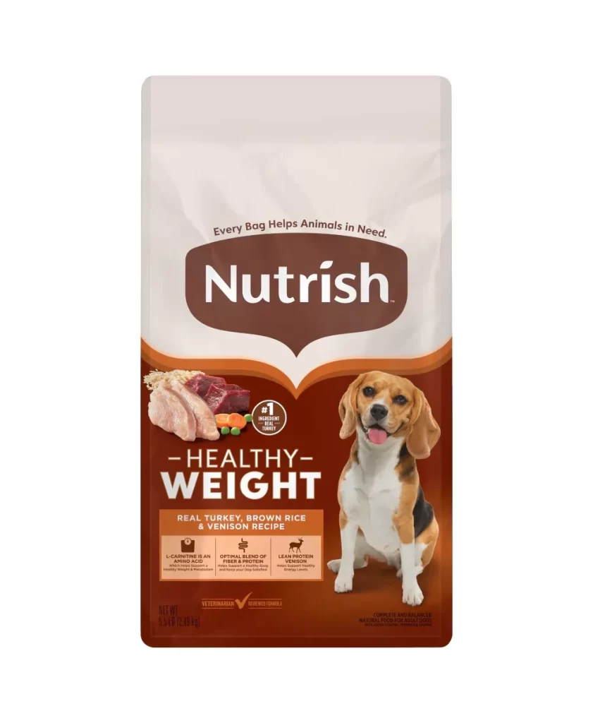
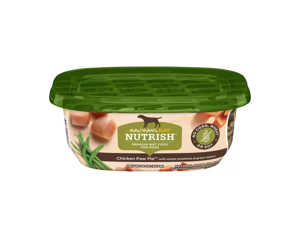
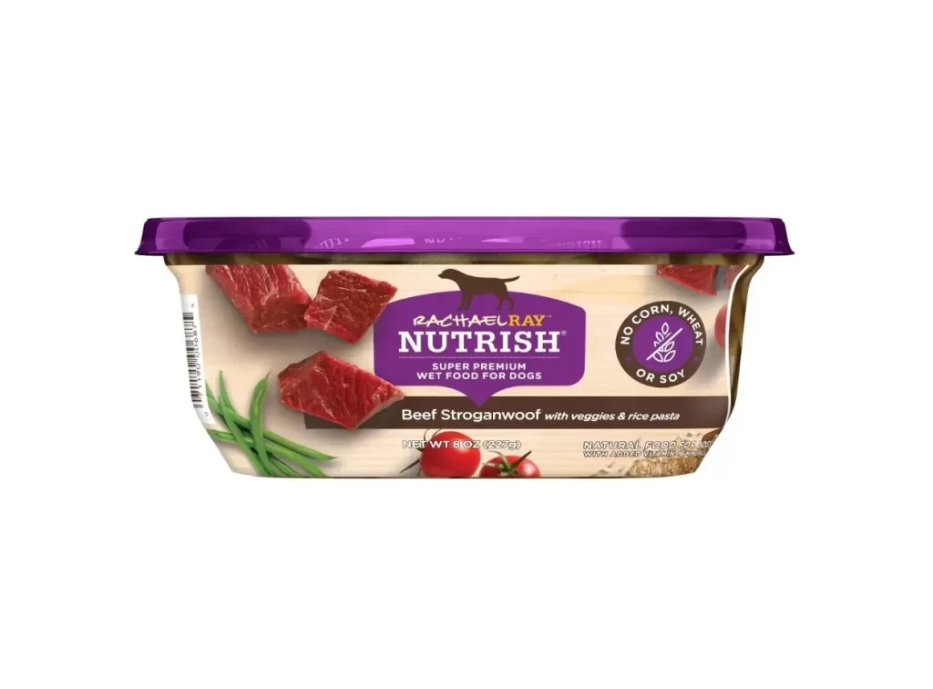
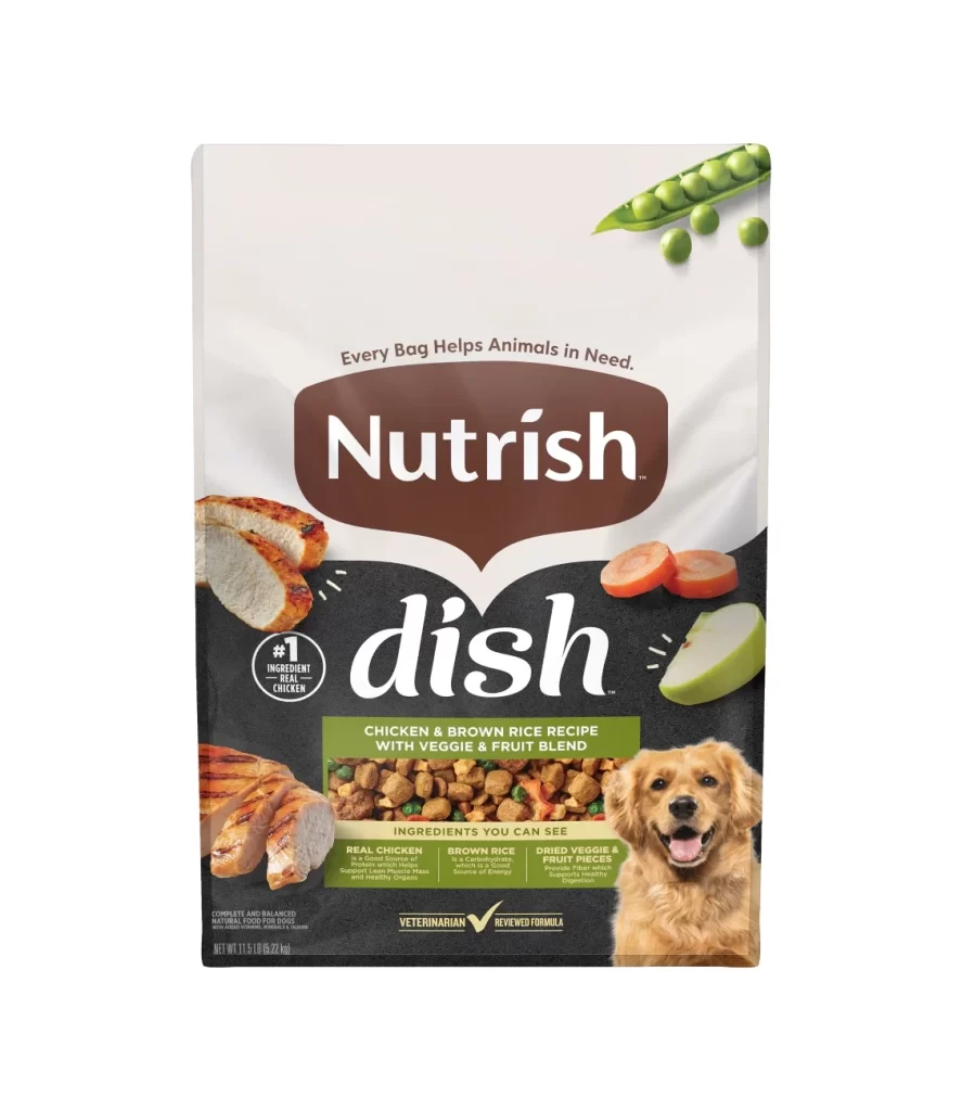
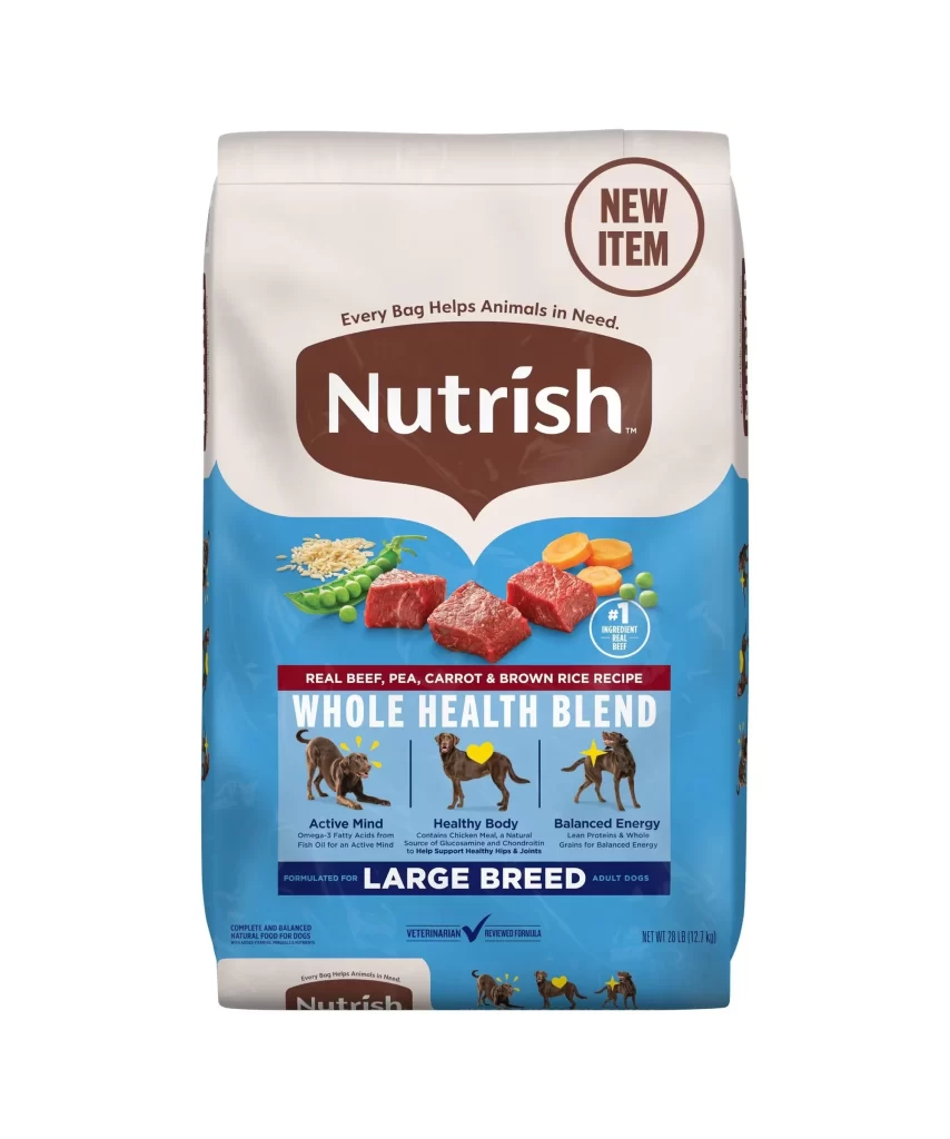
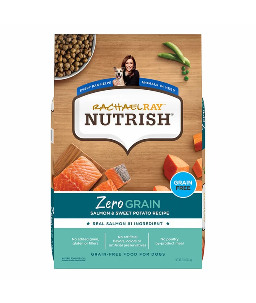
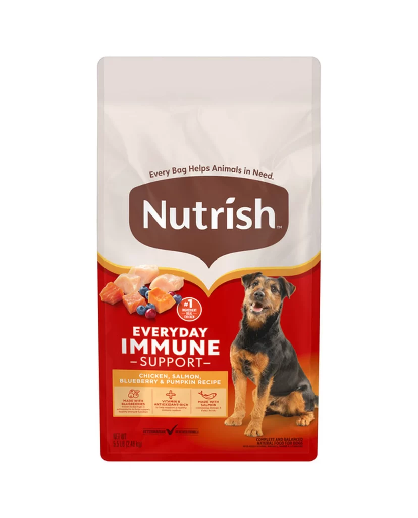
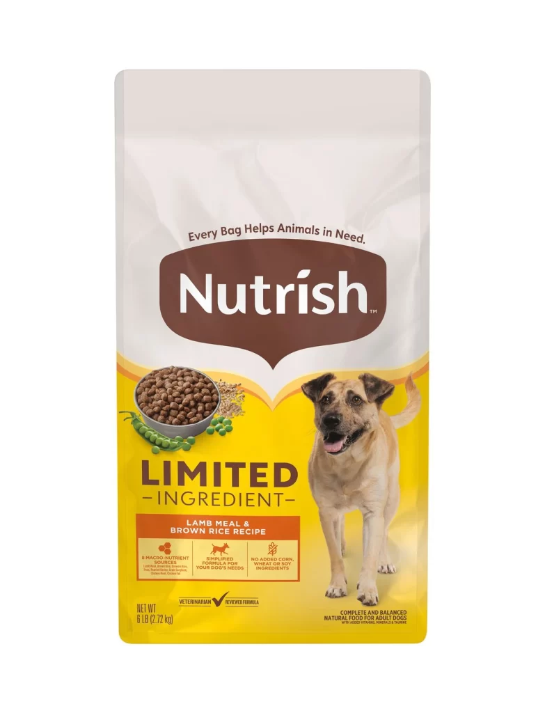
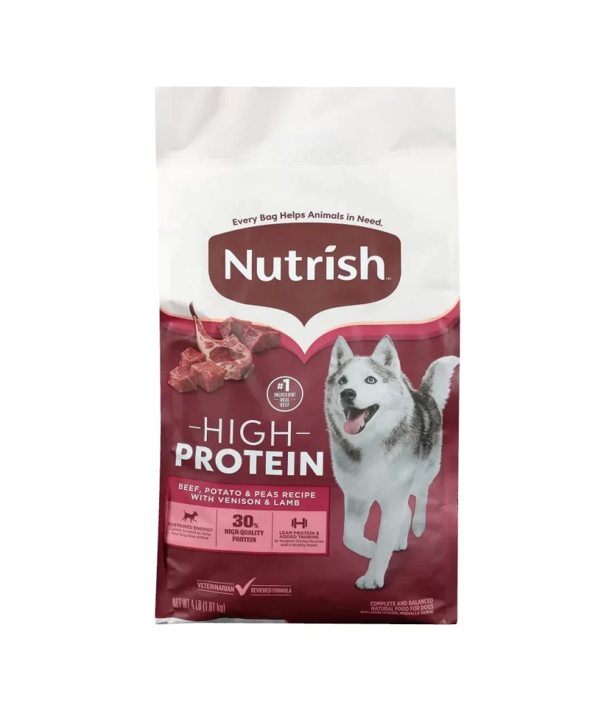
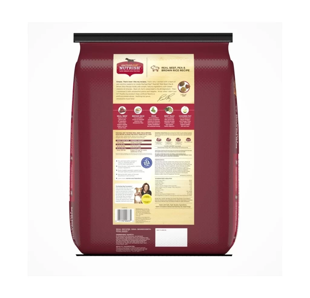
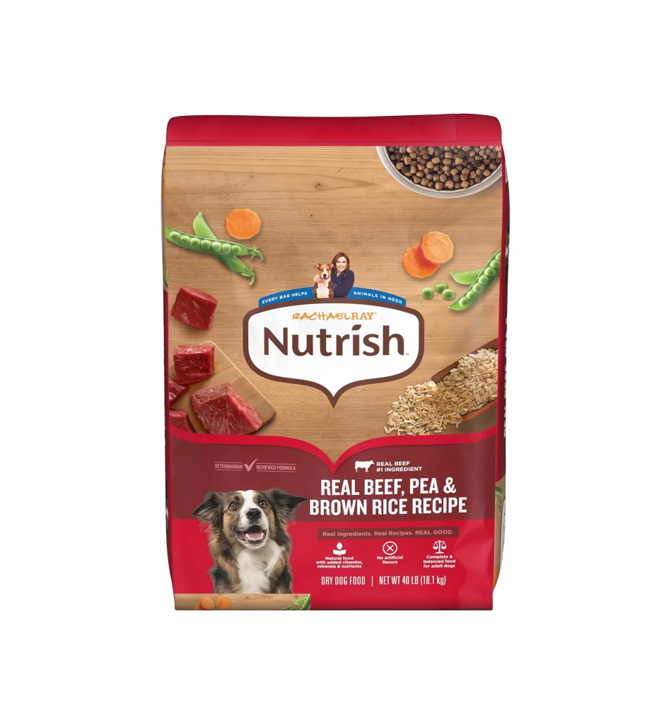
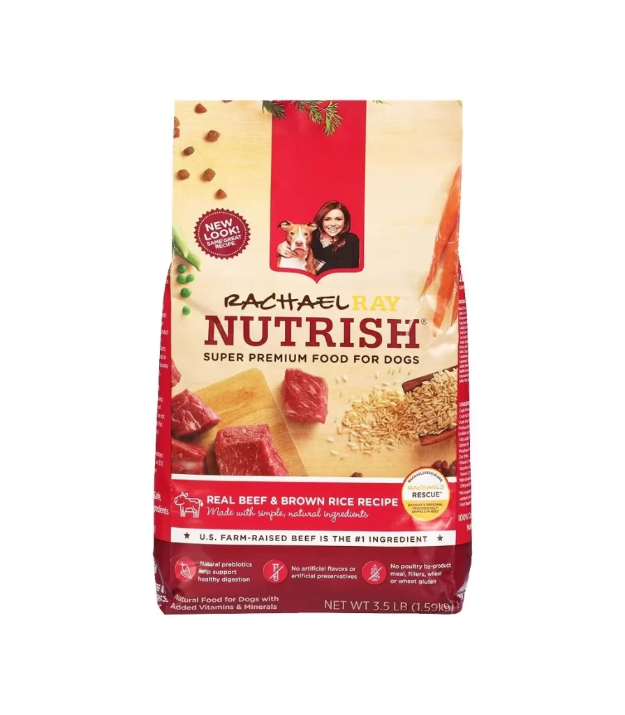
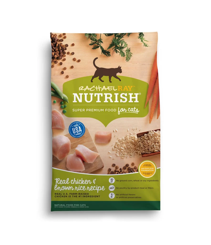
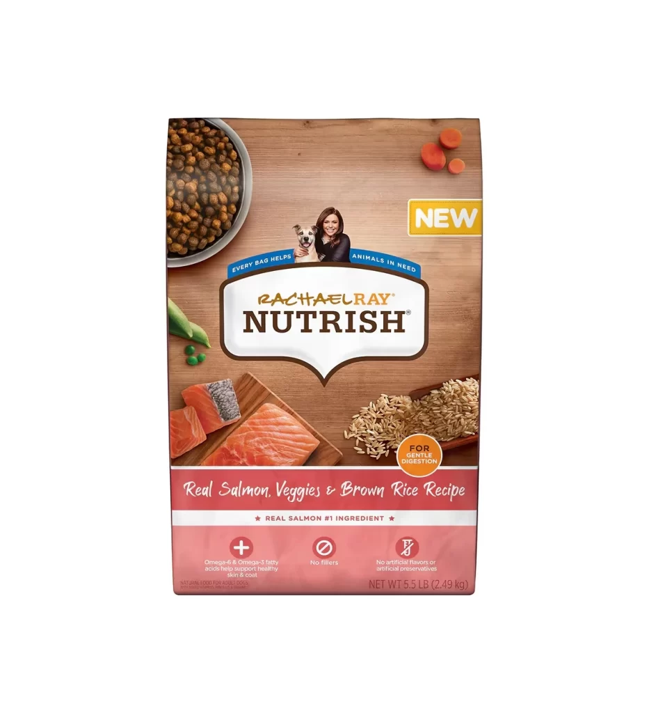
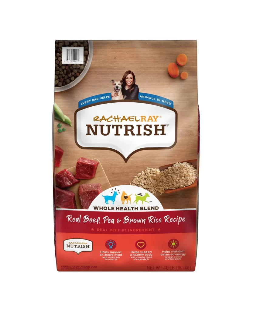
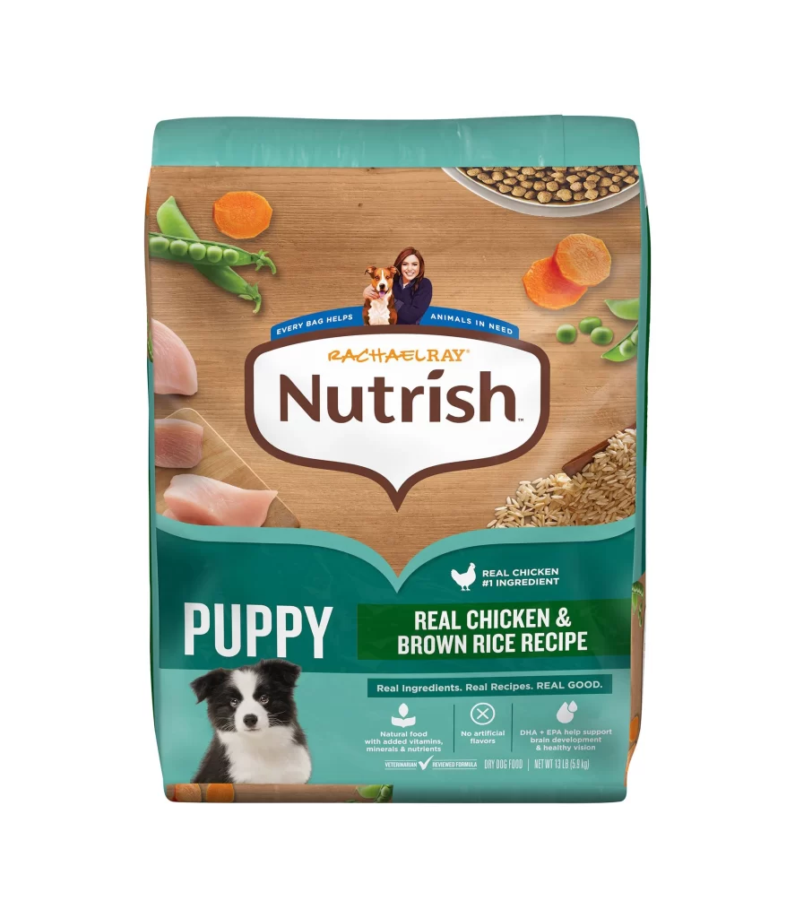
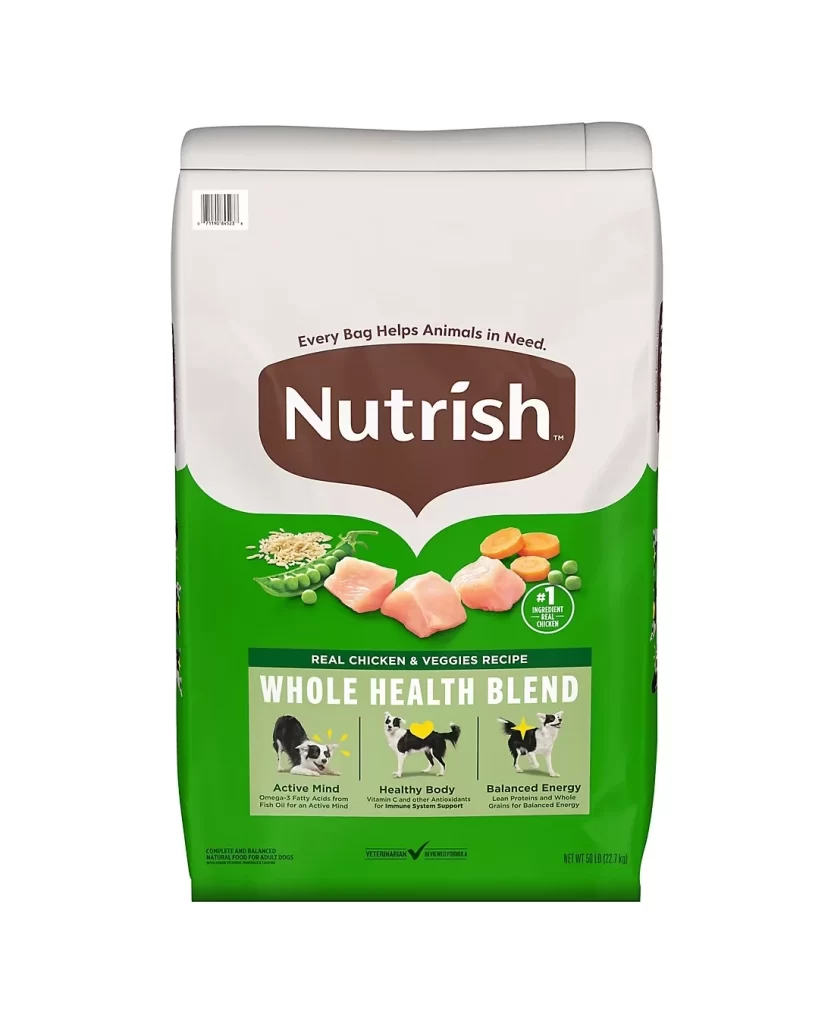
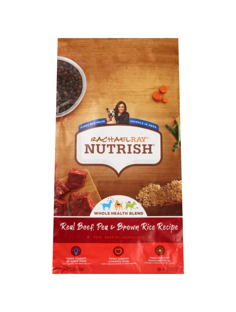
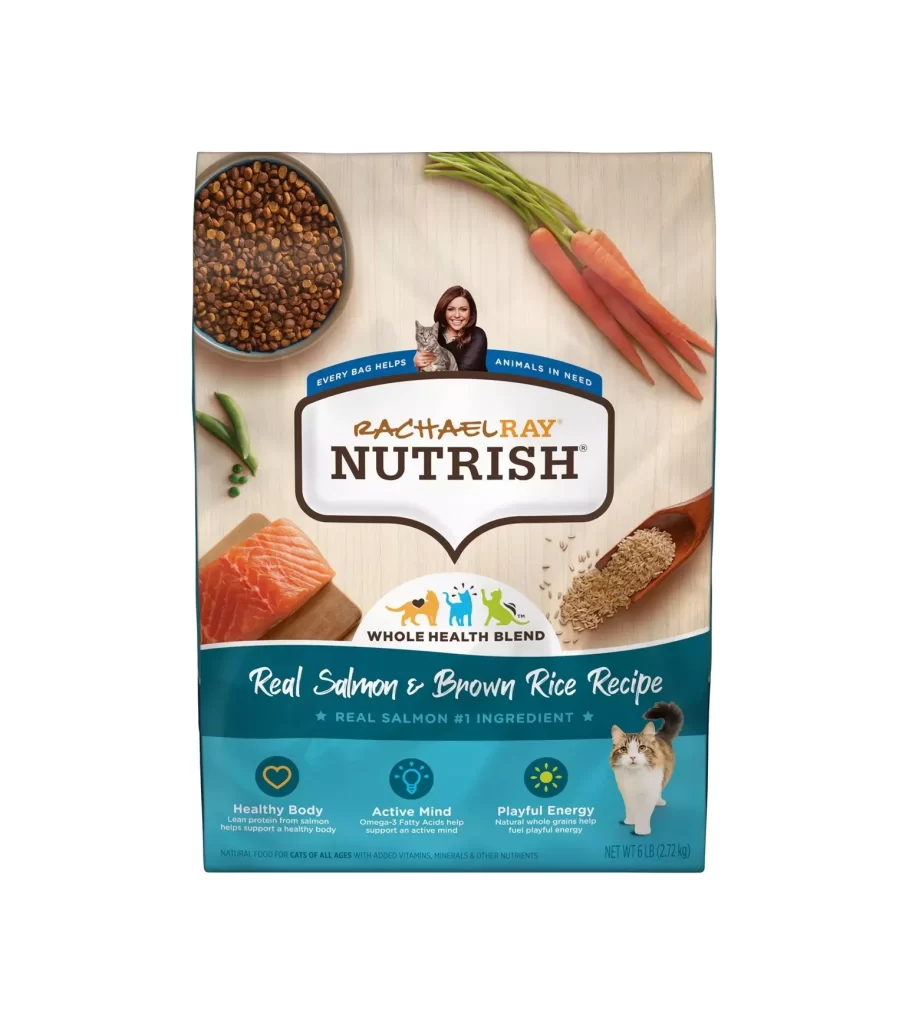
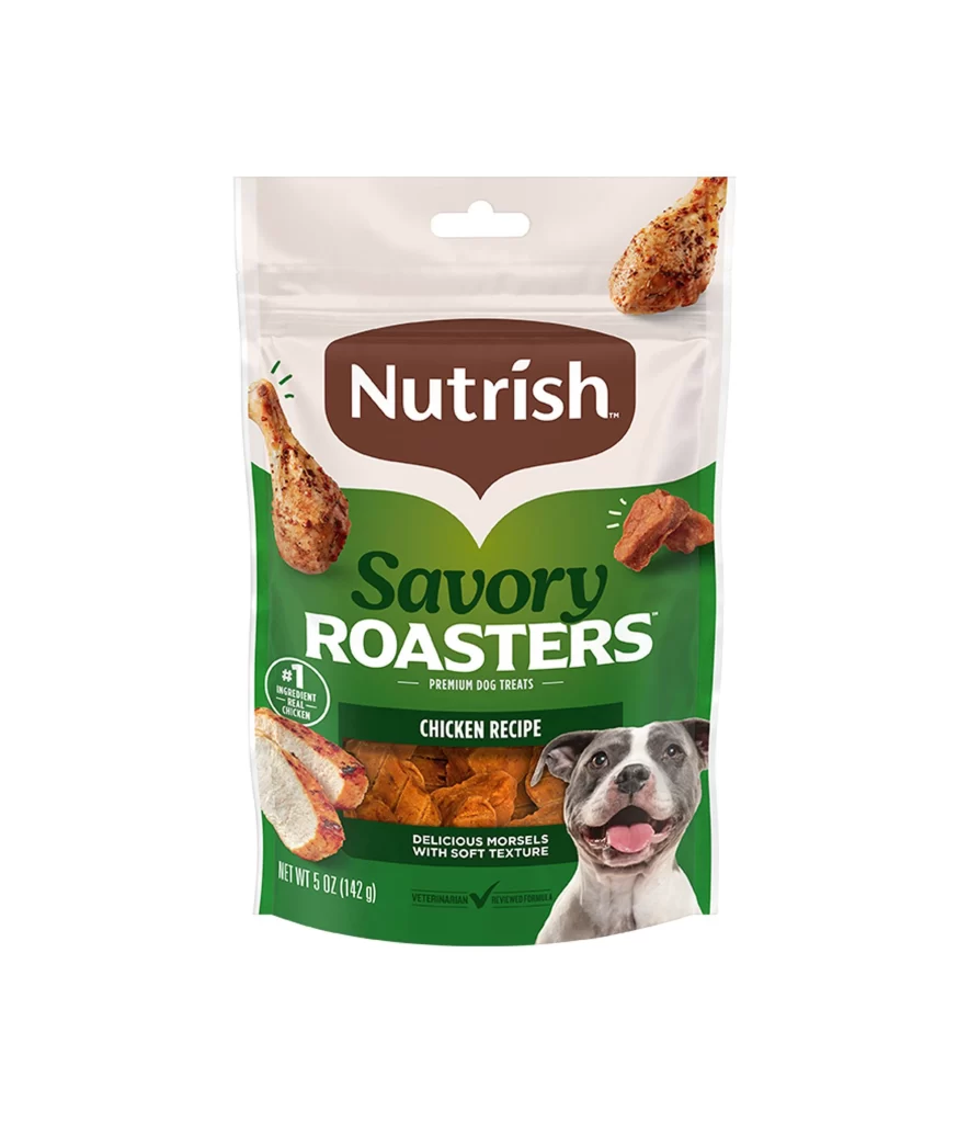
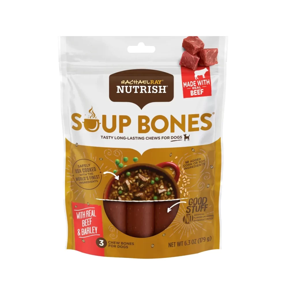
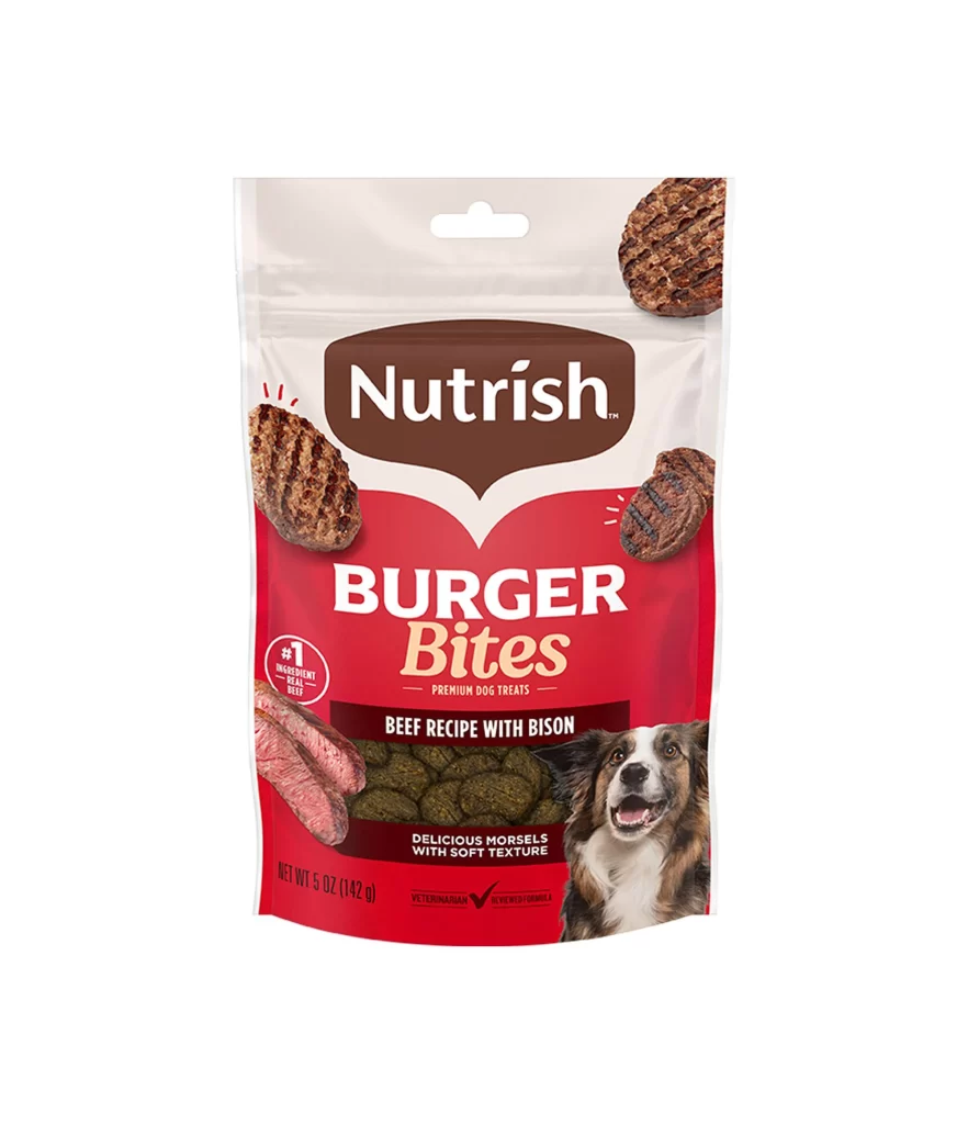
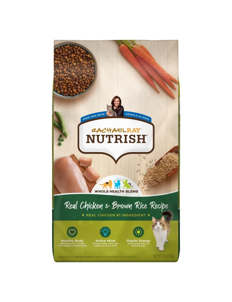
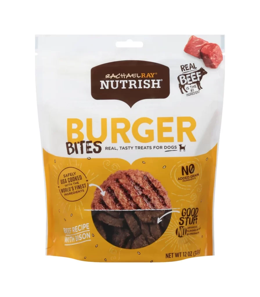
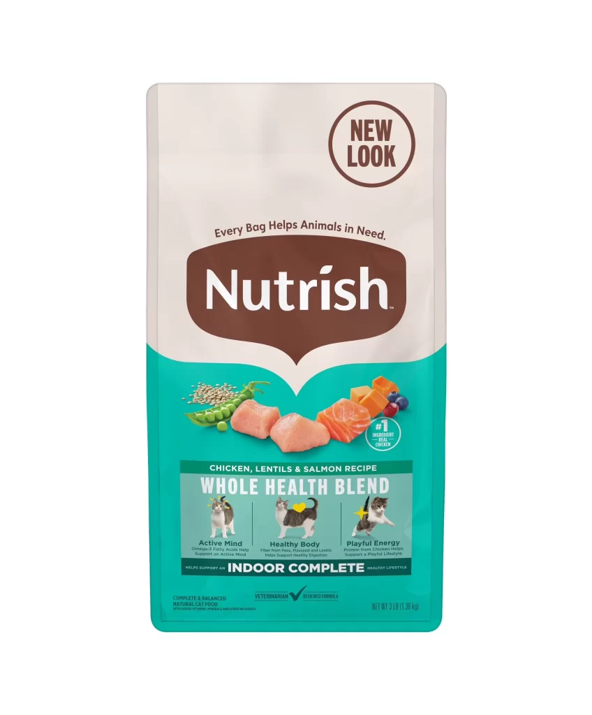
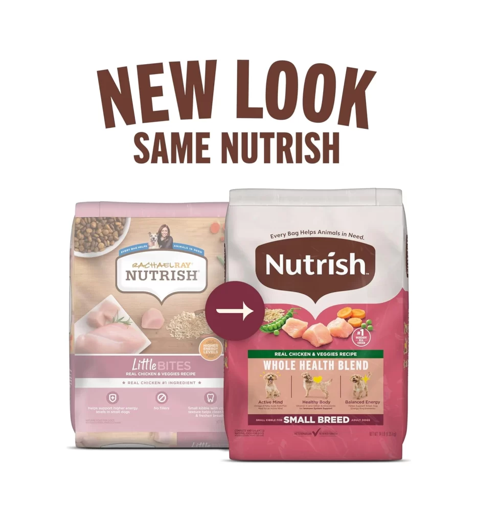
The post displays a side-by-side rebrand comparison of the Rachael Ray Nutrish Little Bites dog food bag. Viewers immediately notice the shift to a clean white background. The packaging highlights the Little Bites Real Chicken and Veggies Recipe. It clearly features the same Nutrish formula claim, positioning the product as a whole health blend for small breed adult dogs with real chicken as the number one ingredient.
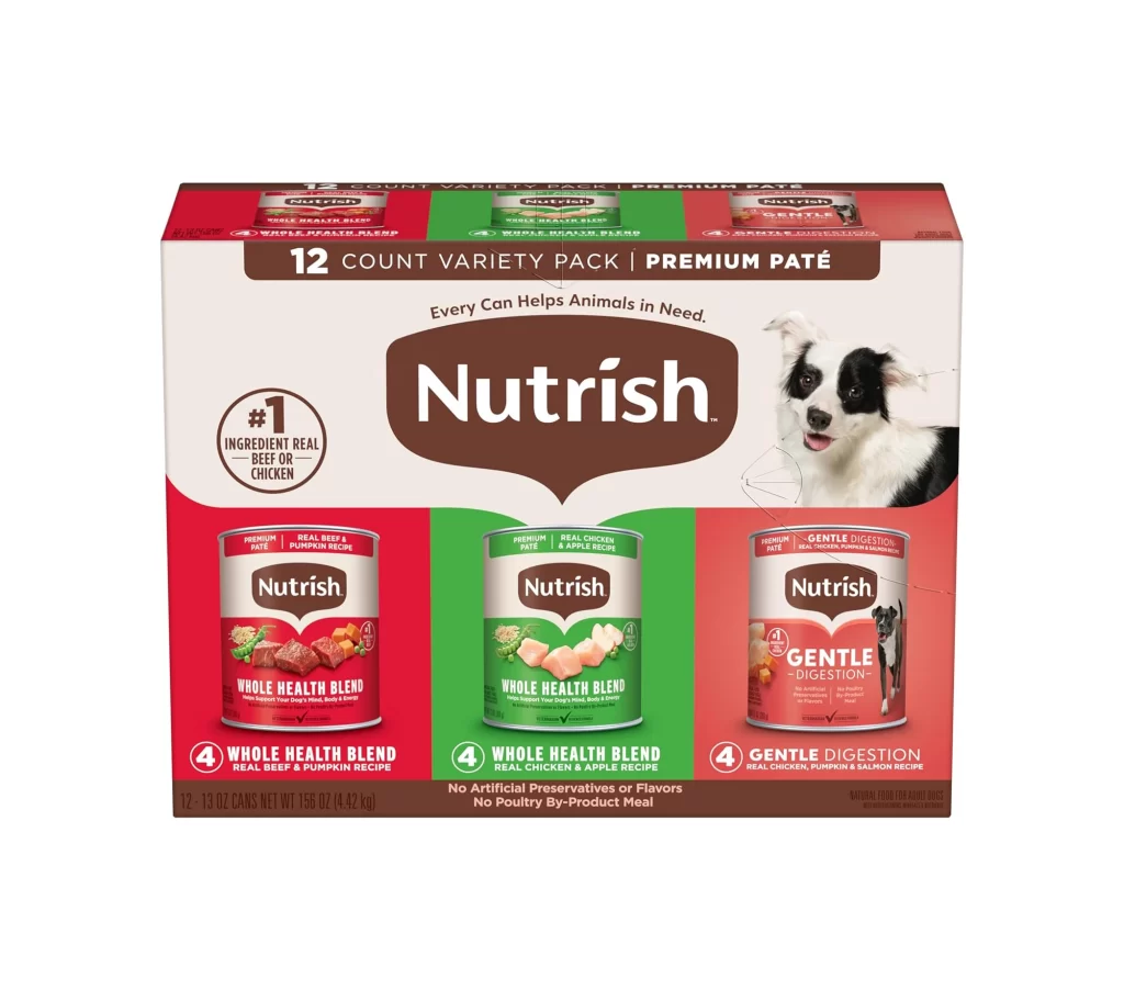
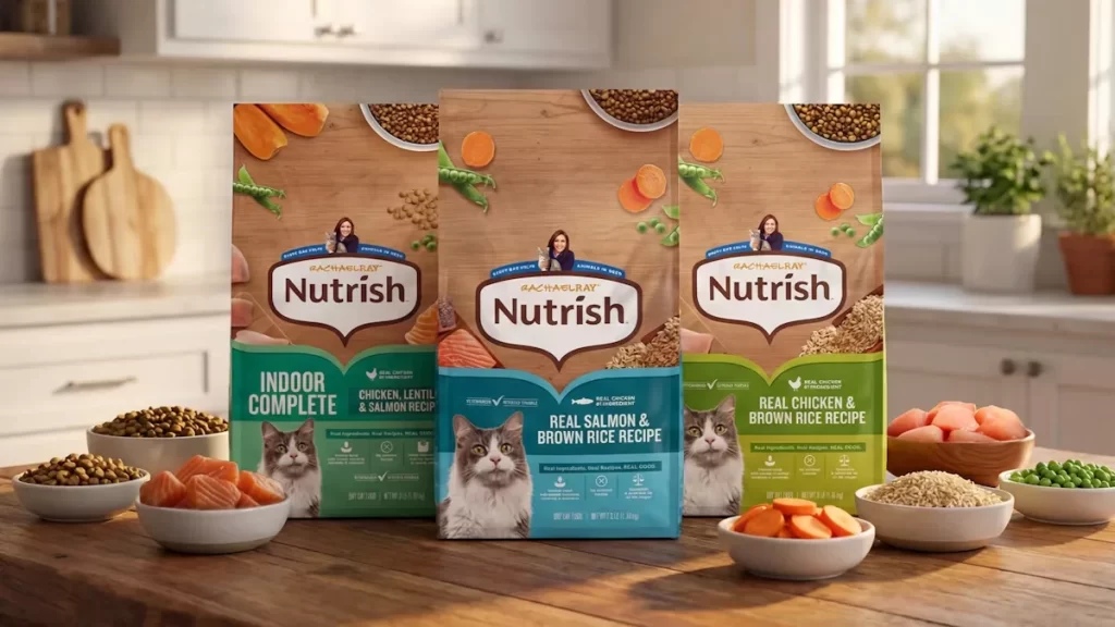
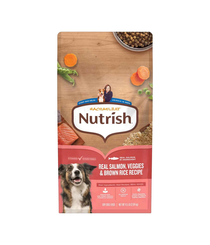
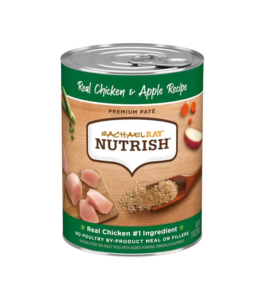
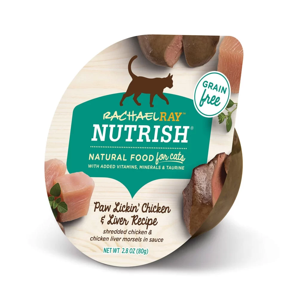
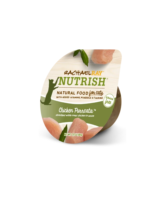
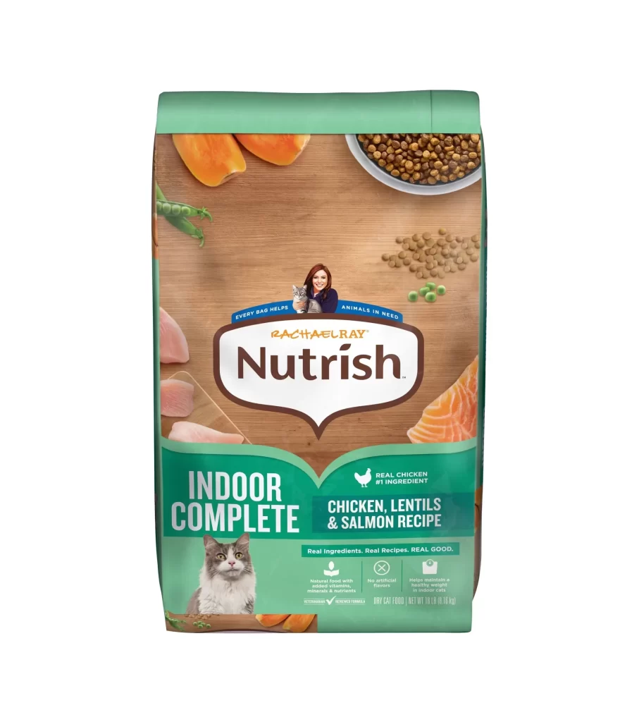
Branding analysis reveals a deliberate logo simplification. The transition from the Rachael Ray Nutrish logo to a streamlined Nutrish wordmark creates a more modern aesthetic. This reduction in visual clutter allows the key product claims to stand out. The clean white background further enhances readability, giving the packaging a premium, health-focused feel that aligns perfectly with contemporary consumer expectations.
This reference is essential for packaging designers and brand strategists working within the pet care industry. It serves as a valuable case study for marketing professionals navigating brand evolution without losing consumer trust. Students studying visual identity will also benefit from examining how simplifying a logo and utilizing negative space can refresh a product line while maintaining its core nutritional messaging.