Rachael Ray Nutrish Whole Health Blend Variety Pack Advertisement
Topics
Details
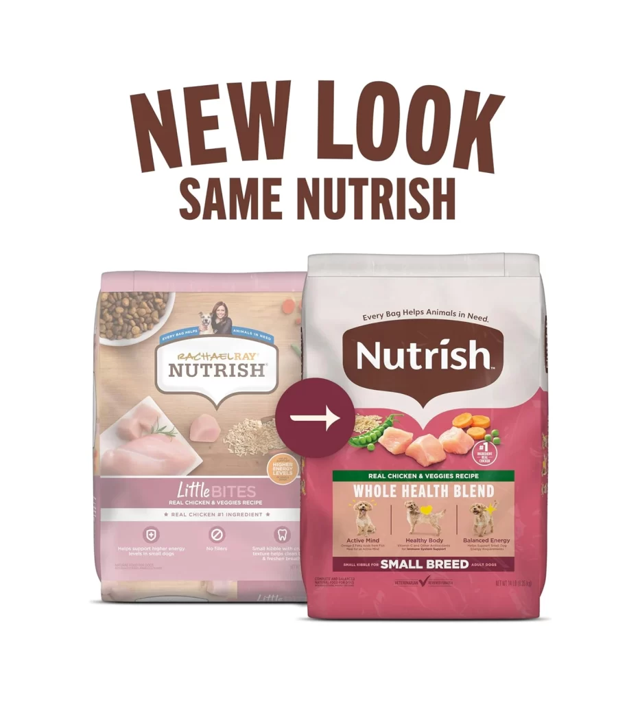
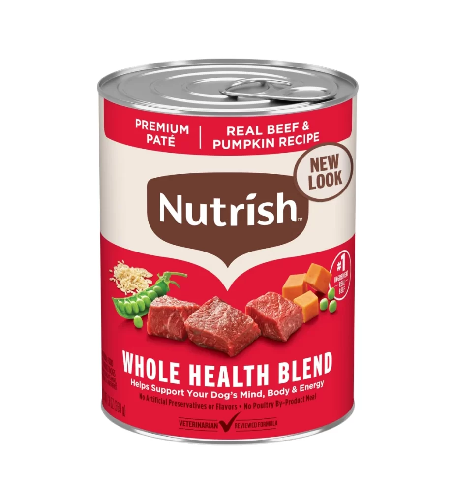
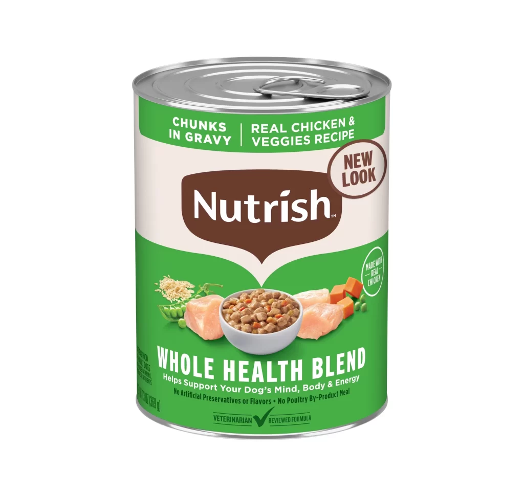
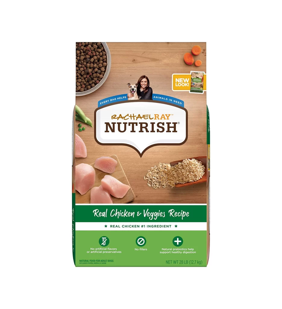
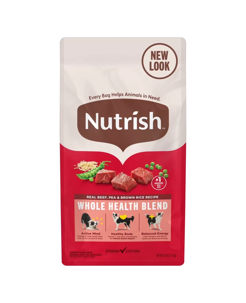
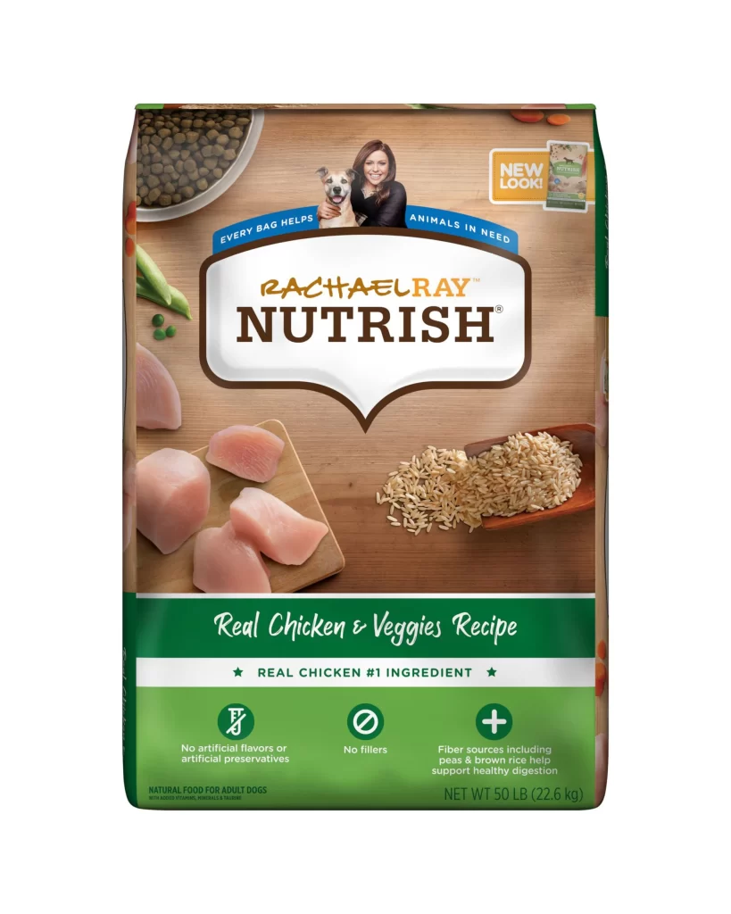
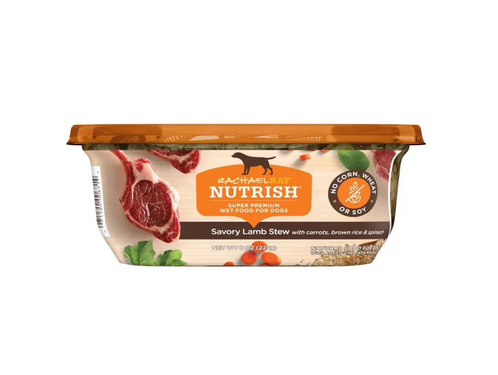
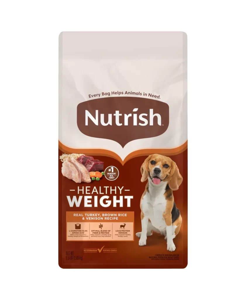
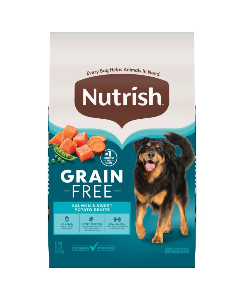
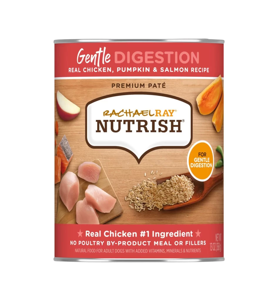
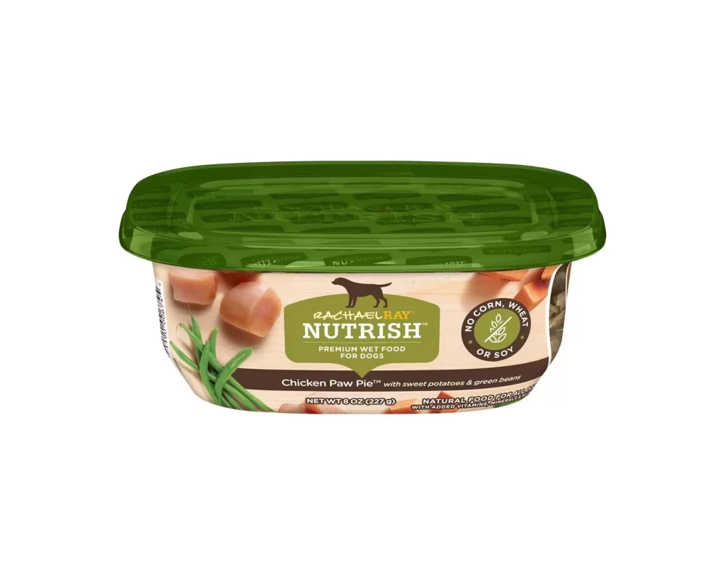
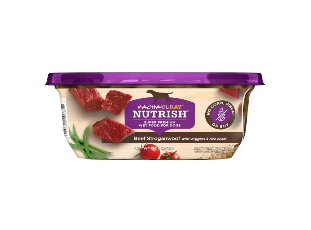
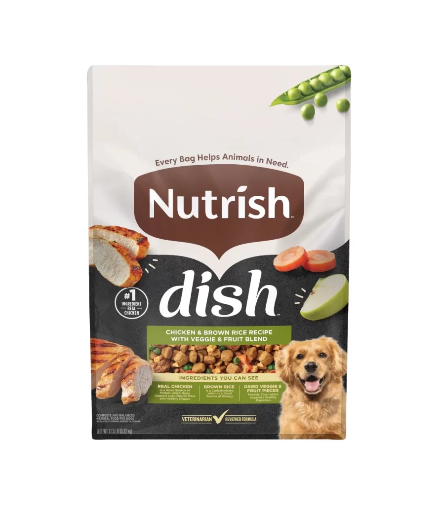
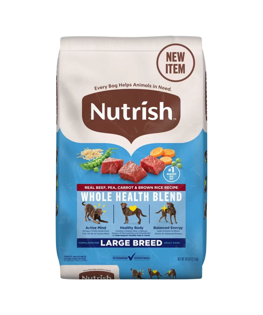
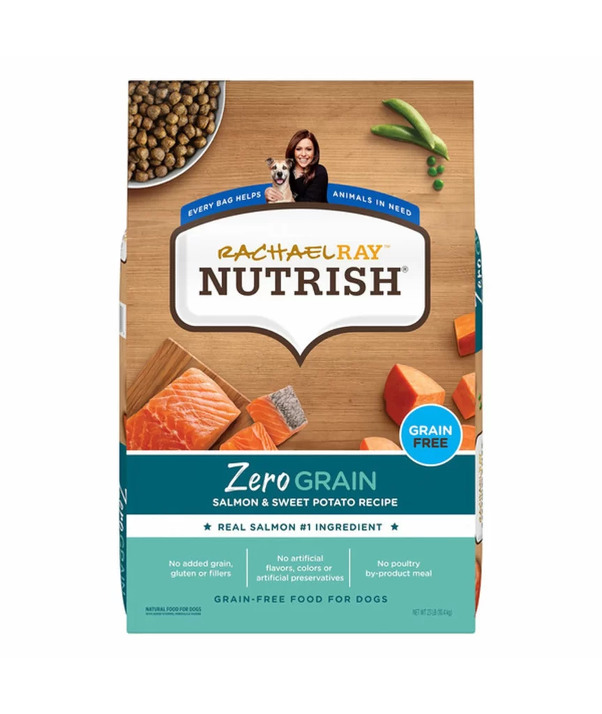
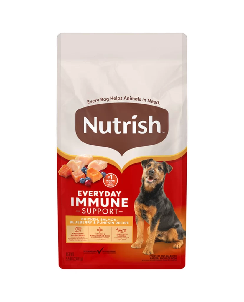
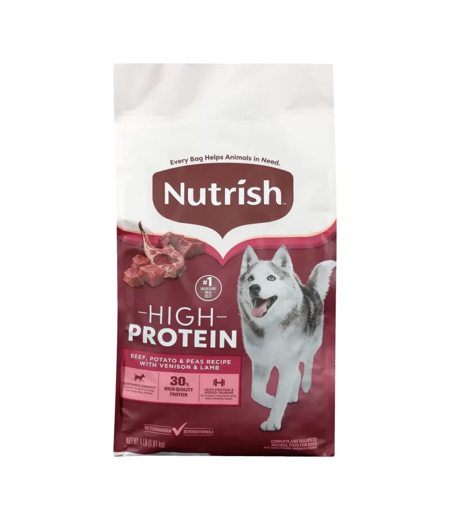
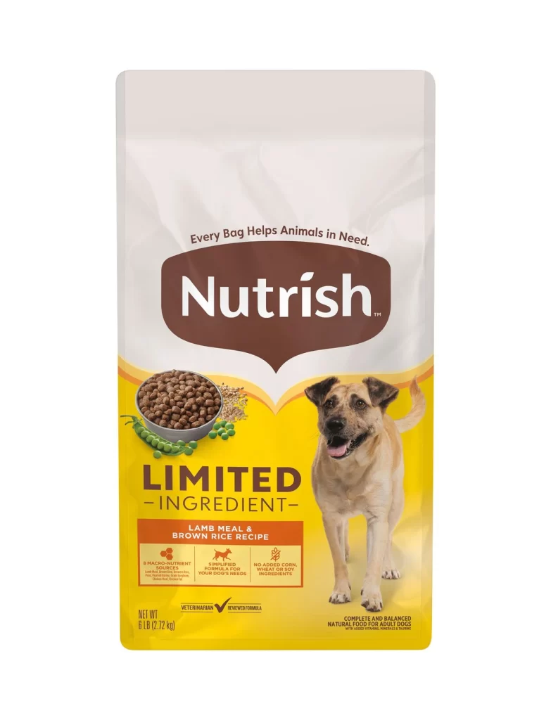
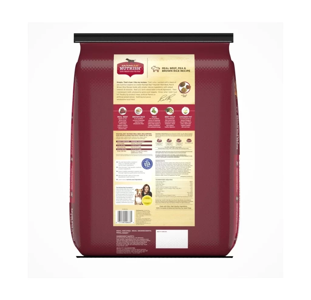
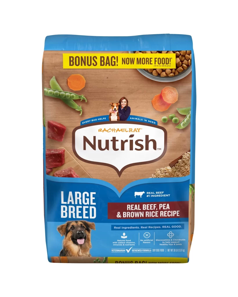
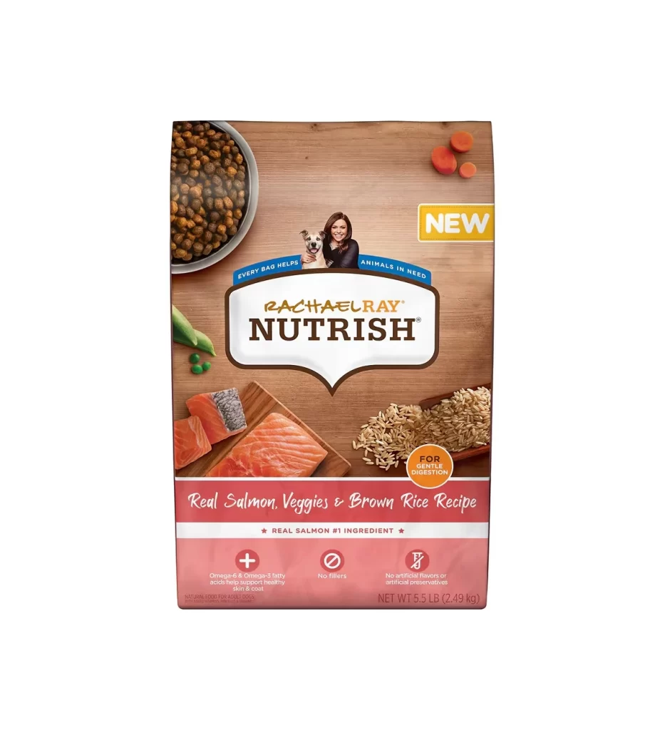
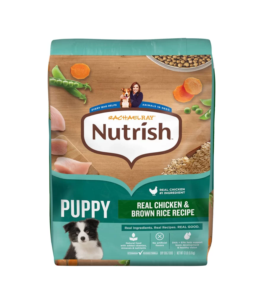
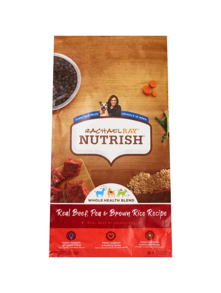
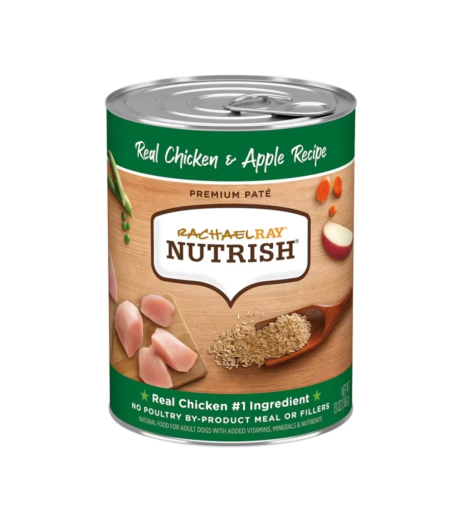
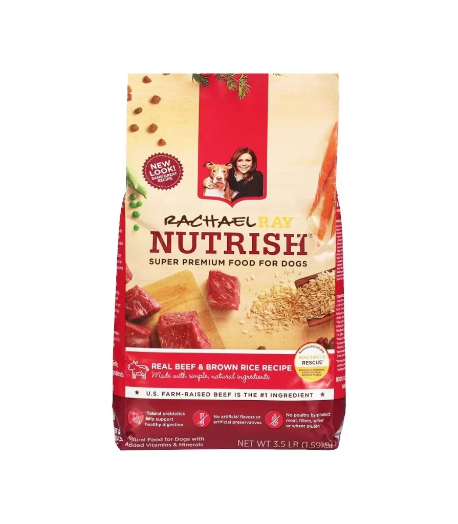
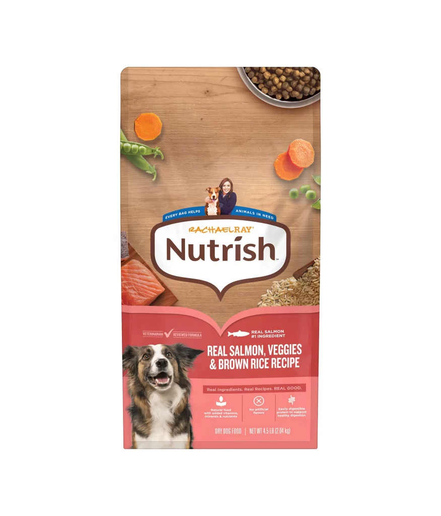
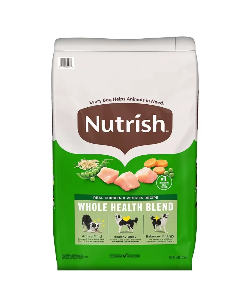
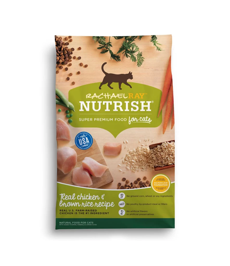
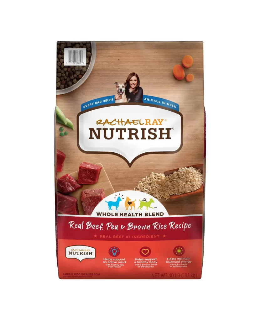
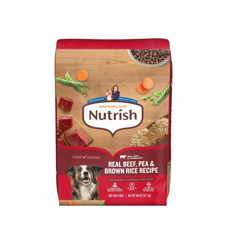
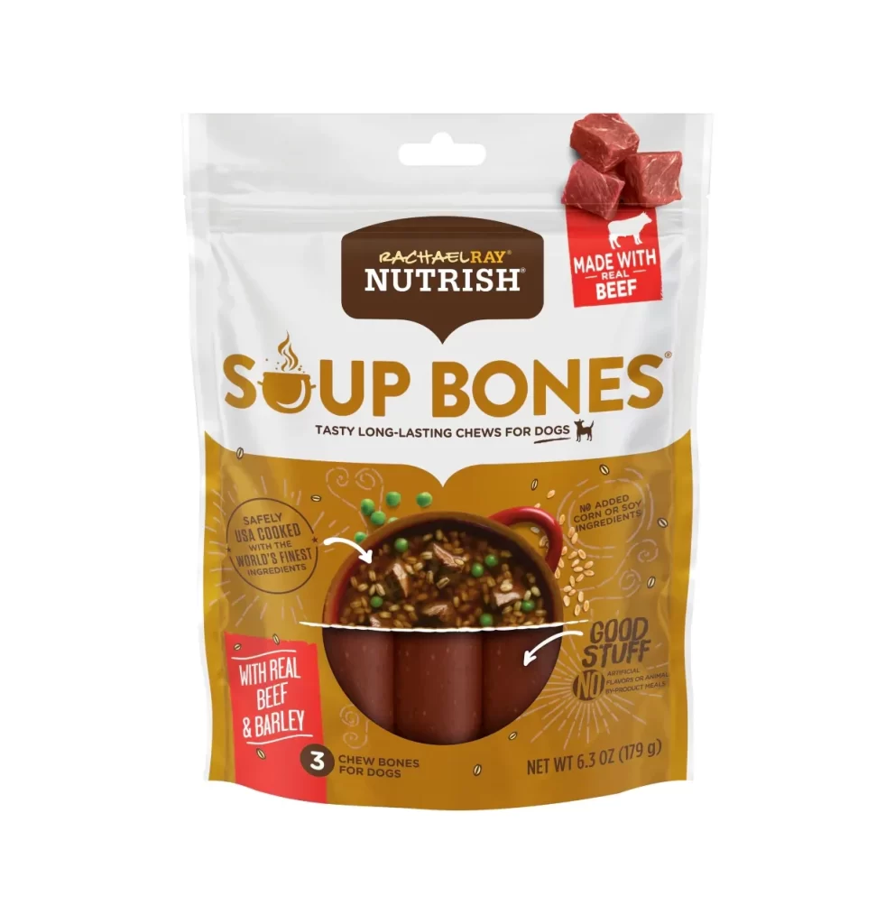
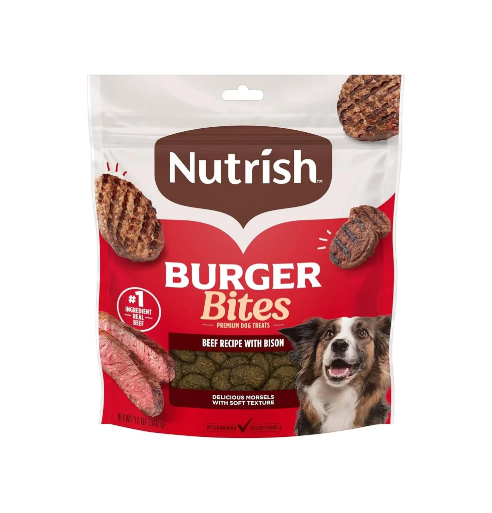
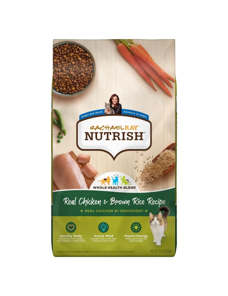
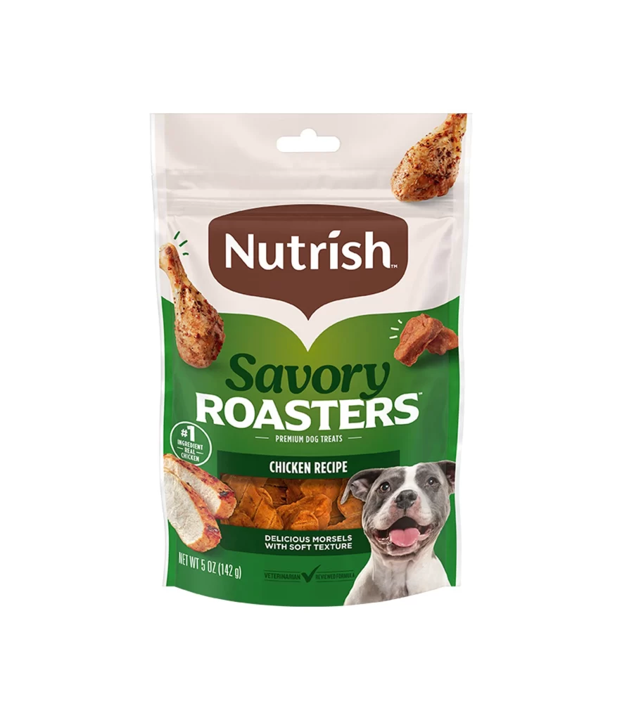
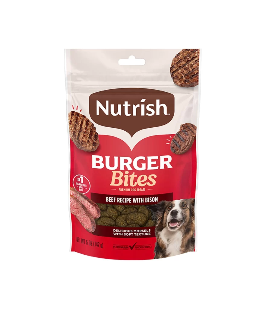
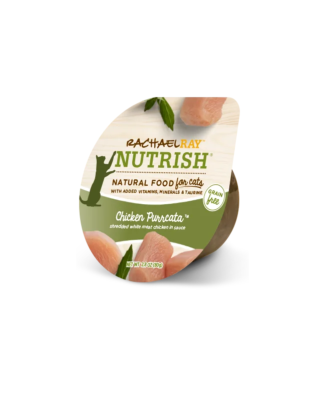
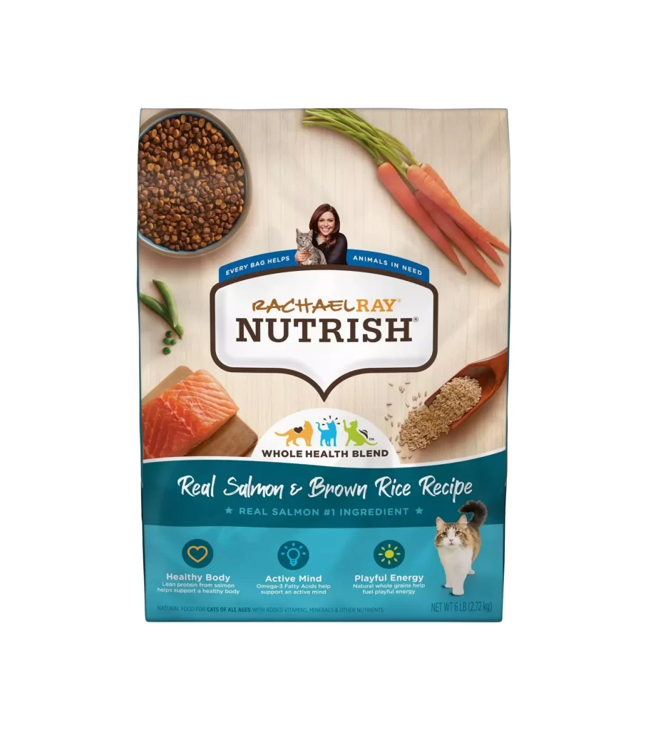
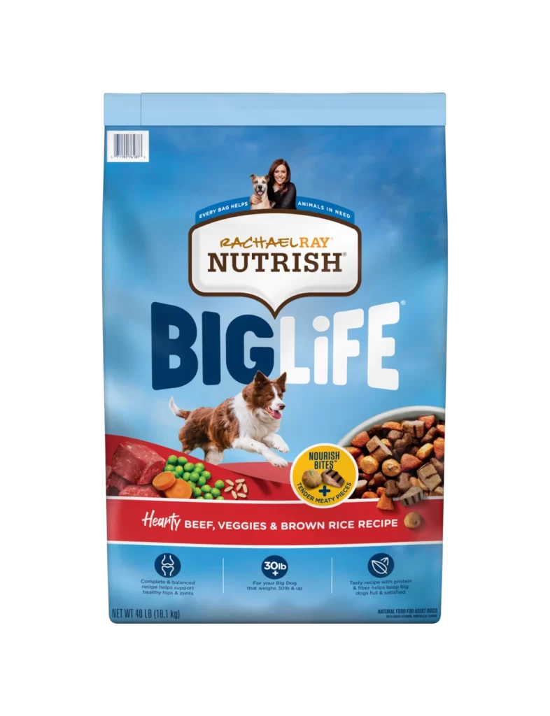
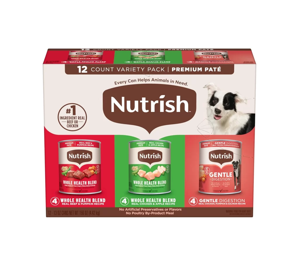
The packaging showcases a bold tri-partite color-block layout in crimson red, forest green, and coral red, perfectly matching each recipe variant. A striking border collie dog portrait anchors the right shoulder, while a large brown shield logo featuring the word Nutrish sits prominently. This twelve count premium pate variety pack includes real beef and pumpkin, real chicken and apple, plus gentle digestion chicken, pumpkin, and salmon recipes.
Design analysis reveals a masterful use of color psychology and structural geometry. The box format utilizes distinct color blockingcrimson red, forest green, coral redto instantly communicate flavor variety and guide consumer selection. The prominent shield emblem conveys trust and premium quality, while the styled background adds depth. The border collie portrait creates an emotional connection, grounding the vibrant palette with relatable warmth and approachability.
Graphic designers seeking inspiration for pet food branding will find this reference invaluable. It demonstrates how to balance vibrant, competing colors within a single box layout while maintaining brand cohesion. Marketers and packaging designers can study its effective use of visual hierarchy, emotional appeal through animal portraiture, and clear product differentiation. It serves as a prime example of accessible yet premium shelf presence.