Rice Flakes Packaging Brown White Simple Clean Design
Topics
Details
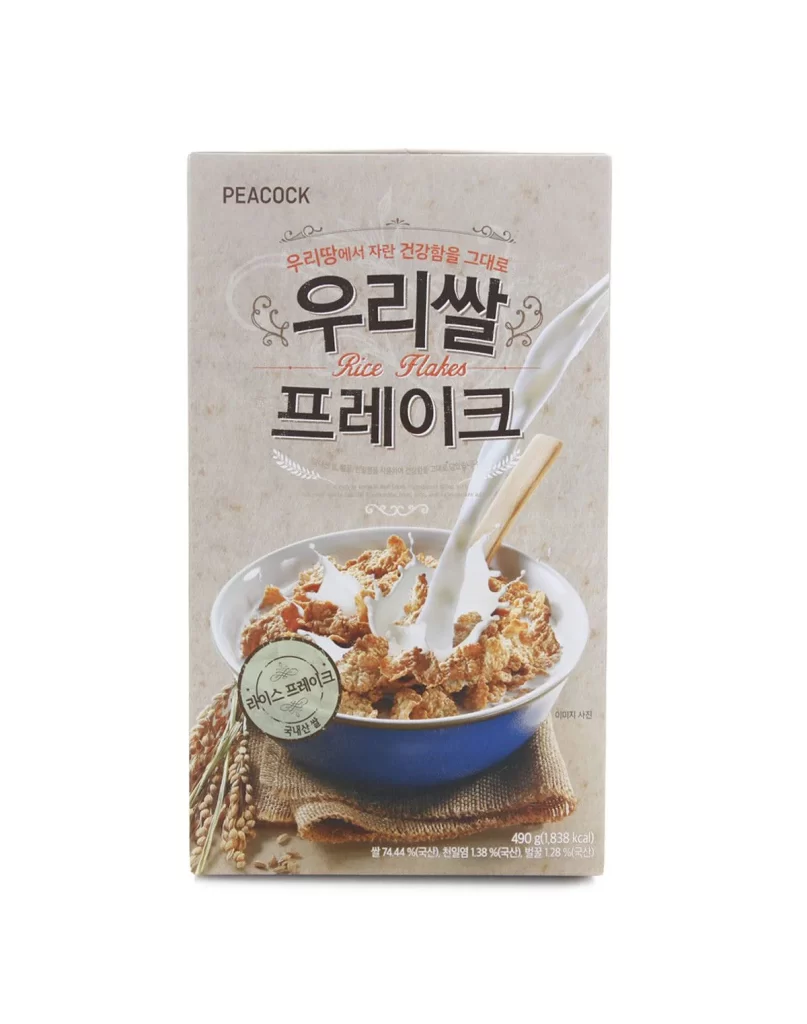
A rectangular cardboard box for Peacock brand Rice Flakes presents a muted, earthy palette dominated by warm beige and off-white tones. The front face features bold, black Korean typography for '우리쌀 프레이크' (Rice Flakes) centered above a photographic illustration of a blue ceramic bowl filled with golden-brown cereal. Milk splashes dynamically into the bowl from the upper right, while stalks of raw rice and burlap fabric anchor the composition at the bottom left against a subtle textured background.
Visual hierarchy relies on contrasting typographic weights, mixing heavy serif headlines with lighter English subtext to guide the eye downward toward the product photography. The design balances rustic agricultural cues—evident in the grain illustrations and fabric textures—with clean, modern layout principles that keep information legible. A circular green seal near the bowl adds a layer of authenticity, suggesting quality certification without cluttering the overall minimalist aesthetic.
Brand strategists developing organic or health-focused food packaging could analyze this layout to understand how earthy color schemes convey natural ingredients. Typography students might study the interplay between Korean script and Latin characters to improve bilingual label designs. Photographers specializing in food styling could reference the lighting techniques used here to capture liquid motion and texture in cereal shots.